
Topics
-
OpenAI, which is expected to need about 3,200 megawatts (MW) of power for its new facility, has agreed to provide up to 1,000 MW to the Southern Co subsidiary Georgia Power's systems in times of high demand. View the full article
-
The affected startup, Hugging Face, said it had turned to Zhipu AI's open-source GLM-5.2 model last week to analyze data from the hack after leading US AI models declined the task, unable to distinguish between a defender and an attacker. View the full article


Leaderboard
-
Himanshu.Sharma
Members2Points16Posts -
Mayank Gupta
Members1Points679Posts -
Gulshan Kumar
Lean Six Sigma Green Belt1Points10Posts


Popular Content
Showing content with the highest reputation on 11/29/2022 in all areas
-
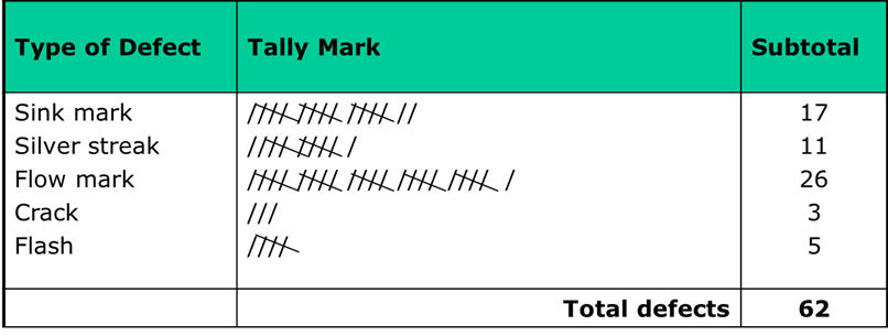
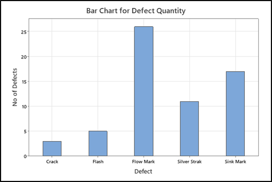
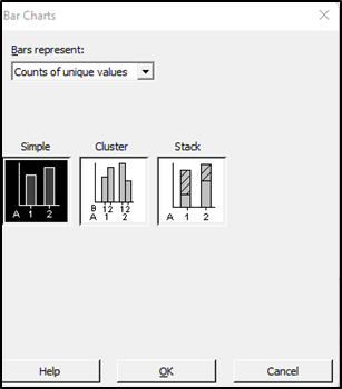
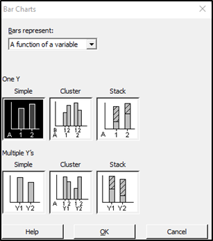
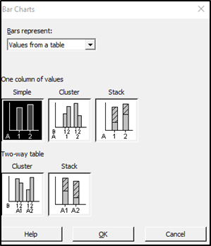
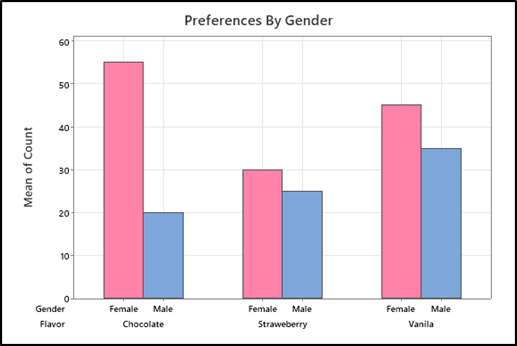
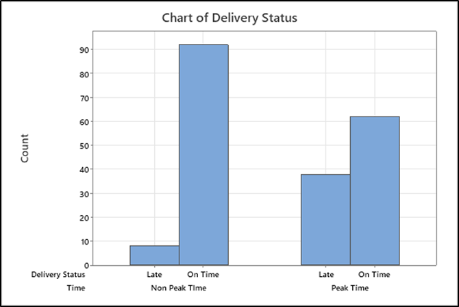
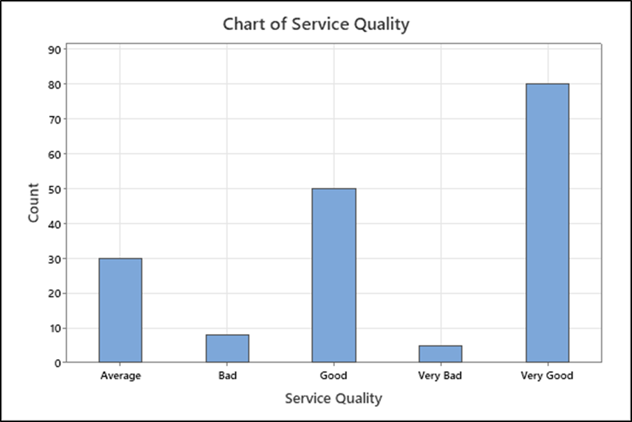
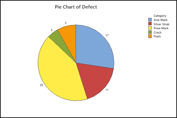
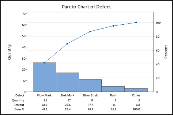
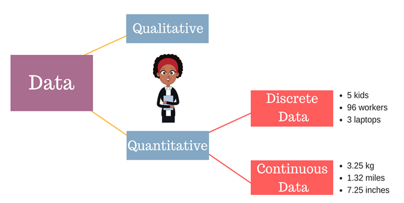
2 pointsBackground: Quantitative data is divided into two categories – Discrete and continuous data. As No. of water drops is Discrete but volume of water is continuous. So when data is countable and can take certain value it is called Discrete data, whole no is used to write Discrete data, Example – Number of student in a class, Number of player in cricket team, Number of Defect per day, Number of books in Book shelf etc. Following type of Graph can be used to represent summery of discrete data: 1- Frequency table 2- Bar Chart 3- Pie Chart 4- Pareto Chart In Frequency table values are represented thorough tally mark representing frequency of data. Below example shows defect monitoring in injection moulding process. Tally mark helps in live data monitoring to avoid end of shift reconciliation. Summery of data can be used for different type of bar chart. Bar chart use to do following: 1- Compare counts by category: 2- Display a frequencies on y axis 3- Understand relationship between categorical variable. In Below Example: Bar chart shows Summary of defects on X axis and defect frequencies on Y axis - help to visualize defect wise frequency as shown in below example: In Minitab and Excel many option are available for bar charts based on requirement. Below options are available in Minitab: Cluster Bar chart showing comparison between Male and Female and preferences for ice cream flavour as shown below: Another Example: Pizza delivery service promise to deliver pizza in specified time. Delivery status compared with time as peak and non-peak. Below possible outcome can be seen using bar graph that peak time having more late deliveries compares to non-peak time. Bar chart for Ordinal data: Service quality compared on 5 point Likert scale for customer feedback. As below: 1- Very Good 2- Good 3- Average 4- Bad 5- Very Bad Pie Chart: We can also make Pie Chart as shown below for defects to see frequency or proportion distribution for of each defect: Pareto Chart is combination of line and bar graph and used to prioritize focus area for project.Below pareto chart shows Flow mark contribute maximum as 41.9% and flow chart and sink mark contribute 69.7%. It shows frequency of defects on primary axis and cumulative percentage on secondary axis. in Below Example X Axis and Primary Y axis using discret data and secondery Y axis having variable data. Above example can be used to present graphical summery of discrete data and required inferance can be drawn.
 2 points
 -
Interesting answers to a seemingly simple question. The best answer has been provided by Himanshu Sharma.1 point
-
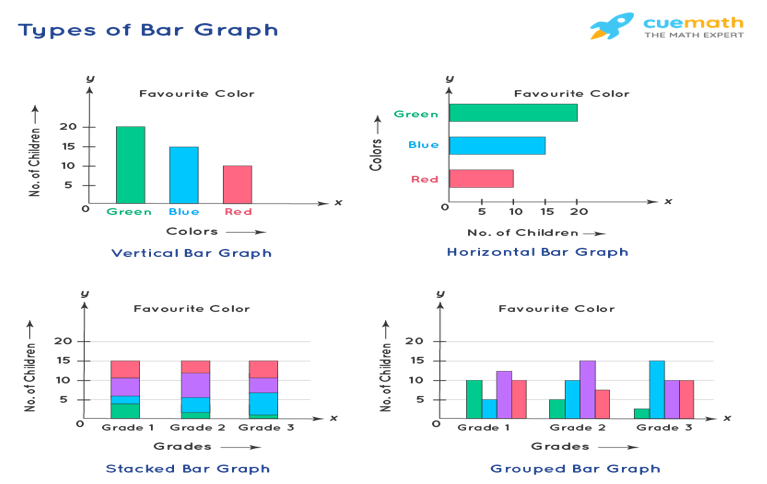
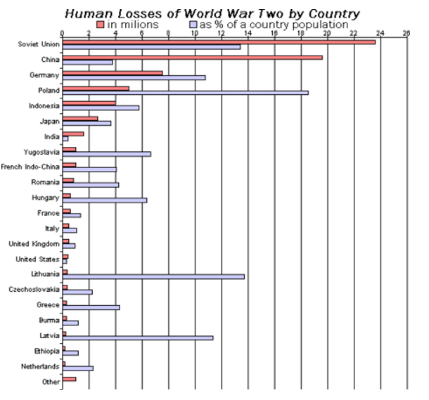
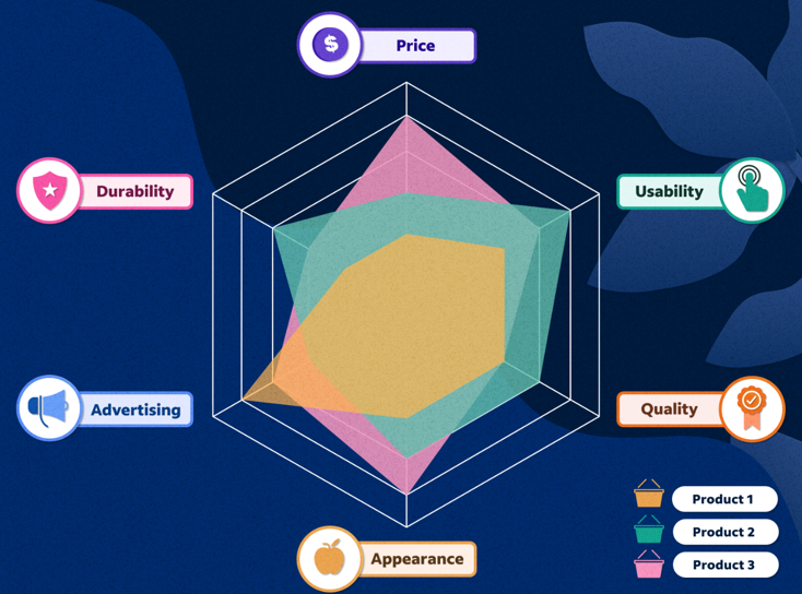
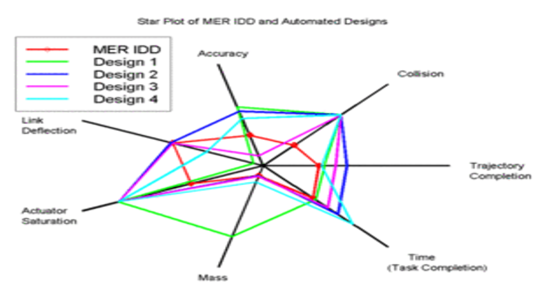
Discrete data is a count that involves integers. Only a limited number of values is possible in case of Discrete data . It cannot be subdivided into parts.E.g., the number of children or teachers in a school or workers in a factory is discrete data. They cannot be further broken down or subdivided into fractions . Examples of discrete data: Ø Number of students in class. Ø Number of workers in company. Ø The number of parts damaged during transportation. Ø Shoe sizes. Ø Number of languages an individual speaks. Ø The number of test questions you answered correctly. Ø Instruments in a shelf. You can count the data. The values cannot be divided into smaller pieces rendering the data futile. You cannot measure the data. By nature, discrete data cannot be measured at all.Eg weight cannot be counted but measured .Hence Weight is Continuous Data.Other example is Revenue. Possible values are limited e.g. days of the month. Discrete data may be ordinal or nominal data : ü When there is an order or rank to the values, we have ordinal discrete data. For example, the first, second and third person in a ticket counter line.Graded or Stratified Data. ü Discrete data may be nominal where is no order in data between the values.Eg, the eye color may be one of these categories: blue, green, brown. The following charts are usually used for representing the discrete data: v BAR CHART. v STACKED BAR CHART. v COLUMN CHART. v STACKED COLUMN CHART. v SPIDER CHART. A bar graph is a specific method of representing data using rectangular bars where the dimensions specifically length of each bar is proportional to the value of the parameter they represent. Graphical representation of data using bars of different dimensions specifically height. Properties of Bar Graph ü All rectangular bars should have equal dimensions and equal spacing in between. ü The rectangular bars are horizontally or vertically plotted. ü The height of the rectangular bar is equivalently proportional to the data they represent. ü The rectangular bars must be on a common base or parameter they represent. Uses of Bar Graph ü The comparisons between different variables are easy, convenient and graphically visual. ü It is the easiest chart to prepare. ü Most widely used method of data presentation. ü It is used to compare data sets which are independent of one another. ü It helps in analysing patterns for longer period of time. Types of Bar Graphs Bar Graphs are chiefly classified into the following two types: v Vertical Bar Graph v Horizontal Bar Graph Apart from the vertical and horizontal bar graphs, two more types of bar graphs are plotted and in use, which are given below: Vertical Bar Graphs When the given data is represented vertically in a graph or chart with the help of rectangular bars, such graphs are known as vertical bar graphs. The rectangular bars are vertically drawn on the x-axis parallel to the Y-axis and perpendicular to the X-axis, and the y-axis shows the value of the height of the rectangular bars. Horizontal Bar Graphs When the given data is represented horizontally parallel to the X-axis by using rectangular bars that show the measure of data, such graphs are known as horizontal bar graphs. The length of the bars in this type of charts also is equal to the values of different parameters. Stacked Bar Graph The stacked bar graph is also known as the COMPOSITE BAR GRAPH. It splits the entire length of the bar into different parts or groups. In this, each part of a bar is represented using different colours to easily identify the different parameters under observation. It requires specific labelling to indicate the different parts of the bar. Can be plotted as both vertical and horizontal diagrams. Grouped Bar Graph The grouped bar graph is also known as the CLUSTERED BAR GRAPH. In this, rectangular bars are grouped by position representing the value of individual parameters with the same colours showing same parameters level within each group and then a comparative analysis is done for each parameter visually and data based . Can be plotted as both vertical and horizontal diagrams. Businesses use both bar graphs and pie charts to present information, such as sales ,revenue, profit etc, to customers as well as to employees and other businesses. People can also use bar graphs and pie charts for keeping track of finances etc. It is mostly used for comparison of two independent data sets. A spider chart is a two-dimensional chart type designed to plot one or more series of values over multiple discrete variables. The spider chart is also known as radar chart ,web chart, spider graph, spider web chart, star chart, star plot, cobweb chart, irregular polygon, polar chart, or Kiviat diagram. Applications of spider/radar charts ü Radar charts can be used in sports to chalk out players' strengths and weaknesses in various parameters. ü Another application of radar charts is the control of quality improvement to display the performance metrics of various objects including computer programs, computers, phones, vehicles, and more. ü Radar charts can be used in pharmaceutical industries to display the strengths and weakness of drugs and other medications.


 1 point
This leaderboard is set to Kolkata/GMT+05:30