

Gulshan Kumar
Lean Six Sigma Green Belt
-
Joined
-
Last visited
Everything posted by Gulshan Kumar
-
Using the Gage R&R technique factors that affect measurement system variation can be studied. In the GR&R system, measurement system variation is characterized by location (stability, bias, linearity) and width or spread (repeatability and reproducibility). The GR&R technique finds application in most manufacturing-related measurement systems. It may be used for: Ø judging new measuring equipment Ø comparison among measuring devices Ø improving performance of measuring instruments Ø comparison of measuring equipment before and after repair Ø Calculating the process variations caused due to production factors and the acceptability levels for the production process. Ø measuring the need for training in how to use measuring instruments Repeatability Variability in any measurement system is caused by prime factor -the measurement device. It is the variation that is observed when the same operator measures the same part many times, using the same gage, under similar conditions. Gage A has less variation, so it is more repeatable than Gage Bin the below figure: Reproducibility Variability in the measurement system is caused due to differences between the operators. It is the variation that is observed when different operators measure the same part many times, using the same gage, under similar conditions. Operators 1, 2, and 3 measure the same part 20 times with the same gage. The three lines are the measurements from Operators. Operator1-blue, Operator 2- red, and Operator 3-green. Therefore, it can be visually seen from the picture that the gage's reproducibility is too low. CROSSED GAGE R&r : Two factors are crossed when each level of one factor occurs in combination with each level another factor. In a crossed study, each operator measures each part for negating error due to measurement device and ascertaining repeatability. It is called crossed gage r&r because the same parts are measured by each operator multiple times without destroying the batch under observation. Eg:weight of drugs in pharmaceutical industry, mileage testing in automobile industry, software testing. Often, a crossed gage R&R study is used to determine how much of process variation is due to measurement system variation. R&R value will be higher in case of crossed study method, because in nested method Reproducibility component of R&R is Nil. CROSSED GAGE R&R DESIGN FOR NON-DESTRUCTIVE MEASUREMENT SYSTEMS Nested Gage R&R: Two factors are nested when the levels of one factor are similar but not identical, and each occurs in combination with different levels of another factor, with no two combinations being the exact same. In a Nested Gage R&R, each part is unique to the operator since no two operators measure the same part but similar parts are used. This study is called nested because one or more factor is nested under the other factor and, therefore not crossed with the other factors. Nested R&R is used in case of destructive testing (component cannot be measured many times and gets destroyed / changed during the measurement process).Eg: composition of drugs in pharmaceutical industries, crash test of vehicles in automobile industry, composition of individual elements in chemical industry. NESTED GAGE R&R DESIGN FOR DESTRUCTIVE MEASUREMENT SYSTEMS Expanded gage r&r : An Expanded Gage R&R study is used when below mentioned conditions exist: Ø more than two factors -operator, gage & part. Ø declare some factors as fixed factors. Ø both crossed and nested factors. Ø unbalanced design. This study is called expanded because it can be used in several types of situations. Differences between a standard and expanded Gage R&R Ø The expanded GR&R study allows multiple factors to be evaluated simultaneously. Ø Interactions between the additional factors and the operator and part also can be measured. Ø The expanded GR&R study allows analysis of the data even in case of missing data points. Ø The data collection is adjusted for the expanded GR&R. Since repetition for each additional factor is costly, so the number of parts is often reduced. In a standard GR&R study, more parts can be selected, but this is an unacceptably large sample size for expanded GR&R and may cost much. Ø When enough data for a standard GR&R study does not exist, an expanded GR&R is an ideal tool to characterize the measurement system. For non-destructive measurement systems, the crossed Gage R&R design is used because each operator can test each part multiple times. With the destructive measurement systems, the batches must be similar with similar conditions. Crossed Gage R&R analysis is used only if each operator can test multiple parts from each batch without destroying it. However, if there are not enough parts in each batch to accomplish this, the nested Gage R&R design is brought into use. Examples of when to use nested design and crossed design have been explained with relevant examples in this article.


-
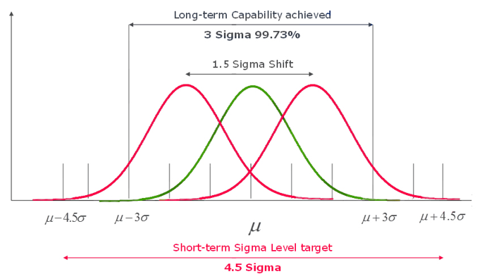
Background Mean is the arithmetic average of a data set. Central tendency is the tendency of data to be centred on this mean. Standard Deviation (also known as Sigma or σ) determines the spread (deviation) from this mean/central tendency. The more the number of standard deviations that fits between process average and acceptable process limits, the less likely it is that the process performs beyond the acceptable process limits, and it causes a defect. It is for this very reason that a 6σ (Six Sigma) process performs better than 1σ, 2σ, 3σ, 4σ, 5σ processes. Specification Limits &Control Limits LSL and USL refer to “Lower Specification Limit” and “Upper Specification Limit”. Specification Limits are obtained from the customer requirements, and they specify the minimum and maximum acceptable limits of processes. Control limits indicate variation in the process performance. It is the actual values that the process is operating on or a real time value. Sigma Shift At Motorola Six Sigma practitioners analysed samples of their processes and deduced that process capability tends to drift over time. In order to ensure the long-term process achieved a target defect rate, and realising that they could only measure their processes in the short term, they concluded that the short-term process tended to ‘accommodate’ more standard deviations between the mean and the specification limits, and concluded that an additional 1.5 standard deviations from the short-term process was about right. The ‘additional’ 1.5 standard deviations is known as the Sigma Shift. The difference over the short and long term between the Sigma Levels of a process is called Sigma Shift. Allowing 1.5 sigma shift results in the generally accepted six sigma value of 3.4 defects per million opportunities (DPMO). Processes tend to behave in a different manner over the short and long terms: A greater Sigma Shift suggests that process could be improved to a great degree. A low Sigma Shift suggests that process is well controlled already and no further control methods are necessitated. Process Capability & Stability A capable process is one that gives an output that meets customer specifications. A stable process has controlled variations and operates within the control limits. There are several methods to measure process capability index and ratio including an estimation of the PPM (defective parts per million) .Capability indices such as Cp, Cpk, Pp, Ppk are the most prime ones. The Cp and Cpk indices denote capability indices. Cp{Capability Index} shows whether the distribution can potentially fit inside the specification, while Cpk{Capability Ratio} shows whether the overall average is centrally located. If the overall average of the process is in the center of the specification, the Cp and Cpk values will be the same. Higher value of Cpk, is advantageous. Cpk values less than 1.0 is considered pretty poor and the process is considered not capable. Values between 1.0 and 1.33 of Cpk is considered barely capable, and values greater than 1.33 is considered capable. Process Capability measures, what the requirements are versus the distribution of the process outcome. The difference between the USL & LSL is the specification spread; also sometimes referred to as the Voice of the Customer. The process spread is the distance between the highest value and the lowest value generated, also sometimes referred to as the Voice of the Process. Ppk is a performance index that measures how close the real time value or the current process is to the specification limits. Think of the Specification Spread as the sides of the garage – those are static, they are not moving, and it is important that the process puts values inside those bounds. The Process Spread is the size of the car we are trying to fit in. Process Stability refers to the consistency of the process with respect to critical process parameters. If the process is consistent over a period of time, we say the process is stable or in control. A process is said to be stable when all of the response parameters that we use to measure the process show both constant means and constant variances over time, and also have a constant distribution. Statistical Process Control Charts are used to ascertain Process Stability. Some charts are used to assess the stability of the process location .Example, Xbar charts that monitor the process average etc, other charts are used to assess the stability of the process variation. Example- range or standard deviation charts. Process stability and process capability are different concepts altogether and there is no inherent relationship between them. Although, there exists no direct relationship between process stability and process capability, there is an important connection: Process capability assessment should only be performed after process stability has been ascertained.


-
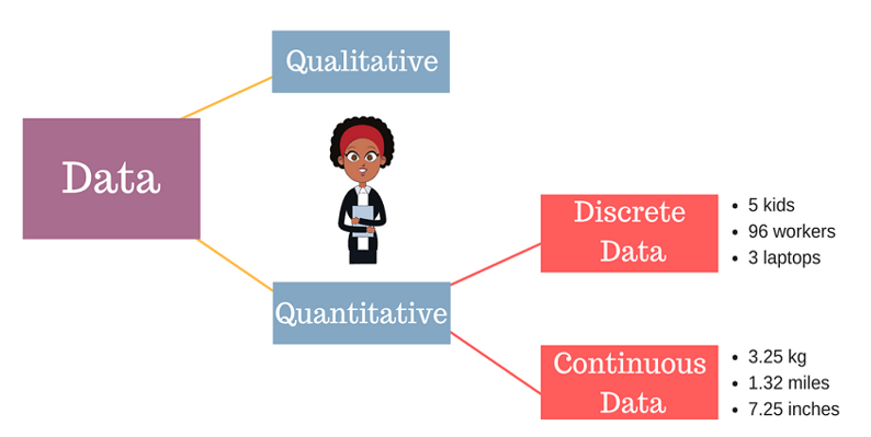
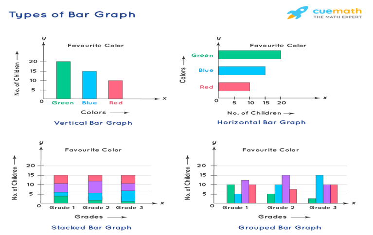
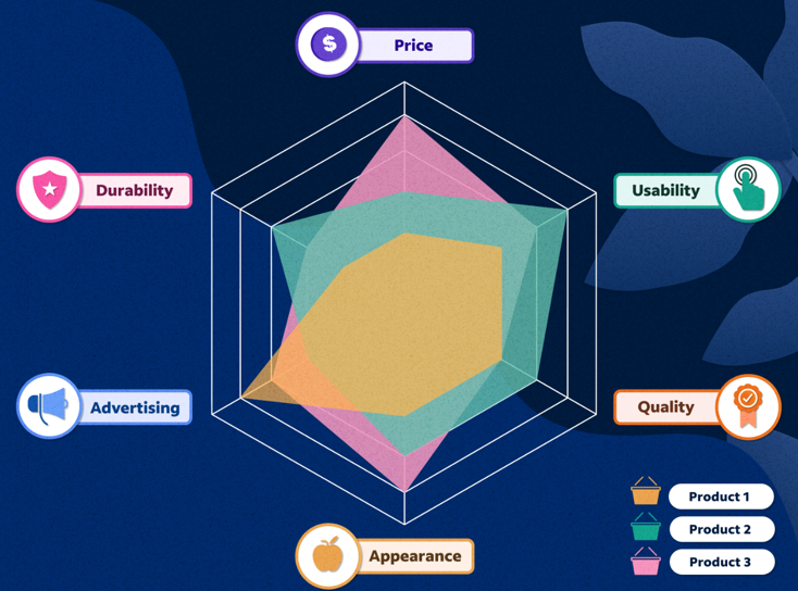
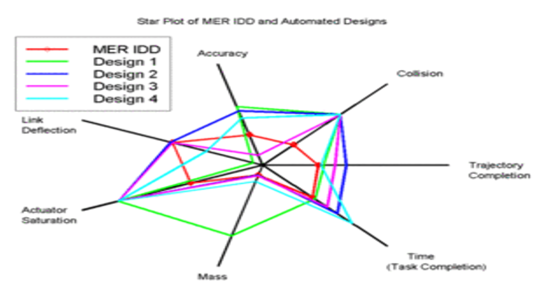
Discrete data is a count that involves integers. Only a limited number of values is possible in case of Discrete data . It cannot be subdivided into parts.E.g., the number of children or teachers in a school or workers in a factory is discrete data. They cannot be further broken down or subdivided into fractions . Examples of discrete data: Ø Number of students in class. Ø Number of workers in company. Ø The number of parts damaged during transportation. Ø Shoe sizes. Ø Number of languages an individual speaks. Ø The number of test questions you answered correctly. Ø Instruments in a shelf. You can count the data. The values cannot be divided into smaller pieces rendering the data futile. You cannot measure the data. By nature, discrete data cannot be measured at all.Eg weight cannot be counted but measured .Hence Weight is Continuous Data.Other example is Revenue. Possible values are limited e.g. days of the month. Discrete data may be ordinal or nominal data : ü When there is an order or rank to the values, we have ordinal discrete data. For example, the first, second and third person in a ticket counter line.Graded or Stratified Data. ü Discrete data may be nominal where is no order in data between the values.Eg, the eye color may be one of these categories: blue, green, brown. The following charts are usually used for representing the discrete data: v BAR CHART. v STACKED BAR CHART. v COLUMN CHART. v STACKED COLUMN CHART. v SPIDER CHART. A bar graph is a specific method of representing data using rectangular bars where the dimensions specifically length of each bar is proportional to the value of the parameter they represent. Graphical representation of data using bars of different dimensions specifically height. Properties of Bar Graph ü All rectangular bars should have equal dimensions and equal spacing in between. ü The rectangular bars are horizontally or vertically plotted. ü The height of the rectangular bar is equivalently proportional to the data they represent. ü The rectangular bars must be on a common base or parameter they represent. Uses of Bar Graph ü The comparisons between different variables are easy, convenient and graphically visual. ü It is the easiest chart to prepare. ü Most widely used method of data presentation. ü It is used to compare data sets which are independent of one another. ü It helps in analysing patterns for longer period of time. Types of Bar Graphs Bar Graphs are chiefly classified into the following two types: v Vertical Bar Graph v Horizontal Bar Graph Apart from the vertical and horizontal bar graphs, two more types of bar graphs are plotted and in use, which are given below: Vertical Bar Graphs When the given data is represented vertically in a graph or chart with the help of rectangular bars, such graphs are known as vertical bar graphs. The rectangular bars are vertically drawn on the x-axis parallel to the Y-axis and perpendicular to the X-axis, and the y-axis shows the value of the height of the rectangular bars. Horizontal Bar Graphs When the given data is represented horizontally parallel to the X-axis by using rectangular bars that show the measure of data, such graphs are known as horizontal bar graphs. The length of the bars in this type of charts also is equal to the values of different parameters. Stacked Bar Graph The stacked bar graph is also known as the COMPOSITE BAR GRAPH. It splits the entire length of the bar into different parts or groups. In this, each part of a bar is represented using different colours to easily identify the different parameters under observation. It requires specific labelling to indicate the different parts of the bar. Can be plotted as both vertical and horizontal diagrams. Grouped Bar Graph The grouped bar graph is also known as the CLUSTERED BAR GRAPH. In this, rectangular bars are grouped by position representing the value of individual parameters with the same colours showing same parameters level within each group and then a comparative analysis is done for each parameter visually and data based . Can be plotted as both vertical and horizontal diagrams. Businesses use both bar graphs and pie charts to present information, such as sales ,revenue, profit etc, to customers as well as to employees and other businesses. People can also use bar graphs and pie charts for keeping track of finances etc. It is mostly used for comparison of two independent data sets. A spider chart is a two-dimensional chart type designed to plot one or more series of values over multiple discrete variables. The spider chart is also known as radar chart ,web chart, spider graph, spider web chart, star chart, star plot, cobweb chart, irregular polygon, polar chart, or Kiviat diagram. Applications of spider/radar charts ü Radar charts can be used in sports to chalk out players' strengths and weaknesses in various parameters. ü Another application of radar charts is the control of quality improvement to display the performance metrics of various objects including computer programs, computers, phones, vehicles, and more. ü Radar charts can be used in pharmaceutical industries to display the strengths and weakness of drugs and other medications.


-
Background Mean is the arithmetic average of a data set. Central tendency is the tendency of data to be centred around this mean. Standard Deviation (also known as Sigma or σ) determines the spread (deviation) from this mean/central tendency. The more the number of standard deviations that fits between process average and acceptable process limits, the less likely it is that the process performs beyond the acceptable process limits, and it causes a defect. It is for this very reason that a 6σ (Six Sigma) process performs better than 1σ, 2σ, 3σ, 4σ, 5σ processes. Specification Limits &Control Limits LSL and USL refer to “Lower Specification Limit” and “Upper Specification Limit”. Specification Limits are obtained from the customer requirements, and they specify the minimum and maximum acceptable limits of processes. Control limits are the indicators of the variation in the performance of the process. It is the actual values that the process is operating on or a real time value. Sigma Shift In 1980s, practitioners of Six Sigma at Motorola analysed samples of their processes and deciphered that process capability tends to drift over time. In order to ensure the long-term process achieved a target defect rate, and realising that they could only measure their processes in the short term, they concluded that the short-term process tended to ‘accommodate’ more standard deviations between the mean and the specification limits, and concluded that an additional 1.5 standard deviations from the short-term process was about right. The ‘additional’ 1.5 standard deviations is known as the Sigma Shift. The difference between the Sigma Levels of a process over the short and long term is called the Sigma Shift. Allowing 1.5 sigma shift results in the generally accepted six sigma value of 3.4 defects per million opportunities (DPMO). If we ignore the 1.5 sigma shift, it results in a six sigma value of 2 defects per million opportunities (DPMO). Processes tend to behave in a different manner over the short and long terms: A high Sigma Shift suggests that process could be improved significantly through better control measures. A low Sigma Shift suggests that process is well controlled already and no further control methods are necessitated. Process Capability & Stability A capable process is one that gives an output that meets customer specifications. A stable process has controlled variations and operates within the control limits. There are several methods to measure process capability index and ratio including an estimation of the PPM (defective parts per million) .Capability indices such as Cp, Cpk, Pp, Ppk are the most prime ones. The Cp and Cpk indices are primary capability indices. Cp{Capability Index} shows whether the distribution can potentially fit inside the specification, while Cpk{Capability Ratio} shows whether the overall average is centrally located. If the overall average of the process is in the center of the specification, the Cp and Cpk values will be the same. The higher the value of Cpk, the better it is. Cpk values less than 1.0 is considered pretty poor and the process is considered not capable. Values between 1.0 and 1.33 of Cpk is considered barely capable, and values greater than 1.33 is considered capable. Process Capability Pp measures quantitatively the process spread against the specification spread. In other words, what the requirements are versus the distribution of the process outcome. The difference between the USL & LSL is the specification spread; also sometimes referred to as the Voice of the Customer. The process spread is the distance between the highest value and the lowest value generated, also sometimes referred to as the Voice of the Process. Ppk is a performance index that measures how close the real time value or the current process is to the specification limits. Think of the Specification Spread as the sides of the garage – those are static, they are not moving, and it is important that the process puts values inside those bounds. The Process Spread is the size of the car we are trying to fit in. Process Stability refers to the consistency of the process with respect to critical peocess parameters. If the process behaves consistently over time, we might say that the process is stable or in control. A process is said to be stable when all of the response parameters that we use to measure the process show both constant means and constant variances over time, and also have a constant distribution. Statistical Process Control Charts are utilized to determine Process Stability. Some charts are used to assess the stability of the process location .Example, Xbar charts that monitor the process average etc, other charts are used to assess the stability of the process variation. Example- range or standard deviation charts. Process stability and process capability are different concepts altogether and there is no inherent relationship between them. Although, there exists no direct relationship between process stability and process capability, there is an important connection: Process capability assessment should only be performed after process stability has been ascertained.


 BACKGROUND OF TRIZ In recent times, it is very much apparent that corporations who seek innovative solutions to engineering problems are capable of maintaining a competitive edge in the global market. The techniques of optimizing and perfecting existing products have now been applied widely and thus are used to occupy leading position by brands and companies and therefore are not unique to a single firm/brand/product/company to create and capture new markets. Innovations and inventions in existing products as well as new products, that too quickly and with fewer resources with immaculate precision, will help in maintaining a competitive edge in an era of downsizing. TRIZ is a Russian acronym meaning "Theory of Inventive Problem Solving".Genrich Altshuller, the founder of TRIZ theory propounded in 1946 , was a patent reviewer at the Russian naval Patent Office. He began a study of 200,000 patents to look for the basic principles and patterns in the most innovative patents of the world. He found that most of the inventive patents primarily solved an inventive problem. Moreover, Altshuller researched and coined that: · Problems and solutions repeat themselves across industries . · Patterns of technical evolution repeat themselves across industries . · Innovations used scientific effects beyond the field where they were initially developed. In the 1970s, Altshuller categorized the solutions into five levels : · Level one. Routine design problems solved by methods known well within the domain specialization. No invention needed. · Level two. Minor improvements done to an existing system, by methods known within the industry through domain specialization. · Level three. Fundamental improvement to an existing system, by methods known outside the industry. Contradictions resolved. · Level four. New generation that uses new principles for performing the primary functions of the system. Solution found greater in science than technology. · Level five. A rare scientific discovery or pathbreaking invention of essentially a new system. DEFINITION TRIZ, also known as the theory of inventive problem solving, is a technique that encourages invention for project teams which have become stuck while trying to solve business challenges. It provides data on similar past projects that can help teams find a new path forward and the ultimate solution needed. Fey and Rivin (2005) described TRIZ as a methodology for the effective development of new technical systems, in addition to it being a set of principles that describe how technologies and systems evolve. TRIZ was developed initially for technology-related problems. However, it has seen multiferous applications in various other fields. How Triz Helps Next generation product and new customer requirements. Some products need to be modified to suit the availability of new raw materials & new types of processing equipment’s. Chronic engineering problems need to be solved without recurrence. Main tools and techniques in TRIZ 40 inventive principles—conceptual solutions to technical and physical contraventions. 76 Standard solutions—solving system problems without the need of identifying contraventions List of the 39 Features 1. Weight of moving object 2. Weight of stationary object 3. Length of moving object 4. Length of stationary object 5. Area of moving object 6. Area of stationary object 7. Volume of moving object 8. Volume of stationary object 9. Speed 10. Force 11. Stress or pressure 12. Shape 13. Stability of the object's composition 14. Strength 15. Time period of action by moving object 16. Time period of action by stationary object 17. Temperature 18. Illumination intensity 19. Use of energy by moving object 20. Use of energy by stationary object 21. Power 22. Loss of Energy 23. Loss of substance 24. Loss of Information 25. Loss of Time 26. Quantity of substance/the matter 27. Reliability 28. Measurement accuracy 29. Manufacturing precision 30. External harm affects the object 31. Object-generated harmful factors 32. Ease of manufacture 33. Ease of operation 34. Ease of repair 35. Adaptability or versatility 36. Device complexity 37. Difficulty of detecting and measuring 38. Extent of automation 39. Productivity List of the 40 Principles Principle 1. Segmentation Principle 2. Taking out Principle 3. Local quality Principle 4. Asymmetry Principle 5. Merging Principle 6. Universality Principle 7. "Nested doll" Principle 8. Anti-weight Principle 9. Preliminary anti-action Principle 10. Preliminary action Principle 11. Beforehand cushioning Principle 12. Equipotentiality Principle 13. 'The other way round Principle 14. Spheroidality - Curvature Principle 15. Dynamics Principle 16. Partial or excessive actions Principle 17. Another dimension Principle 18. Mechanical vibration Principle 19. Periodic action Principle 20. Continuity of useful action Principle 21. Skipping Principle 22. "Blessing in disguise" or "Turn Lemons into Lemonade" Principle 23. Feedback Principle 24. 'Intermediary' Principle 25. Self-service Principle 26. Copying Principle 27. Cheap short living objects Principle 28. Mechanics substitution Principle 29. Pneumatics and hydraulics Principle 30. Flexible shells and thin films Principle 31. Porous materials Principle 32. Color changes Principle 33. Homogeneity Principle 34. Discarding and recovering Principle 35. Parameter changes Principle 36. Phase transitions Principle 37. Thermal expansion Principle 38. Strong oxidants Principle 39. Inert atmosphere Principle 40. Composite materials The Benefits of TRIZ TRIZ Allows Project Teams to Globalize an Issue, find solutions based upon Examples Of How People Have Solved Similar Challenges. TRIZ Translates Problems from the Specific To The Generic-downward percolation in a top to bottom approach. Achieve Significant Cost Reductions Solve Current Technical Problems Produce Breakthrough New Products Produce Intellectual Property Forecast Technological Development. RELATED TERMS Su-Field Analysis ("two Substances and one Field") -is used whenever a new function is introduced or modified and inventive "standard solutions" are available to find an analogous solution. ARIZ -Algorithm for Inventive Problem Solving is used when systems mature and become complex thereby making it difficult to modify or improve them in an incremental manner

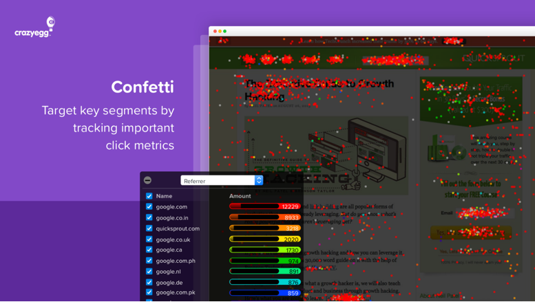
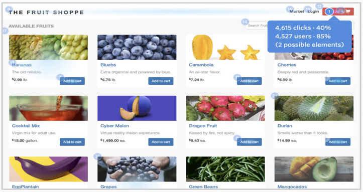
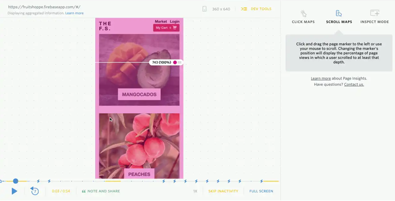
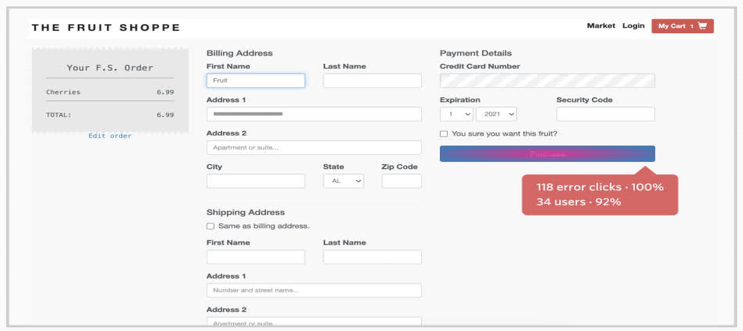
 HEATMAPS Heatmaps are a method of representing data graphically wherein values are represented through color scheme, making it easy to visualize complex data. Heatmaps can be created by hand as well as using specialized heat mapping software. Heatmaps were first used by,Toussaint Loua using a shading map to visualize social demographic changes across Paris. Computer heatmapping technology was first trademarked in early 1990s by software designer Cormac Kinney, who devised a tool to graphically display real-time financial market information. When creating heatmaps a variety of color schemes can be used, including grayscale and rainbow. Rainbow-schemed maps are often preferred, since human beings can perceive more shades of color than gray. Heatmaps are visual representations of user reactions on pages of the website, providing visual context for easy analysis. They help gather visitor behavior insights, which can be used to customize website to better meet visitor expectations. Among other goals are improving conversion funnels, increasing conversion rates, reducing bounce rates, boosting sales. Pictorial Example of Heatmap:- Creation of a heatmap depends upon the type. There are multiple types, but they can generally be classified into two categories: interaction and attention heatmaps. Interaction heatmaps measure different types of engagements and use tracking methodology to record interactions between a user and a website like clicks, scrolls, mouse movements, and more. Attention heatmaps are more complex, and monitor how users look at website content by monitoring or predicting their eye movements. Depending upon attributes, Heatmaps may be classified into the following types:- Confetti Report :- Confetti is typically a specific version of a traditional heat map. It is a high-resolution view that lets visualize individual clicks, each represented by a colored dot on the report. Overlay & List Reports:- An Overlay report breaks down the clicks on website into percentages per element. The Heat Maps overlay indicates the relative frequency of clicks by a gradient color, from gray, indicating a low number of clicks, to red indicating a high. List Report displays similar information, but in a graph format to make spotting of variations easier. Click Maps:- Click maps are one of the most popular types of heatmaps, and show where users clicked on a page, offering deep insights into how people use website. With click maps, elements of site that are most or least clicked can be gauged easily, which reveals navigational issues. Scroll Maps :- In a similar manner as click maps, scroll maps are a visual representation of visitor’s scrolling behavior on a web page. Mouse-Tracking Heatmaps :- Mouse-tracking maps track general mouse movement over a particular website. They help spot frustrated users. It is well researched that an association between where users are looking and where their mouse cursor is, which makes mouse-tracking heat maps informative. Mouse-tracking also shows areas of visitor friction or frustration, optimizing complex web pages. Eye-Tracking Heatmaps :- Eye Tracking uses a sensor technology that tracks the movements of eyes of users while using a web page. This type of technology can monitor eye movement, blinking, and pupil dilation to analyze on which part of a page a user’s attention is focused. However, eye-tracking tools are expensive, also some users are aware and wary of eye tracking and hence, use camera covers to avoid being surveyed. Error Click Heatmaps :- Error clicks occur when a user clicks on an element of a web page that initiates some error, like a client-side JavaScript error or a console error. Though the user may or may not realize the initiation/triggering of an error, error clicks can be used to specifically investigate console errors. Through use of Digital Experience Intelligence tool to view all sessions that contain the same error it can be determined how to resolve the issue. Error-click maps quickly uncovers and fixes bugs, enhancing user experience. Rage Click Heatmaps :- Rage Clicks are used to identify areas of friction or frustration shown by users by depicting areas where users rapidly click an element on website. Rage Clicks might occur when users mistake a static element for a button or a hyperlink and expect something to happen, or when a button is not functioning properly and triggers an error. Rage click maps show all the areas that users click in frustration. With Rage Click maps, unexpected bugs can be fixed to enhance user experience on the website. Dead Click Heatmaps :- Sometimes, users click on un-clickable elements on a website or app as a button, expecting something to happen—resulting in a dead click. Dead clicks reveal which non-functioning elements on website or app are being mistaken for buttons, so that it can be figured out how to reduce user confusion and frustration. These can also help understand behavioral trends over time to identify new opportunities and optimize website designs. AI-Generated Heatmaps :- This type of heatmap uses Artificial Intelligence (AI) to generate visual representations of user attention data .Typically, AI-generated heatmaps predict future user behavior by copying the first three to five seconds of users’ attention on a website to identify which elements are looked at most and least. Uses of Heat maps 1. Website redesign 2. A/B testing 3. Content marketing 4. UX and Usability Testing 5. Conversion Funnel.

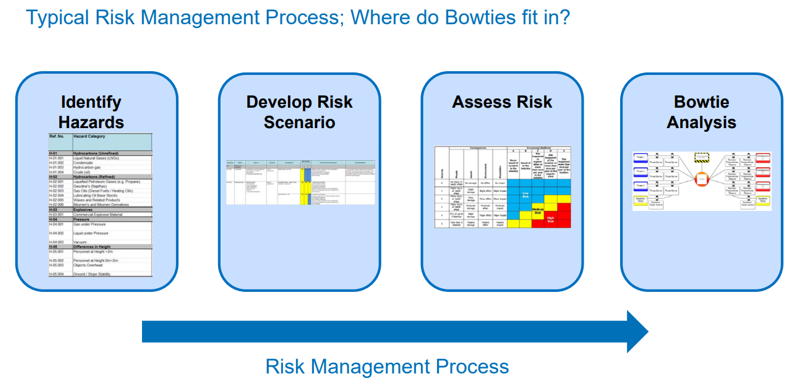
 The Bowtie Principle was developed initially by Royal Dutch Shell in the 80’s. Since then various industries like Oil & Gas, Mining, Pharmaceuticals etc. have used the Bowtie Technique to analyze and mitigate risk .Bowtie Analysis also known as Papion Analysis is a Qualitative Risk Assessment Methodology that provides a way to effectively communicate risk scenarios in easy to understand graphical format and also shows the relationship between the cause of unwanted events and its potential loss and damage CREATING A BOWTIE ANALYSIS Step 1:- Creating the Bow tie starts in the middle with the hazard and the Event that is being analysed. Step 2:- Left side will have all the the potential causes or threats that would lead to the event happening Step 3:- On the right-hand side list all the consequences that had a probability of happening if the event corresponding to the hazard occurred.On the right-hand side list all the consequences that had a probability of happening if the event corresponding to the hazard occurred. Step 4:- Logical flow of the chart is created with potential threat happens linked to the hazard . Introduce countermeasures or Controls & Mitigation steps . Step 5:- From right, for each Potential cause what control measures could be put in place that would prevent that possible cause from happening. Each control is ranked High, Medium, or Low in terms of its effectiveness in being able to stop the potential cause from occurring. Step 6 :- Repeat the process for the right-hand side, this time with the mitigation steps that would limit or stop the potential outcome or consequences from impacting. Step 7 :- For each of the controls and mitigation steps it is wise to add the safety critical activities that need to happen to support them. In the final step of the process review the chart to do a safety risk assessment. ADVANTAGES OF BOWTIE ANALYSIS · It is useful beyond usual risk assessment and highlights the link between risk controls and management system. · Helps to ensure that risks are managed not just analysed. · Comprehensive and structured approach in risk assessment and risk mitigation . · Excellent for communicating risk related matter to non risk-domain employees. · Involves employees using practical approach · Assigns responsibility for hazard controls Identifies where resources should be focused for risk reduction, i.e. prevention or mitigation LIMITATIONS OF BOWTIE ANALYSIS · Qualitative . · Does not replace techniques such as HAZOP or FMECA . · Depends on experience of personnel and participation level of employees concerned . · Controls in bowtie are not truly independent · Important controls are not obvious · Involves long duration to develop a meaningful bowtie diagram. · Barriers identified are not independent of each other leading to a false sense of security.

 Projects are a set of activities or tasks that must be completed in some pre-defined sequence by individuals or groups of individuals, within a certain timeframe, and using a specific set of resources or domain knowledge. There are a set of relationships that can exist between the start and end points of these activities/processes in their execution. There are four possible activity relationships, which are defined in the Project Management Institute's “Project Management Body of Knowledge (PMBOK).” These relationships are Finish-to-Start, Start-to-Start, Finish-to-Finish and Start-to-Finish. FINISH –to- START The Finish-to-Start relationship means that one activity (predecessor) must be fully complete before any following (successor) activities may begin. It happens to be the most common activity relationship in project management. Example: - Newspaper Writing. The writing and editing processes share a finish-to-start relationship because the editor can't start the editing process until the writer has completed their work on an initial draft formation. Example: - Film Making . START-to-START The next relationship is Start-to-Start. In this phase, an activity cannot start until and unless another activity also starts. Example: - Painting an apartment/home. Each room needs a coating of primer and painting. The priming and painting share a start-to-start dependency because the homeowner must apply the primer coat before they can apply paint . Although paint can only begin after the primer, as the homeowner awaits one room's primer to dry, they can apply primer to the rest of the rooms they wish to paint. FINISH-TO-FINISH This phase of relationship exists where two or more activities can only be considered completed if and when both are completed. Example:- Computer Manufacturing. Employees in each department are involved in creating memory chips and assembling motherboards. The creation of memory chips and assembling motherboards share a Finish to Finish dependency. START-to-FINISH And finally, we come to the Start-to-Finish relationship. It is rarely found in real-life projects. In start-to-finish relationships, as soon as the predecessor activity starts, the successor activity will get finished. Company manufactures products and sells them directly to consumers for consumption/usage. For delivering a product, the company requires both warehouse and shipping operations in tandem. The warehouse and shipping departments share a Start–to-Finish relationship for each product they send out for delivery. Benefits of Activity Relationship in Project Management Activity relationship in Project Management helps in identification of :- · Project deliverables that meets stakeholder expectations and business objectives. · Timely and expedited delivery. · Project deliverables with minimum or zero defects. · Enhanced cost control. · Increased quality of product delivery. · Reduced rework . · Reduced customer complaints and grievances. · Integration of Supply Chain & Logistics. · Improved productivity. · Increased team morale and satisfaction, motivation. · Strong service delivery. · Improved decision making. · Continuous improvement of process.TORNADO DIAGRAM Mathematical models of an uncertain real-world quantity Y often involve a set of uncertain input parameters X .Analysts are commonly faced with one of two problems in such a situation: (1) it may be costly to study each input x sufficiently to quantify its probability, or (2) each calculation of y may be costly, so it becomes costly to allow all of the inputs x to vary. In the former case, the analyst might want to deeply investigate only the important X values—those that contribute most strongly to uncertainty in Y. In either case, the analyst might want to simplify the model by setting those X values that do not matter much. An X might vary wildly but have little effect on Y. An X might not vary much at all, but Y could be very sensitive to it. We say that the X values whose uncertainty has strong effect on Y are the ones that matter and the others don’t matter. Once an analyst identifies the most important uncertainties, he or she can focus on understanding and quantifying those input X’s and their effect on the output variable Y, and ignore the variability of the others. For achieving this objective a tool called tornado-diagram analysis is used to identify those important uncertainties. Tornado diagrams, also called tornado plots, tornado charts or butterfly charts, are a special type of Bar Chart, where the data categories are listed vertically instead of horizontal representation, and the categories are ordered in such a sequential manner that the largest bar appears at the top of the diagram followed by the second largest and so on. They are so named because the final chart resembles either one half of or a complete Tornado. The Tornado Chart tool shows how sensitive the objective is to each decision variable as they change over their allowed range. The chart shows all the decision variables in order of their impact on the objective. SENSITIVITY & RISK ANALYSIS USING TORNADO Tornado diagrams are useful for determining sensitivity analysis of final objective - comparing the relative importance of variables. For each variable/uncertainty considered (X variable), one needs an exact estimate for what the low, base, and high outcomes (Y variable) would be. The sensitive variable is modeled as having an uncertain value while all other variables are held constant. This allows testing the sensitivity/risk associated with one uncertainty/variable (X). For example, if a Business owner (say Nike Company) needs to visually compare 100 separate items, and wishes to identify the top ten items with maximum sales his business should focus upon, it would be nearly impossible to do using a standard bar graph. In a tornado diagram through visual representation of the budget items, the top ten bars would depict the items that contribute the most to the variability of the outcome, and therefore what the decision maker should focus on. In simple language, the critical X’s are identified using the Tornado Diagram. A tornado diagram can be a good risk tool because it shows the importance of different variables and it demonstrates uncertainty of more downside or upside risk. SENSITIVITY DIAGRAM The sensitivity chart ranks the sensitivity of the input variables from the most important down to the least important in a model. If an independent input variable and a dependent forecast have a high correlation coefficient, it means that the input variable has a significant impact on the forecast . CREATING TORNADO DIAGRAM IN EXCEL Firstly we need to convert data of (Store1) into the negative value. It will help to show data bars in different directions and distinguish between the input variables. For this, simply multiply it with -1. After that, insert a bar chart using this data. Go to Insert Tab ➜ Charts ➜ Bar Chart .the outcome of this step would be one side for positive values and other for negative ones. From here, select the axis label and open formatting options and in the formatting options, go to axis options ➜ Labels ➜ Label Position. Change label position to “Low”. Next, change the axis position in reverse order. It will adjust bars from both the sides positive and negative representing two separate set of input variables in a model and for this, go to Axis options ➜ Axis position ➜ tick mark “Category in reverse order”. This will change the diagram from highest to lowest values in decreasing order helping in identifying the critical factors among myriads of input variables. Change the series gap and gap width. This will help to streamline data bars with each other and increase their bandwidth. For this go to series options -> Change series overlap to 100% and gap width to 10%. Change the number formatting of the horizontal axis so that the axis numerical appear at the top. For this , go to the Axis Options ➜ Number ➜ select custom ➜ paste following format and click add. In the end, change the format for data labels for Store-1 so that it doesn’t show the negative signs and for this go to label options ➜ Number ➜ select custom ➜ paste following format as above and click add. Congratulations, now we have our first tornado chart in excel worksheet, just like below.


