
Topics
-
Fifty-five women engineering students completed an AI bootcamp focused on rural Karnataka. Participants developed AI-based solutions after visiting villages and conducting field interviews. The She Innovates bootcamp partnered with several organizations to achieve its goals. This initiative aims to boost women's participation in AI and entrepreneurship. It encourages AI applications for rural development and community-focused sectors. View the full article
-
Besi's quarterly orders more than doubled, fueled by AI and hybrid bonding technology. The company saw increased customer adoption of its advanced chip packaging solutions. Demand for AI applications continues to drive growth in data centers. Besi anticipates revenue growth between ten and fifteen percent. This strong performance aligns with other semiconductor sector reports. View the full article


Leaderboard
-
Vishwadeep Khatri
Administrators1Points6,722Posts -
Mohamed Asif Abdul Hameed
Fraternity Members1Points78Posts -
ChandraJ
Members1Points10Posts -
Saurabh Dhaked
Members1Points10Posts


Popular Content
Showing content with the highest reputation on 07/22/2022 in Posts
-
1 pointQ 489. One would assume a positive relationship between smoking cigarettes and COVID-19 severity. However, as per a research (the European Commission review by Wenzel 2020), they have a negative relationship. While it is counterintuitive, this is one of the recent examples of Berkson's paradox. Explain the paradox citing a few more examples. What are the methods of preventing this paradox? Note for website visitors - Two questions are asked every week on this platform. One on Tuesday and the other on Friday. All questions so far can be seen here - https://www.benchmarksixsigma.com/forum/lean-six-sigma-business-excellence-questions/ Please visit the forum home page at https://www.benchmarksixsigma.com/forum/ to respond to the latest question open till the next Tuesday/ Friday evening 5 PM as per Indian Standard Time. Questions launched on Tuesdays are open till Friday and questions launched on Friday are open till Tuesday. When you respond to this question, your answer will not be visible till it is reviewed. Only non-plagiarised (plagiarism below 5-10%) responses will be approved. If you have doubts about plagiarism, please check your answer with a plagiarism checker tool like https://smallseotools.com/plagiarism-checker/ before submitting. The best answer is always shown at the top among responses and the author finds honorable mention in our Business Excellence dictionary at https://www.benchmarksixsigma.com/forum/business-excellence-dictionary-glossary/ along with the related term1 point
-
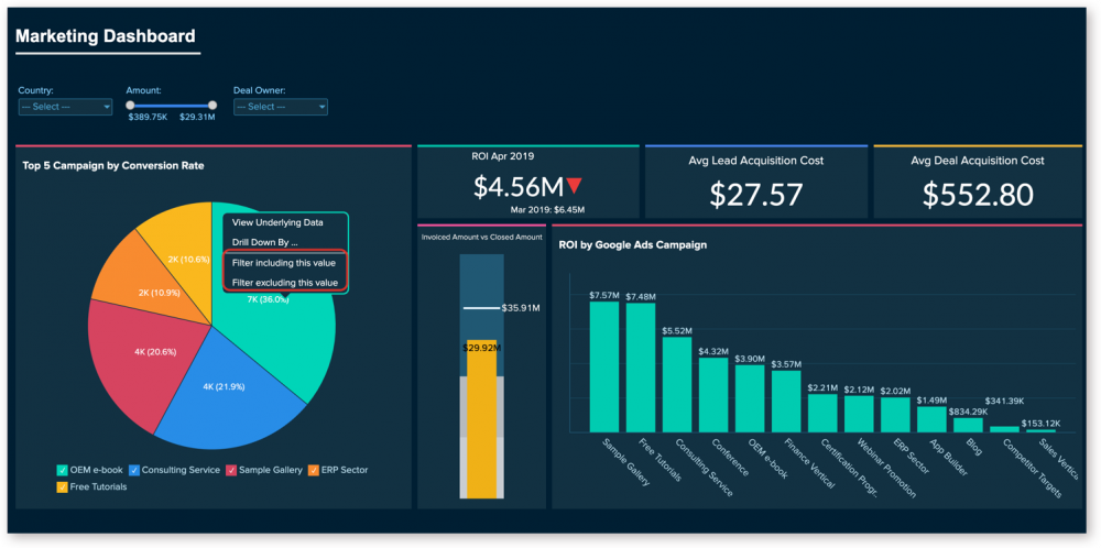
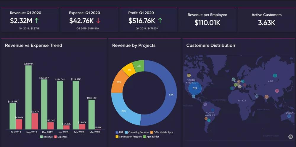
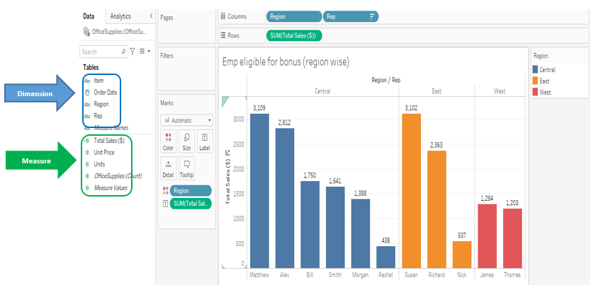
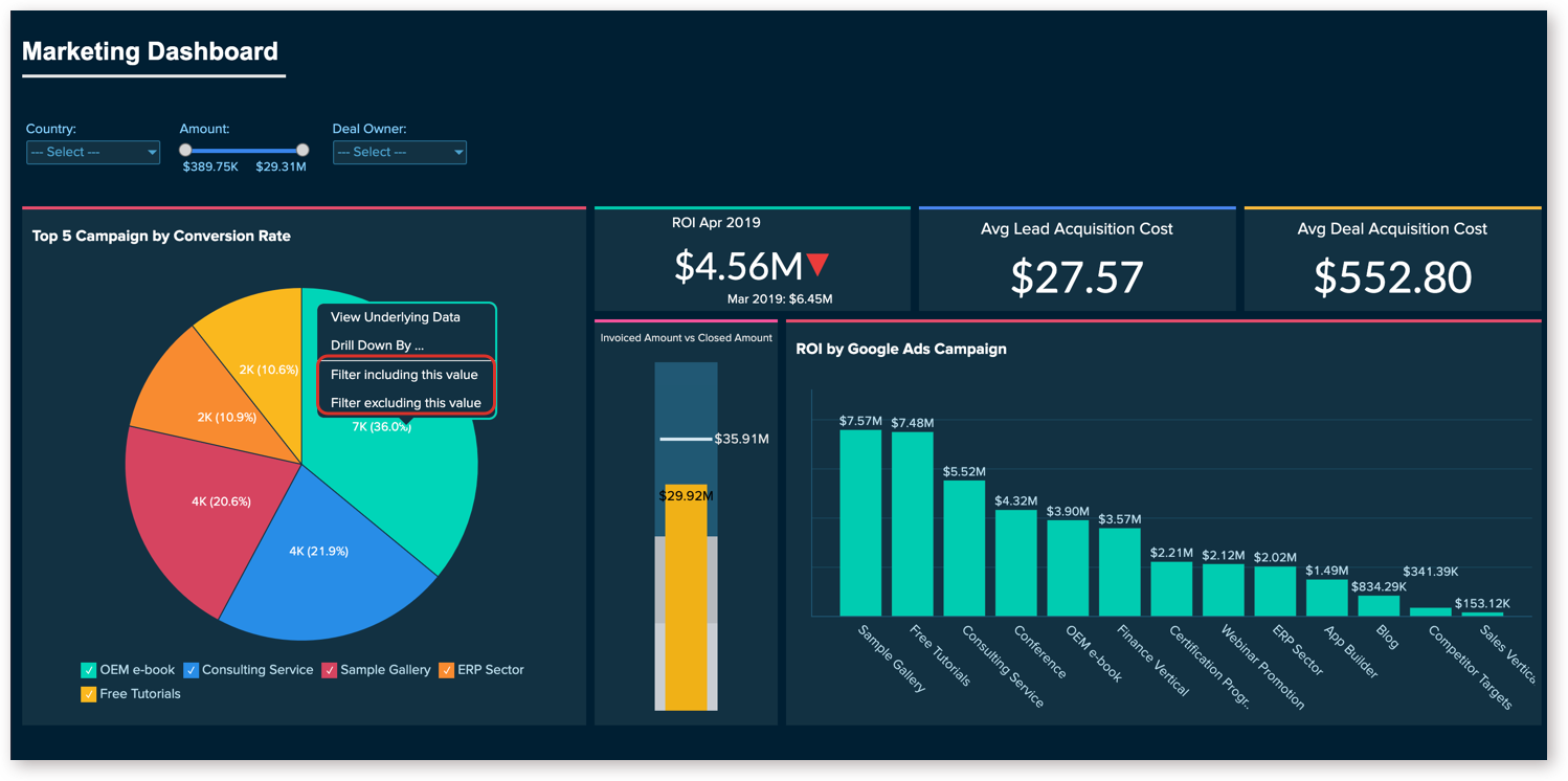
1 pointDimension can have names, dates which are qualitative in nature, whereas measures can have numeric, which is quantifiable. Possible combination of discrete and continuous is viable with dimensions and measures. So, we can have discrete dimension, continuous dimension, discrete measure, and continuous measure as possible data types. In both continuous measure and discrete measure, aggregation (sum, average, count, min, max, percentile, std.dev, variance etc) is possible. However, aggregated value is shown as continuous data value in continuous measure, whereas in discrete measure, aggregated value is shown as categorical value. Dimension Examples (descriptive field): Client Name Client Segment Client ID State City Country Postal Code Measure Examples (numeric field): Profit Unit Cost Orden Quantity Sales Salary Most of the data visualization tools, auto detects data types, for instance, Tableau automatically detects as well as represents data types as symbols. Differences: For Instance, I have considered Tableau Data Visualization tools for reference to give elaborate difference between Dimension and Measure Below are some of the examples of effective usage of dimension and measure in terms of overall data visualization dashboard. Example - Sales Dashboard Example - Marketing Dashboard Example - Revenue and Customer Distribution Overview Dimension and Measures are the key point of any data visualization tool as it plays a major role while driving with data sets.


 1 point
 -
1 pointDimensions: Which answers the who, what, where, and when of our data The data that contains qualitative information are categorized as dimensions. These are expressive attributes, like a category of product, address of the customer, or country of origin. We can say, Dimensions can contain numeric characters (like an alphanumeric customer ID) but are not numeric values (It wouldn’t make sense to add up all the ID numbers in a column, for example). Let us think in this way: if we can’t (or wouldn’t) compute a field, it’s a dimension. Eg. Title of the product, category of products, vendor list, etc. Measures: Which are the numerical fields that we can compute The data that can be quantified are categorized as measures. Fields like subtotal of the order, the number of items purchased, or duration spent on a specific page. “Hence measures are computable”. Say we have a measure, quantity of items purchased: we can do things like calculating the average quantity ordered, sorting by descending quantities, sum all quantities, and so on. Eg. Price of a product, Customer rating for the product, etc., Note: Date fields are dimensions too. Eg, The Year of production will be a dimension because calculating min/max/sum here will not help. Instead, we may group this date according to the year of manufacturing. Dimensions Measures It is an independent variable. It is a dependent variable. It is not dependent on the measure. It is dependent on the dimension. Adding to the filter will give us insight into the data, it is beneficial to add this in the filters. Adding to the filter will not give us many insights of the data. We can’t aggregate it. We can aggregate it. Min, max, and sum won’t work. Min, max, and the sum will work. It is used to compare the data. It is a metric that we use to compare the dimension. It may contain duplication of data. It does not contain duplication of data. Headers are generated when added to the rows or columns. Axes are generated when added to the rows and columns. It contains qualitative and categorical information. It contains quantitative data. It describes data records. It cannot describe data records. It cannot be continuous and discrete. It can be continuous and discrete. It is not possible to get several records because aggregation does not apply to it. Due to the aggregation feature, we can get the number of records present in the database no matter how huge the dataset is1 point
-
1 pointLike Data types in the basis statistic, we also have 02 types of data in the Data Visualization which are 1. Qualitative, 2. Quantitative So in the tableau, when we import data set from source, it gets divided into 02 category which are “Dimension” & “Measure”. Both factors play vital role in the data visualization. Dimensions represent Qualitative data like Name, type, Binary etc. Measures represent Quantitative data like Sales, Production, temperature etc. Dimension Measure Qualitative/Categorical Quantitative Cannot aggregate Can aggregate Field Blue Colour - Discrete Field Green Colour - Continuous Independent Variable Dependent Variable Min, Max, Sum not Work Will Work Duplication of the data is Possible Not Possible Not dependent on the measures Dependent on the dimensions
 1 point
 -
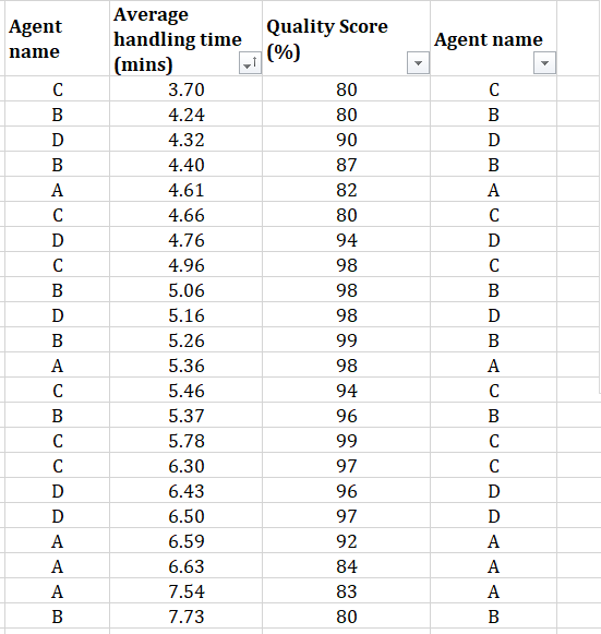
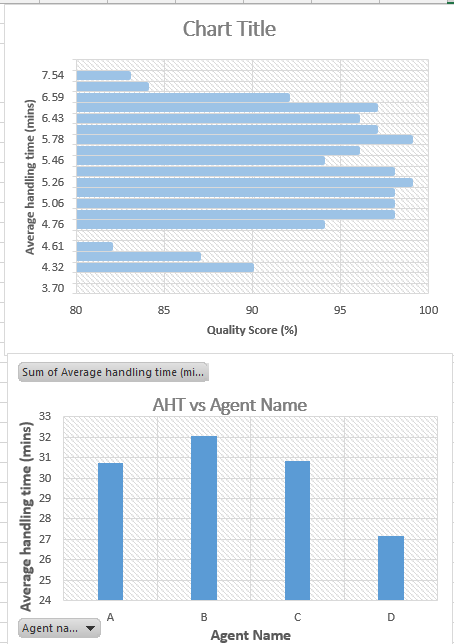
1 pointData visualisation tools, such as Tableau, differentiate the Data into two types, namely Dimension and Measure. Where, while Measure is used for a variable which is Quantifiable and mostly continuous in nature, such as AHT, Turn-around time, sales, cost etc. Whereas Dimension is nomenclature used for defining a variable which is qualitative and discrete in nature, such as Region, Team leader, Process name, Agent name etc. To understand the difference better, attached gives an example showing AHT measure against QC score measure & Agent name dimension. The first graph shows AHT compared to QC scores, where both are measures. And QC is one variable which is continuous in nature and it’s values is in a sequence, hence could be shown in one direction only (80 to 100 or 100 to 80) and can’t be broken. The second graph shows the AHT against the Agent name, where agent name variable gives dimension to AHT measure and shows AHT as a quantity, in this case average of AHT, for each individual agent. Here agents are independent of each other, hence their positions on graph could be changed or shown as separate graph entities.
 1 point
 -
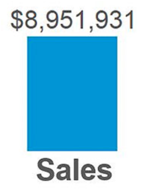
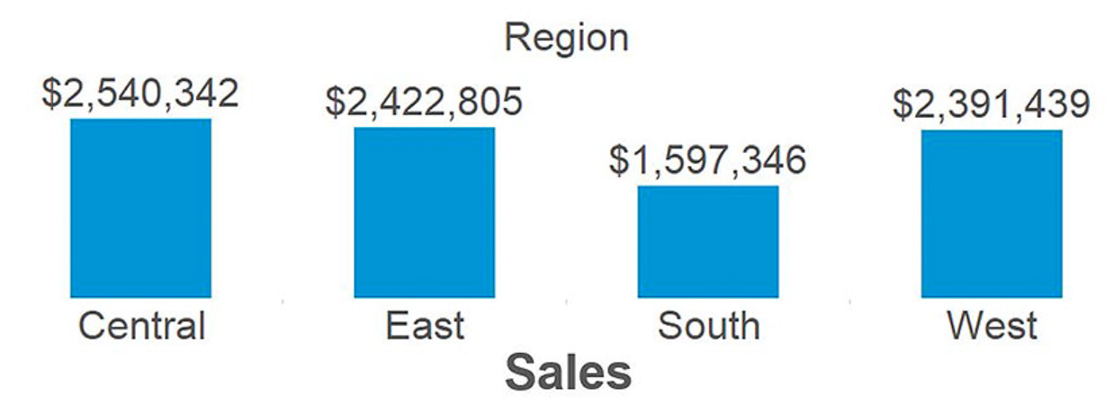
1 pointData visualization is graphical representation of data by using visual elements like graphs, charts, and maps. Data visualization converts large & small data sets into visuals, which is easy to understand and process. Data visualization tools like Tableau and Power BI helps us to understand outliers, patterns, and trends in a data set. What is a measure? A measure is a field that is a dependent variable i.e. its value is a function of 1 or more dimensions. One of the most famous visualization tool Tableau treats any field containing numeric/quantitative information as a measure. For example. let's consider below bar chart, created in Tableau with the Sales measure from the Sample – Superstore data set: Sales is quantitative data, so by default, Tableau will consider that the field is a measure. The value of $8,951,931 is meaningless by itself. It is dependent on context that comes in the form of being broken down by the dimensions. What is a dimension? A dimension is a field that can be considered as an independent variable. Tableau by default treats any field containing qualitative, categorical information as a dimension. Below are Sales measure from above example, broken down by the dimension of Region: Now that our sales total has been broken down by region, we are able to start gaining insights from the data set. From the above example, we understand that South region has relatively low sales compared to the other regions. This is a descriptive insight that materialized only when we combined measures and dimensions together from our data set. Generally, measure is the number and dimension is what you “slice & dice” the number by. Another rule of thumb is that if it doesn’t make sense to sum up a number, it is likely a dimension.
 1 point


This leaderboard is set to Kolkata/GMT+05:30