

Natwar Lal
Members
-
Joined
-
Last visited
Everything posted by Natwar Lal
-
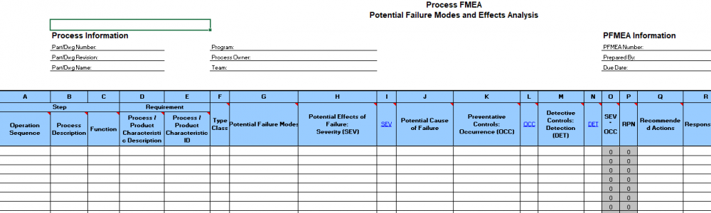
What are existing process controls? Simply stated these are the measures taken in the process to ensure that defective items are not produced. What are the types of existing process controls? There are two types 1. Preventive 2. Detective Preventive process controls have an effect on Occurrence ratings as they prevent the occurrence of the failure modes. Detective controls have an effect on Detection ratings as they help detect that a failure mode has occurred. The same principle is applied when Mistake Proofing is done in the Control phase of a six sigma project. Let us take some examples 1. Production checklist that an agent uses is a preventive control as it ensures that processing is done correctly. If it is used, it will reduce the occurrence of defects. Audit checklist is a detective control as it checks if a defect has occurred or not 2. Using coding best practices is a preventive control as it reduces the number of bugs. Unit testing is a detective control as it checks for bugs present in the system 3. The spelling auto correction or highlighting of the word with red underline in MS word is a preventive control which reduces the number of spelling mistakes (while writing the article). However, a spell check in MS word is a detective control as it detects the incorrect spellings (after the article is written). By the way, in Excel there is only spell check and no auto correction 4. Preventive Maintenance is done in manufacturing. It reduces the occurrence of unplanned downtimes due to faults and hence impacts the occurrence rating 5. The "Caps Lock is on" warning is a preventive control in order to prevent instances of entering incorrect passwords and hence impacts the recurrence rating. The system not allowing to log in if an incorrect password is entered is a detective control which first checks for a valid password and hence impacts detection rating 6. In certain websites, one cannot enter alphabets if it is a numeric field. This is a preventive control which reduces the occurrence of incorrect entry in the field. The warning that some mandatory fields are left blank and system not allowed to go the next screen is the detective control where it checks for entries in all mandatory fields 7. Metal detectors and smoke detectors are examples of detective process controls. These will not impact the occurrence but will definitely have a bearing on the detection rating. 8. The seat belt not worn is a detective process control as it detects that the seat belt is not worn. In some advanced cars, the car will not start unless the seat belt is worn. This is a preventive control as it does not let the occurrence happen In all the above examples, preventive controls impacts the occurrence rating while detective controls impact the detection rating. To sum it up, while doing process FMEA, the below format is more useful where it clearly shows that preventive process controls impact Occurrence ratings and detective process controls impact Detection rating. Source: APQP FMEA format sourced from Google images
-
Run Chart is a plot of the data points for a particular metric with respect to time. It is primarily used for following two purposes 1. Graphical representation of performance of the metric (without checking for any patterns in it). E.g. The scoring comparison in a cricket match. The runs are plotted on Y axis and X axis has overs (which is a substitute for time spent) Source: The Telegraph 2. To check if the data from the process is random or if there is a particular pattern in it. These patterns could be one or more of the following a. Clusters b. Mixtures c. Trends d. Oscillations Source: Minitab help section Run chart if used for point number 2, performs following tests for randomness - Test for number of runs about the median. This is used for checking Clusters and Mixtures. Clusters are present if the actual number of runs about the median is less than the expected runs. This implies that there are data points in one part of the chart Mixtures are present if the actual number of runs are more than expected runs. This implies that there are frequent crossings of the median line - Test for number of runs up or down. This is used for checking Trends and Oscillations. Trends are present if the actual number of runs is less than the expected runs. This implies that there is a sustainable drift in the process (either up or down) Oscillations are present if the actual number of runs is more than the expected runs. This implies that the process is not steady These are hypothetical cases with the below hypothesis Ho - Data is random Ha - Data is not random p values are calculated for all the 4 patterns. A p value of less than 0.05 indicates acceptance of Ha implying that the particular pattern is present in the data set. Absence of these patterns indicate that the process is random. Advantages of Run chart over Control chart Ideally control chart is a more advanced tool as compared to a run chart. However following situations warrant the use of run chart over a control chart 1. Run chart is preferred when we need a snapshot of the metric performance with time without taking into account the control limits or if the process is stable/unstable. E.g. like the scoring run rate comparison for cricket (refer the screenshot above) 2. One can start creating run chart without any prior data collection unlike in a control chart (where data is collected first to determine the control limits) 3. As a quick check to see if the process data is random or not. For doing such checks (clusters, mixtures, trends and oscillations) in a control chart, one would have to run all the Nelson tests (usually control charts are used with only one test i.e. any points outside 3 standard deviations and hence might not be able to detect such patterned data) 4. Apart from the above, it is easy to prepare and interpret a run chart in comparison to a control chart


-
Verification and Validation are used interchangeably and often considered as same. However the two are different. Validation simply means – are you making the right thing? (Source: https://en.wikipedia.org/wiki/Verification_and_validation) Verification simply means – are you making it right? (Source: https://en.wikipedia.org/wiki/Verification_and_validation) The same difference is also highlighted in the definitions of the two as provided by PMBOK "Validation - The assurance that a product, service, or system meets the needs of the customer and other identified stakeholders. It often involves acceptance and suitability with external customers. Contrast with verification." (Source: https://en.wikipedia.org/wiki/Verification_and_validation) "Verification - The evaluation of whether or not a product, service, or system complies with a regulation, requirement, specification, or imposed condition. It is often an internal process. Contrast with validation." (Source: https://en.wikipedia.org/wiki/Verification_and_validation) Simple example to illustrate the difference between the two Voice of Customer: Customer wants to have a hot cup of coffee Validation: Customer would accept the coffee basis below specifications 1. It is hot (research suggests that temp. should be close to 96 degree Celsius) 2. Right amount of sugar (say 5 gm) 3. Right amount of milk (say 200 ml) 4. Right strength of coffee (say strong) These specifications are the needs of the customers and the coffee will only be accepted only if these specifications are met. These specifications only talk about what is the right product. It does not talk about how the coffee will be made to ensure that these specifications are met Verification: The process of brewing the coffee should be designed in a way which ensures that the above 4 specifications are met. Let us assume that we are using a coffee machine to make this coffee. If the machine keeps the temperature around 96 C, adds just the right amount of sugar, milk and coffee, then we would say that the machine is verified to provide the right coffee to the customer. The verification could either be done during development (of coffee machine) or during the production (like QC check). Other Examples 1. Maneuvering Characteristics Augmentation System (MCAS) is a software to control the plane from stalling and is the software which is argued to be the reason behind the 2 fatal crashes of Boeing 737 Max planes (one for Lion Air and the other for Ethiopian Airlines). Verification: When the software was developed, it was put through hundreds of hours of analysis, laboratory testing, verification in a simulator and two test flights, including an in-flight certification test with Federal Aviation Administration (FAA) representatives on board as observers (Source: https://www.boeing.com/commercial/737max/737-max-software-updates.page). This is where the software was verified as per the guidelines provided by Boeing. Validation: Even though verified, it is not acceptable or let me say validated by the airlines or by the aviation regulator as it fails to meet a key customer requirement of SAFETY (the most important requirement in aviation) 2. NASA has an independent verification and validation facility which was set up after the Challenger accident. This facility is set up as an independent verification and validation facility. Reason for challenge accident – failure of O-rings. These O-rings were designed to work at high temperatures and design required each hole (in the rocket motor) to have 2 O-rings. The manufacturing process verified that the O-rings are prepared as per the design specifications. The fabrication process verified that each hole has 2 O-rings in the motor. However, the validation i.e. customer acceptance failed which resulted in the accident. The reason for passed verification but failed validation what the incorrect design specifications for O-rings. 3. Software Development (Agile method). Let us a say a new web-page is developed which captures the demographic data of the user (details like name, age, address, pin code etc.) Verification: This is like unit testing. This would include the following things a. Code written as per the agreed upon standard b. Individual sprint testing to check that all fields are coded perfectly and the overall page is working fine Validation: This is when the new web-page is being integrated with the existing system and released to the customer or in a duplicate replica. This is more like User Acceptance Testing (UAT). This would include things like a. User navigation to page b. User experience on the page c. Overall system working fine 4. Satellite phone developed by Motorola. Motorola at one point of time was the front runner in the field of telecommunications devices. They had a vision of making the satellite phone a household thing. The phone was a verified product (isn't is obvious?). Motorola is the pioneer of Lean Six Sigma. However, even this verified product failed on validation as the customers did not make a beeline to buy the product (unlike what we see for Iphones) As per system engineering, a product or a system being developed will have following levels (similar to what APQP also prescribes) 1. System Level 2. Sub-system Level 3. Component Level Verification is done at all the 3 levels however validation is only done at the system level as the customer is going to use the overall system (with all its parts). From the above it is clear that verification is a more internal process while validation is a more external process (i.e. involves the customer). One could link verification to the process width or the control limits and validation to specification width or the specification limits. Process (manufacturing or services) could well be stable or verifiable, but still not be capable or validated. Best case for a process is to be both verifiable and validated.
-
Hello Team Thank you for asking the two questions per week. The questions that you ask are extraordinary. They make the boring LSS tools look very interesting :) Kudos to all of you for asking such amazing questions. These questions have helped me immensely. While writing the answers to these questions, I have got a better conceptual clarity and understanding of the tool. The competitive spirit makes it even more interesting. I eagerly wait for 5 pm on Tuesdays and Fridays. Obviously I love when I win (specially on a Friday) but I also feel jealous if I don't win. But it also motivates me to write better responses for the next question. I get to learn a lot from different perspectives in the answers that are posted to these questions as well. Sometimes I feel that my answer wasn't the best but I don't mind as long as I win. Thanks again. Keep throwing the googly questions!!
-
Misuse of tools and techniques is a very common phenomenon. Misuse of a tool primarily happens because of two reasons 1. Intentional Misuse (it is better to call it as Misrepresentation) 2. Unintentional Misuse (due to lack of understanding of the concept) Pareto analysis or the 80/20 rule is a prioritization tool that helps identify the VITAL FEW from TRIVIAL MANY. 80/20 implies that 80% of problems are due to 20% of the causes. Intentional Top 20% causes might not be the ones leading to bigger problems - usually it is observed that causes with smaller effects occur more often. Applying the Pareto principle will divert the focus of the team to the causes that have a smaller effect on the customer while the actual cause might be languishing in the trivial many Prioritization without keeping in mind the goal - Pareto will help if the significant contributors identified help us achieve the goal. However, it is seldom checked whether the VITAL FEW will help us achieve the goal or if there is a need to take a larger number of causes. As an example, if our goal is complete defect elimination, we will need to consider all causes. If our goal is elimination of 95% defects, we will need to cover more of the cause. Unintentional Going strictly by the 80/20 rule - some people take the 80/20 principle in the literal sense. They will do a Pareto plot and blindly apply the 80/20 principle. What needs to be noted is that 80/20 is a rule of thumb and it is not necessary to always have 80/20 split. It could also be 70/30 or 90/10 Keeping the total to 100 = 80+20. This is one of the most common misunderstanding of the 80/20 rule where one beliefs that the sum should always be 100. It could be 80/15 or 75/25 as well Unclear about the purpose of using a Pareto Analysis. Pareto can be used while defining afocus area and also in Root Cause Analysis to identify significant contributors. In the former, data is for problems and their occurrence while in the later, it is causes and their occurrence. Due to lack of clarity of purpose, if problems and causes are clubbed together in the same Pareto, then meaningful inferences cannot be drawn. Treating Pareto as a non-living tool - Pareto is usually done once and the same result is treated as sacrosanct for a long period of time. Pareto chart only provides a time snapshot. Over a period of time, the defect categories or causes and their occurrence numbers might also change and hence if Pareto Analysis is done at different points of time, it might yield different results Some that could fit in both categories Small data set - Pareto Analysis will help if you want to prioritize vital few from a big data set. Doing a Pareto analysis on 4-5 categories will seldom yield a good result Completely ignoring the trivial many - Pareto analysis helps identify the vital few but it does not say that one should ignore the trivial many. It simply states that first fix the vital and then move on to trivial. However, most people consider that if they fix the top 20%, they do not need to work on the remaining. Pareto can be used to continuously improve the process by repeatedly prioritizing the causes that you need to focus on Doing Pareto at a high level only - Like most of the tools in Root Cause Analysis, Pareto can also be used to drill down. E.g. Pareto can be done first to identify the top defect categories and then a second level Pareto can be done for the top defect categories (using the causes)
-
Severity Ranking is the value that is given to the failure mode effects. It quantifies the impact of the failure mode on the customer in an FMEA. Denoted by S, the range is 1 to 10. Working on FMEA in itself is a challenging task as the team is trying to figure our the "risks". Some of the challenges while assigning the Severity ranking are as follows: 1. Keeping Severity independent of Occurrence and/or Detection. This is one of the most common challenge. The team usually think that if the occurrence of a failure mode is less or if it could be easily detected, the failure mode is not as severe. How do you address it - keep reminding the team that the three rankings in FMEA are independent of each other. E.g. presence of a smoke detector (makes detection easy) does not impact the severity of the fire 2. Considering the effect of failure mode on the external customer or internal customer. This is a classical debate topic. Do you consider the effect on the end customer or the next process step while doing PFMEA? How do you address it - list down all failure effects in separate row items. This way one could separate the Severity rankings for effect on internal vs external customers 3. Assigning the Severity ranking considering the effect of product failures (DFMEA) while doing the PFMEA. PFMEA is done for process failures and not product failures but sometimes with the mindset of identifying risks, one could also start listing the DFMEA failure modes and their severity rankings How do you address it - the product failure modes are ideally covered in DFMEA. One should abstain from capturing the same in the PFMEA. Failure modes and severity rankings in PFMEA should only pertain to the failures for the process 4. Subjective nature of the Severity rankings. This comprises of multiple challenges a. The details for Severity ranking comprises of multiple themes - level of dissatisfaction, monetary impact, amount of rework, scrap etc. If one keeps switching between these themes i.e. for one failure mode you look at level of dissatisfaction while for another you consider the amount of rework, it might lead to confusion and misunderstandings b. Ratings of 9 and 10. Both are hazardous with 9 being with warning while 10 is without warning. Now ideally if there is warning, it could be considered as a sort of detection. But if Severity is to kept independent of any sort of detection then why have 9 and 10. I mean if it is hazardous, it simply is hazardous irrespective of whether there is any warning or not c. Lack of quantified impact for Severity ranking. The themes for Severity ranking are mostly qualitative and lack quantification. As is true with any qualitative ranking system one could debate on assigning a rating of 6 vs 5 vs 4 etc. How do you address it - Before starting the PFMEA, spend some time to form a common ground of understanding (pick one theme) for the different Severity rankings to avoid unnecessary confusions and debates. You might also want to quantify the Severity rankings to make the selection easier. Finally, once you are done with a few steps or may be at the end of the PFMEA (though it is advised to do it after a few steps), you might want to stop and review the severity rankings that you have assigned to ensure consistency and reconfirm the understanding.
-
Process Mapping - is a diagrammatic representation of the flow of information and/or material in a process. It depicts all the process steps and the decisions taken in the process. Flowchart is the most common form of a process map. (as taken from Benchmark's Dictionary) If you search the net, there are multiple levels of a process map that one would come across. Some content say there are 5 levels (level 0 through level 4) while some talk about 4 or 3 levels. It is all about the perspective and the level of detail that one captures in a process map. I am more comfortable working with 4 levels of Process Mapping which I am detailing below Level 1 - SIPOC (high level view of the process or 30000 feet view of the process). At this level, the entire process is captured in about 3-5 very high level steps Level 2 - Activity Level Process Map. At this level, all the various activities are covered. A particular high level step (as covered in SIPOC) might be broken down into 3-4 activity steps Level 3 - Task Level Process Map. At this level, the tasks within the activities are captured and displayed Level 4 - Key Stroke Level Process Map (more like an SOP). All the key stroke levels are displayed Let us take an example of the process for planning and taking the flight for a vacation. Level 1 - SIPOC will look something like this Level 2 - Activity Level Process Map. Expanding the step of 'Book the Ticket'. It will be broken into following activities Level 3 - Task Level Process Map. Expanding the 'Payment' Activity Level 4 - Key stroke level process map. Expanding the 'Enter Details on Website' task The above is just for explanation sake. You will notice that at each subsequent level (or as we go deeper) more details are getting added. Thumb rules for As-Is process mapping in a DMAIC project - 1. It should never be done at SIPOC (Level 1) or Key Stroke Level (Level 4). SIPOC leaves out too many details while Key stroke will capture too many details 2. If a project is being done for the entire process, As-Is map should be prepared at an 'Activity' Level (Level 2) 3. If the project is being done at a sub-process level, one would prefer to prepare the 'Task' Level (Level 3) map 4. All decision points in the process should be captured in the As-Is process map (both Level 2 and Level 3 maps suffice this requirement) 5. The details in As-Is map should enable one to do the 'Process Door' analysis i.e. project lead should be able to apply some of the process map based tools like VA/NVA analysis to identify the wastes to be removed (again Level 2 and Level 3 will allow one to do process door analysis) If the process is too complex and process map is too big, usually Level 2 map (activity level) is created for end to end process. Each Activity is then treated as a sub-process and a Level 3 (Task Level) is created separately. Also, another practical approach in checking about the details being covered in the process map is whether you are working with the aspirational (or what it should be) or the actual process map (what it actually is). If the team responds like 'it should be done like this' or on similar lines, then the project lead should get a hint that team is working on an aspirational process map and in such cases the details are usually vague or unclear. However, if the team is working with the actual As-Is map, then the team will be confident of even the minutest details and statements will be like 'it is done in this way' etc.


-
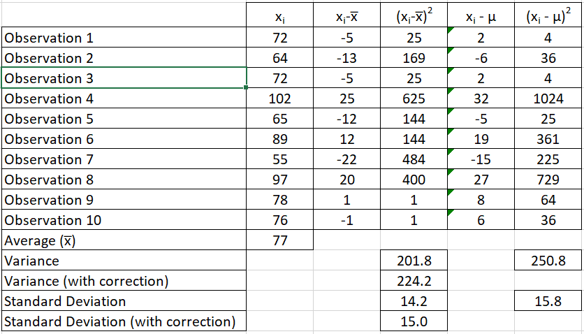
What is Bessel's Correction? - It corrects the bias in the sample variance and standard deviation where the denominator is changed from N to N-1. Why is it required? - It is required because it is difficult to determine the population variance and standard deviation. We all know, that due to the constraints of time and money, we prefer to work with samples and not populations. Once we have the sample, we apply Descriptive Statistics to get the sample statistics. These sample statistics are then used to make inferences about the Population Parameters (which happens to be our interest area). Assume, that we need to determine the average and variance in weight of the Indian male. Here the average weight and variance in weight are the Population Parameters. And it is also obvious that we will not be able to get these numbers by considering the entire male population of India. Hence we revert to doing sampling. For example sake, let us assume that the average weight of the entire male population in India is 70 Kg. BUT we do not know it. Instead we need to determine it. So we picked a sample with a sample size of 10 and measured the weights The sample average is 77 Kg. This is the sample statistic that is then assumed to be the population parameter. Therefore, one would assume that the population average weight is 77 Kg (instead of the actual 70 Kg). Now, we need to estimate the population variance and standard deviation as well (remember weight is a continuous metric and hence we also need to determine the spread in the data). Now in column 4 (in my example), I am working with the sample average of 77 kg and then computing the variance and standard deviations (variance = 201.8 and standard deviation = 14.2). While in column 6, I worked with the population standard deviation of 70 Kg (variance = 250.8 and standard deviation = 15.8). Ideally if the population mean was known, one should be working with 70 Kg (or column 6) but since it is unknown, one could only estimate it using the sample data and sample mean. You will notice that the variance in column 4 (201.8) is less than variance as computed in column 6 (250.8). This highlights two important facts 1. The difference is the bias 2. This bias will always make the variance or standard deviation less than what it should be if population mean is considered I have also calculated the variance and standard deviation with Bessel correction where (N-1) or 9 is used in the denominator (variance = 224.2 and standard deviation = 15.0). You will notice that the bias is corrected to some extent. This happens as the denominator is decreased, the overall value increases. This is Bessel's correction which is applied when population variance and/or standard deviation is to be estimated from sample mean. Bessel correction is to applied only when population mean is unknown. Another way of understanding the Bessel Correction is by the concept of 'Degrees of Freedom'. In my example, I had a sample size of 10. Now if I pick another sample and want to keep the sample mean same, then I have the freedom to change only 9 values. I will need to keep one value fixed. This fixed value is the pivot around which the other observations can change. The same concept is applied to a population. In order to keep the population mean same while picking multiple samples, one would need to keep at least 1 value fixed. Therefore if the population size is N, the degree of freedom becomes N-1. This same N-1 is used in the Bessel Correction.
-
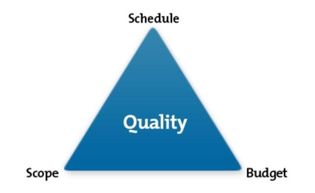
Scope is one of the vertex of the "Holy Trinity" of a successful project. The other two being Schedule and Budget. For any project to be successful, the trinity has to be maintained. Scope Creep is changing the original boundaries of the project which adversely affects either the schedule or the budget of the project. Even though scope is decided early in the project, there are times when scope is kept intentionally fluid and may be it gets finalized mid way through the project. E.g. In a Six Sigma project, even though scope is part of Define phase, it may get revised until the early Analyze phase. Having said that, scope should get finalized and signed off by all relevant stakeholders as early as possible in the project. Scope revisions lead to rework and with each passing phase the cost of rework increases 10 times (rule of 10). Some e.g. of Scope Creep 1. In a Six Sigma project: additional process steps are added to original SIPOC 2. In an IT project: additional functional points or product features get added 3. In a construction project: Change in the flooring design of a multi floor building 4. In a marriage project: addition of another function or expansion of the guest list at the last minute Ways in which you could identify scope creep are 1. Customer / stakeholders / team members keep on changing the requirements resulting in a higher number of Change Requests 2. You find yourself going back to the drawing board 3. Repeated revisions to SIPOC and/or project charters 4. Changes to the project timelines and/or budgets PMBOK prescribes the following ways in which Scope Creep can be prevented 1. Exhaustive requirement collection, documentation 2. Requirement trace-ability matrix across the various phases of the project 3. Create an efficient Work Break Down Structure 4. Validate the scope with all stakeholders 5. Control the scope - limit the number of change requests once scope is frozen unless the sponsor is ready to bear the impact on schedule and/or the budget 6. Change Management principles of effective communication and periodic reviews (tollgates for important milestones). Continuously evaluate the actual delivered scope vs the baseline (original) scope
-
Balanced Scorecard becomes ineffective in the following situations 1. It is used as a Measurement System instead of a Management system 2. Too many metrics are included in it OR too less metrics are included in it (general rule of thumb is to have around 20 metrics) 3. Chosen metrics do not align with the organization strategy 4. Disproportionately high number of metrics chosen in one of the legs 5. No action taken even if metric is in RED 6. No leading indicators / metrics included 7. Dedicated monthly scorecard review meetings not set up and/or relevant stakeholders are not invited to such meetings 8. Metric does not represent the true picture (e.g. data manipulation done to keep the metric in Green to avoid displeasure from senior management or to avoid taking up improvement projects) 9. People unaware of the usage and importance of a Balanced Scorecard 10. Balanced scorecard developed at an org level not broken down for each department (in such scenario departments are not in sync and continue to track conflicting metrics of their own) 11. Operational definitions for metrics in the balanced scorecard are ambiguous and different people have different interpretations of the same metric
-
Heuristic Methods or Heuristics (as it is famously known) is a problem solving approach where one takes a discovery mode to problem solving instead of a well defined and structured (classical) problem solving approach. Such approach may not yield a perfect solution but is usually sufficient in obtaining a good enough solution which works in the short term. You may also refer to heuristics as 'Nani and Dadi ke nuskhe'. They will have a cure for common ailments which might seem illogical, but they still work It is similar to when you know something works without understanding why it works. Therefore, I believe it is a more practical approach to problem solving. Classical problem solving methods can be taught to someone, however, Heuristics cannot be taught. This is something one learns!! Maybe that is the reason, organizations ask for experience and qualifications. Theorists have classified heuristics into multiple types, however the most common ones are 1. Trial and Error 2. Solve by example or solve by seeing 3. Rule of thumb 4. Intuitive guess work etc. The advantages of Heuristics will be similar to situations in which this approach will be preferred over the classical problem solving methods 1. Shortage of Time - consider that you are taking an exam and solving multiple choice questions. The logical approach would be to solve the question and then mark the answer. However, you do not have that much time. The heuristic approach would be 'elimination of options'. The same objective of selecting the correct answer is achieved 2. Lack of complete knowledge - literature with higher knowledge is present, but you are unaware of that knowledge 3. Current complete level of knowledge is inadequate - you are the domain expert and you possess all the knowledge that is available in that particular domain, but that current level of understanding is unfit in solving for the problems that we face today. As Einstein quoted - 'Problems cannot be solved by the same level of thinking that created them'. In both of these scenarios, one adopts the famous method of Trial and Error. For e.g. the objective of the Formula 1 car manufacturer is to increase the straight line speed of the car by also maintaining sufficient downforce. The design team probably has the complete knowledge of the engine and body frame - its make, its components, its design limitations etc. - but still they try a lot of different combinations to meet their objective and that is how new designs come out. 4. High level of accuracy of solution is not required. E.g. a company wants to launch a new product. They do not want a highly precise value of the potential market size. They are ok with a guesstimate as well. They may not take a well structured approach in determining the market size. They might end up working with some macro indicators and basis their experience, they will guess the market size 5. Structure problem solving is complex - assume you have no shortage of time, you have the complete knowledge about the problem and the solution should also be accurate. However, the problem itself is so complex, that even after applying the structured problem solving methods, you are unable to identify the causes and/or the solutions to the problem. In such situations, you may revert to Heuristics for problem solving. One example could be drug discovery. The choice between heuristics vs classical problem solving methods always has a risk of a trade off between accuracy of solution and effort put in for solutions. If risk of the failure is not too big or is unknown, heuristics offer a better trade off i.e. you get a better solution with little effort. Finally, you can always put 'Method to Madness' and convert the Heuristic solution to a well defined, logical and structured solution.
-
DFA - Design for Assembly Design for Assembly is one of the approaches in Design for Excellence (DFX). The X here can take many forms like Manufacturing, Safety, Cost, Service, Reliability etc. So how is DFA different from others and when should one go for it DFA should be the preferred if the product that we are designing needs to be assembled and disassembled often. Because in such situations more than anything else, it is more important that the assembly should be 1. easy 2. efficient 3. effective My top of the mind items that usually require to be assembled and disassembled are military guns and toys (especially track toys and Lego). Elements that you need to consider in DFA 1. Number of parts - product with lesser number of parts is easier to assemble. Therefore the number of parts should be kept to a bare minimum. Parameters to check if a part can be removed or not are a. Is it absolutely necessary to have the part made of a different material? b. Does the part has a movement relative to the other parts of the product? c. Is the part used as a fastener or for securing other parts? 2. Time taken to assemble or ease of assembly - there are quiet a few things that are considered here a. Easy to handle parts - neither too small nor too big b. Symmetry of the parts - symmetrical parts are easy to handle c. Remove flexible, slippery, sticky parts along with parts that have sharp edges d. Easy to insert - unidirectional, self inserting and easy to align For a given design (after considering the above parameters), one could also compare the options using DFA-index i.e. Design for Assembly Index. It is given by the below formula DFA = 100 Nm tm / ta Nm - theoretical minimum number of parts tm - minimum assembly time per part ta - estimated total assembly time Higher the DFA, better is the design for assembly. Taking a hypothetical example below to explain Soldiers are frequently required to disassemble and re-assemble their guns. Soldiers will not be using revolvers, but typically their guns are also without too many screws and fasteners. Most of parts are easily assembled using uni-direction motion and fit into one another. Considering two revolvers here Gun 1 - revolver with a rotating chamber for each bullet Gun 2 - revolver with a magazine holder for bullets Theoretical minimum number of parts in both the guns are same. Therefore Nm = 4 1. Barrel 2. Firing Pin 3. Ammunition Chamber (rotating or magazine) 4. Holder tm - minimum assembly time per part remains 4 seconds. ta - total estimated assembly time varies for each gun. In gun 1, it is 90 seconds because before closing you need to match the chamber with the barrel. In gun 2, it is 60 seconds. DFA for gun 1 = 100*4*4/90 = 17.78 DFA for gun 2 =100*4*4/60 = 26.67 DFA index for gun 2 is better, therefore as a manufacturer you should go for the design of 2nd gun. Gun 1 - Rotating Chamber Revolver Magazine Type Revolver P.S. - Images only for illustration

-
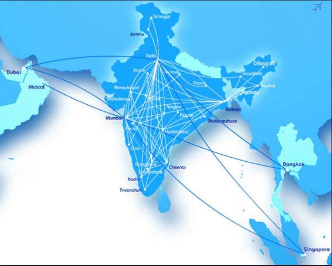
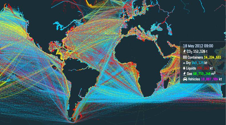
Spaghetti Diagram: is a visual tool to help understand and trace the movement of people and/or material and helps in identification and improvement of the shop floor layout. It helps in visualizing two out of the eight wastes - Transportation and Motion. After studying the spaghetti diagram the unnecessary movements could be curtailed leading to an efficient process. I have never used a Spaghetti Diagram, however, I feel it has usage in the following aspects 1. Designing the most efficient layout of the shop floor 2. Designing the layout of any service organization where customers are required to move. E.g. Bank, Hospital, Super Market, Passport Seva Kendra etc. 3. Designing the optimal route for a delivery boy. E.g. postman, Swiggy or Amazon or any other delivery boys or girls 4. Designing the optimal route for transportation. E.g. bus or cab routes for offices and schools 5. Providing a snapshot view of the route taken or the pre-defined routes. E.g. Map of the route taken post an Uber ride or the route map of an airlines or the map of metro coverage or routes of ships etc. Providing some snapshots below to see how a spaghetti diagram looks like (images from Google search) Fig. 1 - Optimizing the shop floor or customer service center layout Fig. 2 - Route taken post an Uber ride Fig. 3 - Domestic and International routes for an airline Fig. 4 - Metro rail route map of Delhi Fig.5 - World shipping routes (depending on the type of cargo) Fig. 6 - Delivery route (may be planned or completed)


-
Defects Per Million Opportunities (DPMO) is a very powerful metric in understanding the performance of the process. However, following are the pitfalls while using DPMO 1. Calculation of DPMO makes sense only if we have Discrete (Attribute) data. It is difficult to imagine the number of opportunities for a Continuous (Variable) data. E.g. if we are monitoring temperature with an USL of 30. Then what is an opportunity? Defect is easy to tell (temp. going above 30) but determining the opportunity is difficult. Should be each second / minute etc. It is for this reason that for Continuous Data we first calculate the Sigma Level which is then converted to DPMO 2. Even for Discrete Data, DPMO is a metric that could portray a false picture about the process performance. Let's take an example. Number of Units made = 1000 Opportunities for error (OFE) = 10 Total # of Defects = 124 Total # of Defectives = 36 (i.e. all these 124 defects were found in 36 units only). Now, one could calculate the following metrics Defects Per Unit (DPU) = 124/1000 = 0.124 Defective % = 36/1000*100= 3.6% Defects Per Million Opportunities (DPMO) = 124 / (1000*10)*1000000 = 12400 Converting all these numbers to Sigma Level DPU = 0.124; Z (long term) = 1.19 Defective % = 3.6%; Z (long term) = 1.80 DPMO = 12400; Z (long term) = 2.24 It is evident from the above example that for the same process and same numbers, the DPMO provides the best Sigma Level which might be misleading. This is the primary reason that vendor always wants to calculate quality in terms of DPMO while the client always insists on either DPU or Defective %. 3. For DPMO calculation, all defects have same importance. This sometimes becomes a challenge in service industries where some of the defects are considered more critical than others 4. DPMO does not give any indication on the number of units which have defects. It is quite likely that most of the defects could be found in only a handful of units while on the other hand it could also mean that same kind of defect could happen in multiple units. E.g. in my example 124 defects happened only in 36 units. However, these 124 could also happen in 124 units (1 defect in each of the 124 units).
-
Secondary Metric: in a project is one that has to be kept constant or prevented from deterioration as it is an important process metric even though it is not the metric to be improved. (taking the definition from Forum's dictionary) Almost 99.9% of the projects will have one or more secondary metrics. One could imagine the secondary metric as a contradiction or a constraint while improving the primary metric. Providing some examples below 1. Formula 1 race or any other race: Primary Metric is the speed. You want your vehicle to go as fast as possible. However, there are a few constraints (or secondary metrics) in achieving speed greater than a certain value. Listing some of them below a. The downforce has to be high at higher speeds. This is because at high speed, the vehicle will have a tendency to leave the ground and this is undesirable. and If downforce is kept high then higher speeds are difficult to achieve. Hence, a goal would be to maximize the speed of the vehicle without increasing the downforce b. Revolutions (or revs) of the engine. Higher speeds requires an engine to rev at higher speeds i.e. more revolutions per minute. However, higher revs would mean higher fuel consumption. Hence, a goal would be to improve the speed without increasing the revs Similarly there are a host of other secondary metrics when we look at the design of a formula 1 car and the objective is to make it go as fast as possible. 2. Looking at the way India is playing in this semi-final, Primary Metric is to improve the run rate while ensuring that risk of shots played does not increase Risk of the shots played is the secondary metric here Other common examples 3. Lower Average Handling Time should not compromise the First Call resolution 4. Higher Return on Investment while keeping the Risk constant 5. Hiring the best available talent while keeping the cost constant How do we identify the secondary metrics? a. Mostly it is intuitive and if you are well aware of the process, one can easily identify the list of secondary metrics for a particular primary metric. b. One could identify the secondary metrics if one thinks about the constraints or contradictions c. Look at the Roof of the House of Quality (correlation matrix between the technical specs) Situations where there is no Secondary Metric Ideally there will always be one or more secondary metric (I wrote 99.9% above). The only 0.1% situations where I think secondary metric will not make sense are matters of life and death. In other words, these are situations where focusing on secondary metric is of no relevance. Some examples below 1. In medical world, steroids are considered as life saving drugs. However, it is well established that these steroids have side effects as well. Now, if a person is on a death bed (sorry for such an extreme example) and a steroid can save their life, then the side effects really does not matter. Another e.g. from the recent Jet airways. Primary metric was to remain operational. Even though this came at a very high cost (secondary metric) but Jet was not worried about cost because the survival of the organization was at stake (this was obviously before they were completely grounded). 2. If the primary metric is about adherence to regulatory or compliance issues. In such situations, the focus on secondary metric is not at all important. E.g. Indian automobile manufacturers have been advised to be BS 6 compliant. Now this is the primary metric. Due to this the cost of cars (secondary metric) is getting higher, but the manufacturers are not worried about the cost as it is a regulatory requirement. Similarly, the reserves that a bank has to keep is a regulatory requirement from RBI. The secondary metric is the cost of parking funds. But banks do not focus on cost of parking funds in order to maintain the reserves. To conclude, Secondary metrics will always be present. Only in special circumstances, one could choose to ignore the secondary metric since primary metric is too critical and the improvement in Primary metric offsets the degradation in the secondary metric.
-
I will not spend time on explaining what is Kano model. I guess most of us already know what it is. For the uninitiated, Kano Model helps capture the customer experience w.r.t. a particular product or a service. This experience is classified into following 1. Delighters: Customer does not expect it but is super excited if it is present 2. One Dimensional Requirements: Customer expects these and his experience is directly proportional to presence or absence of such a feature 3. Basis Needs: bare minimum features to be present in the product or service 4. Indifferent: customer does not care about these features 5. Reverse: if present leads to bad customer experience Ok, now coming to the more important aspect - how does Kano model help organizations? Simply stated, an organization would know the features that they must have, good to have, should not have in order to give a good customer experience. The interesting part about Kano model is that it will help capture the customer experience at any given instance. But if you were to do it again, the customer experiences change. It has been observed that something that is a delighter today will become a one-dimensional and a basic need over time. Therefore, to keep pace with the changing customer requirements, it is imperative for the organization to keep doing Kano Model. Else they run the risk of being thrown out of business by competitors. To understand the full journey of the Kano Model, one would have to take a longer time span and see how customer expectations have changed. I will 3 examples to explain this Example 1 - Consider a mobile phone say around 10-13 years ago, a time when touch screen phones have just started hitting the Indian market. 10-13 years ago - A stylus to use on the touch screen was a delighter (and so was the touch screen itself). 1-2 years since the launch of touch screen: stylus had become the one dimensional requirement last 7-8 years - no stylus. It has become obsolete. Example 2 - Consider a mobile phone say around 10-13 years ago, when mobile telephony was discovering ways to transfer data and files from one device to another and the cloud storage was in the clouds :) Infrared Transmission: when it first hit the markets, it became a rage. It was a delighter to have a phone which could use IR to transfer files. After some time, it was available as a feature in all the phones. But not, it is not seen, because it has become obsolete. Example 3 - CD Players When the good old music cassettes were still popular, Compact Discs came on to the scene. It was a delighter to have a CD player in the car and there were very few models of car music systems that used to offer CD players. Then CD players became a one-dimensional requirement. Every music system used to have a CD player. Then another delighter was the 3 CD changer (or multi CD changer) in the car music systems. After some time it became a Must Be for a car music system to have a CD player. Customers were no longer excited to have it but were very dissatisfied if it was not present in a music system. Today, we no longer see music systems with CD players (as they have become obsolete). Now, if a company or an organization could gauge the customer needs (using Kano Model), they would provide those necessary features in their products and stay relevant. Sony walkman is just one example where Sony corporation failed to understand the changing customer requirements and the product failed miserably (obviously after touching the sky). Alternatively, Kano Model can also be used to do a competitive analysis and make one's product better than the competitor's by providing a new delighter. Key here is to use the model at different time periods to capture the pulse of the customers' expectations
-
OFAT vs DOE? OFAT or One Factor at a Time is a method in which the impact of change in one factor is studied on the output when all the other factors are kept constant. DOE or Design of Experiments is a method in which the impact of change in factors is studies on the output when all factors can be changed at the same time. Similarity in both techniques 1. Both require experiments to be conducted 2. Both are statistical techniques. Solutions identified from these need to be checked for practical or business sense as well Differences in both techniques 1. In OFAT, only 1 factor can be changed while in DOE, all factors can be changed in a single experiment 2. DOE can be used to screen the critical factors from among a list of multiple factors and can also be used to optimize the factors for a desirable output. On the other hand, OFAT can only be used for screening of critical factors 3. OFAT will only tell the main effect of the factor on the output. DOE will tell us both about the main effect and interaction effects (i.e. the combined effect of 2 or more factors) on the output 4. In OFAT, the project lead can decide the number of experiments that they want to do. DOE will give us the number of experiments that are required (basis the fractional or full factorial design) It is a well established fact that DOE is superior to OFAT as it can help you change multiple factors at the same time and hence allows to study the impact using less number of experiments. However, the question is that whether there is a need to change multiple factors? E.g. Let us assume the mileage of the car as the output. There are multiple inputs for this (limiting to 5 for explanation) Mileage = f(Car Condition) Mileage = f(Road Condition) Mileage = f(Fuel Type) Mileage = f(Way you drive) Mileage = f(Resistance between tyres and road) Now if a car manufacturer wants to understand which of the factors is important for mileage, they will definitely prefer DOE over OFAT. They will be able to identify the critical factors and also optimize the value of critical factors to get maximum mileage. Now, consider my situation. I have only one car (10 years old), I take the same route to office everyday, i have a fixed driving style and the tyres are also in good condition. The above things mean that except for Fuel Type every other factor is almost constant. Now if I need to maximize the mileage of my car, I dont need a DOE. I can simply do a OFAT. This is precisely what I did. I have a BP station where I refuel my car. I experimented with the Speed (97 octane) fuel as compared to the normal fuel. Now common sense would suggest that there will be a statistically significant change in the mileage. However, when i did OFAT testing, the mileages were not different (may be the car engine is old and higher octane makes no difference) and I could continue to use the normal petrol and save by not spending extra for Speed. The point that I want to highlight is that if experimentation does not cause much and you can reasonably assume the other factors to be constant, then OFAT is also useful. Otherwise, it is well established that DOE is advantageous over OFAT. P.S. The data for my fuel test is available on request (though I will have to dig it out from the hard-disk).
-
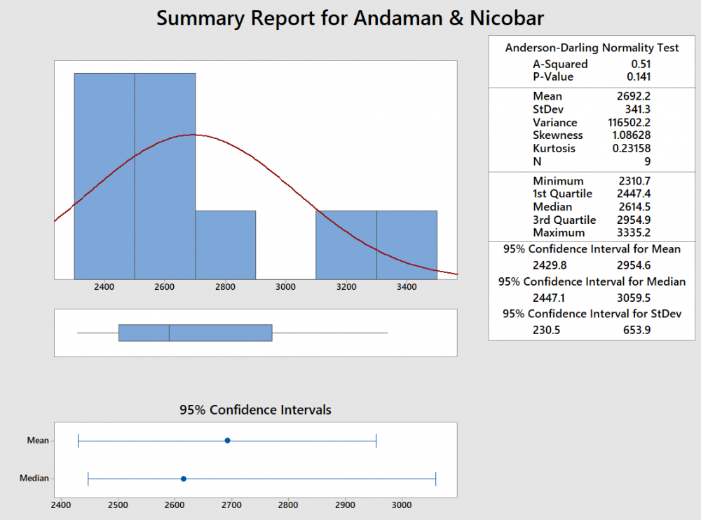
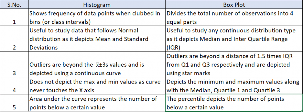
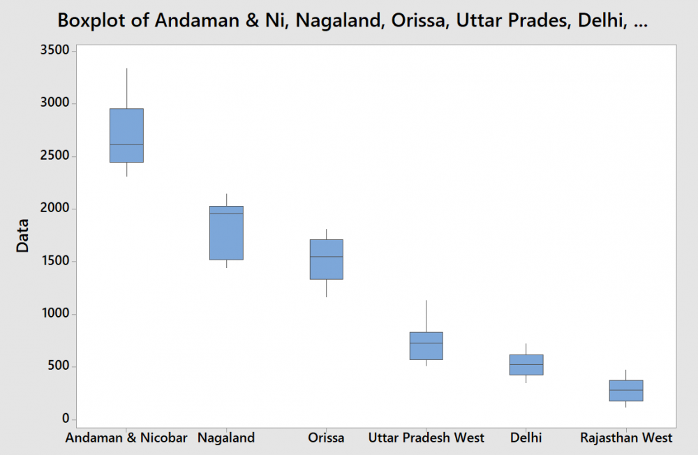
Visuals are always easy to review and summarize the content. This is precisely the reason a graphical summary is done rather than reading data in multiple rows or columns. What is a Box Plot? The most commonly used method for graphical summary is a frequency distribution plot like a histogram (for continuous data). The same data can also be plotted using a box plot which is just another way of looking at the histogram. Box Plot is a top view of the histogram. I took the annual rainfall data (from the GoI website for Andaman and Nicobar) and below is the graphical summary from Minitab. If you notice, the same data is represented in a histogram and a box plot. Even though both graphs represent the same data, the two are actually different. I have tried to summarize the differences below In addition to the insights or usefulness of the Box Plot as captured in the above table, Box Plot can be used in the following scenarios as well 1. Compare data sets for the same metric (I have provided an example below) even when a project is not being done 2. Used to identify the problem in Define phase (too much spread or process shifted to one side) 3. Used to baseline the process performance in Measure phase 4. Used to graphically compare performance of two or more sub-groups (units, departments, centers, shits etc.) in Analyze phase 5. Used to confirm the improvement in the Improve phase (spread will reduce or process is more centered) 6. Check for presence of outliers in data to ensure process control in Control phase In the below example, I considered the annual rainfall data for 6 regions (from the GoI website). Observations from the box plot 1. Clearly identifies the regions which get higher rainfall as compared to the others. A&N receive the maximum annual rainfall while Rajasthan West receives the lowest 2. Rainfall in Rajasthan, Delhi, Orissa and UP West (if I ignore the slightly elongated whisker) is almost equally distributed across the range, while it is skewed in A&N (left skewed) and Nagaland (right skewed) 3. The variation in rainfall is the least in Delhi and Rajasthan West while it the max in A&N and Nagaland (given that the length of the box is highest for them) 4. There are no outliers in the data set Just for illustration, I added another year's data (hypothetically a drought year). Below is how the box plot changes. Now the box plot, adds an outlier (star mark) for all states except Rajasthan West (i had entered a value of 0, but still it did not consider it as an outlier). These star marks indicate the presence of a value which is different from the other values for the data set or in other words is an outlier. Box Plot identifies it and gives us a chance to investigate and do RCA to find out the reason (remember I had entered data for a hypothetical drought year where rainfall will be very less). I guess the limitations of Gauss' Normal Distribution Plot and Karl Pearson's Histogram led John Tukey to identify and start using a Box Plot :)

-
Design Failure Modes and Effects Analysis (DFMEA) and Process Failure Modes and Effects Analysis (PFMEA) are the two types in which FMEA can be done. Both are tools for risk assessment, however there are differences between the two which I have highlighted below The DFMEA and PFMEA are closely linked to each other as one identifies the risk in the product and second identifies the risk in the manufacturing (or enabling) process. The outputs expected from a DFMEA are 1. Design Risks and corresponding recommendations 2. Identification of Critical Items (CIs) and Key Characteristics (KCs) for the product Both of the above outputs feed into the PFMEA. 1. Design risks and CIs could help identify the potential failure modes in a PFMEA 2. KCs help us identify the control parameters for the process The feedback expected from PFMEA is the process capability in terms of producing the product. Sometimes due to technology or knowledge limitations, the process might not be able to produce a desired product in which case the product needs to be modified and hence a need to re-do the DFMEA.

-
Sample size for Regression Analysis. What is Sample Size? Since we cannot work with population data (due to constraints of time and money), we always prefer to work with sample data. Therefore, it becomes important to know how many data points (or sample size) are required in the sample. Usually the sample size determination is dependent on the following parameters 1. Significance Level or alpha 2. Power of the test or (1-Beta) 3. Effect or the difference to be detected Smaller the alpha, Higher the Power of test, smaller the effect that needs to be detected --> Higher is the sample size required. Sample size for Regression Analysis depends on the following (in addition to the parameters already listed for sample size selection above and hence starting with number 4 below) 4. Type of Regression being done (Linear, Multiple, Ordinal etc.) 5. Purpose of Regression - a. Determine the effectiveness of the model (looking at R-square value) b. Determine the statistically important predictors (or determining the Beta values for each predictor) 6. Level of correlation between the predictors For point 4, generally, simpler the regression lesser the sample size required. Hence, a lower sample size if I'm carrying out a linear regression vs a multiple regression. For point 5, if the purpose if only to check the fit of the model a smaller sample size would suffice as compared to determining the significant factors from all the potential ones For point 6, higher the correlation higher the sample size (applicable only if there are multiple predictors) Now that we know the factors affecting sample size for regression, how should be check if we have the required number of samples for doing regression. The best way is to follow the theory behind sampling - higher the size, better it is But this arises another question, what sample is sufficiently high? There are a few empirical formulae that can be of help here. I am listing a few of them below 1. One common rule of thumb and the most famous one is that sample size should be 10 times the number of predictors. So if you have 4 predictors, you should have a minimum of 40 samples for running regression 2. As suggested by Green (1991) a. Sample size = 50+8*k, k --> number of predictors; applicable if we are doing regression for point 5a b. Sample size = 104 + k, k--> number of predictors; applicable if we are doing regression for point 5b There are some more depending on the kind of regression (ordinal, log etc.) that you plan to run. Sometimes, it is difficult to have answers to the 6 parameters before one decides the sample size. A more practical approach is to work backwards i.e. since we know the number of samples or we know how many we could collect, we could always do the Power Analysis (given the other factors are kept constant or pre-decided).
-
"Correlation does not imply causation" is a well known fact. It took me a while to realize that there is a twist in the question. Interesting twist in deed :) What is correlation? Correlation is a statistical measure which identifies the strength of relationship between 2 variables (any 2 variables). It is represented by Pearson's coeff. of correlation (r). This relationship can be positive (increase in one variable results in increase in the second variable) or negative (increase in one variable results in decrease in second variable). The strength of the relationship can be one of the following 1. Strong (negative if r < -0.8 or positive if r > 0.8) 2. Moderate (negative if -0.8 < r < -0.3 or positive if 0.3 < r < 0.8) 3. Weak or No Correlation (-0.3 < r < 0.3) Another key thing to note is that even if not specified, correlation implies a linear relationship between the 2 variables. What is causation? Causation between two variables implies that one is the cause (or reason) of the second or in other words, causation means that one variable is the effect while the second is the cause. Now, if there is a proven cause and effect relationship between two variables, it is intuitive to conclude that the two will also have a strong correlation (may be positive or negative). However, this may not be true always. Following may be the exceptions 1. The cause and effect have Moderate correlation but it is significant. Here the variables are in a linear relationship and hence will have a correlation which is moderate instead of strong. E.g. the number of hours of sleep has an effect on the weight gain. Similarly, the amount of calories consumed also effects the weight gain. However, number of hours of sleep probably does not impact weight gain so much as the amount of calories consumed (it is an assumption that I am making, I might be wrong here as well) 2. The cause and effect are related in a non-linear way (e.g. log, exponential, parabolic, cubic etc.). In such cases, correlation will be 0 however the 2 variables will still be in a cause and effect relationship. 3. Whether the cause is necessary and sufficient for the effect to occur. There are 4 possible outcomes here (all these outcomes assume that the 2 variables are in a linear relationship) a. Cause is both necessary and sufficient: In this case the effect will never happen in absence of cause and hence the two will probably have strong correlation b. Cause is necessary but not sufficient: In this case even if the cause is present, the effect may or may not be there suggesting that the two are NOT in strong correlation c. Cause is sufficient but not necessary: In this case if the cause is present the effect will be there suggesting that the two have strong correlation. However the effect can also sometimes happen in absence of cause (may be there are other causes as well) d. Cause is neither sufficient not necessary: In this case the presence of cause will sometimes lead to the effect (and not always) suggesting that the two are NOT in strong correlation P.S. Thank you for the twisted question (pun intended) to help me get a better perspective on "Correlation and Causation"
-
Xbar-R or the mean and the range chart is ideally used for checking if the process is stable or in control. However, that is not the only purpose of this chart. It is also used in the Gage R&R study. Gage R&R is one of the tools that is used for measurement system analysis. In MSA, the objective is not to check the stability of the process. Rather, it is to check the contribution of the measurement system variation to overall variation. MS variation can be caused by the operator and/or the gauge that we use for measurement. Now while doing Gage R&R, it is important that we consider parts that cover the complete specification range or the tolerance limits. E.g. if the thickness of a metal piece should be 2mm±0.1mm then the specification range is 1.9 mm to 2.1 mm. Ideally we would want parts to have average thickness of 2mm but for our Gage R&R study we will include parts that have thickness of 1.9 and 2.1 as well. Now these parts are checked for thickness by multiple operators multiple times and the results are analyzed. The R chart displays the range (i.e. max - min value for the same part) as measured by the operator and hence indicates the Repeatability or consistency by operators. The control limits for the Range chart are dependent on the following 1. Number of samples 2. Average Range If operators are consistent, then average range will be small. Now, Xbar chart displays the part to part variation. Its control limits are dependent on the following 1. Number of samples 2. Average Range 3. Mean of all observations If the operators are consistent, then average range will be small. However since the parts are cover the entire range of the specification limit, we will observe that the means are different (due to part -to-part variation). Therefore, ideally the control limits in the Xbar chart will be close to each other while the mean of different parts will be scattered. Hence, we tend to see that 50% of the points will be outside the control limits. E.g. In our example, let us say that UCL = 2.05 and LCL is 1.95. However there will be parts that will have average values between 2.05 and 2.1 and also between 1.95 and 1.9. Now on the contrary, if we get all points within the control limits, it will mean two things 1. the parts selected do not cover the entire specification range 2. Operators are inconsistent Both of the above points would indicate that the measurement system cannot be relied upon and needs to be fixed. Hope this helps. Running short on time and hence not showing the same with data. Maybe next time.
-
1 line answer - Sensitivity Analysis is the superset of all the data driven root cause analysis methods (non data driven methods like 5 Why and Fishbone Diagram etc. are not included) All business problems can be expressed in the form of an equation Y = f(X), where Y is the dependent variable or the Output and X is the independent variable or the Input. A better way to represent the same equation is Y = f(X1, X2, X3,.....................Xn), reason being an output is usually dependent on multiple inputs and seldom is a function of a single variable. And we also know that if there is a problem with the Y, one has to identify the critical Xs in order to improve Y. Two most common tools to identify critical Xs are Hypothesis testing and Design of Experiments (DOE). In fact, both Hypothesis testing and DOE are also sensitivity analysis. Technically speaking, Sensitivity Analysis is the study which determines how sensitive is the output to the input or in other words, it is the quantum of change in the output per unit of change in the input(s). Now in Hypothesis, we study the impact of changing one factor at a time (OFAT) on the output while in DOE, we study the impact of changing multiple factors at the same time. Also, in Regression, we get the Rsq value which explains the % variation in output attributed to the input (in case of linear regression) or how good is the model equation (in case of multiple regression). Following are some of the ways in which Sensitivity analysis can be performed (all of these will lead to identification of root causes) 1. Hypothesis Testing (OFAT) 2. Multiple Regression 3. Scatter Plots 4. Simulations 5. Model Identification and Model reduction 6. Design of Experiments 7. Optimization Techniques 8. Reliability studies Points where Sensitivity analysis scores over traditional root cause analysis 1. Some traditional RCA methods like Hypothesis Testing will only tell whether a particular input is critical for the output. It will not tell the extent of impact. Sensitivity analysis will provide the extent of impact as well 2. Sensitivity analysis can help build a new model. E.g. an analyst wants to understand how the share price of a share is dependent on a. Performance of a company (profit) b. Earnings per share c. Historical Performance d. Debt-to-equity ratio e. Performance of Competitors f. Micro economic factors g, Macro economic factors and so on 3. If an output is identified as highly sensitive to a particular input, it would prompt us to put more realistic control measures on it. E.g. we might choose to go for Control Prevention type Poka Yoke or do all tests for special causes on that particular X Success of sensitivity analysis depends on how best you can identify and manage the following 1. Correlated inputs 2. Assumptions for inputs
-
Two reasons 1. The name itself. In Attribute agreement analysis, all 4 things are calculated (repeatability, appraiser accuracy, reproducibility and team accuracy). On the other hand, Gage R&R is only used for repeatability and reproducibility. There is a different test to check for accuracy. 2. In attribute data, there is only one right answer (e.g good / bad, defective or non defective). Hence if given the same defective product, for an appraiser too be accurate he has to be repeatable. But in variable data, there could be a range which is correct. Appraiser might not be repeat his observations but still be correct as long as he is in the range / tolerance. E.g. the landing gear on the plane can only be lowered below a certain speed (say 200 knots). Now pilot may lower it at 200 or 150 as well. He will not be repeatable but will be accurate


