
Topics
-
Fifty-five women engineering students completed an AI bootcamp focused on rural Karnataka. Participants developed AI-based solutions after visiting villages and conducting field interviews. The She Innovates bootcamp partnered with several organizations to achieve its goals. This initiative aims to boost women's participation in AI and entrepreneurship. It encourages AI applications for rural development and community-focused sectors. View the full article
-
Besi's quarterly orders more than doubled, fueled by AI and hybrid bonding technology. The company saw increased customer adoption of its advanced chip packaging solutions. Demand for AI applications continues to drive growth in data centers. Besi anticipates revenue growth between ten and fifteen percent. This strong performance aligns with other semiconductor sector reports. View the full article


Leaderboard
-
Vijay Kumar Tomar
Lean Six Sigma Green Belt1Points6Posts

Popular Content
Showing content with the highest reputation on 06/06/2023 in all areas
-
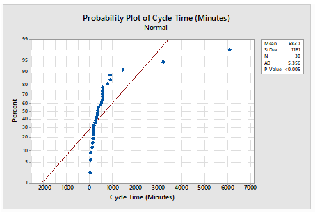
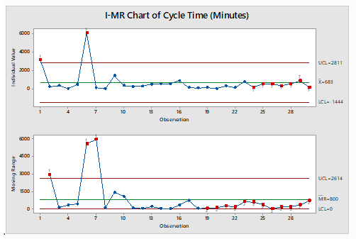
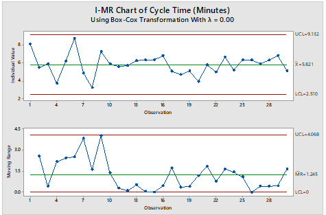
An I-MR Chart is a control chart which is used when data is in continuous category and is collected once at a time. It consists of two charts placed one over above, I Chart which is individual chart and MR chart is plotted for moving range which is absolute value of the difference between two consecutive points. Data following normal distribution is an assumption while drawing I-MR chart however in practical or real-world problem data doesn’t follow normal distribution all the time hence Process stability follows major role. I-MR charts are very sensitive to Normality of the data. Non-Normal data if considered as normal data can cause unexpected behaviors including false alarm rates and difficulty in identifying the special cause variation. If data is not normal, it is always advisable to do transformation using Box-Cox or Johnsons transformation to avoid the false alarm and get the right behavior of data for stability and control. A normal distribution may have the value from minus to plus infinity. In the real-world example this doesn’t occur physically very often. For example, Cycle time cannot be in negative numbers. Following is the Example for drawn I-MR charts when data is considered as normal however data is not normal and respective I-MR charts using data transformation: - Cycle time in Minutes: - Sl.No Cycle Time (In Minutes) S.No Cycle Time (In Minutes) S.No Cycle Time (In Minutes) 1 3196 11 267 21 322 2 241 12 302 22 147 3 372 13 518 23 774 4 42 14 554 24 185 5 481 15 566 25 556 6 6081 16 900 26 555 7 131 17 158 27 361 8 26 18 109 28 556 9 1445 19 167 29 898 10 363 20 51 30 170 Table 1 Probability Plot of dats Using Mini-tab Normality test for data in Table 1: - Normality test is done to illustrate whether data is normal or non-normal. I-MR Charts drawn in Minitab for Table 1 mentioned assuming data following Normal distribution: - The chart clearly illustrates that process is out of control, however out of control points are trigged due to false alarms I-MR Chart drawn in Minitab for Table 1 mentioned after transforming days using Box-Cox transformation: - The Chart clearly illustrates that process is in control, our of control data points mentioned earlier were due to false alarm in wrong assumption of data being normal.

 1 point
This leaderboard is set to Kolkata/GMT+05:30