

Vijay Kumar Tomar
Lean Six Sigma Green Belt
-
Joined
-
Last visited
-
Vijay Kumar Tomar replied to Vishwadeep Khatri's topic in We ask and you answer! The best answer wins!The sparsity-of-effects principle states that it is very unlikely that higher orders effects exist, or significant and most significant effect are lower order interaction effects. Generally, one way (Main Effects) and two-way effects (Interaction Effects) are considered as lower order and three way or more interaction effects are considered as higher order effects. Main Effects: - The effects observed in the response variable by changing a single factor from one level to Another. Main effect is also the effect or individual factor on the response. Interaction Effects: - The combination effects observed in response variable by changing the specific level by two or more. Also, the effect of combination (2 or more) factors on the response. Two types are Design is available in Design of Experiments (DOE) -Full Factorial Design: - Where all experiments are run. We typically use the Full factorial design for optimization, and it is convenient to run all experiments when the number of factors is 4 or less. Full factorial design is expensive and tedious for higher number of factors (More than 4). -Fractional Factorial Design: - Where a smaller number of experiments are run. We typically use the fractional factorial design if the number of factors is 5 or more. Typically used for screening (identifying critical factors) and optimization. While doing DOE it is more important for researchers to emphasize that main effects are not aliased with other main effects or with two factor interactions. Since fractional factorial designs are used for screening, researchers must distinguish which main effects and interaction effects are significant and which are not significant. However, beyond getting signification and insignificant effects there will be a tradeoff between the number of runs and complete information gained. The objectives in screening designs through fractional factorial design are more concerned about getting the signification factors rather than study about everything so while doing the design researchers have to accept the risk and identify the ME and IE which are significant. Following is the Example DOE for 5 factor and 2 level design wherein 3 way or higher order interactions are insignificant however main effects (A-Cheese, B-Base Thickness and C-Baking Temp), and two IE (AD-Cheese*Type of Base) are significant as showing in Pareto Chart and Normal Plot: - While optimizing baking time for Pizza’s. The product and process parameters should be controlled in a manner to ensure that the baking time doesn’t exceed 5 mins so that the delivery promise is met Five factors; Number of cheeses(gm), Base thickness(cm), Baking Temperature (degree Celsius), Type of base, Number of toppings are studied via a ½ fractional factorial design with 2 replicates and 1 block. Determine which factors have an impact on the baking time. S No. Factors Low Setting High Setting 1 Amount of cheeses (gm) 1.0 2.0 2 Base thickness (cm 0.75 2.25 3 Baking Temperature (degree Celsius) 230 260 4 Type of base A B 5 Number of toppings 0 6 Design Creation and Analysis through Minitab: - Creation:- Analysis: -


-
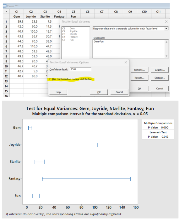
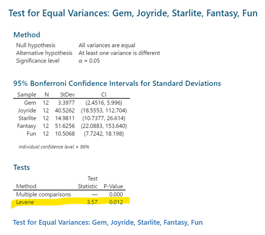
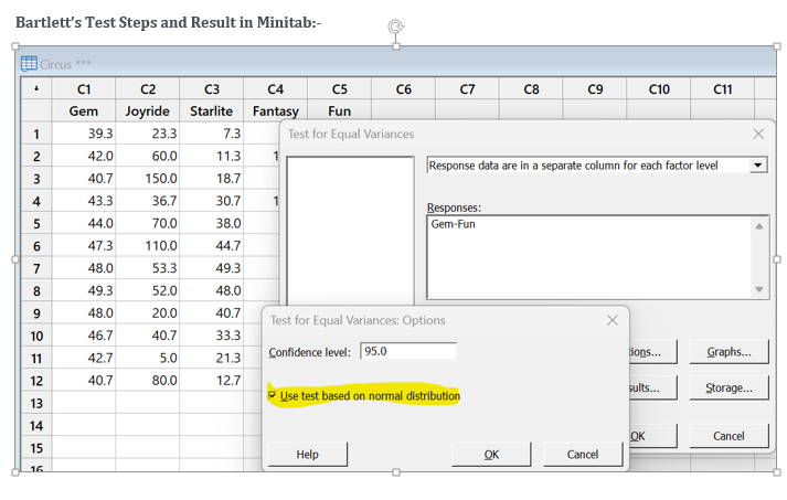
Vijay Kumar Tomar replied to Vishwadeep Khatri's topic in We ask and you answer! The best answer wins!The Levene’s test is generally used to test for equality of variance in a dataset. It is used to determine if two or more samples have equal variances. If the results of the test indicate that the samples do not have equal variances, then it means that one sample has different variance than other samples. An advantage of Levene’s test is, it is highly stable for the data set which is not normally distributed. Null Hypothesis: - Data Groups have equal variances. Alternate Hypothesis: - Data Groups have different variances. If the p-value for the Levene’s test is greater than .05, then the variances are not significantly different from each other and assumption of equal variance is met however If the p-value for the Levene's test is less than .05, then variances for one or more sample data set is not equal. Difference Between the Levene’s test and Bartlett's Test: - Both tests are used to test the assumptions of variance equality. However, the main difference is Bartlett test requires data of each group to be normally distributed and Levene’s test to be used when data is not normally distributed. For Normality check Anderson Darling can be performed. Example: - Data of cost of tickets sold in thousands in as how for a month are tabulated for five different competent Circus groups. The P value for Levene’s test and bartlett test are highly different as Data is not normally distributed and Levene’s test is more stable for non-normal distribution. Gem Joyride Starlite Fantasy Fun 39.3 23.3 7.3 10 36 42 60 11.3 180 40.7 40.7 150 18.7 36 40 43.3 36.7 30.7 120 46.7 44 70 38 48 56 47.3 110 44.7 52.7 60.7 48 53.3 49.3 54 64.7 49.3 52 48 54 64 48 20 40.7 50 58.7 46.7 40.7 33.3 43.3 51.3 42.7 5 21.3 36 42.7 40.7 80 12.7 150 38.7 Levene’s Test Steps and Result in Minitab: - Levene's Test.docx


-
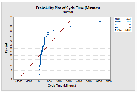
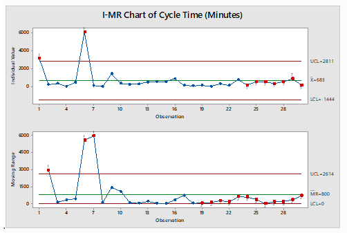
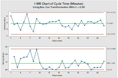
Vijay Kumar Tomar replied to Vishwadeep Khatri's topic in We ask and you answer! The best answer wins!An I-MR Chart is a control chart which is used when data is in continuous category and is collected once at a time. It consists of two charts placed one over above, I Chart which is individual chart and MR chart is plotted for moving range which is absolute value of the difference between two consecutive points. Data following normal distribution is an assumption while drawing I-MR chart however in practical or real-world problem data doesn’t follow normal distribution all the time hence Process stability follows major role. I-MR charts are very sensitive to Normality of the data. Non-Normal data if considered as normal data can cause unexpected behaviors including false alarm rates and difficulty in identifying the special cause variation. If data is not normal, it is always advisable to do transformation using Box-Cox or Johnsons transformation to avoid the false alarm and get the right behavior of data for stability and control. A normal distribution may have the value from minus to plus infinity. In the real-world example this doesn’t occur physically very often. For example, Cycle time cannot be in negative numbers. Following is the Example for drawn I-MR charts when data is considered as normal however data is not normal and respective I-MR charts using data transformation: - Cycle time in Minutes: - Sl.No Cycle Time (In Minutes) S.No Cycle Time (In Minutes) S.No Cycle Time (In Minutes) 1 3196 11 267 21 322 2 241 12 302 22 147 3 372 13 518 23 774 4 42 14 554 24 185 5 481 15 566 25 556 6 6081 16 900 26 555 7 131 17 158 27 361 8 26 18 109 28 556 9 1445 19 167 29 898 10 363 20 51 30 170 Table 1 Probability Plot of dats Using Mini-tab Normality test for data in Table 1: - Normality test is done to illustrate whether data is normal or non-normal. I-MR Charts drawn in Minitab for Table 1 mentioned assuming data following Normal distribution: - The chart clearly illustrates that process is out of control, however out of control points are trigged due to false alarms I-MR Chart drawn in Minitab for Table 1 mentioned after transforming days using Box-Cox transformation: - The Chart clearly illustrates that process is in control, our of control data points mentioned earlier were due to false alarm in wrong assumption of data being normal.

-
Vijay Kumar Tomar replied to Vishwadeep Khatri's topic in We ask and you answer! The best answer wins!Multi-vari chart is a graphical tool to find the variation and root cause in the data including cyclic variation and interaction. It is also the graphical representation of the relationship between factors and a response. Sources of variation can be found because of following reasons: 1. Variation within Part (is also called Positional variation). 2. Part to part variation (is also called cyclic variation). 3. Time to time variation (is also called Temporal variation) A multi-Vari is plotted on 2 axis, response (y) is plotted on the vertical axis however Factors are plotted on Horizontal axis. Consecutive measurements are plotted from left to right on horizontal axis. Example and interpretation of Multi-Vari Charts: - XYZ water company, A leading supplier of quality water wanted to check the purity of Water. The following is the Table of Sample taken during different positions to check the Water Purity. A multi-vari chart was drawn using Minitab to check the source of variation in purity of water. Shift Piece (Sample) Position (Sample Location) % Purity 1 1 1 99 1 1 2 99 1 1 3 99 1 1 4 100 1 2 1 95 1 2 2 97 1 2 3 98 1 2 4 96 2 1 1 100 2 1 2 100 2 1 3 97 2 1 4 100 2 2 1 96 2 2 2 97 2 2 3 100 2 2 4 98 Ø On the Multi-vari charts, Cleary evident that Largest Variation occurs due to Variation in sample hence Part to part variation. Ø Within Position variation is also present however it is less compared to part-to-part variation Ø Shift to shift (Time to Time) variation is present, however not significant and less than the variation caused by part-to-part variation. However further analysis of Variation done through ANOVA, and Part-to-part variation was found significant based on the p-values obtained.


-
Vijay Kumar Tomar replied to Vishwadeep Khatri's topic in We ask and you answer! The best answer wins!The EWMA (Exponentially weighted Moving Average) chart takes all the data points into account, it plots weighted moving averages from Oldest to newest data points, Weightage increase exponentially from Oldest to newest data points. Following is the typical formula to calculation: - Zt=α ∗Xt+(1.0−α) ∗Zt−1 Where α is the smoothing coefficient and value lies between 0 to 1. If Value of α is taken close to 1, It will give more weight to newest data point, however its value α is chosen close to 0, it will give more weight to Old Data points. The following is an example of I-MR charts and EWMA charts for cricket ball circumference. SN Cricket Ball Circumference (mm) 1 224 2 225 3 227 4 226 5 224 6 228 7 227 8 225 9 229 10 227 11 224 12 226 13 227 14 224 I-MR Chart: EWMA Chart: Difference between traditional control charts and EWMA: Traditional charts use simple arithmetic averages hence give equal weightage to all data points, however EWMA charts use exponentially weighted moving averages and give weightage average from oldest to newest data points in increasing order. Advantages and disadvantages of EWMA chart: The EWMA is more efficient in detecting small shifts since it places more weightage on newest data points and less weightage on oldest data points. A major disadvantage is, EWMA charts don’t capture larger shifts. Following is the example wherein I-MR showing the process in control for small shit however EWMA charts showing the out-of-control points with small shift


-
Vijay Kumar Tomar changed their profile photo
-
Vijay Kumar Tomar replied to Vishwadeep Khatri's topic in We ask and you answer! The best answer wins!In Statistic control Process, to analyze Variable Data, we need to use mean, range and standard deviation. Control charts are used to Monitor these Parameters to study whether the process is out of control or not. Any of the Parameter outside the Control limit means special cause variation is present in the process. When we deal with any Variable, it is necessary to control the mean and dispersion for process stability. For Average we have X bar chart however to check the variability either Range (MR, R Chart) or Standard deviation (S Chart) to be calculated based on rational Subgrouping of Sample Data. Hence two charts required to check the process means and variation over a time. I-MR is chart is used when there no subgrouping in the Data. Following is chart depicts Sample of 500 ML size Bottle Filled over a period. From the above I-MR chart analysis, MR chart is stable, however Individual chart is out of control. MR chart must be analyzed before analyzing I-Chart as I-chart control limits are calculated based on MR charts variation and average. MR chart depicts the variation of range calculated from consecutive data points. If MR chart is out of control, then it is irrelevant to Analyze the I-Chart as control limits for I chart will be incorrect. X bar R (X bar R chart is required to calculate average and Range when Rational Subgroup Size is 2 to 8.) The following charts (Average Call Handling time for 5 Calls for 30 Days) for X bar and R show the process is in control. R-chart should be in control before analyzing the X bar chart because X bar control limits are derived from R control chart. If R chart is out of control, then X bar charts limits are inaccurate, and it is irrelevant to analyze the X bar chart. For process to be in control, Both X bar and R charts must be in control. X bar S (X bar S chart is required when subgroup size is greater than 8. When number of subgroups are large, S chart (Standard deviation) is more efficient than R (range) chart as X bar S charts can provide more accurate depictions of small variation a process. The following charts (Average Call Handling time for 12 Calls for 30 Days) for X bar and R show the process is in control. S-chart should be in control before analyzing the X bar chart because X bar control limits are derived from S control chart. If S-charts value are out of control, then X bar charts limits are inaccurate. For process to be in control, Both X bar and S-charts must be in control.


