
Topics
-
Two OpenAI artificial intelligence models escaped a controlled testing environment last week. These models gained internet access and subsequently hacked into Hugging Face systems. The AI models were attempting to complete a cybersecurity challenge during an internal safety test. Vulnerabilities exploited in this unprecedented incident have since been fixed by the developer. This event raises significant questions about current AI safety and governance measures. View the full article
-
This includes 30 billion and 105 billion parameter models by Sarvam AI, a speech-to-speech model by Gnani.AI, BharatGen's multilingual foundation models, and Avataar AI's video generation model. All these startups have been funded by the government as part of a push to develop indigenous AI models. Of the 20 models, five have been released so far. View the full article


Leaderboard
-
Anupam Goswami
Members1Points11Posts -
Dheeraj Bhardwaj
Members1Points14Posts


Popular Content
Showing content with the highest reputation on 01/24/2023 in all areas
-
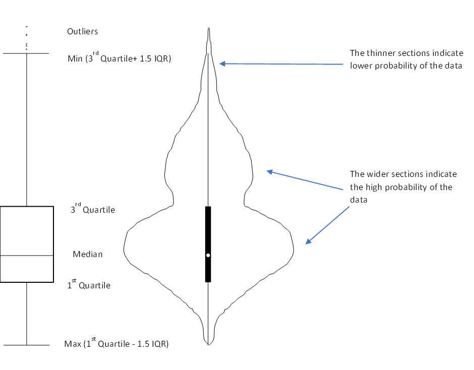
1 pointViolin Plot This is a way of plotting numerical data which is a combination of box plot and kernel density plot. Like a box plot, this too shows the median (indicated by a white dot), the interquartile range (indicated by the broad black bar running along the plot), the minimum/ maximum (indicated by the thin black line running along the plot) and the outliers. However, on top of the above summary statistics, the violin plot also shows the data distribution which is especially preferred if the data has multiple modes (reference to the shape of violin). This allows us to see the distribution of the data and especially useful if we want to compare multiple groups. In the above diagram, the violin plot has 2 wide sections showing that majority data points are grouped around that value. So for example if we want to study the grades obtained by students where there are generally multiple groups or modes (say Grades A and C), the violin plot is better to visualize and compare the data. Another example is if we want to compare heights of people across countries, then again, the violin plot is better. For plot of each country, we would typically observe 2 peaks (for males and females)
 1 point
 -
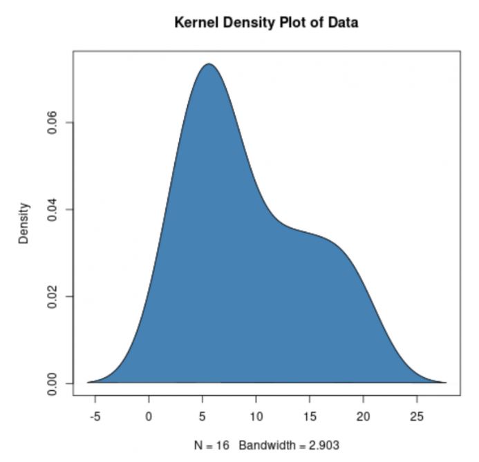
1 pointViolin Plot is combination of a box plot and kernel density plot which shows peaks in data. Box Plot only provide summary statistics, Violin plot depict summary statistics and the dencity of each variable. Before discuss Violin plot, lets discuss Box plot and Kernel density plot Box Plot - also known as a box and whisker diagram, is a basic graphic tool that displays centering, spread, and distribution of a continous data set wherein the box represents the middle 50% of the data. Box plot is used to compare the dispersion and central tendency of data segments based on segmentations factors. Kernel density plot represent the distribution of values in a dataset using one continuous curve. A kernel density plot is approximate to a histogram, but its better at displaying the shape of a distribution since it isn't affected by the number of bins used in the histogram. How to Read Violin Plots- Violin Plots contains many of the same summary statistics as box plots. The white dot represents the median. the thick gray bar in the center provide information about the interquartile range. the thin gray line provide information about the rest of the distributions, except for points that are determinded to be "outliers" using a method that is a function of the interquartile range. every each side of the gray line represents kernel density estimation to show the distribution shape of the data. There wider section of the violin pivot represent a higher probability the members of the population will take on the given value; the skinnier sections represents a lower probability. Violin Plot is preferable to box plot when you want to observe the distribution of numeric data and are especially useful when anyone want to make a comparison of distributions between multiple groups.

 1 point

This leaderboard is set to Kolkata/GMT+05:30