Sourabh Nandi
Members
-
Joined
-
Last visited
Everything posted by Sourabh Nandi
-
-
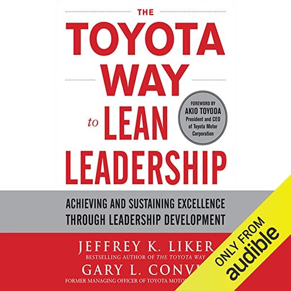
What Is ShuHaRi? The concept of ShuHaRi originates from the Japanese Noh-theater. It is a model practiced to illustrate the pathway a beginner requires to take from each moment someone expresses the interest to study something until that person becomes a master. Though this theory began from the world of theater, it became famous in martial arts. Numerous people still believe today that this is a martial arts technique. + The ShuHaRi principle describes the 3 main stages of learning. Shu, ha, and ri are the various stages of learning. The belief is that each person who embarks the new learning journey will progress through these three stages to become an expert or master. These three terms refer to three stages of learning for the student and three levels of involvement for the teacher: shu means "to protect," ha means "to break away," and ri means "freedom to create." Step 1 – Shu: to obey In the shu phase, the student, under the watchful eye of the master, learns the fundamentals by repeatedly performing tasks to precise standards. At this stage, the student is observed by the teacher, who is, in a sense protecting him, and the work product, from failure. Step 2 – Ha: To liberate oneself In the ha stage, the student has more freedom to practice unsupervised, although the master checks on her; the student can apply the rules creatively, but still follows the standard form quite rigidly. Step 3 – Ri: Separate In the ri stage, the rules and behaviors have become so ingrained that they no longer think about them consciously. The actions come naturally, and the student is then in a position to develop the understanding and to improve on what she has learned. This cycle continues throughout the individual's life. It is a learning cycle because the student is going through ShuHaRi over and over, more and deeply, periodically returning to the basics. + Implementing Lean Six Sigma with ShuHaRi This simplistic but effectual concept can be seen in any learning context, whether in one's personal life or the workplace or implementing Lean Six Sigma. Embracing ShuHaRi will allow us to more efficiently drive change and adopt Lean Six Sigma techniques more effectively. + ShuHaRi applies as follows to the Lean Six Sigma projects : For the first project: The project leader (Lean Six Sigma Master Black Belt), considered as the expert of the subject, is the single decision-maker of the operations to be performed. The whole team is then considered as protegés. For the second project: The project leader (Lean Six Sigma Master Black Belt) intervenes only as an assistant and advises the Black Belt or Green Belt of the different projects. For the subsequent projects: The expert is no longer in the projects and lets them manage the projects themselves. Black Belt / Green Belt, who become experts now, will carry forward the methods they wish to use. The expert is then available to answer problems, guarantee concrete results, and advise if essential. + Example from Toyota The basic principles of Toyota learning can be traced to the teachings of Zen Buddhism, but they are not unique to Toyota. Toyota's teaching methods and the Japanese concept of kata are inline. The core of kata is the layered learning cycle, which is called in Japanese ShuHaRi. While it is easy to see how ShuHaRi applies to manual tasks like those on an assembly line, we might question how this approach works beyond the shop floor. However, at Toyota, ShuHaRi is the fundamental premise for all workers' training and development, including leaders. To understand in detail, the conglomeration of ShuHaRi principles with Lean, refer to or listen to "The Toyota Way to Lean Leadership: Achieving and Sustaining Excellence through Leadership Development" (Book by Jeffrey Liker). Can Six Sigma and ShuHaRi Coexist? Many companies are using approaches like Six Sigma and ShuHaRi in their business. Strategies such as ShuHaRi and Six Sigma allow companies to contend the consumer market's pressures and demands and even outshine in their businesses. However, these two methodologies are different in their intentions and implementation. ShuHaRi and Six Sigma should be seen as parallel strategies. The answer is in getting the right balance between rigidity and adaptability. While ShuHaRi is unquestionably not a lazy approach, combining it with Six Sigma, uniquely for areas where process enhancement is the goal, can help bring a more structured framework to problem-solving, ideation, and process optimization. ShuHaRi and Six Sigma are proven and tested to help companies to achieve better results. However, to successfully implement Six Sigma and ShuHaRi together, companies must not be focusing on the methodologies. Alternatively, teams need to look at the system as a combination and find how ShuHaRi and Six Sigma principles can effectively create a product or service that customers will enjoy.
-
What is a Box-Cox Transformation? A Box-Cox transformation is a method to remodel non-normal dependent variables into a standard pattern. Normality is a vital hypothesis for many statistical techniques; if the data is not standard, applying a Box-Cox signifies that it can run a broader number of tests. The Box-Cox transformation is coined by two British statisticians, namely George Box and Sir David Roxbee Cox, who researched on a 1964 paper and developed it. Running Box-Cox the Test The essence of the Box-Cox transformation is an exponent, lambda (λ), ranging from -5 to 5. All values of λ are estimated, and the optimal value for the information is selected; The "optimal value" is that the one which occurs in the best approximation of a standard distribution curve. The transformation of Y has the pattern: This test only goes for positive data. However, Box & Cox did recommend a second formula that can be adopted for negative y-values: The equations are deceptively simple. Testing all potential values by hand is unnecessary; currently, most software packages will include an option for a Box-Cox transformation, including: R: use the command box-cox (object). Minitab: click the Options box (for example, while fitting a regression model) and then click Box-Cox Transformations/Optimal λ. Most Common Box-Cox Transformations The relation between Box-Cox and Multiple Regression Analysis? Box-Cox transformation is an essential tool in Multiple Regression Analysis. Any linear modes assume that the relationship between the response variable Y and the predictor variable X is linear. However, this is not accurate all the time, so when the association between the dependent variable and independent variable is not linear and yet wishes to fit a linear model to the data, consider a Box-Cox transformation method. This will transform the response variable and then fit a linear model to the data to analyze the predictor variable is the effect. The fundamental assumption of linear models is that the error terms are ordinarily distributed. A significant violation of the assumption also leads to committing the type I or type II error. Use of Box-Cox transformation during the DMAIC process? Process capability studies are performed during the Measure phase of DMAIC. The primary step for process capability reasoning is to check where the data follows normal distribution or not (like ANOVA).The Box-Cox approach helps to address non-normally distributed information by transforming to normalize the data. However, there is neither guarantee that data follows normality because it does not check for normalcy. The Box-Cox system checks whether the standard deviation is the most insignificant or not. Hence it is always desirable to check the converted data for normality using a probability plot or Quantile-Quantile (Q-Q) plot. An example: Figure 1 shows the non-normally distributed cycle time data. Using the Box-Cox conversion in a statistical analysis program renders an output that shows the best Lambda values (Figure 2). Figure 1: Example of Non-normally Distributed Cycle Time Data Figure 2: Example Box-Cox Plot of Data The lower & upper confidence levels show that normality's best results were reached with Lambda values between -2.48 and -0.69. Although the best value is -1.54 (given in Figure 2), the procedure works more beneficial when the value is shaped to a whole number; this will make it more straightforward to change the data. The best whole-number values here are -1 & -2 (the inverse function of Y & Y2, sequentially). The histogram in the above Figure 3 shows the transformed data using Lambda = -1, now more normally distributed. Figure 3: Data Transformed Using Lambda = -1 When does Box-Cox work? The Box-Cox transformation is not a guarantee for normality. It does not check for normality; the method checks for the smallest standard deviation. The assumption is that transformed data has the highest likelihood among all transformations with Lambda values between -5 and +5 – but not a guarantee – to be normally distributed when the standard deviation is the smallest. It is essential to always check the modified data for normality working on a probability plot. Furthermore, the Box-Cox Power transformation only goes if all the data is positive and higher than 0. However, this can usually be achieved easily by adding a constant (c) to all data such that it all enhances decisive before it is transformed. The transformation equalization is then: Y’ = (Y+C)l Cautions for the Box-Cox Transformation John and Draper (1980) showed that the Box-Cox Transformation was not satisfying even when the transformation parameter's best value had been chosen. Doksum Doksum and Wong (1983) indicated that the Box-Cox transformation should be used with discretion in some circumstances, such as failure time and survival data.
-
Defect Concentration Diagram Also, know as: check sheet, concentration diagram, location diagram, defect location, defect map Description Statistical process control involves seven essential tools for quality control. One quality control tool is called the defect concentration diagram. A defect concentration diagram is a type of check sheet using an actual image of the object or area where problems could occur. During data collection, observed defects, mistakes, or problems are marked within the picture. When to Use • When we investigate defects, mistakes, or problems that occur on a physical object or within an area. • Especially when we suspect that the physical pattern of occurrence might provide clues to the cause of the problem. Procedure 1. Decide what object or area is observed. Develop operational definitions. 2. Decide when data are going to be consolidated and for how long. 3. Design the pattern. Draw an outline picture of the objective or a map of the space, showing all significant features. Make it large and uncluttered enough that data will be collected directly on the image. 4. If different varieties of defects, mistakes, or problems are observed, settle on symbols for every kind. Put a legend on the shape showing the symbols and what they mean. 5. Test the diagram for a brief test period to confirm it collects the acceptable data and is straightforward. 6. Every time an observation occurs, record it on the diagram. 7. When the information collection period is over, analyze the information for patterns and trends that may indicate causes. If a visible analysis is inconclusive, we will measure distances between occurrences and analyze those measurements statistically. Example This tool is most common use is to mark defects on a picture of a manufactured object coming off an assembly line. In another example, insurance personal and vehicle repair facilities use pictures of cars to show damaged locations clearly. Here is an example of a non-manufacturing application. A Pharmacy team trying to reduce shoplifting created a defect concentration diagram (Refer to the below figure ) to study how store layout contributed to the problem. Using a diagram of the store, we can mark locations where shoplifted commodities had been presented. When they analyzed the diagram, they observed clustering around the edges of the store, but they could not relate the pattern to aisle length, type of merchandise, or clerk location. Finally, a team member suggested adding to the diagram the positions of monitoring cameras. A pattern became clear based on sight-lines from the cameras. Considerations A common way to layout the check sheet is to create a table with descriptions of what we are observing (events, problems, types of errors) in an exceeding column down the left-hand side (or a row across to the top). Divide the remains of the page into columns (or rows) for accessible data collection. These might represent dates, times, locations of defects, or any other category that we wish to use to examine the data later. Consider what information about the sources of the data might be necessary for the analysis. Plan the check sheet so that data is apprehended. It is easier to capture information when the data is generated than to try to reconstruct it later. Sometimes it is impossible to capture additional information later. See stratification for ideas about the information we might need to capture When designing the form, use illustrations whenever possible, making the check sheet easier to use and can reveal patterns during the later analysis. For example, to collect data on damaged packages, include a description of the package and have data collectors put an X where we see the waste. Think about how data is received or how we are going to want to research it later and consider keeping separate sheets for various aspects of the gathering or analysis. For instance, if different people handle international and domestic shipments, use separate check sheets for international and domestic shipment errors. Keep the check sheet near the purpose where the information to be recorded will occur. As an example, if we monitor forms of telephone interruptions, keep the check sheet next to the phone. This insistence helps us to gather the information consistently. If observations occur frequently, we may opt to record samples instead of every observation. In step 2, decide when and observation are recorded. We may plan to use an amount (every 30 minutes) or a frequency (every fifth phone call). A checklist could be a variation, sometimes called a confirmation check sheet. Defect Concentration Diagram A object might be a fabricated item rolling off an assembly line, an item that might have been damaged during shipment handling, or a form that operators or customers must fill out. An area might be an office building, a laboratory, a warehouse, or a store (retail and storage areas). To scrutinize errors made in filling out a form, use a copy of the form as the defect concentration diagram. Include just enough detail on the picture so that the problem is located clearly, but not enough that the picture is too cluttered to highlight. Use marker pens to mark the defects, so they are easily seen on the black and white illustrations. (But this should not be used if we need to photocopy the completed diagram for analysis or presentation.) When we analyze the data, try to look at the patterns that are not distinct. For example, turn the diagram upside down. Alternatively, have someone unfamiliar with the object or area look at the diagram. Alternatively, add more detail to the diagram—a detail that was initially left out to unclutter the picture— and see if a pattern becomes apparent.

-
What is the HiPPO Effect? HiPPO, the acronym for the “Highest-Paid Person’s Opinion.” This theory refers to the impact of rank or authority in a meeting where members often fall quiet, admitting, for various reasons, to the view of the person with the absolute power and most distinguished salary. This term is coined by Avinash Kaushik in his book Web Analytics: An Hour a Day. HiPPOs can get within the way of ethical Data-driven decision-making. Having a HiPPO within the meeting room can control an agreement as it often carries a lot more weight than other opinions. Members may feel too afraid to question a dominant opinion, although they will fundamentally trouble it, while others may pay hypocrisy and want to please and toe the road. The owner of the authoritative voice runs the danger of believing they alone have the most straightforward ideas and miss the chance of hearing the dear insights or ideas that come from different voices within the room. A stakeholder or product owner could also be conscious of the impact they need on others, but it is hard to form a culture where people feel it is safe to question a HiPPO without concern of reprisal. Why is the HiPPO Effect dangerous? When a highest-paid person has lost touch with customers or fails to recollect that the team has relevant perspicacity, the HiPPO effect is in absolute intensity. Since the highest-paid person experienced success, promotions, and typically consensus from others within the organization, they will still risk believing they are always the ones in the room with the best idea. However, they already have a track record of success, and it will not change in any circumstances. When others in the meeting room consent to the highest-paid person’s opinion without a challenge, it just adds to the highest-paid person’s confidence and sense of superiority. Alas, a wicked cycle begins, and it is hard to end. Dismissing the HiPPOs from daily scrum will ultimately lead to less waste, better growth, happier customers, and happier employees. However, getting there does not happen by establishing the latest machine learning method alone—it happens when analytics is interpreted into a context that internal users can follow, so they do not fall back on intuition or opinion alone. The Scope of Data-Driven Decision Making (DDDM) Data-driven decision-making is where data is collected, analyzed, and decisions are executed based on the insights derived from the accumulated information. The process is more objective and might be quickly evaluated in line with the influence of the information on metrics. Data-driven decision management is crucial for each industry. It helps the management to decide to see what is going to speed the rendering to avoid wasting time. Data based decision also helps to use past information to predict what is to happen within the future. Without data, there are many risks, like working on false assumptions and being swayed by biases. Big businesses can use the approach for giant data analysis, diagnostic modeling, and processing to strengthen excellent performance. The success of data-based decision making depends on various factors, such as the approach used for data compilation and the characteristics of the data. Data based decision management is heavily quantitative. It requires convincing, and enough machines capable of computing and analyzing big data sets most efficiently. Conclusion Despite having enough Data-Driven Decision Making (DDDM), many members would still prefer it over their gut instinct. HiPPO’s must recognize the role other team members have played in past achievements to create a spontaneous growth culture around them. Today, everyone within the organization is well-versed in using data to form decisions. Confirm that each employee has access to the information flow and tools to review it.
-
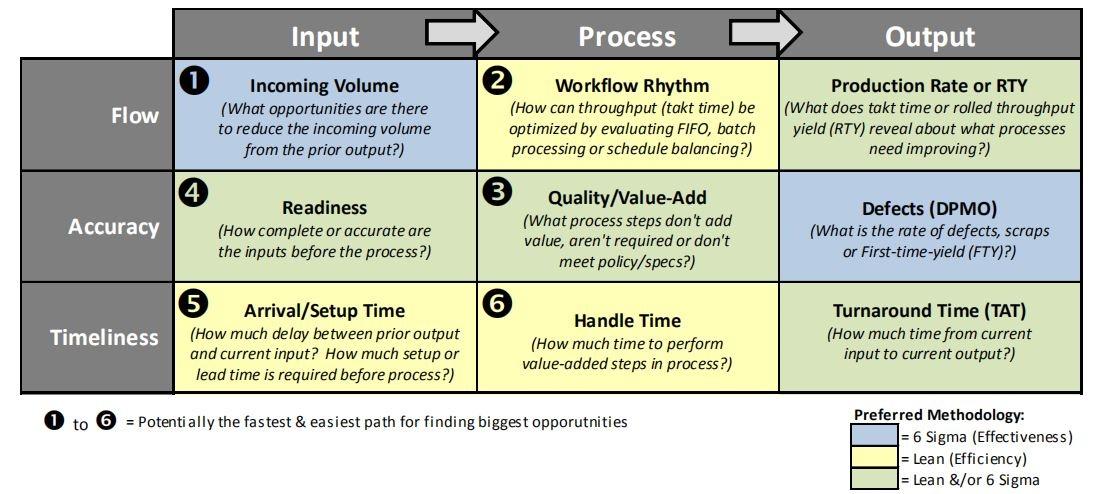
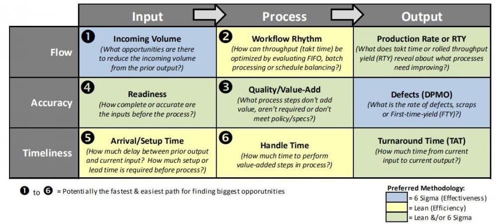
Lean Six Sigma is a process-focused strategy for achieving new levels of performance throughout any company. We need to focus on a process as a system of inputs, activities, and output(s) to provide a holistic way to all the factors and the method they interact together to create value or waste. Many products and services, when used productively, are also processes. An ATM takes account information, personal identification number, and money and processes a transaction that dispenses funds or an account refill. A computer can take inputs, energy, and software to process a Word document. A process diagram can represent this process model, often called an IPO diagram, for input–process–output. Definition of IPO-FAT Tool The IPO-FAT tool is a method of evaluating a business process to identify and prioritize potential possibilities. It explores the Inputs, Process, and Outputs (IPO Flow) of a business area from three perspectives: 1) Flow, 2) Accuracy, and 3) Timeliness. It is often used when a business area has several problems with potentially inter-related root causes. It is not immediately known what order to focus on the foundation causes and problems. It can even be accustomed to find opportunities during a business area by exploring the inputs and processes in this business area from different perspectives. Finding and Prioritizing Six Sigma Projects with an IPO-FAT Tool A different approach to finding hidden project possibilities is to choose a team of specialists and run through an IPO-FAT tool. This tool encourages a team of subject matter experts to analyze everything in their business area that runs within their Input > Process > Output (IPO) model and explore them from three different prospects: Flow, Accuracy, and Timeliness (FAT). Applying this approach allows the team to focus their reasoning and brainstorm into specific areas that will reveal hidden possibilities. A team of experts who works through this tool tends to become energized in finding all possible opportunities to improve it. Once all possible ideas are distinguished, the tool also correctly guides the team to prioritize those possibilities. It also helps the team to assume if the projects will likely be using tools that are more adapted toward Lean or Six Sigma or a combination of them. Developing a project Strategy using IPO-FAT tool The strategy for using this tool would be the following: Identify and explore opportunities using the IPO-FAT tool and brainstorming with the team. Pilot and implement improvements in the office or workshop. Build the necessary control to measure and sustain improvements over time. Advantages of using an IPO-FAT tool The IPO-FAT tool is a method for evaluating a business area to evaluate and prioritize potential opportunities. As opposed to the QFD that prioritizes all existing and known opportunities, the IPO-FAT method can help a team to identify new and different opportunities that do not necessarily have been previously considered. The IPO-FAT tool is used more effectively when a business area has several problems, with potentially severe and interrelated root causes. It is not immediately known what order to target the root causes. It can also be a very effective method of building and communicating the project strategy. The IPO-FAT tool also identifies the priority for each opportunity and the Lean or Six Sigma methodology to use. The color of each box helps us identify the work methodology and improvement that best suits each element. The idea of using this tool would consist of generating brainstorming within our work team so that it would serve to talk individually about each specific cell to find opportunities for improvement in each one of them. Example: A small BPO believes there are problems with its hiring process. Several of the junior technicians that have been hired remained at the company for less than a year. Which is a high cost to the company since recruiting and training new technicians is time-consuming and expensive. The HR manager decides to put together a group of people with extensive experience hiring new technicians. One of their first assignments is to produce an IPO-FAT model of the hiring process as per the below; Input ➠ Process ➠ Output Flow Resumes / Recommendations Interviews / Diagnostic test Job filled Accuracy Credit reports/ Academic records Psychologist review/ Problem-solving exercise Six-month job performance rating Timeliness Portfolio of Job Hiring manager assessment Job satisfaction review Used correctly, the IPO-FAT Model offers an efficient way to both analyze and document the critical aspects of a transformation process.
-
What is Multicollinearity? Multicollinearity is a known statistical event in which two or more variables in a regression model rely upon the different variables to be linearly predicted from one other with a significant degree of accuracy. It is generally used in observational investigations and less popular in empirical studies. An easy way to understand Multicollinearity is as follows; No Multicollinearity: In the following diagram, we can observe that Xs don't overlap with each other and have a mild correlation with Y. Moderate and Extreme Multicollinearity: On the below-left diagram, there is mild overlap among the predictors. We can still measure each predictor's unique effect on Y—those are the yellow, red, and blue sections. The orange and purple parts will not be included in the Type III regression coefficients. The coefficients don't give the full picture of each predictor's effect on Y. But in the right diagram, the overlay between X1 and X2 becomes so intense that it can induce the model to have estimation problems and gives a perfect example of Multicollinearity. This model tries to determine each predictor's unique effect on Y, but there isn't enough individual information about X1 and X2 to calculate it. When Multicollinearity becomes perfect, we find the two predictors are confounded. We cannot separate the variance from one another. Types of Multicollinearity There are four varieties of Multicollinearity: Perfect Multicollinearity – It exists when the independent variables within the equation predict the absolute linear relationship. High Multicollinearity – It refers to the immediate correlation between the two or more further independent variables that are not ideally correlated. Structural Multicollinearity – Each researcher himself causes this by inserting various independent variables within the equation. Data based Multicollinearity– It's originated by experiments that are inadequately designed by the researcher. Causes of Multicollinearity Autonomous Variables, Change in the Variables' parameters do that a little change in the variables; there is a notable impact on the result & data Collections refers to the sample of the selected population is taken. Examples of Multicollinearity Example #1 Let’s assume that XYZ Ltd, a Quality Analyst, is being hired by a pharma company to provide research services and statistical analysis on India's diseases. XYZ Ltd has selected age, height, weight, health, and profession as the prima facia parameters. There is a multicollinearity situation within the above example since the independent variables selected for the study are directly correlated to the results. Hence, it'd be advisable for the researcher to customize the variables first before starting any project since the chosen variables will directly impact the outcomes. Example #2 Let’s assume that XYZ Ltd has been appointed by Tata Motors to learn the sales volume of tata motors are high within which category in the business. In the above example, firstly, independent variables are finalized based upon which the research requires to be completed. It can be a monthly income, age, brand, the socio-economic class. It means only that data is going to be selected, which can fit the whole of these tabs to figure out how many people can purchase this car ( tata nano ) without even gazing at the other vehicle. Example #3 Let’s Assume that XYZ Ltd is appointed to submit a report back to understand how many people under fifty are prone to heart attacks. For this data collection, the parameters are age, sex, and medical records. In the above example, there's Multicollinearity that has occurred. The independent variable “age” must be tweaked to age under fifty for inviting applications from the general public so that the persons who are more than fifty years of age automatically get separated. Advantages Below are some of the benefits of Multicollinearity Linear Relationship between the Independent Variables within the equation. Very useful in statistical models and research papers prepared by the research-based corporations. Direct impact on the specified result. Disadvantages Below are some of the Multicollinearity disadvantages In some circumstances, this problem would be resolved by collecting more further data on the variables. Incorrect use of model variables, i.e., the researcher may overlook to use them whenever needed. Inserting two same or identical variables in the equation like kg and ml in weights. Adding a variable in the equation which is a combination of 2. It isn't effortless to perform calculations since it is the statistical method and requires scientific calculators to execute. Summing-up Multicollinearity is one of the foremost preferred statistical tools often utilized in regression analysis and statistical analysis for extensive databases and the desired yield. All major corporations have a separate analytical department in their company to perform simple statistical regression analysis about products or people to implement a strategic outlook of the market to the management and help them plan their long-term strategies. The Graphical presentation of the report gives the reader a clear idea of the direct relationship, accuracy, and performance. If the analyst's goal is to know the independent variables within the equation, then Multicollinearity will be a significant problem. The researcher has to do the desired changes within the variables at stage 0 itself; alternatively, it should have a tremendous impact on the results. Multicollinearity can also be accomplished by examining the correlation matrix. Remedial measures play a vital role in resolving the problems of Multicollinearity.
-
Andon System The origin of the “Andon” word in Japanese comes from the utilization of traditional lighting equipment employing a burning lamp made out of bamboo and paper. This “Andon” idea translated for manufacturing in Japan. The “Andon” became used as a proof to spotlight an anomaly (i.e., a flashing light). This signal would amplify potential defects in quality. When an error was suspected, an indication board would display a sign to the precise workstation having an issue. The signal event would also show that it stopped the system for the defect and expected the matter to be resolved. Ending an operation when an error was suspected originates from the initial Toyota Production System. The thought behind Jidoka is that by stopping the system, which helps to find a root cause against letting the defect move further down the road and be unresolved. Andon Cord Taiichi Ohno established a radical innovation when he went back to Toyota. At each step of the production line, he placed a rope called the andon cord. Ohno instructed the workers that if they saw a problem, they must immediately pull the cable, which might slow or stop the road so engineers, line workers, and even suppliers could confer and rectify the error. Electronic Andon Board Workshop leaders must be kept up on how smoothly things are moving into their workshops. The earlier they learn of abnormalities or other problems in their workshops, the earlier they will analyze the case and rectify it. Andon (alarm lights) makes an excellent tool for alerting workshop personal and other supervisors to identify problems on the factory floor. Andon is a unique lamp that illuminates issues within the factory. There are four types of andon given in the below figure. 1) Paging Andon Paging andon are often accustomed request supplies of parts for the assembly line. When parts are near to run out at a process, the operator sends out proof that lights the andon. Which also notifies those that operate the parts supply system. The suppliers’ quick movement around the factory in collecting and supplying parts is additionally called “mizusumashi” or beetle. There are two kinds of “whirligig beetle” techniques. One is that the “hire” method, during which a bunch of andon page the carts used for supplying parts. The different technology is that the “taxi” method during which dispersed andon page the carts. The below figure illustrates the “hire” method for paging andon. 2) Warning Andon Warning andon is mainly used on assembly lines and will differ depending upon the length of the road. On short assembly lines, people tend to use “aeroplane andon.” Like the attendee call buttons on passenger seats in commercial aeroplanes, each process within the production line has an emergency call button. When one in every one of these buttons is pressed, the andon board for the mechanical system lights up and shows which process’s button was pressed. Warning andon is mainly used on assembly lines and will differ depending upon the length of the road. On short assembly lines, people tend to use “aeroplane andon.” Like the attendee call buttons on passenger seats in commercial aeroplanes, each process within the mechanical system has an emergency call button. When one in all these buttons is pressed, the andon board for the line lights up and shows which process’s button was pressed. The following may be a detailed description of how “aeroplane andon” is used. The above form of warning andon configuration works tolerably when the mechanical system is brief enough to see all of the andon, processes, and operators. However, longer lines make it impossible to determine the full range and every one of its operators. During this event, the andon are lined up in an exceedingly centralised board, as shown in the figure. 3) Operation Andon Operation andon indicate machine operating statuses. When the device has been stopped, the operation andon shows the explanation for the stoppage. 4) Progress Andon Many assembly lines have short pitch times, like 1- or 2-minute tact intervals. When a range has such a brief tact time, the progress of operations is straightforward to look at just by monitoring the rhythm. It is tough to sense delays in lines with longer tact times, like 10 or 20 minutes. Progress andon enable line operators to measure the progress of their operations. Most progress andon is divided into ten equal sections. Still, the most ideal is to own the assorted stages of the operations correspond in a very level manner to the varied andon sections. When the progress andon board has changed within the case of conveyor lines, the limit switches can also detect the response.
-
Queueing Theory Many of us have encountered the frustration of having to await in line. Unfortunately, this experience remains to be popular in crowded, urbanized, “high-tech” environment. We remain in line in our automobiles in traffic jams; we await on-hold for an executive to pick up our phone calls; we wait in line at fast-food joints and we wait in line at outlets to check out. We, as consumers, hardly like these delays, and the organizers of the establishments at which we await also condemn us to wait, since it may yield them business. Why is there awaiting? The claim is straightforward: There is higher need for service than there is a resource for service possible. Why is this so? There may be many reasons; for example, there may be a deficit of servers, it may be infeasible economically for a business to furnish the level of service necessary to limit awaiting, or there may be a space limit to the amount of service that can be provided. We can take these limitations out with the amount of finance, and to know how much service it should then make available, one would need to know claims to such challenges as “How long must a consumer wait? and “How many of us will form within the line?” Queueing theory seeks to clarify these queries through comprehensive analytical analysis. Characteristics of Queueing Systems A quantitative interpretation of a queueing system involves an analytical model of the elemental processes. Most times, six primary characteristics give an acceptable description of the process: Arrival pattern of customers Service pattern of servers Number of servers and service channels System capacity Queue discipline Number of service stages Problems in a Queueing System The ultimate aim of the analysis of queueing systems is to understand the behavior of their underlying processes so we can make informed and intelligent decisions in their management. We can identify three types of problems in this process. Behavioral Problems Statistical Problems Decision Problems Queue discipline / Service disciplines Queue discipline refers to the manner in which it selects customers for service when a queue has formed. (1) First-come, first-served (FCFS) or First in first out (FIFO) Most popular is the first-come, first-served FCFS rule; which is static because no information other than position in line is used to identify the next customer for service. So it serves the customers in the order they arrive. (2) Last come, first served (LCFS) or Last in first out (FIFO) Last come, first served (LCFS), applies too in many inventory systems, because it is less complicated to achieve the closest items which are the last in. The last customers are going to be served first. Goods inside a van usually arranged specified the primary item enter the truck are going to be delivered last. Stacks of pancakes are eaten from the last item on the highest. (3) Processor Sharing (PS) Processor Sharing (PS) within which the server processes all customers (or jobs) simultaneously but works at a slower rate on each job supported the quantity within the system (this is typical in computer systems). Processor sharing discipline is incredibly popular in computers, communication systems and networks. Queueing systems with processor sharing system represent the acceptable models for sharing the resources, e.g., peripherals of a computer or a bandwidth of delivery systems. (4) Priority They will serve particular types of selected consumers early. Business class passengers will join the aircraft early before the economy class. Patients with extreme cases will be served first in the emergency room ahead of ordinary sickness. (5) Shortest job first (SJF) The scheme implements a shortest job first (SJF) in the queue. Shortest Job First (SJF) is also a datum in which we prefer the refining of carrying the smallest execution time for the next execution. This scheduling method can be preemptive or non-preemptive. It significantly reduces the average awaiting time for diverse processes awaiting execution. (6) Preemptive shortest job first (PSJF) In Preemptive SJF Setting, they put activities into the ready queue as they come. A process with shortest burst time begins execution. If a process with a shorter burst time arrives, the current process is taken out or preempted from execution, and it allots the shorter activity to the CPU cycle. (7) Shortest remaining processing time (SRPT) The Shortest remaining time interval discipline (SRPT) is perfect with relevancy minimizing steady-state mean flow time. Under this rule, when employment is to be selected from among those waiting, we choose the one with the bottom remaining interval. An arriving job will preempt the task in process id and providing the interval of the new arrival is a smaller amount than the remaining time interval of the task than in commission. Queue dicipline flow chart:
-
What is a Venn diagram? John Venn who coined the Venn diagram in 1880 was an English mathematician, logician and philosopher. He also called them Euler diagrams after Leonhard Euler, who checked them out a century before. This is an extraordinarily flexible technique of combining circles useful for identify the contrast between overlapping areas of uniqueness. This representation of how groups relate to one another are generally called “sets”. There must be minimum two number of circles, and also the probability of maximum for many uses is 3. However, there can be more shapes in a diagram based on the number of sets and such a diagram can use unique shapes as per the below figures. Once the circles are interlocked, they reveal discrete areas (in which there’s no overlap). These again compared with the qualities of the overlap areas. Where there are three circles, the central area will show multiple overlapping characteristics. The volume of areas revealed should ideally be kept approximately proportional to their percentage of overlap, in order that the extent of the basic is visually representative. When to use a Venn diagram We often see Venn diagrams in mathematical contexts, but businesses and professionals also use these forms. In each case, the person creating the illustration wants to resolve a controversy, make a crucial decision, predict probabilities or visualize or understand how multiple sets or objects relate to at least one another. Instances when a Venn diagram might be useful in Business Market analysis: A Business Analysis Practitioner might use a Venn’s diagram for basic market research. While using two or more sets of data members within the meeting observe overlapping areas, as those areas contain the business’ target market. Competitor Analysis: A firm might use Venn diagrams to match themselves for their products to their competition. Most times, the business of using the Venn’s diagram may only use two sets of data to work out how they differ from the competition and find any similarities. This helps the business discover what advantages they have already got and specialize in areas where they will make improvements. Product Comparison: Alternatively, a business analyst may create an example with overlapping shapes to weigh the advantages of two or more work ideas. Within the same way that the business analyzes the market, a business analyst will weigh any differences and similarities two or more ideas share to work out which features of a product are the foremost desirable, as shown within the overlapping areas. Decision-Making: The same principles for analyzing two or more product ideas apply to a business’ general decision-making process. Advantages of a Venn diagram A Venn diagram provides the following advantages: It allows an analyst to visualize concepts and relationships between two or more data. It defines complex information into terms that an analyst can understand and represent easily. It helps an analyst to better keep information. Venn diagram symbols “∪ ” Union of two sets. An entire Venn diagram represents the union of two sets. “ ∩ “ Intersection of two sets. This type of intersection shows what items it shares between categories. “ Ac “ Complement of a Set. The compliment is that they don’t represent whatever in an exceedingly set. An classic example of Venn Diagrams; In a survey of the fast-food preferences of three people. We assign these three people as A, B, and C, showing which restaurants they enjoy. A three-circle diagram mostly covers every possibility that they’ll choose a restaurant by one, two, three or no respondents. Scores for Restaurant Survey Results: Restaurant A B C McDonald's 1 0 1 Wendy's 1 1 0 Burger King 0 0 0 In-N-Out 0 1 1 Taco Bell 1 0 1 KFC 0 0 0 A&W 0 0 0 Chick-fil-A 1 1 1 While creating the Venn diagram representing the results, we observed that in A∩B, we’ve Wendy’s because respondent A and respondent B both chose it. Few fast-food restaurants like Burger King, KFC & A&W remain outside the diagram but exist within the universe. Since all the three people have chosen Chick-fil-A, the intersection of all three represents A∩B∩C. So the final Venn diagram will represent in the below figure.
-
Heijunka is one of the underlying concepts of the Toyota Production System (TPS), shown in below Figure. Levelling any work isn’t easy, but it's the inspiration of Toyota’s celebrated production system. The Japanese coined this idea as Heijunka, extending the concept to include the requirement for ‘standard work’ – the processing of work consistently. The TPS consists of two columns – Jidoka and Just- in-Time both are supported by Heijunka. Heijunka involves production and smoothing processing on using levelling, sequencing and standardising . For a process to run smoothly and consistently with many forms of output, it's to average, not just in volume, but also in kinds. So, we'd like to process the unique customer order, as an example, supporting the date they’re received instead of handling the more straightforward cases first and allowing the harder ones to create up and be delayed. Heijunka provides the foundation and involves the subsequent elements; Levelling involves smoothing the amount of production to cut back variation, the trials and troughs that may make planning difficult. Levelling pursues forestall ‘end-of-period’ peaks, where production is initially slow at the start of the month, then again quickens within the last days of an acquisition or accounting period, as an example. Sequencing involves mixing the styles of work processed. So, as an example, when putting in new loans, the loan being processed is mixed to raise match customer demand and help ensure applications are actioned in date order. Managing this method could also be easier in manufacturing, where a producer may hold a little amount of finished goods to reply to the fluctuation in weekly orders. Keeping a tiny low stock of finished goods at the very end of the worth stream, near shipping, this producer can level demand to its plant, and to its suppliers, making for more efficient utilisation of assets along the complete value stream while still meeting customer requirements. Stability and Standardisation is the third strand of Heijunka. It strives to scale back variation within the way we do our work, which highlights the importance of ‘standard work’, of following a typical process and procedure. This method links well to the concept of process management and also the control plan, where the method owner continuously seeks to search out and consistently deploy best practice. In the spirit of continuous improvement the ‘best way’ of ending this method will keep changing, because the people within the process identify better ways of doing the work. Concepts like Heijunka can’t be implemented overnight – as an example, Toyota has taken a few years to attain the successful application of levelling and spreading the load, but is now a paradigm for the growing awareness of lean-thinking principles within the contemporary world.

-
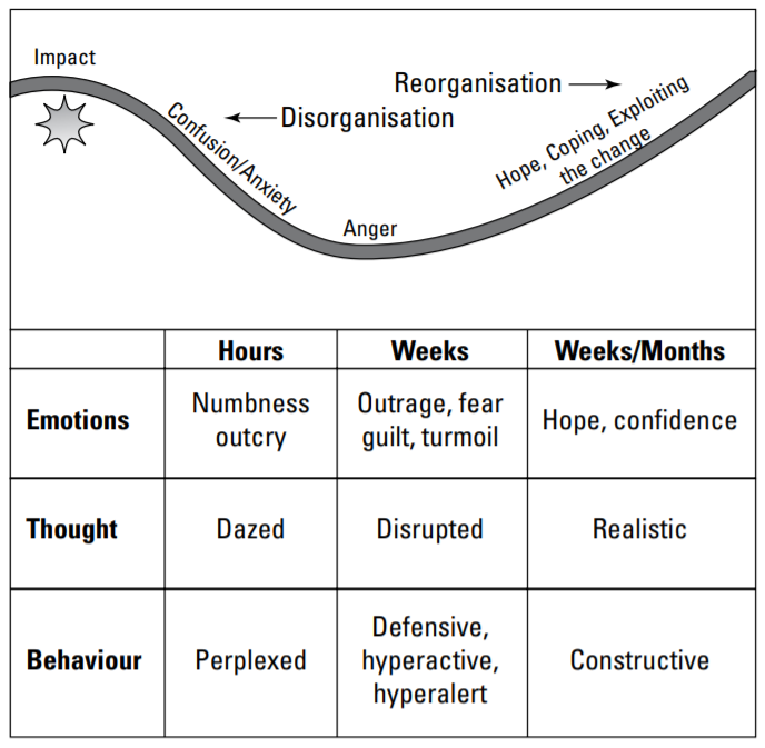
Kubler-Ross model, involving the following stages: shock, denial, awareness, acceptance, experimentation, search and integration. The below figures illustrate how people typically react to change. Lean Six Sigma projects are about changing things for the better. We’re trying to improve processes–so change is inevitable. Blindly hoping that doing the same things in the same way will magically improve your product or service is head-in-the-sand (HITS) thinking. This is what all the organisations learn from the current pandemic situation.
-
Hi! VK Sir, I am Sourabh currently working in Tourism industry. I had done my green belt certification. Now I am about to start my black belt soon. I am also aspire to become a Lean Practitioner/Lean Guide. How Lean program will help in Tourism Industry. Warm Regards, Sourabh Nandi