
Topics
-
OpenAI, which is expected to need about 3,200 megawatts (MW) of power for its new facility, has agreed to provide up to 1,000 MW to the Southern Co subsidiary Georgia Power's systems in times of high demand. View the full article
-
The affected startup, Hugging Face, said it had turned to Zhipu AI's open-source GLM-5.2 model last week to analyze data from the hack after leading US AI models declined the task, unable to distinguish between a defender and an attacker. View the full article


Leaderboard
-
Sriya Chatterjee
Members1Points10Posts

Popular Content
Showing content with the highest reputation on 12/22/2023 in all areas
-
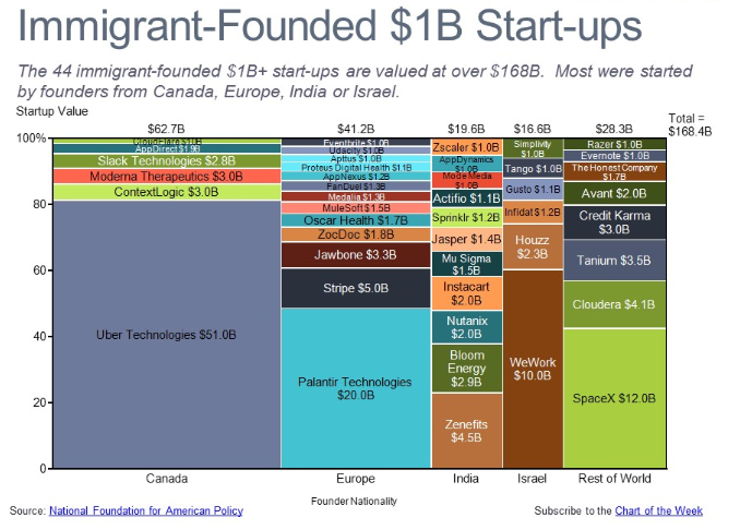
1 pointA Marimekko chart, also known as a mosaic plot or Mekko chart, is a visual representation of categorical data with two or more dimensions. It uses stacked bars of varying widths and heights to depict both proportions within categories and total category contributions. Imagine a Venn diagram where each segment expands and shrinks based on its share. Advantages: Multidimensional insights: Shows relationships between two or more variables simultaneously, revealing nuances hidden in simpler visuals. Flexibility: Handles diverse data types, from percentages to counts, and accommodates various color palettes for effective communication. Comparative power: Identifies outliers and pinpoints dominant categories effectively, highlighting variations within and across dimensions. Engaging presentation: Visually appealing due to its unique layout and color variations, captivating the audience's attention. Disadvantages: 1. Can turn crowded easily and hence, become difficult to interpret. 2. It's usually good for two-dimensional comparisons. 3. Small variations in percentages might get interpreted into visually important changes in bar sizes, potentially misguiding us. 4. Creating this chart usually needs specialized software, making them less accessible. Examples where it can be used in a Six Sigma projects : 1. For visualizing defect types and their distribution across product lines, production stages, or shift times. 2. For showing the contribution of various process steps to the overall variance. 3. Analyze client satisfaction or purchase behavior across demographics, product categories, or regions. 4. For comparing the result or impact and feasibility of different improvement projects based on cost, lead time, and potential benefit.

 1 point
This leaderboard is set to Kolkata/GMT+05:30