
Topics
-
OpenAI, which is expected to need about 3,200 megawatts (MW) of power for its new facility, has agreed to provide up to 1,000 MW to the Southern Co subsidiary Georgia Power's systems in times of high demand. View the full article
-
The affected startup, Hugging Face, said it had turned to Zhipu AI's open-source GLM-5.2 model last week to analyze data from the hack after leading US AI models declined the task, unable to distinguish between a defender and an attacker. View the full article


Leaderboard
-
Dimple Tiwari
Lean Six Sigma Black Belt1Points10Posts

Popular Content
Showing content with the highest reputation on 10/29/2022 in all areas
-
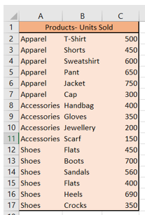
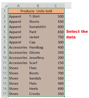
1 pointTreemaps: Data Visualization of Complex Hierarchies Summary: A treemaps is a complex, area- grounded data visualization for hierarchical data that can be hard to interpret precisely. In numerous cases, simpler visualizations similar as bar maps are preferable. Treemaps are a data- visualization fashion for large, hierarchical data sets. They capture two types of information in the data (1) the value of individual data points;( 2) the structure of the scale. Description Treemaps are visualizations for hierarchical data. They're made of a series of nested blocks of sizes commensurable to the corresponding data value. A large cube represents a branch of a data tree, and it's subdivided into lower blocks that represent the size of each knot within that branch. A hierarchical tree diagram, showing the structure of the S&P 500. This structure is the basis of the treemaps shown below. Key Uses of Treemaps Treemaps are frequently used for deals data, as they capture relative sizes of data orders, allowing for quick perception of the particulars that are large contributors to each order. Color can identify particulars that are underperforming (or overperforming) compared to their siblings from the same order. Therefore, FinViz’s Chart of the request is an enduring illustration of treemaps it allows druggies to identify companies that are doing better than their assiduity peers, indeed though their overall stock value may be relatively small. Treemaps work well when your hierarchical data has 2 main confines that you want to visualize: A positive quantitative value, which will be expressed as the area of the cube (Because area cannot be negative, you cannot use treemaps for imaging variables like gain/ loss, which can have both positive and negative values.) A categorical or alternate quantitative value, which will be expressed as the color of the individual rectangles. However, it’s explosively encouraged to use only one color ( if all the figures are positive) or two colors( one for negative and one for positive), and vary the intensity of the color to express precise value, If color is used to express a quantitative value. As humans don’t perceive colors to have an essential order, we explosively recommend that you don't use multiple colors to represent a range of figures. Here are a few guidelines for creating usable treemaps: Visually distinct borders around advanced- position orders help druggies identify the top- position groupings. High- discrepancy textbook ensures that people can read the markers inside the treemap blocks. A visually distinctive named state, reached when druggies hang ( or valve) a cube, helps druggies confirm that they're looking at the right data point. Additional detail about a named cube (appearing in an overlay), similar as the name, value of the variables allows druggies to drill into the data. Illustration Below is a treemap where the blocks represent metropolises and are sized and colored by the column Deals. In this case, the aggregation system Sum was named for the Deals column. This treemap only contains data on one position. The sizes and positions of the blocks, as well as the coloring, indicate that Casablanca and Cannes have the loftiest total sum of deals, while Hong Kong and Bangalore have the smallest. To compare sum of deals for entire countries or mainlands, you can add other situations to the treemap scale without losing the information about the individual metropolises. In the treemap below, the columns Country and Continent were added to the treemap scale. The blocks are now nested. Each cube that represents a mainland consists of blocks representing countries within that mainland. Each cube that represents a country consists of blocks representing metropolises in that country. It's still possible to see which existent metropolises has the loftiest sum of deals, but it's now also easy to see that Africa is the mainland with the loftiest total sum of deals, and that Asia is the mainland with the smallest total sum of deals. Since the blocks are now nested, the blocks aren't in the same positions presently. still, each position of the scale is still organized according to the qualified algorithm. For illustration, the size of the cube representing India is decided by the sum of the areas of the two blocks representing Calcutta and Bangalore. The size of the cube representing Asia is in turn decided by the sum of the areas of the blocks representing China and India. To take a near look at a certain part of the treemap, you can navigate from a advanced scale position to a lower one. Click on the scale title of the position you want to navigate to. In the illustration below, the treemap is shown as it appears when you navigate down to the country position India The upmost scale title now displays the scale situations from the top position to the position you're presently viewing. To navigate overhead in the scale, click on the position you want to navigate to. You can hide both the scale heads and the markers in the treemap at any time from the right- click menu of the visualization. All visualizations can be set up to show data limited by one or further markings in other visualizations only( details visualizations). Treemaps can also be limited by one or further filtering’s. Another volition is to set up a treemap without any filtering at all. See Limiting What's Shown in Visualizations for further information. Treemap in Excel Treemaps are a good option to show hierarchical data in a compact graph. Microsoft Excel enables the stoner to produce, style, and customize a treemap in a many twinkle. Treemaps are generally used for displaying scripts similar as stylish- dealing particulars, the population of a specific position, parochial deals, and analogous parent- child structured data series. This tutorial will discover about Treemap Chart, the step- by- step system to produce this map, its advantages and disadvantages, how to customize and format the Treemap map. "A Treemap chart in Excel provides a hierarchical view of the dataset and designs simple spot patterns, for example, which products are the best seller for a company. In this chart type, rectangular boxes depict the tree branches, and each sub-branch is represented as a smaller rectangle." In other words, Treemaps are employed to work with hierarchical data, and this data contains one- to- numerous connections. Treemaps are useful for depicting particulars similar as stylish- dealing products, the population of any position, parochial deals, and analogous data containing parent- child structuring. For illustration, if in the below map you'll notice look at the deals of a product grounded on, also the quarter is the parent with three children (the months in the quarter), and each order has either four or five children, corresponding to the products. A representation of Treemap is given below: As shown over, a Treemap map incorporates nested, coloured blocks that can be considered branches. Every item specified in your dataset is represented by a blockish box wherein the value of the data determines the sizes of each box. These characteristics of Treemap make it easier to see the groups and sizes. Because the colour and size of blocks are generally identified with the tree structure, this map is named Treemap. Treemap maps are generally used when the stoner wants to punctuate the donation of each item to the whole dataset within the scale. The advantages of using a treemap include an easy system to spot patterns, parallels, and irregularities and a structured way of displaying corridor of a whole. Basics of Treemap A treemap chart primarily consists of 3 sections which are given below: Plot Area This is the part where the entire visual representation of the graph transpires. As you can see each cube of the treemap is shadowed by the loftiest- position orders, and the sub-category(sub-branch) blocks for each item is colored commensurable to the size of numerical numbers they each contribute to the dataset. Chart Title This section represents the title of the map. It helps you give your map a descriptive name, thereby helping your observers fluently understand the visual representation. Legend The legend is the part of the chart that differentiates the colorful data series where each color is represented by one of the loftiest- position orders (branches). Applicable use cases for treemaps Treemaps are the stylish choice if your dataset falls into one of the below- given scripts • If you want to fantasize a part- to-whole relationship amongst numerous orders. • If the exact comparisons between the orders aren't important. • If the data series is hierarchical. Limitations of Treemap Charts Like every map type, there are limitations and times when other map types should be used · A treemap map doesn't accommodate data sets that vary in magnitude. · All values of the quantitative variable that represents the size of the cube have to be positive values. Negative values aren't respectable. · Since the data points are depicted in the form of blocks with no other sorting options, it follows that they take up space. In addition to the spatial constraint, readability can be a little more delicate as it's easier to read long and direct data plots than wide and large bones. This also makes it delicate to publish the treemap. · Some treemaps take a lot of trouble to induce, indeed with technical programs. · occasionally treemaps don't display hierarchical situations as sprucely as other maps used to fantasize hierarchical data, similar as a sunburst illustration or a tree illustration. · Despite all of these limitations, treemaps are one of the most visually suggestive tools to represent data and give information on aspects that are hard to capture using other map forms, making them an necessary tool in data analysis. How to produce a Treemap? Creating Treemap in your Excel worksheet is veritably easy and simple. For illustration, in the table below, you can see we've taken a simple three- column dataset. In the first column, we've specified the order of our best- dealing products. The products within each order are specified in the alternate column. And at last, the units vended are mentioned in the third column. Follow the below given steps to quickly create a Treemap: Select the dataset. Go to the Excel ribbon, click on the Insert tab, -> Hierarchy chart option. As a result, you will notice that the Treemap chart will be immediately displayed in your worksheet. The four rectangles are grouped with their categories, wherein the size of the rectangular boxes is determined by the values provided to them. In the above screenshot, the Treemap has used nested, colored rectangles which you can think of as the branches. Every item in the dataset is represented by a rectangle and the sizes of each correlate to the number data. Note: You can also use the Chart Design and Format tabs to customize your Treemap chart's appearance and look and feel. Sometimes both these tabs are not activated. Click anywhere in the Treemap chart to activate those tabs. Excel automatically uses a different color for each of the top level or parent categories. However, you can also use the layout of the data labels to different between the different categories of data.Right-click one of the rectangles on the chart > Format Data Series. Advantages of Treemap Charts The biggest advantages of treemap maps include · The capability to identify patterns and discern connections between two orders or two rudiments in a hierarchical data structure. also, sub-structures or sub-elements are represented. · Application of space when rendering knockouts of thousands of data points, with the capability to drill down as demanded. · Directly displaying multiple rudiments at formerly, including “ part to whole ” rates. This makes visualization of data easy. · Uses size and color keys to fantasize colorful attributes. orders and subcategories can be color- enciphered to match the parent orders. For case, electronics deals in different branches would be tones of blue, while cabinetwork deals could be tones of unheroic. Summary While treemaps can be useful for imaging certain types of complexes, hierarchical data sets, they are frequently hard to interpret. However, visually separate the different high- position orders, avoid using multiple colors to express numeric values, If using a treemap. Last and foremost, understand what your druggies need to do with your data and consider whether other visualizations (similar as a bar map or a smatter plot) could replace or compound the treemap.


 1 point
This leaderboard is set to Kolkata/GMT+05:30