
Topics
-
Fifty-five women engineering students completed an AI bootcamp focused on rural Karnataka. Participants developed AI-based solutions after visiting villages and conducting field interviews. The She Innovates bootcamp partnered with several organizations to achieve its goals. This initiative aims to boost women's participation in AI and entrepreneurship. It encourages AI applications for rural development and community-focused sectors. View the full article
-
Besi's quarterly orders more than doubled, fueled by AI and hybrid bonding technology. The company saw increased customer adoption of its advanced chip packaging solutions. Demand for AI applications continues to drive growth in data centers. Besi anticipates revenue growth between ten and fifteen percent. This strong performance aligns with other semiconductor sector reports. View the full article


Leaderboard
-
Mohamed Asif Abdul Hameed
Fraternity Members1Points78Posts -
Natwar Lal
Members1Points50Posts


Popular Content
Showing content with the highest reputation on 07/02/2019 in Posts
-
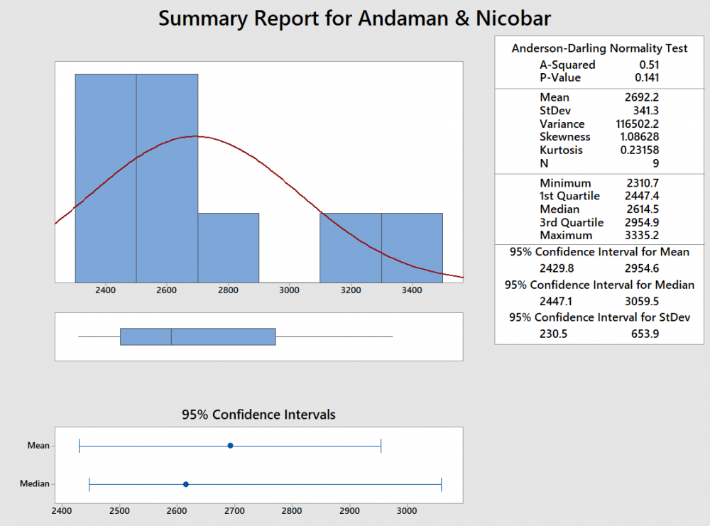
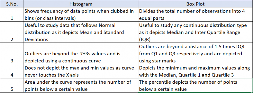
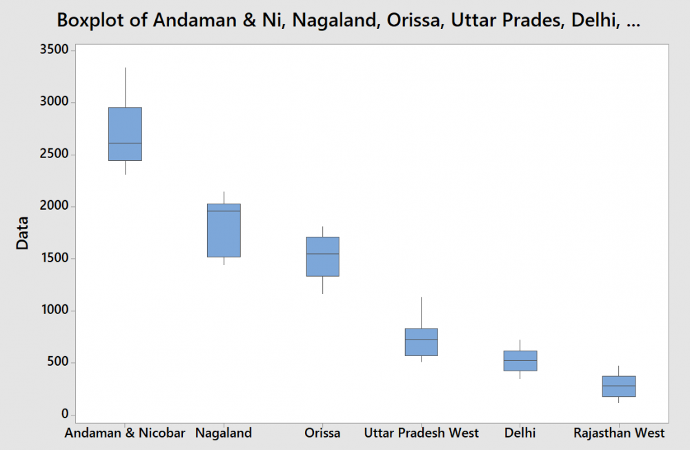
1 pointVisuals are always easy to review and summarize the content. This is precisely the reason a graphical summary is done rather than reading data in multiple rows or columns. What is a Box Plot? The most commonly used method for graphical summary is a frequency distribution plot like a histogram (for continuous data). The same data can also be plotted using a box plot which is just another way of looking at the histogram. Box Plot is a top view of the histogram. I took the annual rainfall data (from the GoI website for Andaman and Nicobar) and below is the graphical summary from Minitab. If you notice, the same data is represented in a histogram and a box plot. Even though both graphs represent the same data, the two are actually different. I have tried to summarize the differences below In addition to the insights or usefulness of the Box Plot as captured in the above table, Box Plot can be used in the following scenarios as well 1. Compare data sets for the same metric (I have provided an example below) even when a project is not being done 2. Used to identify the problem in Define phase (too much spread or process shifted to one side) 3. Used to baseline the process performance in Measure phase 4. Used to graphically compare performance of two or more sub-groups (units, departments, centers, shits etc.) in Analyze phase 5. Used to confirm the improvement in the Improve phase (spread will reduce or process is more centered) 6. Check for presence of outliers in data to ensure process control in Control phase In the below example, I considered the annual rainfall data for 6 regions (from the GoI website). Observations from the box plot 1. Clearly identifies the regions which get higher rainfall as compared to the others. A&N receive the maximum annual rainfall while Rajasthan West receives the lowest 2. Rainfall in Rajasthan, Delhi, Orissa and UP West (if I ignore the slightly elongated whisker) is almost equally distributed across the range, while it is skewed in A&N (left skewed) and Nagaland (right skewed) 3. The variation in rainfall is the least in Delhi and Rajasthan West while it the max in A&N and Nagaland (given that the length of the box is highest for them) 4. There are no outliers in the data set Just for illustration, I added another year's data (hypothetically a drought year). Below is how the box plot changes. Now the box plot, adds an outlier (star mark) for all states except Rajasthan West (i had entered a value of 0, but still it did not consider it as an outlier). These star marks indicate the presence of a value which is different from the other values for the data set or in other words is an outlier. Box Plot identifies it and gives us a chance to investigate and do RCA to find out the reason (remember I had entered data for a hypothetical drought year where rainfall will be very less). I guess the limitations of Gauss' Normal Distribution Plot and Karl Pearson's Histogram led John Tukey to identify and start using a Box Plot :)
 1 point
 -
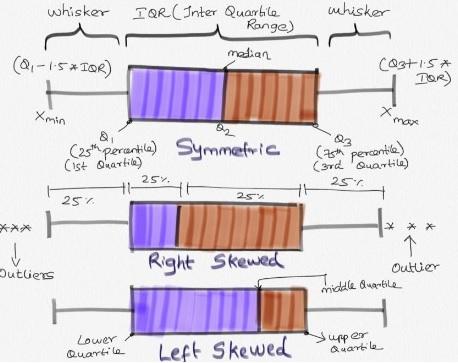
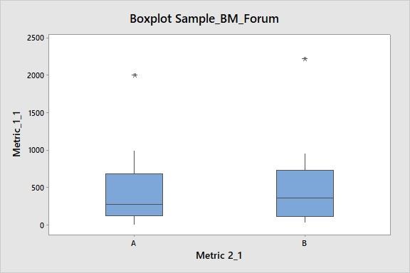
1 pointBox plot (box and whisker plot): This analysis creates visual representation of the range and distribution of Quantitative data (continuous data). It creates 4 Quartile groups. Quartile Group 1: Min - 25th Percentile (Q1) Quartile Group 2: 25th Percentile (Q1) - 50th Percentile (Q2, Median) Quartile Group 3: 50th Percentile (Q2) - 75th Percentile (Q3) Quartile Group 4: 75th Percentile (Q3) - Max In this, Q3-Q1 is Inter Quartile Range (IQR) Insights from Box-plot: Comparing multiple data sets (Categorical variable for grouping (1-4); Understanding Data Symmetry and Skewness * It gives spread of data points. Lowest(min) and highest(max) value in the data set. * It shows outliers (if any) present in the data. Outliers are values which is greater than 1.5 times of IQR away from 25th percentile or 75th percentile. * It clearly shows if the distribution is skewed (left or right. Refer to enclosed pic) * Median: This separates lower 50% of observations from the upper 50% of observations. * Box plot with groups, when we have further categories, we can use ‘categorical variables for grouping’, this helps us to identifying further distribution spread among the groups. Example Reference: This example is for Box Plot Graph with Groups. Group A and Group B Respectively. In this, it is clearly evident that there are outliers in both the graph. Group A is right Skewed. We will have more clarity on the distribution of data in both groups by visual representation.
 1 point


This leaderboard is set to Kolkata/GMT+05:30