

Anjali Nair
Members
-
Joined
-
Last visited
Everything posted by Anjali Nair
-
Tornado Diagram For project managers to evaluate project risks, a tornado diagram is a useful tool. A tornado diagram is a bar chart that graphically shows each risk's relative importance in descending order. This gives it a funnel-like appearance that resembles a tornado. These are helpful project management tools for determining risks and making decisions at various project stages. The risk with the largest spread is indicated at the top of the chart. The risk that requires the most consideration is this one. Tornado diagram in PMP: A bar chart called a tornado diagram aids project managers in performing a sensitivity analysis to ascertain the effects of various risks on a project. The project manager can make judgments on the highest impact items first because they are shown in descending order. Importance: Projects are continually growing in size and complexity. Project complexity keeps rising as firms expand and scale up. There are too many potential dangers for a project manager to be aware of. When used effectively, tools like tornado diagrams may show you where to focus your attention and what choices must be made in order to advance the project while assuming only acceptable levels of risk. How does a tornado diagram work The various project hazards are listed together with their possible benefits in a tornado diagram. Project managers will be able to prioritize tasks based on the severity of the risks thanks to this. How do you read a tornado diagram In a tornado diagram, dangers are listed according to decreasing importance. The size of the risk is shown on the left side of the chart, while the size of the potential profit is shown on the right side. The risks and rewards are shown on opposite side of a tornado diagram like the one shown above. On the left is a representation of the risk, and on the right is a representation of the payoff. As you can see, it seems like the risks and rewards are roughly equal. The danger and return of Risk 7 are the lowest. The risk outweighs the benefit. This risk is not worthwhile because it carries a greater risk than the potential gain. Even if it is successful, the payoff has little impact in the overall scheme of things. The top 3 or Top 4 options should receive more of your attention because they offer a greater payoff and hence call for more careful consideration. Additionally, they have a far higher amount of reward relative to the possible loss. This is not to argue that chances shouldn't be taken at the top. The chart is just one of the many tools you have at your disposal to evaluate risks. The chart tells you which options are more essential to you and how much time you should spend carefully weighing each alternative. The decisions that need to be made may rely on a number of other factors. Sensitivity Analysis Using Tornado Diagram Project risk management involves the usage of tornado carts. The goal of the study of sensitivity analysis is to comprehend risk in numerical terms. One of the techniques used in sensitivity analysis is the tornado diagram. These concepts are frequently used interchangeably since sensitivity analysis uses tornado diagrams so frequently. Depending on which type of chart suits you the most, the data for sensitivity analysis can be shown on a variety of different types of charts. The greatest risk is displayed at the top of a sensitivity analysis plotted on a tornado diagram. This analysis quantifies the risk's size and potential benefits. On the chart, longer bars denote increased sensitivity. Tornado Diagram Quantitative Risk Analysis Any project on which you work inevitably carries a number of hazards. Until you figure out how to prioritize them, it could be difficult for you to keep track of all these hazards. As a result, you should rate the risks based on their importance and degree of impact. Risks are accompanied by gains as well as losses. You run the risk of not receiving the required level of quality if you choose to work with a new vendor on a project in an effort to cut expenses. Calculating the risk's cost and corresponding reward is necessary. You can prioritize the risks based on their possible impact by placing them on a bar chart. You may manage risks and make quick decisions in the best interests of the project by using a tornado diagram to show the dangers. Risks and benefits are often commensurate in size. Creating a Tornado Diagram Template in MS Excel Tornado diagrams are simple to make in an excel sheet. 1. You will require a collection of risks in order to create a tornado diagram. Let's list 10 dangers. 2. Add two sets of values, with risks stated as negative values and rewards as positive values, to each item in the excel sheet. 3. Arrange the things in the manner depicted in the image below, based on the level of danger. 4. Construct a stacked bar graph. 5. Set the axis' formatting such that the labels are on the left. You should have a chart that looks like this:


-
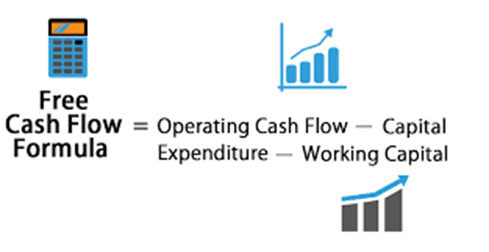
What Is Profit After Tax (PAT)? According to the Indian business laws each business unit is required to pay annual income taxes. Profit after tax is defined as business earning after the income taxes are deducted. It is consistently regarded as the company's total profit and the greatest strategy to provide a return. Operating income and other types of revenue, such as interest income, are included in PAT. Investors typically keep a close eye on a company's PAT in order to track changes over time. Thus, it serves as a valuation indicator that also influences a company's stock price. In other words, if you're wondering "what is profit after tax," it's the last sum that a company keeps after paying all of its taxes and debts and divides among its shareholders as retained earnings. How Profit After Tax (PAT) is important for a Company? The amount that a company and its shareholders can keep after taxes is known as profit after tax. In this regard, the following characteristics of this topic can help you comprehend it better. · PAT is a crucial financial metric that tracks the growth or decline of a company's retained earnings. · People frequently use it for margin research, especially when comparing businesses within an industry. It reflects an organization's capacity for transforming sales into profits. · By examining a company's PAT, investors can assess its ability to generate profits. · Businesses can utilise their PAT to determine whether or not they need to control their expenses. What is the Formula to Calculate Profit After Tax (PAT)? Profit Before Tax (PBT): This figure is arrived at by adding up all costs, including operating and non-operating. After then, it is taken out of the total revenue (operating and non-operating revenue). Tax rate: The taxation is based on PBT, and a company's tax rate is based on where it is located. You can better comprehend the Net Profit After Tax formula by using the following example: IABC Pvt Ltd generates $50,000 in sales per year. Its operating costs are 15,000 and its non-operating costs are 5,000, respectively. The current tax rate is around 30%. Particulars Amount Annual revenue ₹ 50,000 Operating expenses ₹ 15,000 Non-operating ₹ 5,000 Tax rate 30% Profit Before Tax (₹ 50,000 - ₹ (15,000 + 5,000) ₹ 30,000 Taxable amount (30% of ₹ 30,000) ₹ 9,000 Profit After Tax (₹ 30,000 - ₹ 9,000) ₹ 21,000 Thus, PAT of ABC Pvt Ltd is ₹ 21,000. What Is the Significance of Profit After Tax (PAT)? For the purpose of evaluating the development and capabilities of an organisation, the idea of Net Profit After Tax is important. Financial data showing a company's performance in terms of its financial developments is provided to the employers' internal and external management. The tax burden is already reduced by one factor, so business owners can consider how to increase their company's take-home earnings. A company's net income will rise if it operates in a sector that offers significant tax advantages. However, a company's net income will inevitably fall if the industry experiences unfavourable tax benefits. Regardless of the current tax legislation, business owners can compare their activities to those of other companies after computing the PAT. Additionally, Profit After Tax aids investors in the analysis of their investment choices. They can get a complete picture of a company's financial competency by calculating and looking at its PAT. The investor will have to determine whether or not to continue investing in it if this starts to decline. What Are the Advantages of Profit After Tax (PAT) Measures? Profit After Tax has several benefits that you should consider implementing in your business now that you are aware of its functions and goals. · The increased stock price momentum helps companies attract investors. · PAT increases liquidity in companies, thereby providing funds for emergencies and assisting a company to survive without taking loans. · PAT increases stockholder equity and stock value by adding retained earnings to the corporate balance sheet. · Investors may become interested in providing finance for a firm's expansion as they learn more about the retained earnings of the company. What Are the Disadvantages of Profit After Tax (PAT) Measures? Although most organizations and their future growth can benefit from Profit After Tax, one should also consider its drawbacks in this context. Shareholders prefer bigger dividend payments over reinvested profits in order to boost stock value, and interest rates are more advantageous for businesses borrowing money than relying solely on the growth rates of an existing profit. As you can see, Profit After Tax is a crucial component for evaluating the financial competence and profitability of businesses. All taxable amounts must be subtracted from the calculation once they have been paid. Maintaining this sum enables you to analyze your company's retained earnings for the benefit of the shareholders. Why do profits decrease after-tax? The after-tax profit margin may alter if net income growth in your business is outpacing sales growth. Is profit after tax in a company the same as net profit? After all taxes have been paid, your company's profit is described using net income after taxes (NIAT). Contrarily, net income subtracts a number of elements from taxes, such as cost of goods sold, depreciation and amortization, costs, interest, etc. for a given accounting period. Free Cash Flow A company's free cash flow (FCF) is the money it has left over after paying for its operating expenses and capital asset maintenance. Free cash flow, then, is the money that remains after a business pays its operating expenses (OpEx) and capital expenditures (Capex). FCF is the money that is left over after paying for expenses like payroll, rent, and taxes and can be used anyway the company sees fit. The management of a company's cash flow will be aided by knowing how to compute and analyze free cash flow. Investors will be able to make wiser investment choices with the help of FCF computation, which will also give them insight into a company's financials. Free cash flow is a crucial metric since it reveals how well a business generates cash. Using free cash flow, investors can determine whether a company has enough cash on hand to pay dividends or repurchase shares. Additionally, a company is better positioned to pay down debt and pursue possibilities that can improve its business the more free cash flow it generates, making it a desirable investment for investors. How to Calculate Free Cash Flow (FCF) Amortization and Depreciation Find the income statement, balance sheet, and cash flow statement to do a different method of free cash flow calculation. Depreciation and amortisation charges should be added back to net income. Subtract current liabilities from current assets in order to account for changes in working capital. After that, deduct capital expenditures (or investments in machinery and equipment): Net Income + Depreciation/Amortization- Change in Working Capital - Capital Expenditure = Free Cash Flow It might seem strange to include depreciation and amortization as they cover capital expenditures. Free cash flow is intended to assess money being spent right now, not transactions that transpired in the past, which is why the adjustment was made. This makes FCF a great tool for spotting expanding businesses with significant upfront investments that may reduce earnings today but could eventually pay off. Benefits of Free Cash Flow Free cash flow can offer a great deal of information about a company's financial situation. Understanding free cash flow's composition can give investors a lot of relevant information because it includes a number of elements in the financial statement. Undoubtedly, the better, the larger the free cash flow. A diminishing free cash flow, however, is not always a bad thing if it results from new investments in the business that will position it to reap greater returns in the future, as we have previously seen from our Macy's example. In addition, cash flow from operations takes asset and liability growth and decline into account, providing a richer knowledge of free cash flow. For instance, if accounts payable kept dropping, it would mean that a business was paying its suppliers more quickly. A corporation would be getting payments from its clients faster if its accounts receivable were falling. Now, if accounts payable were declining because suppliers wanted their money sooner but accounts receivable were rising because customers weren't paying promptly, this could lead to decreased free cash flow because money isn't coming in quickly enough to cover the money going out, which could cause issues for the business in the future. The overall advantages of a strong free cash flow, however, imply that a business can pay off debt, support expansion, distribute profits to shareholders as dividends, and have promising future prospects. Limitations of Free Cash Flow The fact that capital expenditures can fluctuate greatly from year to year and across different businesses is a disadvantage of adopting the free cash flow method. Because of this, it's essential to evaluate FCF throughout a number of time periods and in relation to the company's industry. It's crucial to remember that an abnormally high FCF could be a sign that a firm is not appropriately investing in its operations, such as by modernizing its plant and equipment. Negative FCF, on the other hand, can indicate that a business is heavily spending in growing its market share, which would probably result in future growth rather than necessarily being in financial problems. Investors in value frequently seek out businesses with high or improving cash flows but discounted stock prices. Rising cash flow is frequently regarded as a sign that further expansion is likely. Return on Investment (ROI) ROI gauges the likelihood of profiting from investments. Return on investment, sometimes known as ROI, is a simple way to gauge profitability. After deducting its expenses, how much money did an investment make (or lose)? Many business and investment choices are based on return on investment (ROI). It can be used to estimate the potential return on a new investment, compare the potential returns of various investment options, or determine the actual returns on an investment. The ROI formula, for instance, can be used to calculate the expenses and prospective returns of a business owner's decision to expand into a new product line. An ROI assessment can assist a business owner in deciding whether a new initiative is likely to be profitable. The ROI formula is a simple indicator of actual or anticipated stock performance for investors who are assessing past or future stock acquisitions. How Is Return on Investment (ROI) Used? An easy way to determine the return on an investment is to use ROI. It can be used to assess the prospective profit or loss of an investment that you are thinking about making as well as to estimate the profit or loss on an existing investment. Remember that ROI ignores a crucial element: the time it took to generate that profit (or make that loss). A stock that returns 10% in a year is obviously better than a stock that returns 10% in four years. Due of this, the annualised return on investment formula may be preferable than the standard return on investment formula. Both are displayed above. How to Calculate Return on Investment (ROI) Limitations of ROI 1. Because your firm's cash flow is not directly reflected in your ROI, it may not always be possible to fully or accurately assess the financial health of your company using ROI alone. 2. You must have a clear knowledge of your anticipated future business expenses in order to compute a ROI accurately. 3. ROI only evaluates a project's financial success. The most important thing to remember is that a ROI only provides certain data, thus it may not always be representative of the whole business. Although it is a useful calculation, the information it offers is somewhat constrained. Benefits of ROI 1. ROIs enable business leaders to monitor and evaluate both short- and long-term projects. 2. ROI enables you to assess the financial performance of your company. Key takeaway: ROI calculations can aid in financial analysis and the formulation of sound company decisions. Conclusion: The profitability of an investment can be measured simply and intuitively with return on investment (ROI). This metric has some restrictions, including as the fact that it does not account for the holding term of an investment and is not risk-adjusted. Despite these drawbacks, ROI is a crucial metric that business analysts use to assess and rate potential investment options. ROI calculations are helpful because they enable you to evaluate the development of your company. Despite being estimates, they have the potential to influence and enhance the choices you make for your organization.


-
Inventory turnover ratio can be defined as a financial ratio which indicates how many times a company’s inventory has been sold and replaced in each period of time. The number of days taken to sell the inventory on hand can be then be determined using the inventory turnover formula and the number of days in the period. Calculating inventory turnover can help businesses for making better decisions about pricing, production, marketing, and inventory purchases. Low sales and surplus inventories are indicators of a slow turnover ratio. Therefore, a higher ratio suggests higher sales /lack of inventory. High-volume, low-margin industries like retail and supermarkets also have the largest inventory turnover. Inventory Turnover Ratio Formula The formula for the Inventory Turnover Ratio is: Where, Cost of Goods Sold: The cost of goods sold is defined as an expense incurred from the direct production of a product. This expense will include the expenses of raw materials and labour. The cost incurred in a merchandising company is usually the actual amount of the finished product also includes any applicable shipping costs paid by a merchandiser to a manufacturer or supplier. The cost of goods sold is appropriately determines both kinds of companies by using an inventory account or list of raw materials or items acquired for production. Average Inventory: The average cost of a set of products across two or more time periods is defined as average inventory and considers the beginning inventory balance at the beginning of the financial year and the ending inventory balance at the end of the same year. The average cost of items will result in sales and is calculated by dividing these two account balances in half. Average inventory need not be determined on a yearly basis. This can also be done on monthly or quarterly basis, depending on the specific analysis used to evaluate the inventory account. How to Calculate Inventory Turnover Ratio? Firstly, how to derive the value of Cost of goods sold? Cost of goods sold is derived by reducing the profit from the revenue generated or in other words reducing profit from sales. Profit refers to gross profit because net profit includes indirect expenses that cannot be attributed to an inventory. Considering the below example, the revenue from operations is Rs. 1,20,000 and therefore the gross profit is Rs. 20,000 (Rs. 1,20,000 -1,00,000). Here, 1,00,000 (revenue – gross profit) is nothing but the value of goods sold derived by unloading the profit margin from the sales. There can also be a case where you may incur a loss on sale of inventory. Then, therein case, the value of goods sold is derived by adding the gross loss to the cost of goods sold. Now say finished goods worth of 1,20,000 was sold for Rs. 1,00,000. Here, the gross loss is Rs. 20,000. therefore, the cost of goods sold in this case should be calculated as below. Cost of products sold = Revenue from operations + Gross loss = Rs. 1,00,000 + Rs. 20,000 = Rs. 1,20,000 Average inventory and its formula Average inventory is an estimated amount of inventory which a business has on hand over a longer period and is calculated by arriving an average of stock at the start and end of the period. Formula to calculate average inventory Average inventory is calculated as Opening stock+ Closing stock / 2 For example, inventory at the start of the year is Rs. 1,25,000 and value of inventory at the top of the period the period is Rs. 1,75,000 Thus, average inventory is 1,50,000 (1,25,000 + 1,75,00/2) Example of inventory turnover ratio Cost of goods sold -4,50,000 Inventory at the beginning -1,25,000 Inventory at the end - 1,75,000 Inventory Turnover Ratio = Cost of goods sold / Average Inventory We know the cost of goods sold i.e. Rs. 4,50,000 as given in the table. Thus, the average inventory. = (Opening inventory + closing inventory / 2) = Rs. (1,25,000 + Rs. 1,75,000)/ 2 = Rs. 1,50,000 Therefore, the inventory turnover ratio will be = Rs. 4,50,000 / 1,50,000 = 3 times The result implies that the stock velocity is 3 times i.e., 3 times the stock of finished goods is been converted into sales. Importance of Inventory Turnover Ratio · Knowing how quickly inventory sells, how well it matches market demand, and therefore the way its sales compare to other products in its class category is one way to evaluate corporate performance. Because inventory turnover could also be a business’s principal source of revenue, analysts use it to gauge product effectiveness. · Higher stock turns are advantageous since they indicate product marketability and lower holding costs, like rent, utilities, insurance, theft, and other expenses associated with keeping products in stock. · one more reason to seem at inventory turnover is to compare a company to others in the same industry. Companies measure their operational efficiency by checking if the inventory turnover is on pace with, or have even exceeded, the industry standard benchmark. · Inventory turnover could also be a metric that indicates how quickly a company’s sales inventory moves. The speed is often viewed as a barometer of corporate success. Fast-moving inventory retailers tend to outperform. the upper the holding cost, the longer the company is holding the inventory. during this circumstance, customers will not return to the store. · Low turnover/sales and excess inventory are all signs of overstocking. the items given or inadequate marketing could be the cause of such a predicament. · When the ratio is high, it states the sales are robust or that inventory is low. The latter may end during a business loss. Interpretation of Inventory Turnover Ratio Good Inventory Turnover What constitutes a “good” inventory turnover will vary relying on the industry. Generally, companies which store relatively affordable products will have greater inventory turnovers. Moreover, sectors that stock costlier items—where buyers typically take longer to form a purchase decision—would have lower inventory turnovers. to figure out whether inventory turnover ratios are favourable or negative, they analyst must compare to the industry and competitors of the company. High Inventory Turnover Ratio A high inventory turnover ratio indicates that an organization has effective inventory control methods in place, also as strong sales procedures. Aiming a high inventory turnover is always a goal for businesses. After all, a high inventory turnover minimizes the number of capital invested in inventory, enhancing liquidity and financial health. therefore, maintaining a high inventory turnover decreases the danger of spoilage, damage, theft, or technological obsolescence rendering their products unsellable. However, a high inventory turnover is caused by a company’s insufficient inventory, which suggests it's missing out on prospective sales. Low Inventory Turnover Ratio It is also conceivable for a business to be at a negative or low inventory turnover ratio and suggest a scarcity of demand, an outmoded product, or a poor sales/ inventory policy, among other things. Low inventory turnover ratios will put your company at an obstacle and may lead to a variety of problems. Stock accumulation leads into expensive maintenance and handling costs. Risk of a product becoming obsolete or out of favour, within the buyer products business. Perishable Goods Businesses must make sure about inventory movement while dealing with perishable and time-sensitive items. Items like milk, eggs, trending or seasonal clothing, and magazines. The longer this stuff are kept in inventory, the additional money the company loses. Unsold inventory and lost revenues would result from an overstock of such things, especially as seasons change and stores refill with fresh, seasonal inventory. Obsolete inventory is mentioned as dead stock and is unsold inventory.


-
WATERFALL CHART A waterfall chart may be a form of data visualization that helps in understanding the cumulative effect of sequentially introduced positive or negative values. A waterfall chart is additionally known by many other names: waterfall graph, bridge graph, bridge chart, cascade chart, flying bricks chart, Mario chart (due to its resemblance to the video game), and net income waterfall chart. no matter the name, this versatile chart may be a great way to provide a quick visual into positive and negative changes to a value over a period. In a waterfall chart, the depiction of the floating steps is the initial and final values are shown as columns with the individual negative and positive adjustments. Some waterfall charts connect the lines between the columns to form the chart look like a bridge, while others leave the columns floating. Waterfall charts became popular within the late 20th century, when the service industry organization McKinsey & Company used them in presentations to clients. Then McKinsey associate Ethan M. Rasiel these widely popular in corporate analysis in one of his 1999 book, The McKinsey Way. The key feature of a waterfall chart, per Raziel, is that it shows changes not only over time, but in reference to the previous period or other milestone of measurement. Each step within the waterfall gets you to the result and demonstrates how you got there. and therefore, the beauty of a waterfall chart is its simplicity of construction, even in analyzing complex information — which suggests it will likely enjoy heavy use into the future. When to Use a Waterfall Chart? Waterfall charts are helpful for a spread of scenarios, from visualizing financial statements to navigating large amounts of census data. samples of situations where we might use a waterfall chart: • Evaluating company profit. • Comparing product earnings. • Highlighting budget changes on a project. • Analyzing inventory or sales over a period. • Showing product value over a period. • Visualizing profit and loss statements. • Creating executive dashboards. • Tracking consulting jobs. • Keeping track of retail inventory. • Documenting contracts. • Demonstrating how operating costs have changed from just one occasion period to another. • Contrasting competitors. Who Typically Uses a Waterfall Chart? Waterfall charts began to trace monetary performance over time and have become a mainstay among financial industries and departments. However, more and more industries, also as departments within those industries, are finding it useful to adopt waterfall charts to trace and present performance. These include the following: • Sales companies and teams • Developers and IT professionals • Retailers and ecommerce companies • Legal departments and lawyers • Construction companies • Educators and exam-scoring companies The Benefits of Using a Waterfall Chart Waterfall charts are an easy visual format that presents your data in an impactful manner, which is why they need become increasingly popular in recent years. There are other benefits of using waterfall charts also . Here are some samples of advantages you can enjoy: • Customize the looks of your waterfall charts, as you'd with any other chart. • Make them as simple and bare-bones or as complex as you wish . • Deploy them for analytical purposes, especially to elucidate or present the gradual changes in the value of an item. • Study a good variety of data, like inventory analysis or performance analysis. • Demonstrate how you have got arrived at a net value, by breaking down the cumulative effect of positive and negative contributions. The Challenges in employing a Waterfall Chart That said, there are and continue to be challenges in creating and using waterfall charts. several the roadblocks’ users have encountered include the following: • It can take plenty of input work to set totals. • There is plenty of unnecessary data and content around and on the chart. • It takes too many clicks to interrupt the axis. • It is impossible to display relative contributions in percentages. • There is no difference within the highlights. • We cannot create a vertical Excel waterfall chart. • They do not allow subtotals. • Scaling multiple charts is time-consuming. The Typical Features of a Waterfall Chart Each waterfall chart will have a rather different appearance, relying on the type of data you choose to visualize. However, your final chart will likely include the next features: • Floating Columns: To quickly provide a visual into the status of a value over time, the floating columns (also mentioned as plot or plotted values) represent the positive and negative changes made to the initial value. • Spacers: Because each of the columns during a waterfall chart don’t begin at zero, they need to be offset by a certain margin. This area is known as the spacer or padding. • Connector Lines: The connector lines (also mentioned as datum) show the relationships between the floating columns. Although they are not necessary for all waterfall charts, connector lines are often a helpful addition to enhance the professional look of your chart. • Color Coding: By assigning specific colors to the varied column types, you will quickly tell positive from negative values and supply a quick visual of the movement over time. • Crossover: There are some instances, relying on the values you're plotting in your chart, where the values will move across the x-axis. as an example, if you're creating a waterfall chart as a visible for a profit-and-loss statement and the first figure is 1,000 while the second figure is -2,000, an element of the floating column will be above the x-axis and part will be below. this is often often an important feature of the waterfall chart, because the chart should adjust automatically to point out movement across the axis. How to Create a Waterfall Chart in Excel A data table for annual sales numbers for the current year is created as below Insert three additional columns which would represent the movement of the columns on the waterfall chart. The base column representing the starting point for the fall and rise of the chart. Then input all the negative numbers from the sales flow on to the fall column and all the positive numbers on to the rise column. Insert the specified formulas to complete the table Select C4 within the Fall column and enter the formula: =IF (E40, E4,0). Drag the fill handle down to the end of the column to copy the formula. ' Select D4 in the Rise column and enter the formula: =IF(E4>0, E4,0). Copy the formula right down to the end of the table using the fill handle. Select B5 within the Base column and enter the formula: =B4+D4-C5. Use the fill handle to drag and copy the formula to the end of the column. The necessary data to build your waterfall chart is ready. Select the data you would like to highlight in the chart. Include the row and column headers, and exclude the sales flow column. Go to the Insert tab, click on the Column Charts group, and select Stacked Chart. The stacked chart now appears in the worksheet, with all the data included, but it is not a waterfall chart yet. Next, the stacked column chart need to be changed into a waterfall chart. In order to make the stacked column chart look like a waterfall chart, need to make the Base series invisible on the chart. Click on the Base series to select them. Right-click and choose Format Data Series from the list. Once the Format Data Series pane appears to the right of your worksheet, Click on the Fill & Line icon (looks like a paint bucket). Select No fill in the Fill section and No line in the Border section. Now that the Base series is invisible, remove the Base label listed in the legend. To do this, double click on Base in the legend, right-click on the selected label, and click Delete from the dropdown list. Format the waterfall chart To make the waterfall chart more engaging apply some formatting. Start by color-coding the columns to help identify positive versus negative values. Select the Fall series in the chart, right-click and select Format Data Series from the list. Once the Format Data Series pane appears to the right of your worksheet, select the Fill & Line icon. Click on the color dropdown to select a color. Once the color for the Fall series, complete the same steps for the Rise series. Color-code the start and end columns to make them stand out, and will need to do those separately. To make waterfall chart look a little nicer, remove most of the white space between the columns. Double-click on one of the columns in your chart. Once the Format Data Series pane opens, change the Series Overlap to 100% and the Gap Width to 15%. Need to change the chart title and add data labels. Click the title, highlight the current content, and type in the desired title. To add labels, click on one of the columns, right-click, and select Add Data Labels from the list. Repeat this process for the other series. To format the labels, select one of the labels, right-click, and select Format Data Labels from the list. Once the Format Data Labels pane opens, can adjust the label position, text color and font to make the numbers more readable. Once done with labeling the columns, you can delete unnecessary elements like zero values and the legend. Helpful Tips to Make Waterfall Charts • You are allowed to enter two or more values into a column. If you've got a column composed of more than one segment, you'll enter an e (for “equals”) for, at maximum, one among them. • For basic waterfall charts, every two columns are connected by just one horizontal connector. Select the connector, and it'll show two handles. • To change the column connections within the waterfall, drag the connectors’ handles. • To start a replacement summation, remove the connector by deleting it. to feature a connector, click Add Waterfall Connector within the context menu. • Connectors may conflict with one another , which can result in skew connectors. you'll resolve the problem by removing some of the skew connectors. • To connect the “equals” column with the highest of the last segment, drag the proper handle of the highlighted connector. • If you would like to create a build-down waterfall chart, use the image toolbar icon. • By using labels for level difference arrows, you’ll support the display of values as percentages of the 100%= value within the datasheet. • Incorporate subtotals as a visible checkpoint in the chart. • Customize the chart with logos, colors, etc., for max impact. • Waterfall charts aren’t limited to financial analysis; they will also show user growth or any other changes in a vital base metric.


-
Robert Abelson in his book “Statistics as Principled Argument” has put forth the set of guidelines mentioned as the Magic Criteria. There are several properties of knowledge, and its analysis and presentation, that govern its persuasive force. Magnitude: “How big is that the effect? “ This is related to the DEFINE in the DMAIC methodology The strength of a statistical argument is enhanced in unison with the quantitative magnitude of support for its qualitative claim. There are alternative ways to index magnitude, the foremost popular of which is the so-called” effect size”. within the basic case of the comparison between two means, effect size are often simply given as the difference between the means; often, however, this difference is split by the standard deviation of observations within groups. Articulation: “How specific is it?” This is related to the MEASURE in the DMAIC methodology By articulation, we ask the degree of comprehensible detail in which conclusions are phrased. Suppose, for instance , that the investigator is comparing the mean outcomes of 5 groups: A, B, C, D, E. The conclusion “there exist some systematic differences among these means" features a very minimum of articulation. a press release such as, ”means C, D, and E are each systematically above means A and B, although they're not reliably different from each other" contains more articulation. Still more would attach to a quantitative or near-quantitative specification of a pattern among the means, for instance ,” in moving from A to B to C to D to E, there's a steady increase in the respective means." Generality: “How generally does it apply?” This is related to the ANALYSE in the DMAIC methodology Generality refers to the breadth of applicability in the conclusions. The circumstances related to any given study are usually quite narrow, although investigators typically intend their arguments to apply more broadly. To support broad conclusions, it's necessary to include a wide range of contextual variations in a comprehensive research plan, or to cumulate outcome data from many interrelated but somewhat different studies, as are often done within the context of meta-analysis. Interestingness: Interesting effects are people who "have the potential, through empirical analysis, to vary what people believe about an important issue". This is related to the IMPROVE in the DMAIC methodology Philosophers, psychologists, et al. have pondered variously what it means for a story to be interesting or to have a point. Our view during this book is that for a statistical story to be theoretically interesting, it must have the potential, through empirical analysis, to vary what people believe about an important issue. This conceptual interpretation of statistical interestingness has several features requiring further explanation, The key ideas are change of belief—which typically entails surprising results—and the importance of the difficulty, which may be a function of the number of theoretical and applied propositions needing modification considering the new results. Credibility: “Credible claims are most compelling than the incredible ones.” This is related to the CONTROL in the DMAIC methodology Credibility refers to the believability of a search claim. It requires the methodological soundness, and theoretical coherence both. Claims supported sloppy experimental procedures or mistaken statistical analyses will fall victim to criticism by those with an interest in the results. Clues suggested by funny-looking data or wrongly framed procedures provide sceptics with information that something is amiss within the statistical analysis or research methodology.

-
Robotic process automation (RPA) is a software technology which makes it easy to build, deploy, and manage software robots which would in turn emulate human’s actions interactions with digital systems and software. Benefits Robotic process automation streamlines different workflows, which in turn makes organizations more profitable, flexible, and responsive and also increases employee satisfaction, engagement in the activities and more productive by removing non value added tasks from their day to day activities Types of RPA The 3 major types of robotic process automation Flow of Building a Bot Key characteristics of RPA include: · Computer-coded software. · Programs imitating human interaction with applications. · Cross-functional application. · Virtual workforce controlled by business operations. · Agile and non-invasive, works with existing IT architecture and governance. Advantages of RPA Disadvantage of RPA Intelligent process automation (IPA) also referred as hyper-automation or intelligent automation or digital process automation is that the process of combining robotic process automation (RPA) with process mining, OCR/ICR, analytics and AI (AI) which helps in creating business process automation that would thinks, learns, and adapts within the autonomous fashion. Benefits of intelligent process automation IPA facilitates the end-to-end processes which enable modern, resilient, flexible business operating models. Combination of IPA with the human experience which may unlock the kind of innovation that inspires teams to create new business value. A successful IPA initiative will demand teamwork between business functions and IT which might evaluate existing processes, then incorporate systems that drive scalable and sustainable become the process framework. It’s critical that employees should be an element of such an initiative, so as to experience the first-hand the benefits of this transformation that happens IPA combines RPA software with intelligence technologies which is as follows: Process mining— is an analytical approach which might diagnoses business processes, then uses data analysis to capture and improve processes. Natural language processing—Also called NLP, which refers to software that empowers hardware to know, interpret and manipulate language, whether spoken or written. Computer vision—Refers to technology tools, like OCR (optical character recognition),which would scan documents and transform them into text. Machine learning—Uses AI software algorithms to spot patterns in structured, historical data and uses these patterns which makes precise predictions on outcomes. Artificial intelligence—Technology that seeks to mimic, and exceeds, human intelligence by analysing data which is quicker than people can and learning from past decisions. Advantages of Intelligent Automation • Efficient use of kit and manpower • Increased effectiveness • Lower costs and high ROI • Seamless customer experience • Enhanced cybersecurity • Focus on critical issues instead of on mundane work Disadvantages of Intelligent Automation • Establishing a strong governance • Creating a correct IT environment and technological ecosystem • Developing the implementation strategy and selecting the right tools • Restructuring the prevailing system and retraining employees • Teaching necessary metrics and assigning tasks • Managing risks Difference between RPA and Intelligent Automation.


-
Frequentist Methodology In frequentist model, probability is the limit of the relative frequency of an event after many trials. This method calculates the probability that is from the current experiment when evaluating outcomes which would have the same outcomes and would replicate the same condition again. When applying frequentist statistics that uses a frequentist model, we will come across the p- value. Which is the calculated probability of obtaining an effect at least as extreme as the one in your sample data when we assume the truth is the null hypothesis. For example, a small p-value means that there is a small chance for the results to be completely randomly. A large p-value means that the results have a high probability of being random. In short, the smaller the p-value is more statistically significant. Often p-value is misinterpreted differently. P-value is the probability of false positive based on the data in the given experiment. It does not tell the probability of a specific event actually happening and it does not the probability that a variant is better than the control. P-values is the probability statement about the data sample and not about the hypothesis itself. So if an A/B test where the conversion rate of the variant is 10% higher than the conversion rate of the control, then in this experiment had a p-value of 0.01 would mean the observed result is statistically significant in the given experiment Bayesian Methodology Bayesian statistics is named after philosopher Thomas Bayes where the probability simply expresses a degree of belief in an event. Bayesian method is different from the frequentist methodology in a number of ways. One of the biggest differences is the probability actually expresses the chance of an event happening. Although the calculation can be extremely complex, Bayesian method seems to be a simpler and more intuitive approach. In simple words, a Bayesian methodology will tell the probability that a variant is better than an original and vice versa The Bayesian concept of probability is more conditional which uses prior and posterior knowledge and current experiment data to predict outcomes. Since we often have to make assumptions when running experiments, the Bayesian approach attempts to account for previous learnings from the experiments already done and data that could influence the end results of all the experiments At this point, many experimentation platforms are using proprietary, hybrid models that would combine a traditional statistical model which can either be Bayesian or frequentist model with some other technology such as machine learning. It is certain to have at least a basic understanding of the methodologies., when it comes down to it, what actually matters is how well we understand the results we have got in the experimentation platform of the choice that we have taken. This understanding leads to a more data-driven approach for assessing risk and what the organization is willing to accept and the predicted improvement to business outcomes could be. When we are debating the pros and cons of Bayesian and Frequentist statistical methodologies. We may have experimentation stakeholders from multiple departments simply wanting a decision and often there would be no regard for the statistical methodology used. Examples: Bayesian way of thinking example: Bayesian way is used in various occasions in our daily life which includes a medical testing for a rare disease. With this we can estimate the probability of actually having the condition given the test coming out positive Frequentist's way of thinking: The frequentist way is probability if there is the long-run frequency of repeatable experiments. For example, saying that the probability of a coin landing heads 0.5 means that if we were have to flip the coin enough times the we would see heads 50% of the time.
-
AHP refers to solving complex problems by using maths and in psychological way to ressolve them by organising and analysing the decision. AHP provides a framework which os rational and quantifies it's criteria with different options for achieving the final goal relating those elements achieved. The main benefit of AHP is that it removes any bais in the decision making process to ensure that the decision is purely bases on the values and priorities. AHP process 1. Defining the decision problems. 2. Developing a conceptual framework 3. Setting up the decision hierachy 4. Collecting data from experts 5. Employing the pairwise comparison 6. Estimating relative weights of elements 7.Calculating the degree of consistency 8.Calculatomg the mean relative weight Other benefits 1. AHP is a very simple and practical process 2. AHP is used for decision making of a complex problem 3. AHP is actively turture intellectual discussion, debates and research in various studies and field. Pugh matrix is a decision matrix method is a qualitative method to rang thr multi dimensional option of a given option set. A weighed decision matrix operates in the same way as any other basic decision matrix and introduces the concept of the weighing the criteria in the importance order. By doing this the importance of the criterion is considered high when the weighed number is on the higher end. The advantages are it encourages self reflection amongst the members of a design team to analyse each criteria with minimum bias. The disadvantage is that there are high Possibility that yur weightage get similar to many criteria and it would make it difficult to prioritise Pugh matrix vs Analytical Heirarchy process Pugh matrix and AHP the more commonly used. They are both decision making methods to incorporate semi objective input and attempts to make quatifiable comparison between alternative solutions. Both the methods reply on establishong criteria based on attributed customer ratio and subjective comparison. Though there are inchangeable. AHp is more simpler and complusive to use. It is better at forcing a decision when there is lots of disaggreement and uncertainty. But Pugh matrix is good at optimising and eliminating bad alternatives There are many situations where Pugh matrix is preferred than AHP and the main is that Pugh matrix has the ability to handle large no of decision criteria.
-
Project Artifacts: Any documents, templates, output or some specific deliverable which is relating to the project is called Project artifacts There are nine types of artifacts Strategy – Any document that relates to strategy of the project and project initiation such as Business case, project charter, roadmaps, timelines etc. Logs and registers – Any documents that is used for the managing the daily/ monthly activity of any project such as the risk register, error log, time sheet etc. Plans – Any document that relates to the plan of the project such as Scope plan, quality plan, logistic plan etc. Hierarchy charts – Document the relates to the organizational structure of the specific project such as Organizational chart, Risk management chart, escalation details etc. Baselines – Any baseline that is created in the project such as the SLA baselining of the process. Visual data and information – Any data that is used to visually represent the progress in the project, flow of the process etc. Example is Flowchart, dashboard etc. Reports – Any report that is shared relating to the project such as the quality report, risk report, status report etc. Agreements and contracts – Any documents that relates to the contract commitment and agreements of the process such as Cost reimbursable contract, time and material contracts etc. Other – Any artifacts that don’t fall under the above category such as the team charter . Project Phase Artifacts Initiation · Business case · Vision · Project Charter · Roadmap/ Time lines · Team charter Planning · Risk register · Stakeholder register · Quality plan · Organizational breakdown structure · Scope baseline · Performance measurement baseline · Gantt charts Execution · Dashboards · Flow charts Monitoring and Control · Quality reports · Risk reports · Status reports Closure · Project closure document · Handover document
-
An S curve is a tool to measure the Progress Performance. It is a graph which is used to depict relevant cumulative data for a project, for example cost or man-hours which is plotted against time. The reason it’s called an s-curve is because the shape of the graph which is in the form of “S”. An s-curve in project management is used to track the progress of a project. An S Curve is very useful in the below ways: Progress and Performance Evaluation – S-curves is mostly used in evaluating project’s progress and performance, For example, if the project is overrunning its budget and is behind schedule. To show this if we draw the forecast S-curve we would be able to see the project’s growth & slippage. By doing this we can baseline the plan and monitor the progress of the project effectively Cash Flow Forecasts – During the project Cash flow represents the need of the cash at each stage of the project and also evaluates the need any payment obligations Quantity Output Comparison -This mainly used in the construction and manufacturing industries where the planned quantity vs. the scheduled time represented along with actual quantities.

