

Rahul.Arora2
Members
-
Joined
-
Last visited
Everything posted by Rahul.Arora2
-
Rare event control charts are leveraged to study the processes where the data is generated from events that occur rarely. These events occur infrequently which a traditional chart will not be able to capture effectively. Thus the rare event control charts were developed keeping in mind the limitations in the traditional control charts. There are two main types of rare event control charts i.e. G Chart & T Chart. Let us understand both these charts. G Charts : G chart is used to measure the number of events between rarely occurring incidents & this chart represents these rare events in a process over time. Here, each point on the chart represents the number of units of the rare event occurrences. One common example can be the medicine indent process in a hospital’s OPD where an expected server breakdown can occur. So, we can use G chart in order to plot the number of medicine indent entries done between events of server breakdown. Below is the visual representation of the G-chart for this example:- Here, the points above the control limit indicate that the number of medicine indent entries has increased between server breakdown, thus it is a desirable to see if any point is above the upper control limit as the number of entries have increased which is favorable as far as patients in OPD are concerned. T Chart : T-chart measures the amount of time that is elapsed since the last event. Here, each point on the chart represents the number of time intervals that have been passed since the prior occurrence of a rare event. Let us take the same above example of medicine indent process in a hospital’s OPD & plot the days passed since the last server breakdown happened. The above chart shows that there is an improvement in the days between server breakdown which is good sign for the process as the rate of server breakdown has decreased. The traditional chart have their set of limitations when it comes to capturing rare event scenarios. Plotting rare events will result in lot of zeros or a spike or two. Let us understand this through an example. Let us say we are having a production process where we are capturing loss in production due to accidents in the shop floor. Let us plot this data on a P-chart:- The above chart shows how many months there were no occurrences of lost production due to shop-floor accidents. Now, there are many months where there are no occurrences of lost production, now if there is an improvement in the process which resulted in a reduction in days lost production due to shop-floor accidents, this chart provides little or no insights. Now let us consider the same data using a t-chart where instead of plotting the lost production per month, the days passed since the last instance of lost production. Now on the t-chart, we can clearly see an increase in the days between two production losses due to shop-floor accident which was not evident on the p-chart earlier. Thus we can clearly see that for capturing rare event, using rare even control charts such as G-Chart or T-Chart offer more advantage over the traditional charts such as P-Chart or U-Chart & are considered to be more robust & insightful.


-
My perspective on this:- It is a common saying amongst various industries that the presence of outliers in a dataset indicate the presence of special causes in a process, however if we introspect on this in a much deeper sense, we can see a thin line difference on the nature of outliers generated on the basis whether the special cause is purely associated with the process or something outside it . Let us understand the above hypothesis along with few examples:- Special causes attribute to a condition in a process that is quite different from how the process behaves in a normal course. This results in a set of values that are quite different from the ones that gets generated during the normal course of a process. For eg: In a contact center of a travel company you may see a sudden surge in contact volume that may be attributed due to a change in the company’s policy or this surge can be influenced by the peak travel season. Another example can be sudden surge in orders for a particular product in an e-commerce company due to a pricing glitch in that product.Thus these contact volumes may not be a pure outlier as there will be multiple data values that might be different from the previous values if we happen to collect data pertaining to these, but can be termed as a Contextual Outliers which can be detected in the form of seasonality or cyclical pattern in the data. We cannot merely remove these outliers as these needs to be considered as a part of your overall process variation. When we talk about Pure Outliers (also known as Point Anomalies), it is not dependent on the type of data under consideration or any changes in the process. Such outliers are far outside the entirety of the dataset & such values does not exhibit any known characteristic of the process for which the data is been analyzed. Such outliers result from a variety of reasons i.e. Typos, Incorrect Measurement, Two or more populations of data getting mixed while taking samples from the data. If we carefully look into these reasons, these are not the characteristics of a process but culminate majorly due to errors which collecting or measuring the data. We can remove these outliers if we happen to justify these being generated as a result of these reasons. Thus these outliers are not due to any abnormality or special cause in the process.
-
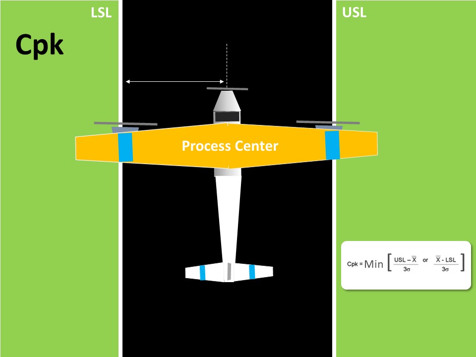
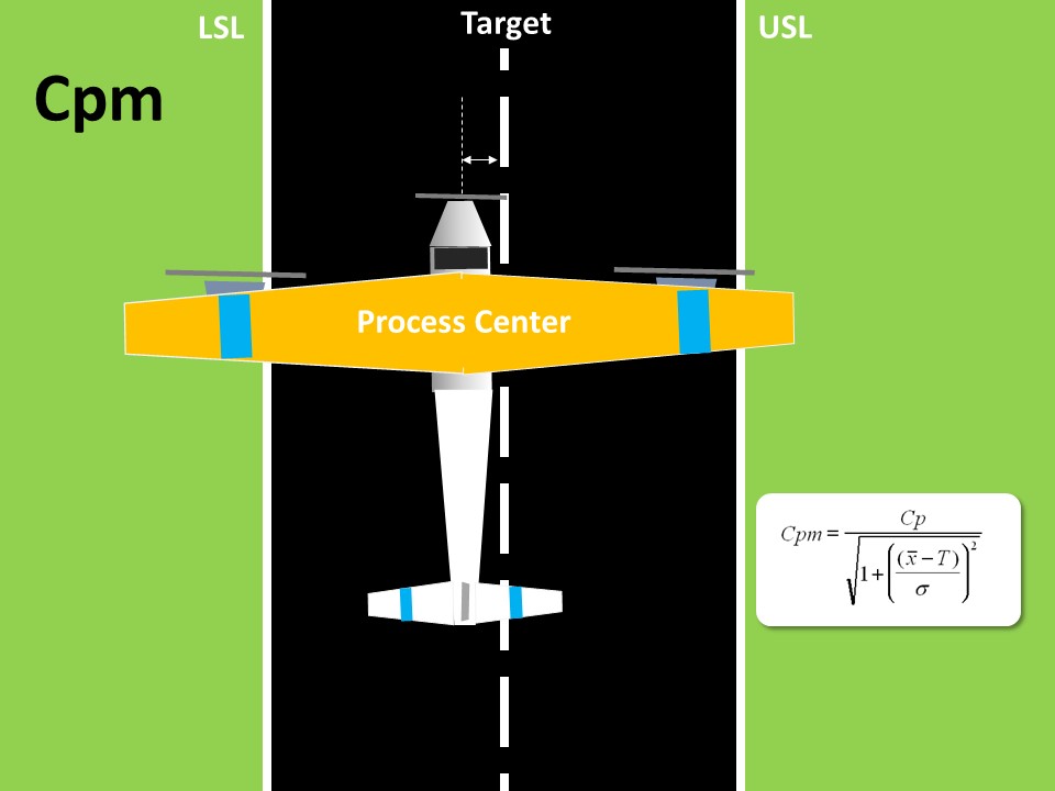
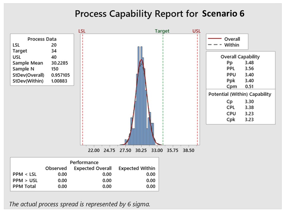
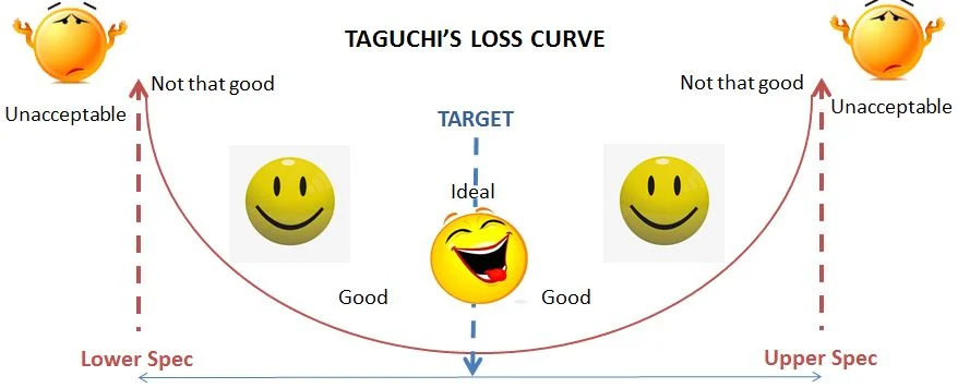
Cpm, also known as Taguchi Capability Measure, is yet another process capability metric, however is more robust than Cpk. Before understanding Cpm fully, let us take a step back & understand Cpk. Cpk is basically a measure of process centering, here the central value is the process mean, however it does not take into consideration the target value, which is in most cases the central value obtained from the customer specifications. The formula for calculating Cpk is as shown below:- Cpk = min ( (USL - Mean / 3σ), (Mean - LSL / 3σ) ) Here it takes the lowest value out of the two i.e. USL - Process Mean & Process Mean - LSL. Let us see this through an example:- Here in the above figure, we will look at the distance from the center of the plane’s nose tip to either side of the landing strip. This is however an indirect way of assessing the center of the process. Cpm, on the other hand, contains the target value in its formula which is expressed as :- Cpm = USL - LSL / 6*SQRT( σ^2 + (X̄ - Target)) Thus in addition to getting USL & LSL from customers, we are also getting from them the target value. Thus Cpm is a true measure of the process centering as it compares the difference between the process mean & target value. Let us see through the above example again:- As you can see, we are now measuring the gap between the nose tip of the aircraft & the center of the landing strip. The Cpm capability index is based on the Taguchi loss curve concept which states that, the increase in quality loss is directly proportional to the gap between the process mean & the target. Higher gap results in higher losses. This is also evident in the below visual:- As you can see that the loss is minimal near the target value & increases as move towards the specification limits. There are three specific scenarios where Cpm proved to be a better measure of process capability compared to Cpk. These are as listed below:- In the first case we have a process with a wide tolerance range however there is a slight shift from the target, in such scenario Cpk won’t change much but there will be a reduction in Cpm, thus showcasing that Cpm is very sensitive even to small drifts of the process mean from the target. In the second scenario we have only a specification on one side, Cpk loses its significance however we can still experience shift of the process mean from the target, which will thus impact Cpm thus showcasing that Cpm is a better measure for one - sided specification. Here we are having a target which isn’t the centre point of the tolerance limits. Here the target is intentionally set accordingly. Here also Cpm will be affected by the shift from the target, however there will be no significant change in Cpk. This makes Cpm a more robust measure for processes having non-centered specification. Now as far as the application of Cpm as a measure of the process capability in service industry is concerned we can think of few examples as explained below:- In a pizza delivery process, we can create a one sided specification in terms of the overall delivery lead time which is let’s suppose set at 30 min as it upper specification limit & we can set an internal target of 20 min & track the process capability basis the target of 20 min. In a wire transfer process of a bank, we can intentionally set the process TAT closer to the LSL i.e. farther way from the USL, in order to ensure a consistent performance & less risk of delays in processing the wire transfer, here Cpm will play a significant role in assessing the process capability. In the accounts receivable process, we can assess the sales executive performance in terms of the deviation of the DSO from the target value & for this Cpm will be the best measure in order to assess an individual’s capability & also compare with its peers.
-
Let us understand the difference in both the approaches:- Synchronous Process In a Synchronous Process, we can only move to the next task or step when the previous task or step gets completed. A simplistic version of a synchronous process is as shown below:- Process: |Task A —————> Task B ——————> Task C| Here Task A will run & finish, then Task B will run & finish & finally Task C will run & finish. We can also have two or more processes synchronized in terms of their start & end points, this is demonstrated below:- Process 1 : |Task A --> Task B| Process 2: |Task A —> Task B| Process 3 : |Task A —> TaskB| Here the start & end points of processes 1,2,3 are synchronized i.e. completion of task B of process 1 (end of process 1) marks the beginning of task A of process 2 & completion of task B of process 2 (end of process 2) marks the beginning of task A of process 3. Common example of a synchronous process is that you cannot get a movie ticket until the people in front of you in the queue gets the ticket & only then you can enter the auditorium. Asynchronous Process In an Asynchronous process, the execution of another task can be done without the compulsion of completing the previous one. Thus there is no dependency on the completion of the previous task. An asynchronous process is as shown below:- Process: |——Task A—— —— Task B—— ——Task C——| Here we can see that the execution of task B has initiated even before the completion of task A & same goes with tasks B & C. Also in a multi process scenario, the start & end points of the processes are not synchronized. This can be shown as below:- Process 1 : |Task A --> Task B| Process 2 : |Task A —> Task B| Process 3 : |Task A —> TaskB| Here we can see that the tasks of all three processes 1, 2,3 are being executed concurrently & there is no sync as far as the starting & ending points of these processes is concerned. Common example of an asynchronous process is when you order your food in a restaurant, others can also order their food & they don’t have to wait for your food to be cooked & served before they can order. Thus one has to fully understand the dependencies amongst the tasks to be performed in a process or a series of process in order to decide their execution sequence & thus come to a final decision as to whether the process will be synchronous or asynchronous.
-
Business Process Management or BPM involves combining design, automation, execution, control, measurement & optimization of business activity flows which are in line with the business goals & it encompasses systems, employees, customers & partners within & beyond the enterprise boundaries. BPM becomes rather more important as every organization follows a flow of business activities which are done in order to complete a business transaction. The effectiveness of these activities have a direct or indirect impact on the organizational goals. BPM lifecycle consists of 5 important stages i.e. Design, Model, Execute, Monitor, Optimize through which an organization can standardize the process of implementing & managing its business processes. Let us now understand the key characteristics of each stage:- Design : This stage involves analyzing & understanding how the process is carried out in the present which is generally done by interviewing all relevant stakeholders, by examining the existing workflows so as to understand the underlying business rules & also by observing the process while it is being executed. This helps in answering key aspects from a high-level process perspective like:- What is the starting point of the process? What is the process sequence? What is the end result that a process is meant to achieve? What kind of tasks are there in the process? Who are the owners of the various tasks in the process? How long does it takes to complete the process? How the integration of various systems exists? From an Lean Six Sigma perspective, we can leverage tools like SIPOC to map out the high level process & also use Stakeholder mapping as well as ARMI in order to map out the key stakeholders & also to understand the role of these stakeholders in the process. Model : This stage provides a visual representation of the various phases of the process. This involves understanding in detail how the process is working at present i.e. AS-IS process & how the process will look like in the future i.e. To-Be Process. Once the revised design is created it will be socialized with all the relevant stakeholders for their perusal & approval. Also adjustments are made in the future state design basis the feedback that is received from the stakeholders. Here we can leverage Level-3 Process Maps (Swim-lane) in order to map out both the AS-IS & TO-BE states of the process. Execute : This stage involves testing the newly validated process model by carrying out the activities as per the newly designed process in order to see its behaviour. It is generally done by carrying out the new process multiple times within a closed group in order to ensure that the new process is effective & also to quickly act on issues if they appear before going for a full scale implementation. We can leverage Hypothesis Testing in order to statistically validate whether there is a significant difference in the various performance parameters between the AS-IS & TO-BE process. This will give a clear picture in terms of the effectiveness of the new process. Monitor : Post implementation of the process, the business process is carried out in an operational environment & data pertaining to critical activities is collected in order to see how these critical activities are performing over time. Collecting data will help in developing the KPIs through which the effectiveness of the new process can be monitored. We can use Data collection plan to collect the relevant data & then use Control Charts in order to assess whether the process is under statistical control or not & accordingly take corrective action in case of any deviation. Optimize : During this final phase, the final insights that have been gained during the monitor phase will be leveraged to further improve the process & make the process more efficient by removing bottlenecks. This will help the organization to identify potential improvement opportunities by identifying the bottlenecks in the process & thus focussing the improvement efforts towards optimizing that constraint. TOC or Theory of Constraints will help in this case to identify the bottleneck or the constraint & then work on optimizing the same.
-
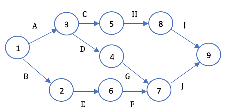
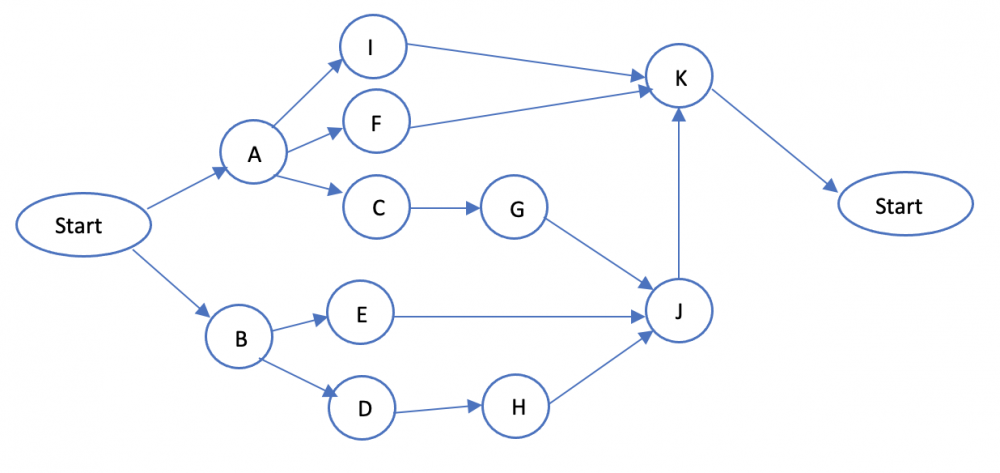
The two most common network diagramming techniques i.e. Activity on Arrow (AOA) & Activity on Node (AON) are used to showcase the graphical association among different tasks & are used to determine the critical path of a project. Using these two techniques we can draw those relationships between the different activities. Let us first understand the concept behind these two techniques. Both of these techniques comes under the purview of Program Evaluation Review Technique commonly known as PERT. Activity on Arrow (AOA) uses arrows to represent the activities while the nodes are used to represent events, here the major emphasis is on the events or milestones. AOA only shows finish to start relationship. Below is an example to illustrate this:- Here each activity is represented on an arrow i.e. A,B,C,D,E,F,G,H,I,J & each node represents the start & end of an activity i.e. nodes 1 & 2 represent the start & end of activity B, 1 & 3 for activity A & likewise for other activities we have nodes for start & finish i.e. 1,2,3,4,5,6,7,8,9. Sometimes we also have to add dummy activities in order to showcase more complex relationships & dependencies amongst the activities which are represented by a dotted line arrow & has no duration associated with it. Activity on Node (AON) as opposed to AOA represents the activities on the nodes & here the main focus is on the activities or tasks rather than events or milestones. Below is an example to illustrate this:- As you can see each node in the diagram represents activities i.e. A,B,C,D,E,F,G & it has only two common event nodes which is the start & end node as opposed to the start & end event nodes for each activities in the AOA technique. Also in AON approach of network diagram creation we can showcase complex relationships without the need of using dummy activities. Also as opposed to AOA which only showcases finish to start relationship, here we can showcase any type of relationship i.e. start to finish, finish to start, start to start & finish to finish. Due to its simplicity & compatibility with most of the project management software, AON is the preferable approach to create network diagrams. Let us now take an example & used both AOA & AON to create the network diagrams. Let us see a project on setting up a hospital, below are the representation of activities & their sequence:- Activity Description Predecessor Activities A Select administrative & medical staff - B Select site & do site survey - C Select equipment A D Prepare final constructions plan & layout B E Bring utilities to the site B F Interview applicants & fill support staff positions A G Purchase medical equipment C H Construct the hospital D I Develop an information system A J Install the equipment E,G,H K Train the support staff F,I,J Let us now observe the AOA & AON Network diagrams created for the above example. AOA : AON : If we compare the above two figures, one can clearly see that the relationships amongst activities can easily be modelled with AON technique as there is no need for using the dummy activities particularly where we are creating network of activity K whose predecessors are F,I,J where you cannot straight away model this relationship in AOA approach as we need to use dummy activity between nodes 7 & 8 in order to project the activity arrow towards activity K which is not the case with AON approach as you can simply model the relationship by creating arrows from activity nodes F,I,J towards activity node K without the need for any dummy activity. Thus with AON approach we can easily showcase even complex relationships & thus this approach is more preferable compared to AOA.


-
Dark Data refers to the data generated by organizations in their daily activities which is not being leveraged to derive insights for decision making & it is estimated that most organizations are only 1% if their data & the data is only being stored for record keeping & in some cases for regulatory compliance purpose. A lot of the dark data collected by organizations is unstructured which makes it difficult to categorize & perform analysis upon. Also most of the organizations do not have the adequate reporting capability to extract insights from the data. Another aspect is that even the useful data will have a probability to become dark data if organizations are not able to extract timely insights from the same as those insights will lose its value. For eg: Information on customer demographics can help an organization to roll out promotional offers to that customer, however if data is not processed immediately then it becomes irrelevant to be actioned upon later. From a storage perspective there will be opportunity costs associated with under-utilization of the data & performing meaningful actions accordingly in addition to the energy costs linked to storage of the data. Now from a value perspective only approximately 14% of the data stored in data centres are critical to the organizations & rest of the portion contains dark data & under-utilized data. This ongoing storage of dark data can pose a serious risk to organizations particularly if the data contains sensitive information & can result in serious legal & financial repercussions in case of any data breach which will ultimately tarnish an organization’s reputation. However there are many organizations in recent times that are able to successfully leverage the dark data in order to derive valuable insights from it. Some of these examples are:- E-commerce giant Amazon harnesses the insights generated from each & every user activity to provide recommendations to its users. In addition to that it also leverages Amazon Web Services (AWS), their cloud computing capability to store massive customer data that gets generated on daily basis & also provides AWS cloud services to other organizations for efficient storage as well as insights on the data. Indiana University Health or IU Health is exploring ways to leverage dark data in order to personalize health care for its patients. Stitch Fix, an online subscription shopping services is deeply monitoring its customer preferences in order to thoroughly understand each customer’s sense of style & then leveraging this understanding to create personalized fashion. Thus with advancements in analytics tools & technologies, it is now very much possible to extract deeper insights from a large amounts of data.
-
Berkson’s Paradox also known as Berkson’s Bias or Collider Bias is a particular kind of selection bias that is caused by systematically observing some events more than the others. It seems to show case correlation between two independent events however in reality there is no such correlation that exists between those independent events. Here the correlation between two events let’s say A & B i.e. the probability of event A happening is higher in the presence of event B happens because cases where neither of the events occurs are excluded from the sample taken fro study. This principle was illustrated by Joseph Berkson in 1946 with a case study that linked diabetes with cholecystitis amongst the patients admitted in a hospital. There seemed to be no correlation amongst both the diseases based on the data collected from the overall population, however since the samples in this study were taken from the patients admitted in the hospital it indicated a misleading positive association between the two diseases. Let us see this example to understand why such association was observed:- Let’s say that the population of patients admitted in the hospital is 100 & the two diseases i.e. diabetes & cholecystitis are two independent events & we have even distribution of population amongst the four categories as shown below:- High cholecystitis & low diabetes : 25 High cholecystitis & high diabetes : 25 Low cholecystitis & low diabetes : 25 Low cholecystitis & high diabetes : 25 Now since the data was collected from the hospital hence the category with low cholecystitis & low diabetes would not appear in the study i.e. only the data for the other three categories would be reported. Let us calculate the probability that a patient with lower diabetes diagnosed with cholecystitis would be calculated as:- P(High cholecystitis | Low Diabetes) = 25/25 = 100% (since we have not considered the category with low cholecystitis & low diabetes in the study) Now let us calculate the probability that a patient with high diabetes would be diagnosed with cholecystitis:- P(High cholecystitis | High Diabetes) = 25/(25+25) = 50% (since we will be taking into considerations both the categories where patient has high diabetes) Thus there is a false conclusion now that the patients with high diabetes tend to have a lower risk of having cholecystitis. Let us now take another example in order to see the effect of Berkson’s Paradox:- Let us consider two seemingly dependent events i.e. Diligence & Academic Results. Now logically there should be a positive relationship between these two variables i.e. the more diligent you are the better your academic results would be. Thus there will be an uneven distribution of population as well as shown below:- Lazy & Good Results : 20 Hardworking & Good Results : 30 Lazy & Poor Results : 30 Hardworking & Poor Results : 20 Now let’s say the data is collected from a top school then we would not be considering lazy students with poor results. Here the probability of lazy students getting good results is given as :- P(Good Results | Lazy) = 20/20 = 100% (since we have not considered the category of lazy students having poor results in the study) Also the probability of hardworking students getting good results:- P(Good Results | Lazy) = 20/(30+20) = 60% (since we have not considered both the categories where students are having good results) Thus this study also gives us a wrong impression that the lazy students have better chances of getting good results which is not the case had we collected the data from the entire population of schools. Preventing Berkson’s Bias: Below are the common strategies should be adopted in order to prevent Berkson’s Bias:- Select the correct target population eg: if the target population is students then including locals who didn’t attend college will introduce bias. Select random samples from the target population eg: in order to study the effect of sleep on college student grades ensure that the right balance of students who have enrolled to early morning courses & night courses are included rather than taking students belonging to only one type of course. Perform a pilot study before going for a full blown study as this will give an idea quickly on the appropriateness of the selection design. Create a standard method of selecting samples from the population & measuring data so that everyone involved in the study is calibrated.
-
Defining the data in terms of dimension & measure is a common practice when it comes to analyzing & visualizing data. Data Visualization tools particularly Tableau leverages this practice in order to enable effective analysis & interpretation of data. Let us understand the difference between a dimension & a measure along with relevant examples:- Measures: Measures are basically numerical data which is either calculated or aggregated. Measures can be both discrete & continuous in nature eg: Sales Revenue , Product Cost, No. of Invoices Processed, Sales Quantity etc. There will always be an aggregation type that is associated with measures i.e. we can perform various aggregations to the measures i.e. there are various aggregation predefined in the Data Visualization tools for measures. Some of the typical aggregations are Sum, Average, Count(Distinct), Minimum, Maximum, Variance & Standard Deviation. Dimensions: Dimensions represent categorical data like year, country, region, product type etc. There is no predefined aggregation associated with dimensions. These work similar to how a GROUP BY clause works in SQL where we are splitting our measure which can be continuous or discrete basis the dimensions eg: Sales per Region, Revenue per Service Line, Product-wise Quantity sold, No of active voters per country etc. Note : When it comes to date related data, we can consider it as both a dimension & a measure depending on the type of analysis. Eg: Let’s say we want to analyze the Sales by year & region, then we can aggregate the date on a year basis & consider it as a dimension along with region & then we can slice our data accordingly. In another instance we want to analyze the sales trends over a period of time then we can consider the date data as a measure & we can see the sales data even on daily basis granularity. Thus classifying data into dimensions & measures will help us perform an efficient analysis & visualization of our data.
-
In order to fully understand the concept of Mafia Offer, it is first very important to first understand Unique Selling Proposition or USP & what are its limitations which makes Mafia Offer the go to strategy these days. USP is a marketing concept which allows a company to differentiate its products or services from the products & services of similar nature of its competitors. USP’s are generally short term statements of differentiation or positioning. Some of the common examples are:- Dominos Pizza : “You get fresh, hot pizza delivered to your doorstep within 30 minutes”. FedEx : “When your package absolutely, positively has to be there overnight”. Thus USP is that distinct & appealing idea that sets a company favourably apart from its competitors. The statements examples shared above summarizes why a consumer should buy a product or a service & it convinces a potential consumer that a particular product or service will add more value than other similar offerings. While USP are good in expressing the value proposition of a product or service to a potential customer but they sound more like a list of attributes or things that are totally subjective. In most of the cases the statements are copied by the competition very quickly & also even though these statements are good but they are not specific like for eg: Increased revenue & decreased costs are good to say but there is no mention by how much & what if a company doesn’t get the results that it brags about. The risk is still on the consumer whether they are ready to take the risk to take your word for it. In order to really differentiate what a company can offer, a good USP is accompanied with a market offer which is unrefusable & is known as Mafia Offer. Mafia Offer is an offer which is so good that your consumers cannot refuse & your competition can't or won’t match. It makes use of the fact that many business have constraints with the outside world as well in conjunction to a business’s internal constraints & the mafia offer capitalizes on this fact by managing this constraint & thus creating demand. A Mafia Offer is the key to exploring a market or sales constraint & it typically requires a company to do something different particularly (in terms of operational changes so as to make a decisive competitive edge)in order to actually deliver something which is delightful to the consumers & not matched by the competition. With mafia offers most companies offer solutions that solve their customer’s core problems. It is basically built on three key aspects:- What are the internal capabilities of a company compared to its competitors. How competitors are selling their products & services. How the customers of a company are affected by its current capabilities & how a company sells. Some of the common examples of a mafia offer are:- Hyundai : "We will buy back your car if you get laid off during the next two years" - this was made during the recession period. Xerox : “We offer copies when & where you need them & at a fixed rate per page” - this came when competitors were selling expensive machines & providing inconvenient servicing. Thus a mafia offer is a sustainable market offer which is built on its advantage & is not merely a tagline as the case with USP.
-
The basic premise of conducting Attribute Agreement Analysis is to assess whether there is consistency amongst the appraisers in terms of assessing an attribute which is non-measurable in nature (i.e. Nominal, Ordinal, Binary etc) in terms of three aspects:- Agreement of appraisers within themselves i.e. Repeatability Agreement of appraisers between themselves i.e. Reproducibility Agreement of appraisers with the standard i.e. Accuracy There are two popular measures of appraiser consistency / reliability i.e. Fleiss Kappa & Krippendorff’s Alpha values. However both are equally consistent measures when it comes to assessing the reliability of your measurement system, there are slight differences in these two measures. These differences are as mentioned below:- Fleiss Kappa is based on the concept of the ratio calculated between observed agreement(Pa) & agreement expected by chance(Pe) whereas Krippendorff's Alpha is based on the concept of ratio calculated between observed disagreement(Pa) & disagreement expected by chance(Pe). Mathematically both are calculated by the below formula:- Ranges for both the measures is from -1 to 1 with 1 indicating perfect agreement, 0 indicating no agreement & -1 denoting inverse agreement in case of Fleiss Kappa with an acceptable threshold value of 0.75 resembling significant agreement. However in the case of Krippendorff's Alpha an alpha value of 1 denoting perfect disagreement, 0 being no disagreement with an acceptable threshold value of 0.80 for significant disagreement. Fleiss Kappa is most suitable in case of nominal data while Krippendorff's Alpha has high flexibility as it can work with nominal, ordinal as well as metric data. In case of missing data Krippendorff's Alpha is the preferred option rather than Fleiss Kappa which cannot handle missing values & these missing values must be excluded from the data. Krippendorff's Alpha is said to be much more robust even if we have 50% of the values missing in our data & provides unbiased results. Based on the above facts it would be preferable to use Krippendorff's Alpha as the preferred statistic for measuring inter-appraiser reliability in situations where we have data other than nominal data, have multiple appraisers choosen randomly & the attribute agreement data is having missing values.
-
In simple words Cobots are basically robots that can work together with humans & that too without any barriers. It is also known as Collaborative Robot which comes from the fact that these are intended for direct human interaction & both humans & cobots are in close proximity within a shared space. Cobots are cost effective, safe & flexible to deploy While Industrial Robots have been in existence in the large scale manufacturing industries for quite some time now, Cobots are now slowly building their footprints especially in medium & small scale manufacturing industries & even in large scale manufacturing industries with typical applications in the automotive sector. For medium & small scaled manufacturing industries, Cobots are deployed especially for tasks that are repetitive & are risky from a safety standpoint for humans. Common examples can be loading & unloading of CNC machines where material is being fed by them to the machine, deburring application of aluminium castings, palletizing of materials as well as the welding of small parts. There are noticeable differences in various aspects when it comes to Cobots & Traditional Industrial Robots. Few of them are enlisted as below:- Industrial Robots are ideal for large organizations that manufacture high volumes of the same product for longer time periods while Cobots are specifically designed for low volume & high mix production scenarios. Industrial Robots require expensive programming skills & has a longer set up time whereas Cobots & simple to program & easy to deploy with a less complex set up. Industrial Robots require safety guarding in order to keep human workers out of the robot’s work area while Cobots have safely designed tools that simplify interaction with humans. Industrial Robots have integrated tools that are required to perform the same set of actions for entire lifespan, however Cobots have flexible tooling that are used for performing multiple processes. Industrial Robots are expensive as they require large upfront investment owing to longer & complex system integration, operator trainings & generally takes longer time in order to realize the ROI whereas Cobots have minimal upfront costs due to cost effective tooling that speeds up integration & thus a quicker ROI. Cobots is now spreading its existence not only in manufacturing industries but in service industries as well. Some of the potential areas of Cobots application in service industries are:- Food Service : Cobots are making their way into the fast-food industry where we have them flipping burgers, frying fries. Warehousing : One of the common example of Cobots are Amazon’s Kiva bots which have played a significant role in boosting the overall efficiency & accuracy of warehousing operations. Education: Cobots are now helping students learn robotics with little programming required to function those robots. Entertainment: Cobots are sometimes used to carry cameras that are too heavy for humans to handle or for filming spaces too tight & can also film precise shots at high speeds & complex angles. With this wide adoption of Cobots in diverse industries, the future of Robotics especially Cobots is moving in a very positive direction & will contribute a big way in disrupting the way of working of various industries at large.
-
Sandbox is an integral part of the set up when it comes to testing any new software or code as it provides a secure virtual environment without the need for interrupting the main stream process. it is basically an isolated testing environment that empowers the users to test their code without affecting the application or platform on which they are being run. One more area of application where Sandbox is widely being used is for Malware Detection & Prevention however nowadays there are ways devised by hackers which program their malware in such a way that it remains inactive in the sandbox which thus enables the malware to bypass protections & thus execute malicious code without the chance of being detected. Below are the different ways in which the evasion malware functions:- By Detecting User Interactions Here the malware is made to wait for user to perform a specific action eg: Scrolling a document (malware gets executed after scrolling to a particular page or place in the document) or Moving / Clicking the mouse (malware gets activated only after a certain clicks of the mouse) & then only afterwards it will exhibit its malicious behaviour. By Detecting System Characteristics This aspect involves malware being programmed to find some real features of a system that are not available in the sandbox environment. These real features which a malware detects include CPU Core Count, Digital System Signature, Availability of Antivirus programs & Operating System Reboot scheduling. Through Environmental Awareness In order to detect the environment in which a malware is present, it looks for indicators specific to virtual environment such as hypervisor calls or specific file names & processes typically belonging to a sandbox. Through Delayed Execution Here the malware only gets executed after a short period of time in order to successfully evade the sandbox. this is done in three common ways i.e Extended Sleep, Malware programmed to be executed on a specific date & time which is commonly termed as Logic Bomb, malware executing unnecessary CPU cycles in order to delay the actual code till the sandbox finishes testing also known as Code Stalling. Through Data Obfuscation This technique allows malware to change DNS & IP addresses known as Fast Flux or by encrypting API calls known as Data Encryption so that the sandbox is not able to read them. Now In order to protect the sandbox from evading malware, below are the common measures that can be adopted:- By dynamically changing the sleep duration which significantly increase the chances of malware detection. By adding user-like interactions within the sandbox environment in order to better detect the malware. By retrieving system information such as hard disk size, cpu core count, OS version etc within the sandbox environment so as to have better chances of detecting the malware. By incorporating Static Analysis along with the existing dynamic analysis within the sandbox environment so as to improve the malware detection capability of the sandbox by detecting the evasion techniques in a more methodical manner By adding Kernel Analysis in order to prevent the malware from entering the kernel space i.e. root-kits or drivers in order to prevent the malware from escaping the sandbox. By designing malware analysis based machine learning algorithms in order to detect sandbox evasion malware Thus by adopting the above measures one can make the Sandbox environment safe & more robust to detect any evasion malware present.
-
The Concept of q-value Whenever we are running hypothesis test on a sample of data values that are drawn from the same population, there are chances that we will be getting a test statistic that is very extreme compared to the hypothesized value which indicates that the sample values belongs to a different population while in reality it belongs to the same population from where it is drawn. This extreme value is termed as False Positive(FP) & the probability of getting this false positive or Type-I error is expressed as p-value for that single test, the threshold of this p-value is generally kept at 0.05 (i.e. significance level) & it is desirable to have the p-value to be less than 0.05 or 5%. Let us now apply this to a multiple testing scenario where we will perform multiple hypothesis tests taking different samples from the same population, now for all these tests we set a threshold p-value of 0.05, it will mean that 5% of all the tests conducted will result in false positives(FP) (i.e. let’s say if we have conducted 1000 tests thus generating 1000 p values there are chances that 50 of those tests will result in p-value<0.05) although all the different samples taken for different tests belong to the same population. If we try to plot the p-values generated from all the tests in a histogram this will result in a shape similar to uniform distribution where each bin represents a p-value range & the frequency represents the number of tests in which p-values fall within this range. In case of tests conducted by taking samples from two different populations & try to plot the histogram for different p-values generated from these tests we will get the histogram shape that will be right skewed as most of the p-values would be falling within the p<0.05 & thus will be true positives. So let’s say that we conducted 1000 tests & found that 80% of those result in true positives i.e. 800 of them are True Positives(TP) (having p-value < 0.05) thus significant & 200 of them are not significant. Now out of these 800 true positives or significant tests there are false positives as well & this is not possible to identify with the p-value alone. In order to overcome this limitation we will be leveraging the concept of q-value which leverages the concept of False Discovery Rate (FDR) (defined as FDR = FP / (FP+TP)). q values are basically the p-values that are adjusted by leveraging an optimized FDR approach. Thus let’s say if we have a q-value of 0.05 which means that 5% of the true positives obtained after performing multiple tests are actually false positives. So taking the reference of the above scenario if 800 are true positives (or significant) initially identified then 5% of them i.e. 40 will turn out to be false positives after adjusting the p-values basis the FDR approach. The range of q -values lies between 0 & 1. Generally the cut off for significance for FDR is < 0.05 which means less than 5% of the significant results will be false positives. There is one popular method i.e. The Benjamin-Hochberg Method which adjusts the q-value in a way that limits the number of false positives that are reported as significant or True positives by making the p-values larger for eg before the FDR correction, the p-value may be 0.04(significant) & post the FDR correction it may become 0.06(not significant). Let us now see an example in order to understand the above method of adjusting the p-value:- Let’s say we have conducted 10 tests taking 10 pairs of sample each time from the same distribution & below are the p-values obtained for each test : 0.91 0.11 0.71 0.31 0.51 0.41 0.61 0.21 0.81 0.01 First step is to order the p-values from smallest to largest & rank these values as shown below: p-values : 0.01 0.11 0.21 0.31 0.41 0.51 0.61 0.71 0.81 0.91 rank : 1 2 3 4. 5 6 7 8 9 10 Here we have one false positive which is the first one i.e. p=0.01 which is < 0.05. let us now see whether this false positive is significant or not. Next step is to calculate the adjusted values starting from the last value ranked 10th Here the largest FDR adjusted p-value is same as the largest p-value. For the next largest adjust p-value we will choose the smaller of the two options i.e. the previous adjusted value & current p-value x (total number of p-values / p-value rank whose adjusted p-value is to be calculated) Thus for calculating the adjusted p-value for the 9th ranked p-value it will be smaller of previous adjusted p-value which is 0.91 or current p-value at 9th rank i.e. 0.81 x (total no. of p-values i.e. 10 / p-value rank whose adjusted p-value is being calculated i.e. 9) which comes out to be 0.90, thus between 0.91 & 0.90 we will choose the smaller value i.e. 0.90. Similarly we will be repeating this for the other ranked p-values as well & the final output will be as shown below:- adjusted p-values : 0.10 0.55 0.70 0.77 0.82 0.85 0.87 0.89 0.90 0.91 Now as you can see the false positive value of 0.01 is now converted into an equivalent adjusted p-value or in other words q-value of 0.10 which is no longer significant as it is now > 0.05. Thus we can see how we can leverage q-value in order to perform adjustments on p-value in order to separate the true positives from the false positives.
-
KT Analysis or Kepner Tregoe Analysis is a rational problem analysis model created by Charles Kepner & Benjamin Tregoe. This is a very popular problem solving method & has found its common application in field of IT & has now also being included as a part of IT infrastructure library framework. It has two fundamental building blocks i.e. Problem Analysis & Decision Analysis. The Problem analysis focuses on defining & describing the problem, identify differences & changes, formulating the causes, testing the causes against the facts & finding the true causes. The Decision Analysis focuses upon objectively taking a decision by weighing the objectives (musts & wants) & then evaluating those alternatives against those weighted objectives in order to select the suitable alternative. Here I will be focussing on explaining the problem description aspect which is a distinguishing factor for KT approach. Often it has been observed that people try to jump into finding causes to any problem which is not the effective way of problem solving without understanding the true problem. While there are various problem solving tools available but none of them focuses upon dissecting & understanding the problem first which will give us a more focussed problem to work upon. The KT method is successful in bridging this gap. The key to problem solving is to study the problem in great detail first before going into the causes. Let us try to understand this through an example:- Let us see an example of a poorly written problem statement : "The banking mobile banking application is closing unexpectedly.” Now by using KT analysis the above problem would be described basis 4 aspects i.e. What is the problem, Where is the problem, when the problem occurred & how much is the extent of the problem. For each aspect we would be describing each of the four aspects in the form IS & IS NOT in order to further explore the problem:- Let us analyze the above problem :- WHAT IS : XYZ Bank Mobile Banking Application closing unexpectedly during fund transfer. WHAT IS NOT : Mobile Banking Application not closing unexpectedly while performing other tasks. WHERE IS : This issue is being experienced by customers in the European region. WHERE IS NOT : This issue is not being experienced by customers in the other regions. WHEN IS : This issue is being experienced by customers after doing the recent update of the application on 26th June. WHEN IS NOT : This issue is not being experienced by customers before the application update. HOW MUCH IS : This issue is being experienced by all the customers having a current account. HOW MUCH IS NOT : This issue is not being experienced by customers having a savings account. Thus now we have understood the true nature of the problem & can be described as:- “ XYZ Bank’s mobile banking application is closing unexpectedly while performing fund transfer for its current account holders in the European region post the recent update of the application on 26th June”. Thus now we have a comprehensive & a very focussed problem to work upon & now we can now deep dive into finding the causes, validating those causes & accordingly come up with solutions.
-
Thematic Analysis is a method of analyzing qualitative data. It is generally applied to a set of text such as verbatim or transcripts where it is closely examined in order to identify common themes. It is a good approach to leverage whenever you are trying to find something meaningful(eg: people’s views, opinions etc) from a set of qualitative data. It is basically a data analysis process which involves deep diving through a dataset, create coding, identifying patterns, , deriving themes & then finally create a narrative. Following are the steps to perform Thematic Analysis:- First step is to familiarise yourself with the data i.e. performing an initial exploratory analysis of the data in order to identify meanings & patterns in the data. After familiarising with the data, create the initial codes that represent the meanings & patterns identified in the data. Decide the code, go through the data again & identify the excerpts, then apply the appropriate codes to them. Also add new codes as deemed fit. Bring together all the excerpts associated with a code & collate them under that appropriate code, repeat the same for other codes as well. Group the collated codes containing the excerpts into suitable themes . Evaluate & revise the themes, also ensure that each theme has data to support it & each theme must be unique. Once themes are finalised the final step is to create the narrative in order to share your findings to the audience. Based on the above understanding one of the common applications of thematic analysis in lean six sigma is VOC analysis. The objective here is to identify major recurring themes that reflect the concerns or problems raised by the customer & eventually this will help to identify the key needs of the customer basis which we can focus our improvement efforts accordingly. Let us take the example of a bank having rolled out a survey to its customers in order to get their valuable feedback on the overall performance of the services thy are delivering. Now once we have received the responses from the bank’s customers the bank decides to use Thematic Analysis in order to analyze those responses & post the analysis it was found that there were two major themes identified from the data points one towards the accuracy & other towards the timeliness of the Bank’s wire transfer process. Thus by leveraging this analysis they identified two major improvement areas i.e. To improve the accuracy of the wire transfer process & to reduce the overall time to completion of the wire transfer process.
-
Outliers in a dataset are basically the data points whose magnitude is significantly different from other data points in that dataset. Outliers signifies either error while keying in data or they signify presence of special cause. The most common method for identifying outliers is through Box plot however we can also leverage Grubbs Test to detect the same, but there is a marked difference in both the methodologies. Let us understand both these one be one:- Grubs Test:- It is one of the most commonly used hypothesis test for identifying outliers & it comes with the below hypothesis:- Ho: All the data points in a sample are drawn from a single population that follows a normal distribution Ha: One data point is not drawn from the same normally distributed population as other data points Thus a p-value of less than 0.05 indicates the presence of an outlier in the data. One of the biggest limitation of Grubbs test is that it assumes that the data is drawn from a normally distributed population, thus we have to first check whether the data qualifies the normality test. If the data fails the normality test then we cannot use Grubb’s test. Another limitation associated with Grubb’s test is that it only detects a single outlier at a time, thus requiring the outlier to be removed from the data set first & then again running multiple iterations of the test until no outliers are detected in the data. Box Plot:- Box-Plot is the commonly used graphical technique to detect outliers in a dataset. The outliers are based leverages Interquartile Range(IQR) with fences in order to identify outliers. Lower Fence : Q1 - 1.5*IQR Upper Fence : Q3 + 1.5*IQR Thus any value below the lower fence or above the upper fence will be considered as an outlier. The box-plot shows outliers as datapoints in the form of asterisk. Box plot is a more robust method to detect outliers as it is not driven by the assumption of normality & once can also detect multiple outliers in the data in a single iteration itself. Conclusion:- The best blend would be to use box plot coupled with domain expertise to identify & treat the outliers in a data.
-
My two cents on this:- Let us understand the concept & limitations of the two conventional experimental designs & how latin square design takes care of those limitations through example from optical lens industry:- Completely Randomised Design (CRD) or One Way ANOVA: In CRD each experimental unit is randomly assigned to one of the treatment levels. For eg: Let us take an example from optical industry where we want to study the Impact of different varnish types (coating formulations) on the final yield of our lens coating process. Here the experimental unit is the lens on which coating will be done. Here each sample will be randomly allocated to a treatment group hence in this case let’s say we have 60 samples & three types of varnishes (let, say X,Y,Z) thus the entire samples will be divided into three groups of 20 each & one group will be subjected to Varnish X, other to Y & the third to Z. This can be shown as:- Varnish X Varnish Y Varnish Z Group B Group A Group C We will be taking into account the variability within each unit in the overall sample (SS within) & the variability between groups subjected to the three varnish types X,Y,Z (SS between) Randomised Block Design (RBD) or Two Way ANOVA: Now in the above example let’s say we observed that the suppliers (let’s say Supplier A,B,C) from which the varnishes (X,Y,Z) are imported also influences the final yield of our coating process. Here the supplier factor will become the blocking variable. In this case the units are first assigned to each block & each unit within the block will be subjected to all the treatments but cannot be assigned to other blocks & other treatments. Thus let’s say we have 180 samples , first we will divide these samples into three groups of 90 I.e. one for supplier A, one for Supplier B & one for supplier C & these three groups will be further subdivided into groups of 30 & one subgroup will be subjected to Varnish X, second with Y & third with Z & likewise for supplier B & C group. Block Varnish X Varnish Y Varnish Z Group 1 Supplier A Subgroup 1 Subgroup 3 Subgroup 2 Group 2 Supplier B Subgroup 2 Subgroup 3 Subgroup 1 Group 3 Supplier C Subgroup 3 Subgroup 1 Subgroup 2 Here we will be taking into account the variability within each unit in the overall sample (SS within), variability in groups amongst the blocks I.e. supplier A & B (SS blocks) & the the variability between groups basis the three varnish types X,Y,Z (SS between) Latin Square Design: Latin square Design takes care of above limitation with the fact that each experimental unit will get all the treatment but that treatment combination will be a square & each treatment combination occurs only once in a row & a column which is the underlying principle of Latin Square Design. Let us see below:- Now considering the above example lets say we have a sample of 60 lenses & these will be divided into groups of 20 basis the supplier levels A,B,C as well as Varnish Types X,Y,Z. Here each group will be subjected to a combination of each supplier & each varnish type but only once. An important assumption to consider in Latin square Design is the levels in each of the factors considered should be the same like in this example where we have three levels of Suppliers (A,B,C) & three levels of medicine (X,Y,Z). Thus in this case it will be a 3x3 latin square . Varnish X Varnish Y Varnish Z Supplier A Group B Group A Group C Supplier B Group C Group B Group A Supplier C Group A Group C Group B Here we will be taking into account the variability within each unit in the overall sample (SS within), variability in groups amongst the blocks I.e. supplier A & B (SS blocks) & the the variability between groups basis the three varnish types X,Y,Z (SS between) & the variability due to each combination of block I.e. supplier & Treatment i.e. Varnish & Supplier.
-
This is very true in context of the fast changing business environment & with the world now being shifted towards Agile ways of working, the leadership nowadays are not willing to wait for 4-6 months & let their processes bleed, rather they want quick outcomes. Business Modelling & Simulation can be the perfect aid in the following ways:- Business Modelling & Simulation is particularly useful when there is a lot of uncertainty around the process in focus & also when we don't have the luxury of large amount of data. Also we can easily come up with insights in a very less time which is analogous to the work which is done from Define, Measure & Analyze phase of a conventional DMAIC project. Here we require the cause-effect knowledge of the process basis which we can create our model. (For eg: Lead Time = Cycle Time + Wait Time + System Downtime) Business Modelling & Simulation comprises of three main elements i.e. Simulation, Sensitivity Analysis & Optimisation. Through Simulation we can perform multiple trials & combinations on the parameters which have been selected as assumptions & accordingly come up with accurate forecasts of the output. This will ensure we have the optimal assumptions in order to have a robust output. Through Sensitivity analysis we can find out magnitude of the impact that a particular assumption or a variable has on the variability of the output & this will ensure tat we will be putting our improvement efforts in the right direction. Optimisation will help us to arrive at the correct decision basis the given assumptions, decision criteria & the constraints & come up with the optimal settings which needs to be done in order to arrive at the right decision. Thus it is imperative that Business Modelling & Simulation largely aids the business excellence practitioners in simulating the process & come up with the optimum settings for the process which will ensure that all the improvement efforts are in the right direction in a considerably less time than a conventional DMAIC approach.


