Rahul.Arora2
Members
-
Joined
-
Last visited
Everything posted by Rahul.Arora2
-
Let us try to understand through an example from procurement: - A multinational company has teams spread across US, Europe & India & these teams procure parts from suppliers. Every region has its own way of working i.e. US team manages purchase orders through excel & email, Europe team leverages an ERP system whereas the team in India use paper-based tracking & performs manual approvals. This results in an inconsistent process & can result in duplicate work as well as posing compliance risk. This is where AI plays a pivotal role in driving standardization. Below are some critical aspects: - 1. Process Mapping & Benchmarking - AI analyzes the procurement data for all the regions (PO cycle time, errors, supplier onboarding time) & identifies that the ERP model pertaining to Europe region is the most efficient one(20% faster & fewer errors) while the processing steps in India region has the most redundancy. 2. Global Standard Design – AI will suggest a standardized workflow by combining all the best practices from all the regions. 3. Automation – AI bots will automate the repetitive work like PO data entry, invoice matching & approval reminders etc. The same automated workflow will be leveraged by every region thus making the process uniform. 4. Compliance Monitoring – AI dashboards can track the adherence of the standard PO process & will raise a flag in case of any deviation from the standard process. Eg: Let’s say India team is doing any manual approval instead of system-based approval, it will flag a risk. 5. Continuous Learning – AI will analyze the supplier performance / cycle times over the course of time & suggests areas where the process can be streamlined. The above approaches will ensure: - 1. All global teams follow the common standardized procurement process. 2. Transparency, speed & improvement in compliance. 3. Local differences like tax rules, languages etc. adjusted automatically.
-
Special Cause Variation may exist in a process that appears to be in control i.e within upper & lower control limits & it may also be reflected in trends or behaviors that appear non-normal. There are various tests for finding potential special cause variation. Most of these tests divide the control region of the chart into 3 zones which are usually 1 sigma apart from each other. These zones are as shown below:- Now Let us explore some of the most common rules for testing special causes in control charts :- Western Electric rules for control charts : Western Electric rules are the original set of four control chart rules used to conduct stability analysis. These rules are used with all the control charts & are commonly known as WECO rules. These rules are as stated below :- 1 One point above UCL (Upper Control Limit) or below LCL (Lower Control Limit) 2 Two points above or below 2 sigma zone i.e. zone which is usually 2σ above or below mea 3 Four out of five points above or below 1 sigma i.e. zone which is usually 1σ above or below mean 4 Eight points in a row above or below the central mean line Below are the examples demonstrating the WECO rules:- Nelson rules for control charts : Nelson rules were developed in the 1950s & can be used with any control chart & they are the extension of the WECO rules. These rules are as stated below :- 1 One point above UCL (Upper Control Limit) or below LCL (Lower Control Limit) 2 Two points above or below 2 sigma zone i.e. zone which is usually 2σ above or below mean 3 Four out of five points above or below 1 sigma i.e. zone which is usually 1σ above or below mean 4 Eight points in a row above or below the central mean line 5 Six points in a row ascending or descending (trend) 6 Fifteen points in a row between -1σ & 1σ 7 Fourteen points in a row alternating up & down 8 Eight points in a row above 1σ or below -1σ Below are some of the examples showcasing some of the above rules :- Westgard rules for control charts : Westgard rules include the WECO rules-1, 2, 4 & rule-5 of the Nelson rules. These rules are used with levey jenning charts in laboratories. These rules are as stated below :- 1 One point above UCL (Upper Control Limit) or below LCL (Lower Control Limit) 2 Two points above or below 2 sigma zone i.e. zone which is usually 2σ above or below mean 4 Eight points in a row above or below the central mean line 5 A trend of seven points in a row increasing or decreasing 9 Four points above or below 1 sigma or two points in a row with one above & one below 2 sigma Here the rule-9 is unique & is not included in other control chart rule sets. Let us now summarize the differences of different rules :-


-
A universally accepted fact for a six sigma process is that it attains a process capability of 3.4 defects per million, however statistically a six sigma process translates to 2 defect per billion opportunities. So this 2 defect per billion becoming 3.4 defects per million is attributed to the 1.5 sigma shift. This 1.5 sigma shift is empirically determined by Motorola through years of data collection for processes & it was observed that the processes tend to vary & drift over a period of time, which they called as Long-Term Mean Variation, this variation typically falls between 1.4 & 1.6. Statistically speaking, 2 defects per billion opportunities correspond to six sigma & 3.4 defects per million opportunities correspond to 4.5 sigma, also the overall goal in long term is a near-zero defect process or a 4.5 sigma level. The variation due to changes in environmental conditions causes a shift in the process in the long run & this shift corresponds to 1.5 sigma. No matter how stable a process is, over an extended period of time, the environmental conditions change, which causes variation in the process. Thus at the initial onset, the process capability needs to be balanced by a compensating factor in order to account for the changes in order to ensure that the long term goal is met. Thus Short-Term Sigma Level (6 sigma) = Long-Term Sigma Level (4.5 sigma) + Compensation Factor (1.5 sigma) This overall phenomena of 1.5 sigma shift can be visualized as shown below:- Also after a process has been improved, we calculate the standard deviation & sigma value, however these are considered to be short-term values as the data only contains common cause variation, whereas in the long run a process can have both common cause as well as special cause variation. Since the short-term data does not contain the special cause variation, thus it has higher process capability than long-term & the 1.5 sigma shift attributes to this difference in the short-term & long-term process capabilities. Although the original work was done by Motorola led to the discovery of the 1.5 sigma shift, however lean six practitioners have concluded that the size of the shift depends on the industry & type of process being studied, although the general concept that processes drift over time & the short-term capability needs to be better than the long-term capability remains valid everywhere.

-
TRIZ is a Russian acronym for the Theory of Inventive Problem Solving. There are certain universal principles of creativity that form the basis for innovation. TRIZ identifies & codifies these principles & uses them to make the creative process more predictable. In simpler words, whatever problem than an individual or a team is solving, somebody, somewhere has already solved it. Thus inventive problem solving involves finding that solution & adapting it to the problem in hand. There are two central concepts that form an integral part of TRIZ i.e. generalizing problems & solutions, and eliminating contradictions. The first concept can be explained as shown below:- Here, a specific problem is taken & is generalized to one of the TRIZ general problems. From the TRIZ general problems, you identify the general TRIZ solution that is required, & then one considers how to apply the same to the specific problem. TRIZ is basically a collection of 40 principles & 76 standard solutions which can be leveraged to solve any kind of problem. The other concept which talks about eliminating contradictions & it explains the fact that there are contradictions at the root of most of the problems, thus it is important to eliminate these contradictions in order to effectively solve the problem. TRIZ has two main categories of contradictions i.e. Technical Contradictions & Physical Contradictions. Let us understand both of these categories:- Technical Contradictions : These are the classical engineering trade-offs, where you can’t reach the desired state because something else in the system prevents it i.e. when something gets better, something else automatically gets worse. Some of the examples can be:- The product gets stronger, but the weight increases. Service is customized to each customer, but the service delivery system gets complicated. Training is comprehensive, but keeps employees away from their BAU. The key technical contradictions are summarized in the TRIZ Contradiction Matrix which is a matrix that is organized in the form of 39 improving parameters & 39 worsening parameters with each cell entry giving the most used inventive principles that may be used to eliminate the contradiction. The contradiction matrix is leveraged using a four step process:- Use the 39 parameters to identify the critical features in the problem. Identify the contradictions between the parameters where one causes problems with other. identify the principles that can be used to resolve the contradictions. Use the numbers from the matrix to look up the resolution principles & use these principles to find solutions to the problem. Below is an excerpt of the contradiction matrix:- Physical Contradictions : These are the situations in which an object or system suffers contradictory, opposite requirements. Some of the examples are:- Software should be complex i.e. have many features, but simple i.e. easy to learn. Coffee should be hot to be enjoyed, but also cool so as to avoid burning the tongue of the drinker. An umbrella should be large to keep the rain off, but small so as to be easily moved in the crowd. Physical contradictions are solved with the TRIZ Separation Principles, these separation principles are as explained below:- Separation in Time : Changing the property, response or behavior vs time. Here the concept is to separate the opposite requirements in time. Here one can try to schedule the system operation in such a way that requirements, functions that contradict each other take effect at different times. One classical example can be traffic lights that are used to sequence the flow of traffic at different points of time. Separation in Space : Changing the property, response or behavior based on special location. Here the objective is to separate requirements in space. Here try to partition the system into sub-systems & then assign each contradictory function or condition to a different sub-system. One common example is bifocal lenses for eyes where you have sections for far vision & near vision at separate locations within the same lens. Separation between Part & Whole : Changing the property so as to make it different in the sub-system/system/super-system. Here the concept is to separate the opposite requirements within a whole object or its parts. Here we try to partition the system & assign one of the contradictory functions to a sub-system or several sub-systems. One common example can be a bicycle chain which has rigid links but is flexible at the system level. Separation between Conditions : Changing the property, response or behavior on condition. Here the concept of separating opposing requirements of a condition can resolve contradictions in which a helpful process takes place when special conditions exist. Consider changing the system or the environment so that only the helpful process can take place. One common example can be Ice Skates where ice which is initially solid but when ice skating, the ice below the skates melts for a fraction of a second, therefor enabling the skaters to slide. When deciding which separation principle to use, 40 inventive principles can be used as guidelines to implement solution. Below is an excerpt of some of these inventive principles:- An interesting thing to note that can never be a situation when you have a physical or a technical contradictions only. Both are two different but interrelated views of the same problem & thus can’t exist separately. Below visual will help us to understand the above statement. Let us now see this conversion through an example:- Let us first define the negative effect of a problem for eg: Long travel time, the cause for this problem is that the car stops at a traffic light, the positive effect of this problem is that it will avoid collision with other cars. Thus the technical contradiction in this will be "Long travel time vs Avoiding collision with other cars”. Thus in this case we have specified both technical contradiction & one side of the physical contradiction (i.e. the cause).


-
Effect size indicates the practical significance of a research outcome. it tells you how meaningful the relationship between two variables or the difference between groups is. A large effect size means that a research finding has practical significance. While statistical significance shows that an effect exists in a study, practical significance shows the effect is large enough to be meaningful in the real world. Statistical significance is denoted by p-value, whereas the practical significance is represented by effect size. Statistical significance alone can be misleading as it is influenced by sample size i.e. increasing the sample size will always make it more likely to find a statistical significant effect, no matter how small the effect truly is in the real world. In contrast to this, effect size is independent of the sample size which makes it relevant to showcase in order to represent the practical significance of a finding. Let us understand the difference in statistical & practical significance through an example:- In a study, we are comparing two weight loss methods with 13000 subjects each in two groups. One group let’s say uses method I of weight loss & the other group uses method II of weight loss. Now basis the results, the mean weight loss in Kg for one group is 10.6 kg with standard deviation of 6.7 kg, which is marginally higher compared to the mean weight loss in Kg for the other group which is 10.5 kg with a standard deviation of 6.8 kg. Statistically these results are significant at p=0.01, however a difference of only 0.1 kg between the groups is negligible & doesn’t really tell you that which of the weight loss method is more effective. Here adding a measure of practical significance can showcase the differences in the two methods. There are various measures of effect size. Let us see some of the common ones:- Cohen’s d : Cohen’s d is designed for comparing two groups, it basically takes the difference between two means & expresses them in standard deviation units. It shows how many standard deviation lie between two means. Cohen’s d is calculated with the below formula:- d = (x̅1 - x̅2) / s where x1-bar is the mean of one group, x2-bar is the mean of the other group & s is the standard deviation. In general, greater the value of cohen’s d, the larger the effect size. Considering the above weight loss example, let us calculate cohen’s d for both the groups:- d = (10.6 - 10.5) / 6.8 = 0.015, now with this value of cohen’s d, there’s limited to no practical significance that one group findings are more effective than the other group’s findings. Pearson’s r : It is also known as the correlation coefficient & it measures the extent of a linear relationship between two variables. The main premise is to compute how much of the variability of one variable is determined by the variability of the other variable. A value of pearson’s r closer to -1 or +1 indicates a larger effect size. Below is the representation of the magnitude of the effect size in terms of both Cohen’d d as well as Pearson’s r methods:- Effect Size : Small, Cohen’s d : 0.2, Pearson’s r : +/- 0.1 to 0.3 Effect Size : Medium, Cohen’s d : 0.5, Pearson’s r : +/- 0.3 to 0.5 Effect Size : Large, Cohen’s d : >=0.8, Pearson’s r : >= 0.5 or <= -0.5 It is always helpful to calculate effect size before commencing any study & post data collection completion. The reason behind this statement is that within an expected effect size, one can figure out the minimum sample size required in order to have enough statistical power to detect an effect of that magnitude. If we don’t ensure enough power in a study, we may not be able to detect a statistically significant result even though it has practical significance, thus it is helpful to perform a power analysis, so that one can use a set effect size & significance level to determine the required sample size.Once data is collected, one can calculate & report the actual effect size.
-
The different proficiency levels of six sigma explains about who can perform what role & what needs to be dealt with in a project. At each level there is an underlying difference in terms of skills & knowledge (both business & technical) that an individual can have in order to undertake a project. There are primarily six levels of proficiency in Six Sigma parlance. Each of the level is as explained below:- Six Sigma White Belt : Professionals who are considered six sigma white belts have undergone a formal session with an overview of the relevant methods & tools. This extends to all the workforce of an organization. White belts usually work on local problem solving teams that support six sigma projects. For eg: a white belt can participate in a problem solving to identify the potential Xs for the project Y, assist the green belts & yellow belts in data collection, also support in solution deployment in their respective areas. However in some cases this level is not being formalized & many organizations start from yellow belt onwards. Six Sigma Yellow Belt : A yellow belt professional have exposure to six sigma concepts that goes beyond the fundamentals provided for a white belt. They have much deeper knowledge when it comes to leveraging problem various solving tools & they are assigned to a project as fully contributing team members. For eg: A yellow belt can lead smaller incremental improvement projects like lean A3 or Just do-it kind of stuff. They also support the higher belts in their projects, they can lead & support green belts & black belts in various facets of a project like performing fishbone analysis to identify potential Xs, leading the data collection exercise as well as piloting solution i.e. leading pilot experiments etc. Six Sigma Green Belt : A green belt professional either leads low complexity projects(full time) related to improving their business process or support the black belts in high complexity projects (usually 20-50% of their bandwidth). While yellow belts have a good understanding of the various problem solving tools, green belts have a comprehensive understanding of six sigma methodology & its tools which also includes various statistical methods for validating the potential Xs in terms of its impact on project Y. As an example in a black belt level project, green belts can help the project team members (who are generally yellow belts or white belts) collect & organize data for a project. Six Sigma Black Belt : A black belt professional typically works full-time basis in driving high complexity improvement projects. they are the main project & team leaders & guide other employees towards bringing value to the process. They are the first to mentor other belts in their respective projects. They perform training sessions, discussions or other forms of mentorship. In a mature organization you will see, several green belts working under a black belt. As an example for an improvement project that is lead by a green belt, black belt mentors & guides the green belt in executing the project. Black belts possesses knowledge on advanced statistical methods in addition to the problem solving tools & are also actively involved in change management pertaining to the high complexity cross functional projects that they are driving. Six Sigma Master Black Belt : This is the highest level of proficiency in Six Sigma parlance. Master black belts have the most thorough knowledge, comprehensive understanding of the methodology. They work hand in hand with the leadership of an organization & report to them the status of the improvement projects being run. They work at a strategic level & play an important role in identifying potential improvement opportunities that are relevant to the business goals. They are also the evangelist of Six sigma, spreading awareness on six sigma methodology throughout the organization by developing black belts & green belts through training & up-skilling. Also they serve as a mentor to black belts for their projects. Master Black belts have a broader view of strategy throughout a business, coordinating teams across verticals. Six Sigma Champion : Six sigma champion is the individual who translates the mission, vision & values into a six sigma deployment strategy that supports the business goals. As an example, a six sigma champion works closely with master black belt in identifying potential projects & also identifies the resourcing needs & removes roadblocks during the course of the projects. They are generally someone higher up in the organization like Vice President or Director.
-
The most critical aspect of a high-performing team is the continuous flow of value to its customers which can be in the form of a product or a service. Anything which impedes this flow of value is an impediment, it is crucial as a scrum master to help teams visualize impediments, resolve issues that are within team’s control & advocate on team’s behalf to remove obstacles in their path. An impediment is anything that prevents the team from doing their work, slows progress, or delays delivery of value. If a team’s goal is to optimize for the fast flow of value to its customers (measurable value), an impediment is anything that gets in a way of the team achieving that goal. The three common types of impediments & how as a scrum master one should handle them are as explained below:- Skill or Capability Gap : These are the impediments that arise due to skill gap that exists amongst team members & this can lead to uneven work distribution, which leads leads to burnout of frustration amongst skilled team members. As a scrum master, one can persuade the leadership in order to help secure more resources or support the team in training so as to build new skills. Process or System Issue : These kind of impediments are primarily due to the inefficiencies in the underlying delivery process or systems that are involved in delivery of value. These inefficiencies are the non value added things that are a part of the legacy processes or systems. As a scrum master, it is of paramount importance to reduce the unnecessary bureaucracy or gains approval to change process. Behavioral Issue : This is one of the most common impediments as it is important for a team to exhibit a certain set of behaviors that will ultimately reflect upon their ability to deliver value to its customers, these issues primarily gives rise to conflicts within the team & can impact big time the entire value delivery chain. As a scrum master, it is important to address any conflict proactively & also provide the necessary feedback in order to coach the desired behaviours Impediments must be reviewed on a regular cadence & must be owned at appropriate levels for eg: an impediment that can be resolved within the team, should be owned by the team. Management of impediments requires careful consideration of whether the impediment is resolvable within team’s control, or whether it requires support from leadership or support external to the team. As a scrum master while escalating impediments for leadership support, one must consider four key things:- Try to resolve the impediment at your level i.e. by having a conversation with another team & asking for their support. Make sure that there is a crisp description of the impediment, including its implications. Provide options for resolution, including a recommended option. Indicate priority / severity of the impediment. It is also very important to have an impediment backlog, as by creating a visible, transparent & an actionable impediment backlog, everyone will have a visibility into a list of prioritized problems & issues that the team is experiencing. The team can then be coached & supported as to remove these blockers to value delivery or get support from the leadership as well. Everyone in the team shares responsibility for identifying impediments & most importantly their root cause. It is vital as a team to continually identify new impediments.
-
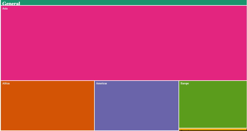
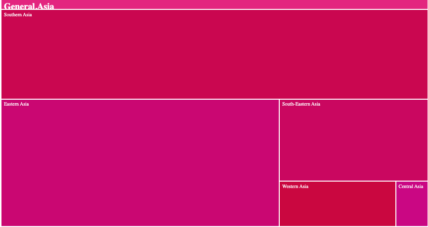
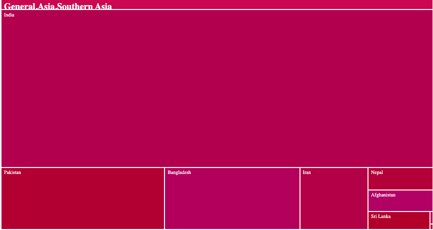
A Treemap is a common visualization tool to represent hierarchical data structures. It displays hierarchical data as a set of nested triangles. Each group is represented as a rectangle where area of each rectangle is proportional to its value i.e. higher the value bigger the area of the rectangle. Several dimensions or groups/sub-groups are differentiated through color schemes. Treemaps are used to show two types of information simultaneously:- How the whole is divided i.e. for each level of the hierarchy, it is easy to understand which entity is the most important & how the whole is distributed among entities. How the hierarchy is organized, it make efficient use of space, which makes them useful for representing big amount of data. Let us see a common example of a treemap describing the world population of different countries. Here the world is divided into continents which constitute a group & these continents are further divided into regions which constitute sub-group & these regions are divided into countries. In the tree structure, the countries are considered as leaves i.e. they are at the end of the branches. The treemap for this example is as shown below:- The above treemap represents each node of the hierarchical structure as a rectangle. Each rectangle area is proportional to its value which is the population. We can easily figure out from the treemap that regions of southern & eastern asia are the most densely populated part of the asia continent. In order to showcase the above data more efficiently, we can create an interactive treemap, as it is advised to have not more than 2 or 3 levels of the hierarchy to display in order to avoid cluttering the treemap. Thus the above example of world population can be showcased via an interactive treemap in which the starting level will be the continents i.e. Asia, Americas, Europe, Africa & Oceania, one can then click on any of the continent in order to see further categorization of each continents into regions & then click on any region to see the different countries comprising that region. The same can be visualized as shown below:- Another common example of treemap is to visualize the sales of a company broken down basis the regions i.e. Central, West, South & East, along with the customer segment i.e. Corporate, Consumer, Small Business, Home Office. Here each of the rectangles represents sales for a particular customer segment pertaining to a particular region. The rectangles having a bigger area shows high sales for that particular customer segment for a region. The treemap can be visualized as shown below:- From the above treemap, one can easily decipher that the corporate sales for central region is the highest following by the corporate sales for West region. Thus with the treemap, one can easily drill down into multi level sets of information in order to derive meaningful insights & then drive appropriate actions.


-
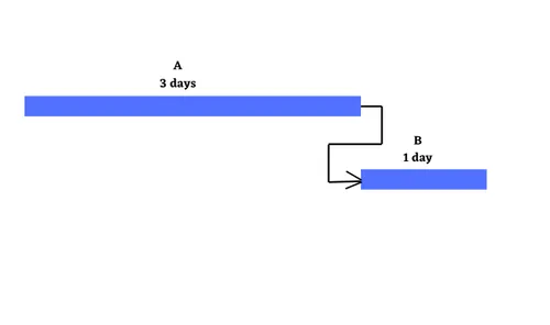
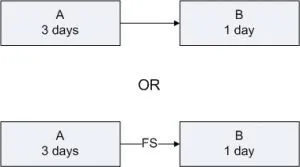
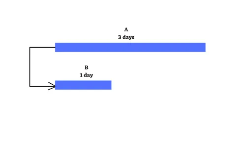
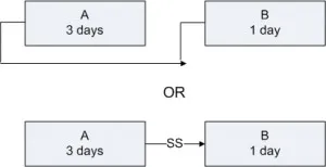
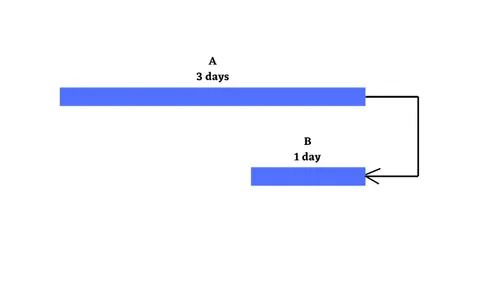
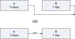
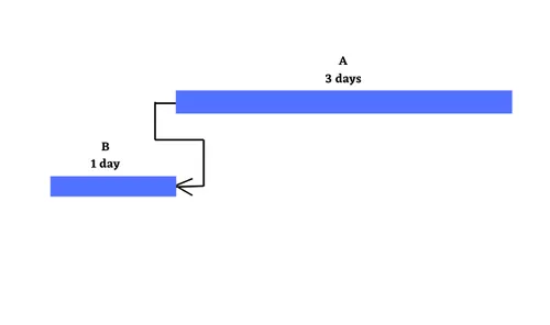
At the simplest level, projects are about a set of activities or tasks that must be completed in some defined sequence. There are a defined set of relationships that exist between the start & end points of the activities. These are Finish to Start, Start to Start, Finish to Finish & Start to Finish. Let us explore these four kinds of relationships along with relevant examples. Finish to Start : Finish to Start is a logical relationship in which a Successor Activity cannot start until a Predecessor Activity is finished i.e. the starting event of a Successor Activity is dependent on the finishing event of a Predecessor Activity. Here the predecessor activity must be fully complete before any successor activity has begun. It is the most common relationship amongst all four relationships. The Finish to Start relationship can be represented on the Gantt Chart & Project Network Diagram as shown below with A as the predecessor activity taking 3 days & B as the successor activity taking 1 day:- Let us take the example of Setting up a router to showcase the Finish to Start relationship. In this case, one must finish deciding where to install the router before one can start the next step i.e. plugging in the router. Another scenario can be configuring a wireless router gateway, before starting to connect it to the router. Start to Start : Finish to Start is a logical relationship in which a Successor Activity cannot start until its Predecessor Activity has started i.e. the starting event of the Successor Activity is dependent on the starting event of the Predecessor Activity. The Start to Start relationship can be represented on the Gantt Chart & Project Network Diagram with Activity A having duration 3 days, Activity B having duration of 1 day as shown below:- Let us again take the same example of router set up with some tweaks. Let’s say that we have multiple, rack-mounted routers & we need to slot them in & then connect them to the internet. Here slotting in the routers is the predecessor activity & connecting them to the internet is a successor activity. Here as soon as we start to slot the routers into the rack, we can also start to make the internet connections. Thus we don’t need to start to make the internet connections immediately, but the first one must have begun ti plug the routers into their rack slot. Finish to Finish : Finish to Finish is a logical relationship in which a Successor Activity cannot finish until its Predecessor Activity has finished i.e. the finishing event of a Successor Activity is dependent on the finishing event of a Predecessor Activity. This relationship exists where two or more activities can only be considered completed when both are completed. The Finish to Finish relationship can be represented on the Gantt Chart & Project Network Diagram with Activity A having duration 3 days, Activity B having duration of 1 day as shown below:- Let us again take the router example, now we are bringing a new server online. You need to load & configure the server operating system & you must also connect the sever to the router. Here configuration of the server operating system cannot be considered complete until the server is connected through the router to the network. Here in this case both activities can begin independently, however to ensure a fully functioning server on the network, both activities need to be completed. Start to Finish : Start to Finish is a logical relationship in which a successor activity cannot finish until its predecessor activity has started i.e. in which the finishing event of the successor activity is dependent on the starting event of a predecessor activity. This kind of relationship is rarely found in real life projects, as soon as the predecessor activity starts, the successor activity will finish. The Start to Finish relationship can be represented on the Gantt Chart & Project Network Diagram with Activity A having duration 3 days, Activity B having duration of 1 day as shown below:- The best example to explain this kind of relationship is let’s say, we are installing a new router to replace the old one. One can’t finish disconnecting the old router until the new router is up & running i.e. starting the go-live activity for the new router is the trigger to finish the disconnect activity for the old one.

-
A Tornado Diagram is basically a two-sided bar chart where there are two data bars that are opposite to each other. It is a special type of bar chart where data is sorted vertically from highest to lowest & due to this sorting the shape of the chart resembles a tornado, hence it is named accordingly. It is a useful tool for decision making by comparison as one can compare two different items or a single item for the different periods. Let us see an example below where we are comparing the sales made by two different stores for each product category. Tornado chart is commonly leveraged in performing Sensitivity Analysis where it is used to depict the sensitivity of an output as a result of the changes in selected variables. In other words, it shows the effect on the output of varying each input variable at a time while keeping all other input variables at their initial values. Generally a low & a high value for each input is selected & the result is then displayed on a tornado chart, where the bars of each input variable showcases the variation from its nominal or initial value. The bars having the highest variation are placed on the top & rest of the bars are arranged in a descending order of the magnitude of the variation. Let us understand with the help of an example. Below is a tornado chart displaying the impact of variation of different parameters on the reliability of the material. From the chart, it can be clearly seen that the strength of the material & Coil diameter have the highest variation, thus both the parameters greatly influence the reliability of the material. Hence in order to improve the reliability, one has to focus on reducing variation of these parameters. Tornado chart also has its applications in the field of project management where it is leveraged to perform risk analysis i.e. it is used to display the magnitude of each risk in order to identify those risks that can impact the cost, schedule or both of a project. Here the biggest risk is shown on the top of the chart which is having the biggest spread & this risk requires the most attention. Let us see below, how the tornado diagram is leveraged to perform risk analysis:- From the above diagram, it is clear that the Risk 1 will have a significant impact when it comes to the overall project cost, thus appropriate mitigation needs to be put into place.


-
Inventory Turns / Inventory Turnover Ratio is a financial ratio that represents the number of times an organization turned over its inventory with respect to its cost of goods sold (COGS) in a given time period (typically a fiscal year). It is calculated basis the given formula:- Inventory Turnover Ratio = COGS / Average Inventory Where Average Inventory = (Inventory Balance at the year beginning + Inventory Balance at the year end) / 2 Let us see how this is calculated with the help of an example:- XYZ Company has cost of goods sold amounting to $5M for the current fiscal year. Its inventory balance at the beginning of the fiscal year was $600,000 & at the fiscal year end amounts to $500,000. Here let us first calculate the Average Inventory = ($600,000 + $400,000) / 2 = $500,000 Now let us calculate the Inventory Turnover Ratio = $5,000,000 / $500,000 = 10, thus the value of 10 denotes that the inventory turns are 10 times for the fiscal year i.e. 10 times in a year an inventory has been converted into sales by XYZ Company. Let us now see how does the Inventory Turnover Ratio aids in business growth:- A high inventory turnover ratio is a good sign for an organization as this means that the goods are generally sold at a faster rate & a lower ratio indicates excess inventory in the ecosystem which leads to additional inventory handling & carrying cost burden for an organization. Its is a useful measure for organizations to gauge their operational efficiency by comparison of their ratios with the industry benchmark. A low inventory turns ration is also a sign of weak sales as it can indicate problem with the overall sales & marketing strategy of an organization & will channelize an organization’s effort to improve upon the same. It also signals towards the rate at which the demand is generated, thus aiding in decisions pertaining to regulating the output generation for an organization. We can also leverage the Inventory Turns Ratio to calculate the Days Sales of Inventory (DSI), which gives an idea of how long it takes for an organization to turn its inventory into sales. This is basically calculated as shown below:- Days Sales of Inventory = (Average Inventory / Cost of Goods Sold) x 365 (i.e. no of days in a fiscal year). Let us now calculate the Days Sales of Inventory for the previous example of XYZ Company:- DSI = ($500,000 / $5,000,000) x 365 = 36.5 ~ 37, which means that for XYZ Company approximately 37 days is the number of days for which the inventory is there in their system before being sold.
-
A Waterfall Chart is basically a variation of a bar graph that shows how an initial value changes due to other factors over a period of time. It is also known as a Waterfall Graph or a Bridge Chart particularly in finance parlance. Its purpose is to show a before & after picture of your data, it depicts each step in the journey & shows which factors increases or decreases the progression. Its was made popular by McKinsey & Company, thus many people consider it to be a financial charting tool, however it has its applications in other areas as well. Let us see below a common example of a waterfall chart being leveraged in financial sector in order to study the effect of various revenue streams on the overall profit of an organization. Waterfall chart has its application in business excellence as well, especially while driving improvement projects. Let us see some examples in order to further explore this aspect:- In this example, the waterfall chart is leveraged to showcase the roadmap of achieving the targeted goal broken down in terms of various solution levers. Here we will start off with the initial baseline of the project metric & then showcase each solution lever along with its projected impact on the metric & finally arriving at the targeted value of the project metric. This example showcases the application of waterfall chart at a program level in order to showcase the 5 year projection journey of the program metric by showcasing the projected reduction of the program metric over a period of 5 years. Let us have a look at one more example where we are showcasing the impact of various factor X’s on the output Y of a regression model. Here we are starting with mapping the intercept coefficient value & then also showing the coefficient values of all the relevant X’s & finally arriving at the projected Y.


-
Below are the key differentiating aspects amongst the three experimental approaches:- Differentiating Aspect Trial & Error One Factor at a Time (OFAAT) Multiple Factors at a time (Factorial Design) Concept Subject matter experts hypothesize the critical independent factors that will create a desired outcome or response. The experiments are done with these factors. If the experiments are not successful, another set of factors is selected & the experiments are repeated on the another set of factors until the hypothesized factors are not validated to impact the outcome The experiments are designed in such a way that one factor is varied throughout its normal range while other factors are kept constant. The factor is set at the optimal setting & the next factor is selected & varied throughout its normal range in order to determine the optimal setting. The process continues until all the factors are tested by varying one factor while keeping all other factors constant This experimental approach consists of two or more factors each with discrete possible values known as levels, the experimentation takes into account all possible combination of these levels of all the factors involved, the experiments are conducted by taking different levels of the factors simultaneously Suitability Appropriate where there is a specific goal or response that is desired from the dependent factors & there are subject matter experts who can confidently select the appropriate independent factors for conducting the experiment Best suited for basic research projects for testing new technologies or inventions. This allows the researchers to define the relationships between the factors & the system performance Often used to create a statistically valid equation for the system performance based upon the input values of the selected factors being studied. It determines the optimal level of performance basis the multiple level factors that are used Advantages This approach is the fastest & lowest cost experimental design approach. By leveraging the expertise of the subject matter experts & focusing the experiments on a specific goal, the number of tests can be held to a minimum The OFAAT methodology is very efficient when it comes to characterizing how the selected factors impact the system performance i.e. product, service or process. By varying each factor at a time through its normal range, one can efficiently study the magnitude of impact of each factor on the output & this will aid in better decision making in terms of factor selection for further optimization This is the most comprehensive approach of experimental design as we can easily perform a comprehensive analysis of the design space for the system being analyzed. The final result of all the experimentation is an equation that can be leveraged to predict performance & this equation camn be used to identify the factor settings that will yield optimal performance, thus making this approach a go-to tool for prescriptive analytics Limitations This approach is highly dependent upon the knowledge & experience of the subject matter experts. Also this is a difficult methodology to estimate, this is because if the estimates of the factors during experiment turns out to be not true, then additional unplanned tests are needed & this can create massive delays & overruns This approach works best if the impact of the factor is linear, however if the effect is non-linear or curvi-linear then the order of factors can impact the final setting & performance. Also this approach only studies the effect of one factor on the outcome however does not take into consideration the intercation effects or two or more factors simultaneously on the overall outcome All the tests basis the possible combination of levels of all the factors must be conducted in order for the statistics to be valid, thus making this approach both time & resource intensive In cases where exploration of the potential factors that can impact the outcome needs to be done, trial & error approach will be more beneficial compared to OFAAT or Multiple Factors at a time. Here we can conduct preliminary experiments to check whether the selected factors are having a significant impact on the outcome or not. If not we can further identify another set of factors in order to validate their impact on the outcome. From a cost, time & resource perspective also, we want to make sure that the factors that are being considered for study have at-least gone through a preliminary validation & now we are sure that the factors being studied through OFAAT or Multiple factors at a time approach are being identified correctly. In such scenarios, trial &b error approach will play a very important role.
-
The MAGIC criteria was put forth by Robert Abelson in his book “Statistics as Principled Argument” & is leveraged for making persuasive statistical argument. The five letters in the MAGIC criteria are as explained below with analogy to DMAIC :- The M in the acronym stands for Magnitude i.e. How big is the effect? - here we can tell how big an effect is through various measures of the effect size. It tells that big effects are impressive, small effects are not. Let’s take the scenario in the Improve phase of two DMAIC projects working on reducing the Vendor Payment Cycle Time of processes spread across two different locations of a company, now the first project has yielded a 40% cycle time reduction while the second one has yielded 10% reduction, thus clearly the magnitude of effect of the first project on the cycle time is much more substantial than the second project. The A in the acronym stands for Articulation i.e. How precise stated it is? - it is measured in form of ticks & buts. A tick is a statement while but is an exception. The more precise the statement is i.e. more ticks the precise the statement is. From a DMAIC parlance this is analogous to the Define phase, where we are stating the problem statement. Here we are leveraging 4W 1H in order to have a precise problem statement framed in terms of What is the problem, Where it has occurred, When it has occurred, Who is impacted by this problem & How much is the magnitude of the problem. All these aspects helps us in creating a precise problem statement which becomes the basis for creating the goal statement so that everyone in the project team is calibrated. The G in the acronym stands for Generality i.e. How widely does it apply? - it states that how broadly the empirical conclusion can be generalized, in other words it refers to how general an effect is?, this can be very general or can be very specific. Usually more general effects are of greater value than more specific ones. It we strike an analogy with DMAIC, this would refer to working out the scope of an improvement project. Too broad of a scope makes the project more impactful, although it adds to the complexity of the project as well & too narrow a scope makes the project less impactful. The I in the acronym stands for Interesting i.e. How interesting it is? - it basically identifies the potential of an empirical finding to change people’s beliefs. This is analogous to the Analyze phase of a DMAIC project where we are leveraging hypothesis to identify which of the potential causes are significantly impacting the effect or the problem being focussed upon. The significant causes are then only considered for further root cause analysis & rest are ignored as they fail to prove that they have a significant impact on the problem. The C in the acronym stands for Credibility i.e. How believable it is? - this means that the research method should be sound & disciplined, in other words, the more hard a result is to believe, the more stringent you have to be about the evidence supporting it. From a DMAIC perspective, this makes sense while planning for hypothesis tests, where it is of paramount importance that you precisely define your hypothesis & also calculate a statistically significant sample size considered both the type-1, type-2 errors & power of the test. This will ensure that the test undertaken will be effective in delivering accurate results.
-
Let us understand the difference between RPA & IPA based on certain criteria along with relevant examples :- Execution Approach : Robotic Process Automation (RPA), refers to a set of automated tools that help businesses to automate processes by mimicking human actions on computers, with little or no assistance. RPA tools are designed specifically for automating mundane, repetitive tasks that follows defined business rules & requires mimimal decision making. Eg : Bank reconciliation where the transactions recorded in general ledger are matched with bank statements. In this case the RPA bot logs into bank portal as well as the oracle in order to fetch the general ledger as well as bank statements, performs reconciliation of each transaction based on a business rule. Intelligent Process Automation (IPA), on the other hand augments the traditional rule-based automation with decision-making capabilities in order to deliver results with utmost efficiency. It is combination of RPA & AI technologies, which handle more complex processes rather than just routine rule-based tasks. Eg : In an accounts payable process where we are getting scanned invoices in different formats from different vendors, here we will not be able to get the information in a standardized format, here RPA will not be able to decipher information from those invoices & requires OCR technology to extract required information from invoices & then using RPA will copy paste that extracted information into the ERP. Automation Development Complexity : RPA helps automate high volume rule-based processes & does not require any prior coding knowledge in order to build the automation. Most platforms such as UiPath & Blue-Prism provide flowchart based designs which makes it easy to automate business processes. Nowadays platforms like Uiath provide StudioX where a business owner can build automation logics himself/herself in order to automate its simple routine tasks. IPA requires coding knowledge & require expert IT professionals to build the automation logic as it includes scenarios like API automation in order to integrate applications or classification of invoices involves a complex logic, which requires knowledge of model building & these tasks only be performed by expert developers having expertise in such areas. Scalability : RPA bots can easily be monitored & scaled up or down quickly basis the changes in work volume since we are here dealing with repetitive, rule-based tasks. Thus with changing work demand, RPA bots can be easily & quickly deployed at minimal costs without any compromise in terms of quality of work. Eg: RPA bots can be easily monitored & scaled by leveraging Uipath Orchestrator which will ensure their efficient utilization with minimal to no human intervention. IPA on the other hand, requires considerable effort when it comes to scaling the technology as the work involved is of higher complexity & this results in higher deployment costs as well. However coupled with RPA can be scaled up or down to a lesser degree of effort as it will be implemented to augment the effort of RPA bots. Underlying Technology : RPA thrives on common technologies like Screen Scrapping, Workflow Automation which supports in automating back end business processes with more accuracy compared to when they were manually executed. IPA brings & supplements RPA with newer technologies such as Natural Language Processing (NLP), Machine Learning (ML), Data Extraction (OCR) in order to supplement the existing capabilities of RPA so as to perform more complex tasks.
-
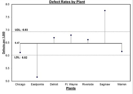
ANOM or Analysis of Means is a systematic procedure for analyzing the difference among groups or sub-groups in a visual form. it allows the data to be graphically visualized. It is a graphical variation of ANOVA or Analysis of Variance. The graph shows the decision limits, overall mean & mean for each group. If a point in the chart falls outside of the decision limit for any given group, it will thus showcase a significant difference between the group mean & the population mean. Below is an example of this graphical representation:- In the above visual, the centre line represents the overall mean & the dots represent the means of different groups, also the line connecting these dots with the overall mean center line represents the difference of the group mean with the overall mean. UDL & LDL represents the upper & lower limit values of the decision limits. Also one can see that there is a large difference between the mean defect rate of Eastpointe & Saginaw sites when compared with the overall defect rate for the entire company. While conceptually both ANOM & ANOVA serve a common objective, there are still marked differences between the two approaches. Let us try to understand these differences basis certain criteria:- Framing the Hypothesis :- In case of ANOM below are the hypothesis that can be framed : Ho : Means of all groups are equal. Ha : Mean of at-least one group is not equal to the population mean. Below are the hypothesis in case of ANOVA : Ho : Means of all groups are equal. Ha : Mean of at-least one group is not equal to other group means. Distribution Assumptions :- While ANOVA only takes data which belongs to a normal distribution, ANOM can take into consideration data belonging to both Normal & Binomial Distribution. Calculation Approach :- ANOM calculates the overall mean of all the data from all the samples & then measures the variation of each group mean from the overall mean. Here the identity of the sources of variation is retained. ANOVA takes into account two calculations while assessing variations i.e. Variation between groups is summarized into Mean Squares Between or MSB, variation within each group is summarized into Mean Squares Within or MSW. Here the individual identities of the groups are somehow lost. Flexibility of Result Interpretation :- ANOVA tell us whether or not there is a statistically significant difference amongst the group means, however it cannot tell whether which of the group(s) is different from the others. Here we generally leverage tests like Fisher LSD or Tukey Post Hoc test in order to identify the statistically significant difference creating group in terms of absolute difference. ANOM on the other hand in addition to telling whether there is a significant statistical difference between the group mean & the overall mean, also tells which group mean is having a significant difference when compared to the overall mean & can be visually represented as well. Now let us take an example of a bank where we want to see the impact of performing wire transfer to four countries eg : India, Brazil, USA & France on the wire transfer cycle time. Here we want to analyze the whether there is a significant variation in cycle times when compared to the overall cycle time. By applying ANOM in this case, we will first able to find out the variation in mean cycle times for each country with respect to the overall cycle time & also will be able to find out that the transactions to which country is generating the most variation when compared to the overall cycle time. This would not have been possible while using ANOVA as we would not have been able to figure out the country(s) are contributing the most to the variation in wire transfer cycle time. Thus to conclude in this example, that ANOM not only reveals the statistically significant difference amongst the wire transfer cycle times for different countries, but also identifies those countries which are contributing to these differences which would not have been possible through ANOVA.
-
Lindley’s Paradox, developed by Sir Harold Jeffrey, showcased the conflict between the frequentist & bayesian approaches to hypothesis testing. It refers to the fact that with the increase in sample size (keeping a constant p-value eg p < 0.05), there seems to be a conflict between p-values & baye’s factors i.e. the p-value suggests that the null hypothesis (Ho) should be rejected, however the baye’s factor indicates towards the null hypothesis (Ho) out-predicting the alternative hypothesis (Ha) & this would ultimately result in Ho being rejected as per the frequentist approach & accepted basis the bayesian approach simultaneously. Let us try to understand this concept through an example:- Suppose a bank which processes loan applications receives applications for home loan. Also generally the bank receives all kinds of loan applications in two batches on a regular basis i.e. one batch containing 25% home loan applications & the second batch containing 50% home loan applications. Now the bank wants to figure out which of these two batches the received applications belong to. Thus in order to do that, let’s say the bank takes a random sample of 48 applications & observed that 36 of these random samples are home loan applications which amounts to 75%. Thus going by the above result we can conclude that the applications belong to the second batch i.e. which contains 50% home loan applications. Now let us apply hypothesis testing & go with the first hypothesis i.e. Testing whether the applications belong to the first batch which contains 25% home loan applications. Let us calculate the populations parameters i.e µ & σ. µ = np = 48*0.25 = 12 σ = sqrt(np(1-p)) = sqrt(48*0.25*(1-0.25)) = sqrt(48*0.25*0.75)) = 3 Now at 99% confidence level (or 0.01 significance level), the range is 12 +/- 3*3 i.e. from 3 to 21. Here findings of 36 samples taken above is nowhere close to this range thus making us reject the null hypothesis i.e. the applications belong to the batch containing 25% home loan applications. Now let us also test the hypothesis whether the applications received belong to the second batch containing 50% home loan applications. Let us again calculate the populations parameters i.e µ & σ. µ = np = 48*0.50 = 24 σ = sqrt(np(1-p)) = sqrt(48*0.50*(1-0.50)) = sqrt(48*0.50*0.50)) = 3.5 Now at 99% confidence level (or 0.01 significance level), the range from 13.5 to 34.5 which does not include the sample result of 36, which again will lead us to reject the null hypothesis that the applications received belong to the second batch i.e one containing 50% home loan applications. Now basis the results, the possibility of the received applications belonging to both the batches got rejected which is the underlying premise of lindley’s paradox. Let us now also see the different ways through which we can mitigate the same:- One approach is to lower down the alpha level as a function of the sample size, thus one should get the best result with any value of alpha that makes the ratio of critical value to the standard error increase with increase in sample size. Another approach is to set the baye’s factor (which is basically the ratio of the probability of data under both null & alternate hypothesis i.e. p(data|Ha) / p(data|Ho)) to 1 which implies equal evidence for both null & alternate hypothesis. Next is to adjust the alpha level in a way that the baye’s factor at the critical test statistic value is not greater than 1.
-
There are two common statistical approaches that are being followed when it comes to statistical testing i.e. The Frequentist Approach, which is based on the observation of data at a given moment or instance & The Bayesian Approach, which is basically a forecasting approach & it involves analyzing prior information. The frequentist approach is also described as experimental or inductive as it relies on observations while the bayesian approach is theoretical or deductive as it enables to combine the information provided by data with a priori knowledge from previous studies or expert opinions. Let us take a very simple example to understand both the concepts:- Let us toss a coin 10 times, now when it comes to frequentist approach, the probability of getting either a head or a tail is 0.5, now let’s say we get heads on 7 out of 10 tosses, then the probability of getting the heads will be 7/10 i.e. 0.7. Now let’s say we have a prior information through previous experiments of expert experience that heads will come 6 out of 10 times thus we have a prior probability of 0.6, now we will compare the outcome of the experiments with this prior probability. Thus we can say that the objective of the frequentist approach is to explore the data collected in order to identify a significant effect that could only be explained through by the hypothesis of the experiment & for the bayesian approach the focus is on comparing two hypothesis by comparing the data collected at the time of the experiment with the prior information available therefore assessing the chances that one was true comparison to other. As an organization performing experiments & relying on statistical analysis for analyzing the results of these experiments, it is thus important to understand the difference between the above two approaches on the basis of different parameters which are as shown below:- In terms of analyzing the test data :- Frequentist approach requires the experiment to be completed first by collecting sufficient samples before analyzing the data, this limits the test to be an offline experiment. Bayesian approach analysis can be performed during the experiment while collecting the data. Also it is an online experiment as the analysis results get updated when new batch of data gets ingested. Sample Size :- Frequentist approach requires calculating the sample size prior to conducting the test, also the number of samples among test groups needs to be balanced. Bayesian approach does not require a pre-defined sample size & also there is no need to have same number of samples amongst the test groups thus allowing an imbalanced sample size. Test results explanation :- For the frequentist approach, conclusions can be made like “We reject/ fail to reject the hypothesis that group A is better then group B. This conclusion is based on the observation of the historical data collected during the test. This approach uses p-value in order to quantify the confidence of the business conclusions. For the bayesian approach, we introduce the element of probability while making an interpretation of results such as “ There is a 98% probability that group A is better than group B”. Thus this probabilistic result quantifies the confidence of the business conclusions. Leveraging Test Results :- Frequentist approach gives summary statistics of the samples collected during the experiment period, thus cannot be used for making any conclusions about the future unseen data. Bayesian approach leverages the parameters of the distribution from the data & gives the posterior predictive distribution for unobserved, future values on the observed data. Duration of the Test :- In the frequentist approach, the duration of the experiment can be estimated basis the designed sample size as it is easy to estimate how long an experiment will be conducted. In the bayesian approach, the duration of the experiment cannot be estimated as more samples coming every day helps to get more confidence conclusions, but cannot estimate how long a specific experiment would take. Granularity of input data :- In the frequentist approach, the level of granularity of the input data is at the very base level for eg: data collected basis each user / ID & also it depends on the duration for which the test is conducted. In the bayesian approach, the level of granularity of the data depends on the frequency of the updating the test results, for eg : in case you are testing the Click through rate & the results are updated every 24 hours, one needs to calculate the number of total seen events & number of click events every day in order to arrive at the daily click through rate. Performing Multiple Comparison :- Frequentist approach leverages bonferonni adjustment in case when multiple variants are required to be tested at the same time. Bayesian approach uses hierarchical bayesian methods for cases involving multiple variants. Testing Approach :- The frequentist approach recommends different tests based on the distribution(s) that a variable of variable(s) follows. The bayesian approach leverages conjugate families for variables following different distributions for eg : Click through rate would leverage the beta distribution conjugate wherein prior parameters need to be set for the beta distribution, collected data is updated basis the baye’s rules in order to get the posterior of the parameters, then samples are taken from the posterior distribution & inferences are made on the test results accordingly.
-
Analytic Hierarchy Process (AHP) & Pugh Matrix are two common methods that are leveraged for decision making in situations having multiple alternatives to be compared basis the multiple criteria. Both these methods incorporate quantifiable comparisons amongst alternatives & rely on establishment of a criteria based on subjective comparison. While Pugh Matrix is good at optimizing & eliminating low quality alternatives, AHP gets an edge as it performs better when it comes to forcing a decision in cases where there is lot of uncertainty & disagreement. Below are some limitations of Pugh Matrix which can be mitigated through AHP:- The only comparison that is happening is with the datum or the base alternative, however there is no pairwise comparison happening between different criteria which is being done in AHP where we performing a pairwise comparison amongst the criteria. Also when evaluating alternatives we are only using a 3 point scale i.e. +, -, s which provides limited granularity as it is leveraging attribute data while AHP leverages ratio scale data i.e. 1,2,3,4,5,6,7,8,9,1/2,1/3,1/4,1/5,1/6,1/7,1/8,1/9 which provides a much granular pairwise comparison amongst the criteria. There is an element of bias when it comes to assigning the importance ratings (usually on a scale of 1-5) as these tend to change basis how the people feel on a particular day while AHP enforces a consistency ratio (CR) threshold which ensures optimum degree of consistency in terms of agreement amongst the people involved in decision making. Now the choice between using AHP & Pugh Matrix depends on situations. Let us try to understand some of these situations:- For organizations who are mature in terms of adopting best practices such as lean six sigma can leverage Pugh matrix for their decision making as the decision makers are not aligned in terms of thought process thus less probability of disagreements. For organizations that have a higher leverage (i.e. organizations that thrive on external investments rather than equity) have to take into considerations the relative importance of different criteria that are being leveraged for decision making, thus they tend to use AHP for making decisions, however for less leveraged organizations since investment is coming through equity they have much more flexibility in terms of investing for future, thus they can use Pugh Matrix for making decisions. Thus using AHP or Pugh Matrix depends on the organizational maturity & complexity of the situation. I hope you all agree with this..!!
-
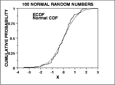
One of the most common requirements for statistical test procedures is that the data used must be normally distributed thus it is very important to understand whether the data belongs to a normal distribution or not. In order to achieve this, there are various normality tests available for testing the normality of the data, the common ones are:- Anderson Darling Test Kolmogorov Smirnov Test Chi Square Goodness of Fit Test Shapiro Wilk Test However there are graphical methods also available such as normal probability plot or Q-Q plot for assessing normality of a data set, for this discussion we will be focussing our attention on the tests mentioned above. Let us understand each of these along with examples:- Anderson Darling Test : The Anderson-Darling Goodness of Fit test basically compares the empirical cumulative distribution function or ECDF (an estimator of the cumulative distribution function which allows to plot a variable in order from least to greatest & see how the variable is distributed across the data set) of the sample data & compares it with the expected distribution if the data was normal. If the observed difference is sufficiently large, the assumption of normality is rejected. Below is the null & alternative hypothesis : Ho : The data follows a normal distribution Ha : The data does not follow a normal distribution The Anderson-darling Test Statistic is defined as : A^2 = -N-S where S = Σ[i = 1 to N] (2i-1)/N (ln F(Yi) + ln(1-F(Y(N+1-i)) & F is the CDF of the specified distribution & Yi is the orderd data. Also ECDF is given by : E(N) = n(i)/N where we have N order data points Y1, Y2, …, YN. This test is a one-sided test with the hypothesis that the distribution is normal is rejected if the test statistic A-Sq is greater than the critical value. Amongst all the above test, the Anderson Darling Test is the most effective when non normality is due to variation in the tails of the distribution & also the tails are the most critical part of the distribution when it comes to checking its normality. Let us say we generate 1000 random numbers each for four different distributions Y1, Y2, Y3, Y4 & apply the test to ascertain whether the data follows a normal distribution. Below are the results:- H0: the data are normally distributed Ha: the data are not normally distributed Y1 adjusted test statistic: A2 = 0.2576 Y2 adjusted test statistic: A2 = 5.8492 Y3 adjusted test statistic: A2 = 288.7863 Y4 adjusted test statistic: A2 = 83.3935 Significance level: α = 0.05 Critical value: 0.752 Critical region: Reject H0 if A2 > 0.752 Looking at the above results the data sets Y1, Y2 & Y4 follows normal distribution as we fail to reject the null hypothesis in these cases. Kolmogorov Smirnov Test : Similar to Anderson Darling Test, the Kolmogorov Smirnov Goodness of Fit Test is also used to decide whether a sample comes from a normal distribution. Here also we compare the ECDF of the sample data with the expected normal distribution if the data were normal & we reject the assumption of normality if there is a significant difference observed. This test has the same set of null & alternate hypothesis as mentioned above for the Anderson Darling Test. However there is a marked difference in terms of its sensitivity as it tends to be more sensitive near the center of the distribution compared to Anderson Darling Test which tends to be more sensitive at the tails of a distribution. Also this test does not depend on the sample size in order for the assumptions to be valid thus making it an exact test. Also the critical value of the test statistic does not depends on the underlying distribution being tested as opposed to the Anderson Darling Test. The Kolmogorov Smirnov Test Statistic is defined as : D = max[1 <= i <= n](F(Yi) - ((i-1)/N), i/N - F(Yi)) here F is the theoretical CDF of the distribution which is being tested. Also the parameters for distribution i.e. shape, location & scale must be fully specified & cannot be estimated from the data. Let us again generate 1000 random numbers each for four different distributions Y1, Y2, Y3, Y4 & apply the test to ascertain whether the data follows a normal distribution. Below are the results:- H0: the data are normally distributed Ha: the data are not normally distributed Y1 test statistic: D = 0.0241492 Y2 test statistic: D = 0.0514086 Y3 test statistic: D = 0.0611935 Y4 test statistic: D = 0.5354889 Significance level: α = 0.05 Critical value: 0.04301 Critical region: Reject H0 if D > 0.04301 So the null hypothesis got is not rejected for the first data set Y1 & got rejected for the remaining three which is Y2, Y3 & Y4. Thus the data set Y1 follows a normal distribution. Chi-Square Test : The Chi-Square Goodness of Fit test is used to test if a sample of data come from a population which follows a specific distribution , in our case it is the normal distribution. It is applied to binned data where the data is put into classes & we calculate the Chi-Square Test Statistic & compare that to the critical value in order to reject or accept our hypothesis which is whether the data follows the normal distribution or not. The Chi-Square Test Statistic is defined as : Chi-Sq = Σ[i= 1 to k] (Oi - Ei)^2 / Ei where data is divided into k bins & Oi is the observed frequency of the bin & Ei is the expected frequency of the bin. Here Ei = N(F(Yu) - F(Yl)) where F is the CDF of the distribution being tested, Yu is the upper class limit & Yl is the lower class limit & N is the sample size. The test statistic follows approximately a chi-square distribution with (k-c) degrees of freedom. Let us again generate 1000 random numbers each for four different distributions Y1, Y2, Y3, Y4 & apply the test to ascertain whether the data follows a normal distribution, here we applied the chi-square test with 32 bins, also c = 2+1 = 3, as we have two parameters in a normal distribution i.e. mean & standard deviation. H0: the data are normally distributed Ha: the data are not normally distributed Y1 Test statistic: Χ 2 = 32.256 Y2 Test statistic: Χ 2 = 91.776 Y3 Test statistic: Χ 2 = 101.488 Y4 Test statistic: Χ 2 = 1085.104 Significance level: α = 0.05 Degrees of freedom: k - c = 32 - 3 = 29 Critical value: Χ 21-α, k-c = 42.557 Critical region: Reject H0 if Χ 2 > 42.557 From the above results, we can infer that for data set Y1, we fail to reject the null hypothesis, thus we can conclude that the data set is normally distributed. Shapiro Wilk Test : The Shapiro Wilk Normality Test basically quantifies the similarity b/w the observed & normal distributions by superimposing a normal curve over the observed distribution. It then computes which percentage of our sample overlap with the normal curve. Thus this test computes the probability of finding this similarity percentage. It calculates the W statistic that tests whether a random sample comes from a normal population. Small values of W showcases the evidence of deviation from normality. This test statistic is calculated as shown below : W=(∑ni=1aix(i))2∑ni=1(xi−x¯)2 where xi are the ordered sample values & ai are constants generated from the means, variances & covariances from these ordered sample of size n from a normal distribution. Let us take an example where we collected the reaction times of a sample of people who have appeared for a typing test. Let us analyze the descriptive statistics computed for these samples:- Reaction Time : N = 233, Mean = 969.97, Median = 932.00, Std Dev = 275.32, Skewness = 0.341, Kurtosis = -0.394 Here we can observe from the results that the skewness & kurtosis are closer to zero, thus resembling data closer to a normal distribution, next the actual test is performed & below are the test results:- Reaction Time : Statistic = 0.984, df = 233, Sig(p) = 0.075 Since p > 0.05, we can conclude that the data follows normal distribution.

-
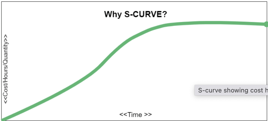
S-Curve is a useful tool for project managers in order to see the progress of a project at a high level.It is basically a mathematical graph that represents the critical data for a project. The information plotted on the graph typically consists of project cost or the number of hours worked compared against time. It is known as S-Curve as the the shape of this curve resembles the letter ’S’. A typical S-Curve is as shown below:- As you can see from the above curve, at the start of a project, the progress is slow & looks more of a straight line as more time is spent in planning & once the project is in full swing, the growth in project activity gets significantly higher & the middle part tends to be steep curve upwards & the point of maximum activity is commonly known as inflexion point. As the project move towards closure, the curve levels out & resembles a shape close to a flat horizontal line. Below are the various uses of an S-Curve in project management:- A project manager can monitor real time cumulative data pertaining to various project elements & compare it with the projected data. During the project lifecycle, he/she can plot the actual resource use & can see how well it matches what’s expected. In case there is a gap, there is an opportunity to make appropriate adjustments. It helps to make budget planning & resource allocation more accurate as plotting the S-Curve indicates when you expect the project to be the most resource intensive. Also it will be easy to communicate to the stakeholders in terms of resource provision such as budget or manpower. It helps in visually engaging the stakeholders & explain to them the pace of work throughout the different stages of a project & also keeps the team members calibrated in terms of deliverables for the project they are involved. Once the baseline S-Curve is created, we can vary the inputs in order to identify their impact on the project thus helping us to plan for different scenarios. Here 2 curves are created that join the start & finish & is known as banana curve. This indicates how much float is there in the schedule in case things change during project execution. Thus we can plot the actual work delivered against the banana curve. If the data points are close to the latest date curve, one can flag the risk of delay in the project & thus prompting the project team to take action accordingly. This scenario is as shown below:- Thus to summarize, an S-Curve graphically displays cumulative parameters plotted over time. The typical parameters that are monitored include Man-Hours, Cost, Progress & utilization of these parameters is represented as shown below:- Let us also look at typical example where we can leverage S-Curve:- Let us consider a scenario where a vacation rental company is slated to launch an important policy change at a designated date to its platform users, since the timelines in this case are non-negotiable due to the leadership commitments done to the users, thus tracking the actual timeline of execution of tasks pertaining to the change as against the projected timelines becomes critical. Here S-Curve will help to monitor any potential delay so that prompt action can be taken to bring the project on track.


-
Although Student’s T, Logistic & Binomial distributions have a shape that resembles a bell curve or a Normal distribution, however these distributions have their own set of criteria which differs from a Normal distribution. Let us try to understand each of these distributions:- Student’s T Distribution : The T distribution is used for performing inferential statistics on the population mean in scenarios where the population standard deviation is unknown & population being normally distributed. It is a series of distributions which depends on the sample size as every sample size has a different distribution. Compared to a Normal distribution, the T distribution has flatter in the middle & have more area in the tails. Also as the sample size becomes large it approaches a Normal distribution thus making it suitable for use in case of unknown population standard deviation, regardless of the sample size as opposed to Normal distribution where we have a known population standard deviation. A typical application of this distribution is in instances where experimental studies are undertaken & we do not have a historical standard deviation about the population. Let us say a new branch of a mortgage loan company has opened & we have a few samples in order to validate the hypothesis that the lead time for mortgage settlement is achieving a certain hypothesized target value or not. Logistic Distribution : The Logistic distribution has wider tails than a normal distribution thus it provides better insight into the likelihood of extreme events. One of the most common application of this distribution is the Logistic Regression study where we predict the outcome of a discrete binary dependent variable on the basis of continuous independent variable(s) & because of the discrete nature of the output variable we cannot use normal distribution. An example can be whether a person will have a heart attack basis his blood pressure & blood sugar levels, so here we will predict the probability of having a heart attack & observe whether it is above a certain probability threshold (typically it is p=0.5), then heart attack will occur & if it is below that probability threshold then heart attack will not occur. Binomial Distributions : As opposed to Normal distribution which models continuous data, the Binomial distribution is used to model binary data such as a coin toss or a roll of a dice where each event is a discrete event & all the events are independent of each other. A binomial distribution curve consists of estimating the likelihood of occurrence of each independent event, thus we calculate the PDF(probability density function) as opposed to CDF(cumulative density function) which is the case in Normal distribution. An example can be estimating the probability of getting a flu basis a known long term probability of having a flu. Binomial distribution will show the likelihood of a specific no. of times of getting a flu.

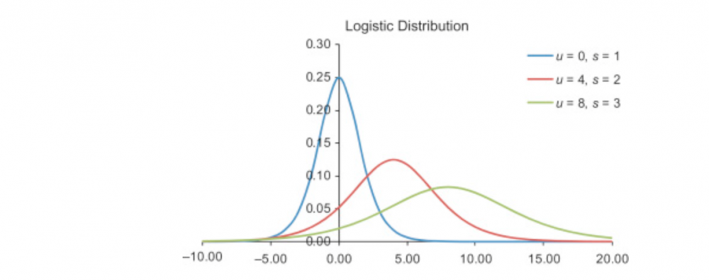
-
Both Multiple Linear Regression (MLR) & Design of Experiments (DOE) provide appropriate information on the interaction effects, however when we compare the two DOE has an edge when it comes to extracting information about the interaction effects. Below are some reasons that can be thought of which can support the above assertion:- In Design of Experiments, the experimental conditions are controlled by the experimenter. On the other hand regression analysis is done mostly on observational data which might not come from a controlled environment. There are elements of bias when it comes to observational data i.e. let’s say if we collect data on height of students in a primary school, the data will be collected from all students regardless of the gender & this can result in bias in the results. However when we are performing experiments we can select an even proportion of boys & girls in our sample in order to eliminate or reduce this bias. Although Regression models can easily explain effect of variables on the target variable i.e. both main & interaction effects, there is still a random error component that is present in all regression models thus making it difficult to understand the sources of variation which is not the case with DOE where we are carefully designing the structure of the experiment & the results will give a more comprehensive view of the sources of variation. In a Regression study as well as in DOE , we can check for the effect of interaction effects through interaction plots however we can go a step further in DOE & find out the optimal settings so as to optimize the target variable. In DOE analysis, we can also look into the impact of both main as well as interaction terms on the target variable through Pareto & can take a conscious decision in terms of variable selection basis their sensitivity on the output.
-
Let us understand the various types of ANOVA’s:- One Way ANOVA : The purpose of performing one way ANOVA is to compare the population means of more than two populations or more than two subgroups within a single population. The objective is to ascertain whether a significant difference exists amongst the population means. The hypothesis can be formulated as mentioned below:- H0 : µ1 = µ2 = µ3 =…….= µn Ha : At least one of the means is different from the other means Let us take an example where we are comparing the cycle time of wire transfer process which is being performed by the branches located in different cities i.e. Delhi, Mumbai & Hyderabad. Here we will be testing whether there is a significant difference in the mean cycle time of wire transfer for the transactions performed by the three branches. Thus:- H0 : µ-del = µ-mum = µ-hyd Ha : Mean cycle time of at-least one branch is different from the mean cycle times of the other branches In order to perform the One way ANOVA test we would be taking random samples of the wire transfer for the transactions performed by each branch of the bank. A typical data table for one way ANOVA table is as shown below:- Delhi Mumbai Hyderabad 27.01 20.59 20.92 25.1 27.4 22.75 22.37 24.04 26.24 26.49 27.03 20.37 28.53 28.3 24.78 25.39 21.73 20 28.79 29.18 25.31 24.07 28.17 29.46 23.44 26.46 26.93 24.02 24.23 27.8 26.12 20.08 20.35 21.5 21.62 27.84 Two Way ANOVA : In a typical One way ANOVA, the variance would be explained in two parts i.e. Variance between the groups & the Variance within the groups. Now in two way ANOVA, there will be a new dimension in order to separate the data which is termed as Blocks. Blocks allow us to further assign of split the overall variance thus now we will be having three components of variance i.e. Variance within the groups, variance between the groups & variance between the blocks. Let us again take the wire transfer example, now we have an additional blocking variable which is currency which is in INR, USD & GBP, thus we will be comparing the mean cycle times of wire transfer for each currency for all the transactions done in the three bank branches. Here we will be taking random samples of cycle times for wire transfer pertaining to each currency in each of the branches separately. ANCOVA : ANCOVA also known as Analysis of Covariance where covariance is the measure of joint probability between the two variables & it measures how the values in one variable compares to the value in other variable. ANCOVA is an extension of ANOVA but here the dependent variable for which we are studying the effects is being adjusted for difference associated with one or more Covariates, these covariates are correlated to the dependent variables. The focus is to study the effects on independent variable on the dependent variable which is adjusted basis the covariates. Let us try to understand this with an example:- Let us say we are analyzing if there is a significant difference in the test scores obtained by three groups of students i.e. Group A, B & C & we are also taking into consideration the effect of GPA scores on the test scores, here GPA will be the covariate. Let us see how the data table looks like in this case:- Group A Group B Group C Test Score GPA Test Score GPA Test Score GPA 51 3.92 79 2.11 60 2.55 72 2.83 95 3.22 75 3.16 83 3.05 53 3.45 65 3.38 95 2.39 75 2.37 51 2.75 71 3.87 62 2.88 65 2.8 84 2.32 59 2.21 89 3.29 50 3.88 58 2.44 83 2.85 52 3.5 56 3.67 51 2.16 74 3.89 56 3.62 76 3.17 75 2.92 84 2.16 72 2.3 76 2.42 56 2.35 88 3.18 50 2.3 81 3.33 55 2.48 MANOVA : MANOVA or Multivariate Analysis of Variance is an extension of ANOVA in which we study for the statistical differences on one continuous dependent variable by an independent grouping variable. In MANOVA, we take into account multiple dependent variables & combine them or bundle them together into a weighted composite variable & then will study for the statistical difference on the composite variable amongst the different subgroups of the independent variable. Let us understand this by the help of an example. Let us say we want to study the effect of three treatments on the growth of a plant & we have taken into consideration three parameters in order to ascertain the plant growth. The data table for this case will look as shown below:- Treatment Height Width Weight 1 16.07 5.68 31.72 1 18 5.04 30.33 1 17.87 5.04 32.1 1 15.11 3.33 30.78 1 15 5.8 33.13 2 17.83 4.84 30.82 2 17.51 4.02 29.48 2 16.62 4.15 31.8 2 17.15 3.79 30.22 2 17.91 3.23 31.32 3 15.47 4.12 33.43 3 17.57 3.09 30.28 3 15.74 5.62 30.67 3 16.95 3.52 30.58 3 16.49 4.52 32.26 MANCOVA : MANCOVA or Multivariate Analysis of Covariance is an extension of ANCOVA, here we will be studying the effect on independent variable on more than one dependent variables while also taking into consideration the effect of covariate(s) as well. let us understand this through an example:- Considering the above plant growth example, let us say we want to study the effect on different treatments on the plant growth with addition of temperature as a covariate factor. The data table can be shown as:- Treatment Height Temperature Width Temperature Weight Temperature 1 16.97 48.04 3.44 30.18 31.68 30.71 1 17.67 41.96 5.39 31.5 31.73 33.65 1 17.21 42.32 3.85 45.21 29.58 49.51 1 15.74 42.55 3.91 38.25 32.45 46.92 1 15.76 44.76 5.19 46.93 30.1 30.13 2 17.39 35.09 4.47 48.77 31.09 44.46 2 15.16 33.48 3.78 34.94 33.6 39.63 2 16.21 41.01 3.83 47.95 32.96 41.59 2 17.48 46.86 5.92 42.55 33.53 38.8 2 17.1 49.02 4.98 33.38 29.66 36.2 3 16.54 32.19 4.54 34.83 32.1 39.63 3 15.31 35.16 4.97 45.55 33.63 49.01 3 17.93 34.61 4.69 36.94 31.69 31.69 3 15.44 36.99 4.74 38.85 29.39 49.86 3 17.21 43.67 5.89 36.96 33.77 43.41

- 10 replies
-
- anova variants
- anova
- ancova
- manova
-
Tagged with:
-
Regression analysis is one of the most common forecasting method, one of the most critical assumption while leveraging regression analysis is that the error terms are independent or random i.e they are not correlated. However in most business scenarios, these error terms tend to be correlated. This correlation of error terms of a regression forecasting model is termed as Autocorrelation or Serial Correlation. From the above visual we can clearly deduce there is an underlying pattern being formed by the error terms when they are correlated thus indicating autocorrelation. There are two common scenarios pertaining to autocorrelation i.e. Positive Autocorrelation & Negative Autocorrelation. Positive autocorrelation exists when, the positive errors are associated with the positive errors of comparable magnitude & negative errors are associated with negative errors of comparable magnitude. Negative autocorrelation exists when, the positive errors are associated with the negative errors of comparable magnitude & negative errors are associated with positive errors of comparable magnitude. There are several possible problems that can arise due to autocorrelation:- The estimates of the regression coefficients will become inefficient as they will no longer have the minimum variance property. The variance of the error terms will be underestimated by the mean square error value. The true standard deviation of the estimated regression coefficient will also be underestimated. The confidence intervals & the tests using the t & F distribution will no longer be strictly applicable. One of the most common way to test whether autocorrelation is present in a regression model is by leveraging the Durbin Watson Test, which is calculated basis the below equation:- where n is the number of observations. Durbin Watson test involves finding the difference between the successive values of error i.e. (et - et -1) & it formulates the below hypothesis:- H0 : ρ = 0 (There is no autocorrelation) Ha : ρ != 0 ((There is autocorrelation) The Durbin Watson statistic ranges from 0 to 4 & consists of two values dU & dL. If DW > dU, we fail to reject H0 hence no autocorrelation exists & if DW < dL, we reject H0 & there is autocorrelation. Several approaches are leveraged in order to overcome the autocorrelation problem. Some of these are:- By adding independent variables, as one of the most common reason autocorrelation exists in a regression forecasting model is that one or more important independent or predictor variable have not been included in the analysis. For eg : In a model which predicts the sales of new homes might contain autocorrelation & exclusion of the variable “mortgage interest rate” might be a factor contributing to autocorrelation, thus adding this variable to the model might reduce the autocorrelation significantly. Transforming the variables will also help in significantly reducing the autocorrelation. One such method of transforming variables is the first differences approach, which involves subtracting each value of the independent variable X from each succeeding time period value of that same variable X. This difference thus becomes the transformed X variable, the same process is used to obtain the transformed Y. The regression analysis is then conducted on these transformed X & Y variables in order to compute a revised model free of autocorrelation. Another way is to use the percentage changes from period to period & regressing these new variables. Another important approach is to leverage autoregression models which leverages the relationship of values Yt to previous period values i.e. Yt-1, Yt-2 etc. Here the independent variables are time lagged versions of the dependent variable & is represented as Y-hat = b0 + b1Yt-1 + b2Yt-2 +….