Avishi Mehta
Members
-
Joined
-
Last visited
-
Outsource manufacturing involves a company utilizing third parties as part of their manufacturing process. It can include any and multiple parts of the manufacturing process, including assembly, packaging, and distribution. IPhone is one of the most well-known examples of outsource manufacturing. It’s also regularly used in the automotive and apparel industry. Outsource manufacturing is usually used to take advantage of selected benefits it provides. For example, a company needing specific processes better handled by a specialist might utilize a third party for their core competencies. It might also be cheaper for a third party with supply chains and other resources to act in certain capacities in the manufacturing process; using an external trucking company with established routes, for example, might be cheaper than hiring internal employees and purchasing a fleet of trucks. These resources might also be easier for an external party to scale, increasing flexibility in production. Lastly, outsourcing can result in risk mitigation if errors in that part of the process could be costly if completed incorrectly. One of the biggest disadvantages caused by outsource manufacturing is the control lost by the outsourcing company. Relying on external parties for part of the manufacturing process increases risk of reduced quality, delays caused by communication issues, and relying too heavily on suppliers that may not reach agreed targets. There is also the possibility that, although the third party may pay for the risk, the primary party may receive negative publicity caused by said reduced quality. These risks can best be mitigated with good research and communication. For example, understanding what an external vendor will be used to provide will help in both improve the resulting pool of selected candidates and will help in providing clear and concise direction when negotiations of terms and pricing are discussed. Contracts can also include quality control procedures to ensure deliverables are provided in a timely manner at a pricepoint agreeable by both parties. While outsourced manufacturing is used in many industries, it’s not ideal in situations where strict regulatory requirements or protection of proprietary information are paramount. For example, it would not be suitable for Coca-Cola to outsource the production of their base recipe, because the classified nature of the ingredients they use is invaluable to this product’s success.
-
Freemium business model is a business tool that renders services in Free + Premium mode. When the suer signs in, a basic version of the product or services “free trial” are offered free of cost (e.g. For 30 days) and then the company offers premium versions that gives users an access to additional features (Often referred to as “Pro” versions.) The main idea of implementing Freemium strategy is to attract customers and introduce them to experience/try out the Product/ Services without any cost, “Free trial”. Once the user starts the “free trial” and benefits from the free mode, can then sign up/ upgrade to the premium version that provides additional access to extra also referred to as “PRO” features. Benefits of implementing Lean methodologies: 1. Making the model LEAN: Freemium model provide a chance to the new businesses to analyze and identify the non-value adding steps (TIMWOODS) that can be eliminated making the delivery of the product simpler and more efficient. 2. Identifying core features: Lean six sigma processes like value stream mapping helps to identify the key deliverables to the users. Prioritization of the “high in demand” features will enhance customer satisfaction, reduction in lead time leading to higher retention of the users and boosting efficiency. 3. Pricing strategies: Once nonvalue adding steps are identified and eliminated, businesses can focus on customer preferences, how much are they willing to pay and what are the competitors charging. By analyzing different dynamics, we can set defined prices for the product and services. 4. Customer satisfaction: Gathering customer feedback for both free and premium versions will provide insight into what services the customers use, and which steps can be eliminated to make the process more efficient. Making small yet efficient improvements will enhance customer requirements and satisfaction. 5. Quality enhancement: Proper implementation of standardized measures will ensure high standards delivery for the product or services rendered. For e.g. Uses of control charts will provide visibility to determine deviations from expected results and monitor performances. Business example: Canva is an online graphics designing tool that enables users to create and sell digital posters, flyers, logos, Brochures and create a wide range of visual art. It allows free access to users for the first 30 days to get acclimated to the software with limitations: you can only download 5 high-quality projects created by the user, and it limits access to its library of templates in the free version. Once the trial period is over, it allows users to sign up for the premium version which does not have these limitations, offering a wide range of high-quality creative tools and removing the limitations to the number of high-quality project downloads. This software is commonly used by the HR department to create posters, flyers, notifications with graphics, etc.
-
Process benchmarking is a tool that involves a comparison between the internal processes/practices of a company against the practices/processes followed by the best-in-class leaders or competitors leading to continuous improvements. It involves different steps of 1. Identifying a process 2. Selecting the best in class/benchmarking processes to whom you want to compare to 3. Collection of data 4. Analysis and comparison 5. Identifying areas of improvement and monitoring the process and its performances DMAIC DMAIC is a structured approach that stands for Define, Measure, Analyze, Improve, and Control. Proper implementation of this approach results in reducing cost, enhancing quality, and improving customer satisfaction across different industries. Benefits of process benchmarking in DMAIC projects 1. Identification of a best-in-class process: This is a major part that helps DMAIC projects identify the best-in-class projects across the industry. This step helps them to understand what measures the industry leaders are implementing to be the top in class. 2. Setting a benchmark to compare your project: Once you have identified the project, it is crucial to set a benchmark that enables you to drive your actions/planning towards achieving the set objectives/benchmarks. 3. Data collection: This step involves the collection of data that is to be compared and analyzed. The data can be qualitative and quantitative. 4. Comparison and analysis: Involves comparison between your process with the set standard. It helps you to identify the difference between where you are and where you want to be “Gaps”. Once gaps are identified, it helps you to brainstorm and identify what effective measures can be implemented to reach the set standard. 5. Control/Measure: This step focuses on monitoring the performance/results of the process and ensuring that improvements are made as and when required. Example: Certainly! Here's a reframed version: Company Y Ltd., a paper manufacturing company, produces 10 short tons of paper napkins with a total production cost of $500/short ton. Upon benchmarking their processes against the industry leader - Company X Ltd, they found out that Company X Ltd. is producing the same production volume at a total cost of $300/short ton. On further data collection market analysis and comparison, Company Y Ltd. identified a substitute for their current raw material, priced at half the cost. Implementing the new raw material, helped them achieve a 47% reduction in production costs, resulting in Cost savings.
-
The process of evaluating and contrasting your business's methods with those regarded as best practices in the industry is known as process benchmarking. In order to provide meaningful comparisons during process benchmarking, it is imperative that the processes being compared have similar characteristics. Enhancing current business procedures is the main objective of process benchmarking, which enables your company to successfully compete with market leaders. Advantages: 1. Recognizing Current Position: This aids in determining how your business procedure compares to others. 2. Enabling Improvements: Process benchmarking establishes standards for improvement and offers precise goals to be met. 3. Promoting Planning: A well-defined route promotes planning and harmonizes objectives for the expansion of a corporation. Steps in Project identification: 1. Identify Success Metrics: It is important to understand success metrics to identify a project. Proper strategic planning and thorough research is required when benchmarking a project. The goal is to identify valuable data related to a specific objective which includes Key Performance Indicators (KPIs) that measure project success. By understanding these metrics, we gain insights into what works and what doesn’t. 2. Comparison: The benchmarking process involves comparing your project’s performance data with external benchmarks like other best in class projects, competitors, or industry standards. This helps in understanding the what the project lacks and what areas can be improved. 3. Measurement: Benchmarking allows you to define and measure project performance accurately at any stage whether it’s the beginning, middle, or end of a project, you can assess progress effectively. This accurate measurement helps track success and identify deviations. Types of Benchmarking: i. Internal Benchmarking: Compare processes within your organization. ii. Management Benchmarking: Compare leadership practices across different locations. iii. Functional Benchmarking: Focus on specific functions like software development, product design, marketing campaigns etc. to improve processes. Real life example: 1. Iterations in Product Design:- Examining the approaches taken by different businesses or sectors in terms of product design, prototyping, and iteration cycles. Product development can be streamlined, and creative design techniques can be found through benchmarking. 2. Marketing Campaign Initiatives: - assessing marketing initiatives from various companies. Businesses can improve their own strategies and learn from successful campaigns by comparing metrics like as return on investment, conversion rates, reach, engagement, and conversion rates.
-
A tolerance interval is a set of upper or lower limits with specified confidence that a given percentage of the process output falls in. A confidence level and a minimum percentage of the population must be specified in order to develop tolerance intervals. Tolerance intervals can be either one-sided, which means that one limit is either positive or negative infinity, or two-sided, that means that there are minimum and maximum values in the range. Confidence Interval is the interval where the population mean is projected to fall. In all hypothesis testing, Confidence Intervals are calculated as we make conclusions about the population from the data set. It is a range of probabilities that is calculated by taking a set of observed data and using a confidence level (95%) to forecast where a population parameter eg. Mean is likely to fall. As Confidence Intervals are forecast for means, they are smaller and have less chances of going wrong. Examples: 1.) Tolerance intervals may also be employed to identify process variance. Tolerance intervals are used to determine when product variation is excessive by comparing customer needs to tolerance limits covering a given percentage of the population. 2.) A customer care company would aim to make sure that, when calling customer support, 95% of its clients wait less than five minutes. Tolerance intervals allow the business to calculate the range of wait times that, with a certain degree of confidence, probably consists of 95% of future customer calls.
-
Response Surface methodology is a statistical and mathematical approach that can be used to design, improve, and optimize a process. It is beneficial for analyzing the situation when multiple independent variables impact the dependent variable or response. It helps to reduce the noise of an experiment which in turn and guarantees optimization. It consists of a response variable which displays observed outcomes of experiments which is also referred to as output. It plays an important role with its involvement in new product design and development and also in upgrading the existing designs. It is an essential and very robust technique for data manipulation and analysis of research data in order to acquire a quality result or improve it. · One of the main advantage of RSM is large volume of data can be obtained by performing limited number of experiments. RSM in Improve phase 1.) All project or experiment decisions are clearly explained and outlined during this phase. Some of the decisions made under this topic include the research purpose, technique, and variables that may influence the outcomes. This procedure handles all the information required for the experimental strategy. 2.) Once the experiments is defined clearly and the data is collected, we get an idea of how many experiments are to be performed and how to perform them. 3.) After performing the experiment, the result is then compared and analyzed. The analysis of the outcome is compared to specific conclusions and defined research parameters/ the target or the expected outcome. 4.) A test can be performed to see whether the actual performance of the product in service matches the improvement identified in the results. The test here allows in determining the research gap. After the gap is identified, various other steps are considered to improve the experiments and make it achieve the target determined. RSM utilizes a number of surface visualization techniques. It visually assesses how various circumstances influence the answer. When a regression model is constructed as an outcome of interactions that involve multiple factors that predict, visualization helps to express the experimental results or answers more effectively. Some examples of graphical visualization tools known as response surface plots include effects, contour, residual or surface plots
-
Robust means something is sturdy or able to hold up which is an important quality to have in a product because the customers want a product, they can trust and depend on. Robust design is a quality engineering approach that companies use to specifically focus on eliminating or reducing variations in products or a process. it uses statistical methods and experiments which may not eliminate the causes of variation but reduces their effects. it also involves continuous customer focus and design optimization. It can help to create low-cost, high-quality products and processes, and to gain a competitive advantage and a reliable brand image. In simple words, the overall objective of a Robust Design is to make a sound and successful design which is acceptable to the customer and the market. Tools: 1.) FAST Diagram approach: Function Analysis Systems diagram explains a logical relationship between how functions are linked together to deliver required service to produce a product. It answers the questions Why to perform this function, how to perform it and when is it to be performed. It helps analyzing complex systems, and narrowing down the conclusions of the functions performed into the essence of the tasks that must be delivered. It is a creative thought process which enhances communication among team members. 2.) CAD: Computer Aided Designing is used to create highly accurate 2D and 3D models which included all steps in the design process beginning from creation and modification to analysis and design. It is very useful in delivering precise, high-quality visualizations and is easy to understand. Every step of the design process is documented, including measurements, angles, and dimensions which can also be referred to in the future. 3.) QFD: Quality function deployment is a method used to translate voice of the customer into product translated to engineering characteristics of the product and service and after that plans to produce the products that fulfil customer requirements. Design engineers often begin with a gradual drill-down method with planning the development and go through four phases to gain a deeper grasp of the necessary process control and quality. 4.) DFMEA: Design Failure Mode and Effects Analysis identifies the design functions, Failure modes and their impacts on the customer with associated severity ratings and danger of the impact. The detection grade emphasizes how effectively particular tests can verify that the failure mode and its causes have been removed. The DFMEA keeps track of improvements through reduction in the Risk Priority Number (RPN). An improvement and risk mitigation history can be recorded by comparing the before and after RPN. 5.) Response Surface Methodology (RSM): it is a statistical technique that examines the relationship between a number of explanatory factors and one or more response factors. RSM's is a The technique that utilizes a series of planned tests to find the best response. It can be used to improve the design of a product or process by determining the crucial elements that have the greatest impact on performance and then optimizing these elements. Examples for Robust design 1.) Developing separate fuel pump nozzle for diesel and gasoline so that people do not mistakenly fill up gasoline powered vehicles with diesel fuel, increasing the risk of accidents. 1.) an umbrella fabric that remains intact when exposed to changing environments (external variation)
-
No. Laney’s U chart U chart C Chart Descrp A Laney U' chart is a control chart which is used to monitor data when the sample size is very large and the assumptions are not met. Laney’s U chart is used for number of defects per unit for variable set of data. U chart is a control chart for data which has defects. It helps in identifying Special causes when the data has defects and has variable Sample size. The data follows Poisson distribution C chart is a control chart for data which has defects. It helps in identifying Special causes when the data has defects and has Fixed Sample size. The data follows Poisson distribution It uses a weighted average of the defect rate across various subgroups to boost its sensitivity to minor changes in the process. When the sample size varies there is a variation in the control limits as well. C Chart should not be used for Variable sample size because it makes it difficult to understand. Pros It helps in giving more accuracy in distinguishing Special cause variation and common cause variation. U chart is used to evaluate how many errors there are per unit of measurement to determine whether the process is under control. The control limit is fixed when the samples are the same size or when average sample size is considered. C charts determines if the number of defects in each group are in control or not. It helps to identify the variations in each process and understand the problem indicators to take corrective measures leading to an improvement in the process. It helps is reducing false alarms and early detection of issues as it is sensitive to small changes in the process which further results in better accuracy and flexibility U chart helps to show the patterns in defects data and predict future performance. It helps in tracking the production capacity by monitoring the number of defects per unit measurement and verifying the production levels are meeting the demand C chart monitors the number of defects overtime and helps in identifying trend which help in determining the root cause of certain processes, eg Quality control as it provides a clear and easy approach to identify issues and take corrective measures Cons It includes calculating weighted average of the subgroup defect rates and a weighted standard deviation which sometimes is difficult to understand and perform leading to complexity in the process. It requires large set of data which consumes a lot of time. It is not useful for fixed sample sizes It requires breaking the data down into smaller groups, which might take time and may not be possible for all Processes. It is based on the assumption that the process is consistent and the defect rate is stable throughout. It may not offer accurate information if the process is unstable. The chart can be expensive and hard to create because it involves a lot of data and time Conditions: · Laney’s U chart should be used when the Sample size is very large, >5000 · When the data follows Poisson Distribution · Data follows Variable sample size · The probability of Defects occurring the process is constant
-
A control chart is a visual tool for monitoring process efficiency with time. These graphs help with determining whether or not the process is stable. The process will only have inherent variation (common cause variation) if it is stable. The range of common cause variation is determined by control limits (Upper and Lower control limits). Outside of these parameters, any process variation is referred to as a special cause variation. Laney’s P Chart NP Chart P Chart · The Laney P' chart is used to track the percentage of defective products produced by the process and to correct for data over- or under dispersion. It is used when the subgroup/sample size is very large and assumptions are not met. NP chart control chart for defectives. It helps in identifying the presence of Special causes when the data is defective and has a Fixed sample size and follows binomial distribution P Chart is a control chart for defectives. It helps in identifying the presence of Special causes when the data is defective and has a Variable Sample size and follows binomial distribution Pros A Laney P' chart can more easily and accurately distinguish between common-cause variation and special-cause variation if your data show over- or under dispersion. Np-charts are used to check for predictability and stability in the process as well as to track the outcome of process improvement theories. The number of nonconforming units in subgroups of set sizes is represented by the Np-chart. P charts helps in identifying sudden system changes that have an identifiable cause. It show whether the system is in control and stable and compares two systems before and after a significant change. Cons It requires more data and is more complicated than a Standard P chart. When the process is unstable or the probability of non-conformance varies over time, Laney's P chart may be sensitive to small sample sets and have limited applicability. Np chart requires various complex calculations which make them more challenging to use.Setting proper control limits can be more difficult because the control limits for an NP-chart rely on how many units were inspected. It becomes more sensitive to changes made during the inspection process, which needs gathering of more data. P chart can only be used when the sample is fixed. They are based on small sample sizes which results in wider control limits making it difficult to identify changes in the process. They may not offer information about the fundamental reasons of non-conformance. · Laney’s P chart follows moving range factor which helps to adjust the variation in sample sizes making it more sensitive to the changes in the process. This helps to identify if the process is in control or going out of control and what is the source of problem. · It is used when the data being tracked contains a broad range of variance in sample sizes. This is because the shifting range factor accounts for sample size change, which can aid in stabilising the control limits and lowering false alarm rates. · It should be sued when the process is stable or else the control limits will results in inaccuracy and the chart may not be useful to detect changes in the process.
-
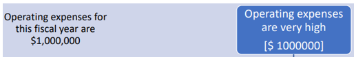
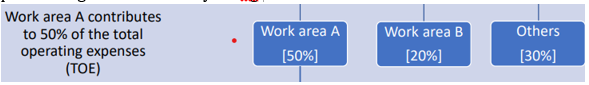
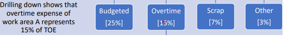
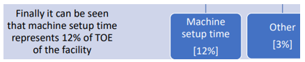
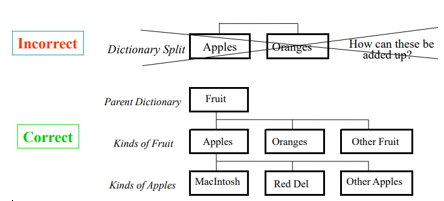
Problem definition tree is graphical tool that represents a problem, its causes and effects. A problem tree has a similar structure to a tree, with the roots representing the causes, the trunk representing the major issue, and the leaves and branches representing the results. It can also be represented in a flow chart format. The Problem being highlighted, all the causes and factors contributing to the problems can be split into small boxes of causes leading to the problem. Problem definition tree helps the project team to quickly see how various complex issues interact to create a problem and how this problem develops into a series of repercussions. It shows a means-end relationship. Problem definition tree helps in: a. Planning a project b. Helps to identify complex problems and various causes contributing to the problem c. Gives a summary of the project plan, other than the problems and causes it also show case the tasks that must be completed, the objective, and the project's results. Steps and example: 1. Understand the situation: Analyse what the problem is, why it occurring and what are the factors contributing to the problem. Eg: 2. Identify the cause: Find out the cause by collecting information, analysing the data and performing root cause analysis. Eg: 3. Organize the problems in categories so it provides a clear picture of that specific category and doesn’t overlap. Eg. 4. Find the major cause: Decide which issues/problem is the highest contributor and require immediate attention. Further, Drill down the major cause and determine all the factors leading to it. Eg. 5. Once analysed, define a problem statement Eg. Machine time can be reduced by 60% to realize savings of $60,000 Decision Tree Rules: 1. Splits should be logical. Be creative and consider alternatives. 2. Until the most important family is identified, do not move on to the next step 3. Ideally all but one box on a level can be taken off. If not, search for a new split. 4. Start with broad splits and go on to more precise splits. It’s better to not test individual X’s until the Solution tree is completed. 5. We can also make decisions based on facts and physical laws. If we do not have complete data, draw on people’s knowledge to create a Cause-and-effect matrix. Guidelines to split the problems: a. The problems should be split into boxes (causes) which are independent of each other and do not overlap. If the causes are overlapped, it will give mixed signals. Example: b. Split must the include everything from the dictionary in the category mentioned in the above and use a common basis for boxes inside a split. Important information might get skipped if the whole dictionary is not represented. Example. c. The split should be Accessible. It must be able to conduct tests and collect data that separates out the rule's boxes. Inaccessible boxes might lead to multiple open branches. Example.