Moushmi Kandori
Members
-
Joined
-
Last visited
Everything posted by Moushmi Kandori
-
Moushmi Kandori replied to Vishwadeep Khatri's topic in We ask and you answer! The best answer wins!Levene's Test: It is a statistical test used to assess if the variances of two or more groups are statistically different. The test determines if the differences in the variances of the groups are more than what would be expected by chance. It is commonly used in analysis of variance (ANOVA) to confirm the assumption of homogeneity of variance across different groups. If significant differences in variances are found through Levene's test, it may impact the results and interpretation of ANOVA, and alternative approaches may be necessary. Purpose: The purpose of using Levene's Test is to assess whether the hypothesis of equal variance between groups is valid or not. This helps to determine whether a parametric statistical test (such as a t-test or ANOVA) which assumes equal variances can be used to analyze the data or whether a non-parametric test which does not assume equal variances should be used instead. Overall, the purpose of utilizing Levene's Test is to ensure the validity and accuracy of statistical analyses. Bartlett’s Test: It is also a statistical test used to determine whether the variances of two or more populations are equal. Specifically, it tests the null hypothesis that the variances are equal against the alternative hypothesis that at least one variance is different from the others. This test is commonly used in analysis of variance (ANOVA) to ensure that the assumption of homogeneity of variances is met before performing further tests. Bartlett's test is sensitive to departures from normality and can give erroneous results if the data are not normally distributed. Equality of variance: This refers to the assumption that the variance of the population is the same across different groups or samples being compared. This assumption is important in many statistical methods, such as analysis of variance (ANOVA) and t-tests, because violating the assumption can lead to incorrect conclusions or inaccurate results. Hypotheses: When performing Levene's Test or Bartlett's Test to assess homogeneity of variance, we are testing for two hypotheses. These can be simply stated as follows: Null Hypothesis – which assumes that the variances are equal across all samples or groups; Alternative Hypothesis – which proposes that the variances are not equal across all samples or groups. To test for equality of variance, a common method is to use either Levene's test or Bartlett's test. These tests compare the variances of the groups or samples being compared and calculate a p-value. If the p-value is less than a chosen significance level (such as 0.05), then the null hypothesis of equal variances is rejected, indicating that the variances are significantly different and that the assumption of equality of variance has been violated. In such cases, alternative statistical methods that do not rely on the assumption of equal variances can be used instead. By above definitions, it is clear that both Levene's Test and Bartlett's Test, are statistical methods used to determine the equality of variances among multiple groups. However, they differ in their assumptions about the distribution of the data. Levene's Test is a robust method that is less sensitive to outliers, whereas Bartlett's Test assumes that the data is normally distributed. The purpose of utilising Levene's Test is to determine whether the variances of the groups are equal or not. If the variances are not equal, it can have an impact on the results of further statistical analyses, such as ANOVA. By using Levene's Test, researchers can ensure that they are using appropriate statistical methods to analyse their data. For example, let's say a researcher wants to compare the math test scores of three different high schools. Before running an ANOVA to compare the means of the three schools, they should first use Levene's Test to determine whether the variances of the scores are equal. If the variances are not equal, they may need to use a different statistical method, such as Welch's ANOVA, which is designed to handle unequal variances. In summary, Levene's Test is a valuable tool for researchers to assess the equality of variances among multiple groups. While it differs from Bartlett's Test in its assumptions about the data, it provides a robust and reliable method for ensuring that appropriate statistical methods are used in further analyses.
-
Moushmi Kandori replied to Vishwadeep Khatri's topic in We ask and you answer! The best answer wins!Definition: A design scorecard is a tool that evaluates and measures the quality and effectiveness of a design project. It is used to assess different aspects of the design, such as visual appeal, functionality, usability, user experience, brand consistency, and more. The purpose of a design scorecard is to ensure that the design meets the goals and objectives of the project, as well as the needs and expectations of the target audience. It can be a useful way to communicate feedback and provide direction for design improvements. Usefulness of Design Scorecard in DMADV project: Design scorecards are a measurement tool that helps organizations evaluate the success of a design project. It is a valuable tool that can be used in a DMADV project to ensure that the design meets the customer's needs and expectations. DMADV stands for define, measure, analyze, design, and verify, which is a methodology that is used to develop new products or services. Here are some ways in which design scorecards can be used in a DMADV project: 1. Define stage: During the define stage, the design scorecard can be used to identify the key metrics that will be used to measure the success of the design. The scorecard can help identify the customer's needs, the market trends, and the competitive landscape. 2. Measure stage: During the measure stage, the design scorecard can be used to evaluate the data and measure the baseline performance of a product or service. The scorecard can help identify the areas of improvement and provide a benchmark against which the success of the design can be measured. 3. Analyze stage: During the analyze stage, the design scorecard can be used to evaluate the root causes of the problems and identify the solutions that can improve the design. The scorecard can help prioritize the design changes that will have the greatest impact on the project. 4. Design stage: During the design stage, the design scorecard can be used to create a detailed design plan that will meet the customer's needs and expectations. The scorecard can help ensure that the design is aligned with the organization's goals and is innovative and practical. 5. Verify stage: During the verify stage, the design scorecard can be used to evaluate the performance of the design and ensure that it meets the customer's needs and expectations. The scorecard can also help identify any design flaws or defects that may need to be addressed before the product or service is launched. In conclusion, design scorecards are a valuable tool that can be used in a DMADV project to ensure that the design meets the customer's needs and expectations. The scorecard can help identify the key metrics, evaluate the data, prioritize the design changes, create a detailed design plan, and verify the performance of the design. Use case of Design Scorecard in DMAIC project: There is a use case for a design scorecard in a DMAIC project. A design scorecard can help the project team evaluate and compare different design options and select the best one based on key criteria, such as cost, performance, quality, safety, and environmental impact. The design scorecard can be used as a tool for decision-making and communication among stakeholders, including the project team, management, customers, suppliers, and regulators. The design scorecard can also be used to monitor and track the progress and effectiveness of the design changes throughout the project. Overall, the design scorecard can help the project team ensure that the design changes align with the project goals and customer requirements and deliver measurable improvements in the process and product performance.
-
Moushmi Kandori replied to Vishwadeep Khatri's topic in We ask and you answer! The best answer wins!Using IMR control charts for continuous data assumes that the data follows a normal distribution. If the data does not follow a normal distribution, using transformed data may be useful in verifying process stability. Transforming data can help to make the data conform to a normal distribution. For example, if the data is positively skewed, using a logarithmic transformation can help to normalize the data. Similarly, if the data is negatively skewed, a reciprocal or square root transformation may be used. Using transformed data can be useful in detecting process stability by identifying any patterns or changes in the data that may indicate a shift in the process mean or variability. For instance, if the control chart shows a trend or pattern with transformed data, it may indicate a shift in the process. In this case, further investigation may be required to identify the problem and take corrective action. For example, consider a manufacturing process that produces steel rods. The process involves heating and cooling the rods to achieve the desired tensile strength. The control chart for the tensile strength of the rods shows a trend with the raw data, indicating a possible shift in the process mean. However, after applying a logarithmic transformation to the data, the control chart shows no trend or pattern. This suggests that the process is stable and the raw data is not normally distributed. In another example, consider a call center that tracks the number of calls received per hour. The control chart for the call volume shows a shift in the process mean with the raw data, indicating a possible problem. However, after applying a square root transformation to the data, the control chart shows no shift in the process mean. This suggests that the process is stable and any concerns were due to the non-normal distribution of the raw data. In conclusion, while IMR control charts for continuous data are designed for normal distribution, transformed data can be useful in identifying process stability. If the transformed data shows no patterns or trends, it suggests that the process is stable, regardless of the distribution of the raw data. However, it is important to note that transformations should be used with caution, and the results should be interpreted carefully to avoid incorrect conclusions.
-
Moushmi Kandori replied to Vishwadeep Khatri's topic in We ask and you answer! The best answer wins!A collaborative strategy called "Way of Working" (WoW) concentrates on building successful work procedures within an organisation. It attempts to establish a pleasant work atmosphere that promotes growth and innovation and covers topics like communication, decision-making, and problem-solving. WoW is most closely tied to the Improve phase of the DMAIC (Define, Measure, Analyse, Improve, Control) framework. This phase entails putting new procedures into place in order to streamline operations, cut down on waste, and boost overall productivity. Businesses build a foundation that promotes a culture of continuous improvement by focusing on improvement opportunities through WoW practises. WoW supports an organization's culture of continuous improvement in a number of ways: 1. Promoting open communication: WoW promotes openness and encourages team members to openly discuss ideas, difficulties, and best practises, which results in a more collaborative workplace. 2. A focus on collaboration: WoW encourages synergistic teamwork by destroying silos, ensuring that everyone is working towards the same objectives. 3. Increasing adaptation: Teams in WoW learn to be proactive in their responses to shifting conditions while still being effective. 4. Fostering problem-solving abilities: Thanks to WoW's emphasis on proactive issue resolution and innovation, staff members become adept at seeing areas where they may strengthen either their individual or collective performance. 5. Creating learning opportunities: WoW encourages employees to continuously hone their skills through education and experience and supports their ongoing skill development. WoW helps foster continuous development inside teams and across the organisation as a whole by integrating these concepts into an organization's fundamental values, producing superior results for both people and enterprises.
-
Moushmi Kandori replied to Vishwadeep Khatri's topic in We ask and you answer! The best answer wins!A Top Down Diagram is a visual representation of a process, system, or organization from a high level. It displays the relationships between the many parts or systems as well as the overall structure. The method of creating the diagram begins with the major elements, which are then divided into more manageable sub-elements until the complete system or process is properly depicted. Systems can be planned and designed using top-down diagrams as well. It can be simpler to understand how the many components of a system will fit together and interact if you start with the broadest elements and work your way down to the more precise ones. Top-down diagrams are an effective tool for planning, understanding, and designing systems. A top-down diagram can be applied in a variety of ways to a DMAIC project. It may be utilized for: · Define the project's overarching objective. · Divide the objective into smaller, easier to handle tasks. · Monitor the project's development. · Note any potential issues or dangers. · Share the project plan with all relevant parties. Industry illustration : A high level top-down representation of a medical claims process that is up for audit is shown in the figure below. The procedure displays the claims that have been received, which the users verify to determine the auditable expenditures, which in turn go through many phases to generate the net income for a specific claim. This can be an effective technique to comprehend how a complicated system operates and to pinpoint the various components that must cooperate for the system to operate as intended.

-
Moushmi Kandori replied to Vishwadeep Khatri's topic in We ask and you answer! The best answer wins!A probability plot is a visual tool for analysing the distribution of data. The cumulative distribution function (CDF) of the data is plotted against a reference line on a line graph. The CDF is a step function that leaps from 0 to 1 at each data point, and the reference line is often a straight line. The probability plot's form can be used to evaluate the data's distribution. For instance, if the data are regularly distributed, the probability plot will be a straight line. The probability plot will be curved if the data is skewed. Outliers can also be discovered using probability graphs. Outliers are data points that deviate significantly from the average. Look for data points that are significantly above or below the reference line to spot them. A helpful tool for analysing the distribution of data is a probability plot. They can be used to determine the distribution's shape, spot outliers, and assess how two or more data sets' distributions compare. A probability plot is a visual tool for evaluating how well a collection of data fits a distributional model. A probability map with a straight line shows that the hypothesised distribution fits the data well. A curve that deviates from a straight line shows that the hypothesised distribution does not adequately fit the data. On a probability plot, a curve that deviates from a straight line may occur for a variety of reasons. Among them are the following: · The proposed distribution does not adequately capture the observed data. · Outliers contaminate the data. · The distribution that was predicted is unreliable. It is crucial to look into the causes of any deviations from a straight line that appear on a probability plot. To achieve this, examine the data, search for outliers, and experiment with various hypothesised distributions.
-
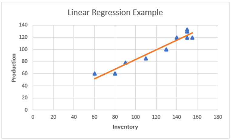
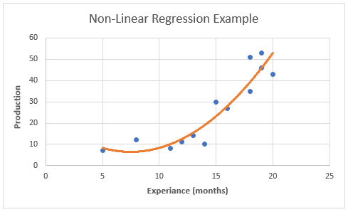
Moushmi Kandori replied to Vishwadeep Khatri's topic in We ask and you answer! The best answer wins!Regression - A statistical method called regression links a dependent variable to one or more independent variables. It allows for the discovery of data trends. The method examines the relationship between a dependent variable and independent factors, and it is typically expressed as a graph. You can confidently establish which elements are most important, which ones can be ignored, and how these factors interact when you do a regression. Regression analysis can assist you quantify your assumptions, for instance, that there is a relationship between the quantity of inventory received and the quantity of production. Types of Regression – We have multiple types of regression models, and Linear Regression is one among them. Linear Regression: A dependent variable (y) and an independent variable (x) are related in a linear regression model. Finding the correlation between dependent and independent variables is done statistically. Since the relationship between the two variables in a linear regression is one of a straight line, the term "linear regression" was coined. One of the most prevalent kinds of predictive analysis is this one. It uses a regression graph to examine the strength of the link between two variables. It chooses the data set's nearest points that correspond to a linear pattern. It is used in situations where a change in the value of a second variable has a considerable impact on the variance in the value of a first variable. The linear equation for linear regression is always Y = a + bx, where x is the explanatory variable and Y denotes the dependent variable. Subtypes - Simple and multiple regression are the two subtypes into which they are divided. Simple Linear Regression: A straight line is used to evaluate the connection between one independent variable and one dependent variable in a simple linear regression model. Both variables ought to have numerical values. Multiple linear regression is a type of regression analysis where the variation in two or more correlated independent variables affects the change in the dependent variable. Refer to the example of linear regression below, which illustrates the link between production and various inventories (independent variable on x-axis, dependent variable on y-axis). Interpretation: From the above graph of regression, we can see there is a linear relationship between inventory and production numbers. As inventory increases, production numbers also increase. Thus, using this regression analysis, we can predict the value of the dependent variable (production i.e., ‘y’) based on the value of the independent variable (inventory i.e., ‘x’). Advantages and Disadvantages of Linear Regression: Benefits Challenges It is simpler to implement and interpret linear regression. As boundaries in this method are linear, outliers might have a significant impact on the regression. For data that can be separated linearly, linear regression works remarkably well. It can be difficult to satisfy the assumption that dependent and independent variables are linear. Easier to use, understand, and effectively train It is quite often prone to noise Using dimensionally reduced approaches, regularisation, and cross-validation, it manages overfitting rather well The sensitivity of linear regression to outliers is high. The ability to extrapolate beyond a particular data set is a further benefit It is prone to multicollinearity Non-Liner Regression: Regression analysis that depicts a nonlinear relationship between dependent and independent variables is referred to as non-linear regression. When using linear parameters, it is employed when the relationship cannot be accurately modelled. In contrast to linear analysis, nonlinear regression uses a curve to link the variables. In statistics, the word "nonlinearity" is used to describe a scenario in which an independent variable and a dependent variable do not have a straight-line or direct relationship. Changes in the output are not directly proportional to changes in any of the inputs in a nonlinear connection. When predictors and responses have a certain function form, non-linear regression arises. Y=f (X, β) + ϵ, where X is a vector of p predictors, is a vector of k parameters, f() is a recognised regression function, and is an error term with a potentially non-normal distribution. View the example below to see how the dependent (y-axis) and independent variable (x-axis) are related nonlinearly. Interpretation: From the above graph of regression, we can see there is a non-liner relationship exists between the variables in x and y axis. As per the scatter plot of changing production count over months of employee experience shows that there seems to be a relationship but that it is non-linear relationship which requires to use of a non-linear regression model to predict the data. Advantages and Disadvantages of Non-Linear Regression: Benefits Challenges The functionality for curve-fitting that is most flexible is offered by nonlinear regression. Selecting the nonlinear function that produces the best fit for a specific curve shape can be very time-consuming. Additionally, it can show oblique or nonlinear connections between variables. Since nonlinear models can have several local minima and maxima, it can be challenging to determine the ideal parameters and function for the data. In the data, nonlinear regression can detect more intricate patterns and behaviours. When a model is too complicated for the data, overfitting can happen, leading to poor generalisation abilities. It can also be applied to jobs involving forecasting, such as predicting future inventory based on current. However, fitting a nonlinear model might require more computation and requires careful model parameter selection to prevent overfitting. Most real-life phenomena typically involve nonlinear regression Nonlinear models typically describe observable relationships more accurately, but at the cost of added complexity. Governing criteria: The following factors should be taken into consideration when selecting non-linear regression: • Prioritise linear regression - Use linear regression first to see if it would fit the specific sort of curve in the data set. We must use nonlinear regression if satisfactory fit cannot be obtained using linear regression. • R-Squared - Non-Linear regression cannot yield a reliable R-Squared value. • P-Value - Non-Linear regression makes it impossible to calculate P-Value. • Goal - To verify that the data fits a model and acquire the best-fit values for the parameters, or to compare the fits of other models, we must carefully choose a model (or two alternative models). We should also pay attention to all the outcomes.
-
Moushmi Kandori replied to Vishwadeep Khatri's topic in We ask and you answer! The best answer wins!Introduction – One of six sigma's key objectives is to reduce variation, and comprehending these variations can be aided by using Multi-Vari charts. Leonard Seder first described Multi-Vari charts in 1950. Later, it was widely used to comprehend stock market fluctuations. Then, Dorian Shainin began utilising it as a root cause analysis tool, which he referred to as Red X. Definition – Multi-Vari charts analyse various sources of variation or classes of variation, according to their definition. It is useful for early root cause analysis and helps us focus on the inputs that are producing issues. These are sometimes referred to as multiattribute utility theory charts, and they assist people in comparing numerous options by outlining the advantages and disadvantages of each other. This is just an another way to narrow down our inputs by analysing the process Xs or the inputs. Especially in the early stages of data analysis, use a Multi-Vari chart to visually portray Analysis of Variance (ANOVA) data to analyse data, understand potential relationships, and root causes for variation. Multivariate graphs are particularly helpful for comprehending interactions. Sources of Variation as we have in ANOVA: Interaction Within Variables – This source let us understand the reasons for variation within a batch. This is also called positional variation. For instance, it is comparing within the variables if we observe variation within a batch on a given day. Interaction Between Variables – This source explains the causes of the change between batches. Additionally known as cyclical variation. For instance, if we are seeing variation between Batch 1 and Batch 2, it is comparing between the variables. Time-to-time Interaction – This provides the reasons between weeks or days or any time frame we want to analyse. This is also called temporal or shift-to-shift variation. For instance, if we are looking to find our variation across the Day 1 and Day 2, then the time factor comes into picture and it is Time-to-Time variation. A Multi-Vari chart is a two-axis plot. These graphs are used to examine a process's consistency or stability. Time is represented on the chart's horizontal, or X-axis while the process output or reaction measurement is depicted on the vertical, or Y-axis. The multiple measurements of each unit are plotted together. Consecutive measurements are plotted from left to right over time. A break in the horizontal groupings indicates a break in time during the sampling process. Advantages – Ø It gives us access to several sources of variation, such as within, between, and over time, and is comparable to the reproducibility and repeatability of ANOVA. Ø Despite the need for additional statistical analysis, it points us in the right path for determining the reasons of variations. Ø This is easily illustrable without the aid of any graphic programme. Disadvantages – Ø As was already said, Multi-Vari only provides preliminary sources of variations. Ø Given that it is merely a graphical tool, a thorough interpretation is not feasible. ANOVA can be used to undertake statical procedures and uncover the underlying causes of sources of variation. Ø With discrete data, it is ineffective. To measure the variances, we can only use continuously data. Let's look at one of the industry examples of Quality scores broken down by week that was taken from various clients below. Interpretation – · Client 5: The Multi-Variance chart shows that Client-5 demonstrated strong Quality performance over the course of all four weeks, with very little variations in their weekly results. · Client 2: The Multi-Variance chart shows that Client 2 has higher weekly variations and is also going lower than 90%. · Client 1 is performing similarly to Clients 2 and 4 in terms of quality, however there is more variance between the weeks. · Client 3: When compared to other clients, this client's quality is inconsistent and shows significant fluctuations.

-
Moushmi Kandori replied to Vishwadeep Khatri's topic in We ask and you answer! The best answer wins!Out of Control Action Plan Definition - One of the often employed tools in the Control phase to track the efficiency of the process is the control chart. We can determine using the control chart whether the process is operating within the UCL and LCL. We will require an action plan to bring the process under the control limits if the data exceeds these control limits or if there are too many control limitations because the process is not streamlined. I'd like to give an example of a project we started at my current organisation to illustrate the significance of the Out of Control Action Plan. OCAP works well when we have batch processing, several causes, and lengthy cycle periods, but in this project, we have used it to reduce the lengthy cycle time. The team attempted to identify non-duplicate claims during this procedure. We did a time-study on each and every step and we learned that to find non-duplicate claims using the conventional method, the processor needs to spend close to 4-5 hours every report. Due to the fact that we had been following the process steps for a long time, we had to raise the UCL and LCL. After this, we have taken some sample records, processed it and understood the accuracy and effort hours required to process those records utilizing the traditional method. We plotted the control chart to check the variations. Below is the control chart where we learned that we are superficially showing the process under control by just raising the UCL and LCL. After continuous brainstorming and utilizing the Cause and effect analysis, we understood the problem area as below: According to the cause and effect analysis, the manual effort is what is causing the UCL and LCL processes to go awry. If we can use automation to cut down on the time spent on this particular cause, we will be able to bring the process under control. Here, we understood that the goal of out of control, Control Chart was to assist us in locating the causes of the issue and help us eliminate those that are hindering the processes. The OCAP (automation) that we derived assisted us in understanding the variable and the trend that impacted the process. This also enabled us to think on each process step, conduct brain storming sessions, and use the cause and effect analysis to ascertain which is the root cause that affects performance. Below is the control chart after taking appropriate steps and implementing the automation, where we can see that the UCL and LCL have been optimized and the effort hours required have also reduced from 4-5 hours/record to max of 15 minutes/record. This has also resulted in dollar savings of 14-15% month on month. Lessons learned from this project: It helped us to understand the current state of the process and what is the issue. It helped us to think and analyze and eliminate non-value added tasks. It helped us to build an automation step that was never a part of this project. Goal was to improve productivity of the processor and improve satisfaction levels. Team worked in tandem with the all the stakeholders in the brainstorming sessions to identify the root causes. We have considered both immediate as well as long-term goals to make the process robust.


-
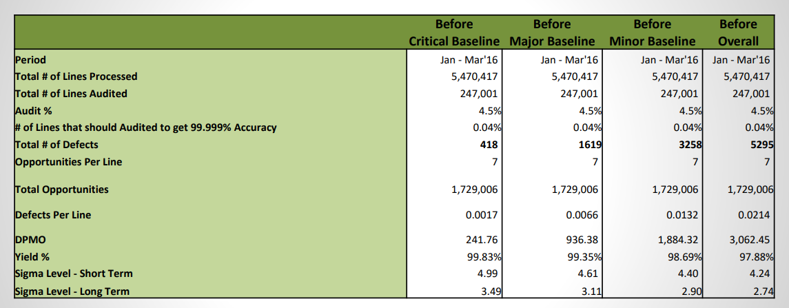
Moushmi Kandori replied to Vishwadeep Khatri's topic in We ask and you answer! The best answer wins!Moushmi Kandori replied to Vishwadeep Khatri's topic in We ask and you answer! The best answer wins!DPMO is the best metric to use, though we can also check the yield %. Below is one of the project example that I initiated.