

Partho
Members
-
Joined
-
Last visited
Everything posted by Partho
-
The Sparsity of Effects principle is a concept used in the field of Design of Experiments (DoE). It suggests that in most experimental systems, only a small number of factors significantly affect the response variable, while the majority of factors have little or no effect. This principle highlights the idea that experimental resources can be used more efficiently by focusing on the important factors, rather than investigating all possible factors. The Sparsity of Effects principle is valuable to researchers in the Design of Experiments (DOE) as it allows them to efficiently identify and study the critical factors affecting a process or system. By focusing on the few significant factors, researchers can reduce the number of experiments required, saving time, resources, and effort. Let's say a manufacturing company wants to improve the strength of a metal component produced through a particular process. The company decides to use DOE to investigate the factors that affect the strength of the component. They consider factors such as temperature, pressure, cooling rate, and duration of the process. Instead of testing all possible combinations of these factors, which would be time-consuming and costly, they can utilize the Sparsity of Effects principle. Based on prior knowledge and initial screening experiments, the company suspects that only a few factors will have a significant impact on the component's strength. They design an experimental plan using fractional factorial design, which enables them to study a subset of the factor combinations. By selecting an appropriate design based on the principle of minimum aberration, they can ensure that the significant factors are included while minimizing confounding effects. After conducting the experiments and analyzing the results, the company identifies that temperature and cooling rate are the primary factors influencing the component's strength. They can then focus their efforts on optimizing these factors, such as identifying the ideal temperature range and cooling rate, to improve the overall strength of the components. By leveraging the Sparsity of Effects principle, the company achieves their goal with fewer experiments, reduced costs, and improved efficiency. While the Sparsity of Effects principle can greatly assist researchers in streamlining their experiments and focusing on the essential factors, it does have some disadvantages. Here are a few considerations: 1. Risk of missing important factors: The principle assumes that only a few factors are significant, potentially leading to overlooking potentially important but non-obvious factors. It is important to carefully choose the factors to include in the design based on prior knowledge and understanding of the system. 2. Limited understanding of interactions: By focusing on a subset of factors, the principle may not fully capture complex interactions between variables. Some interactions might only become evident when multiple factors are considered simultaneously, which might be missed in a sparse experimental design. 3. Context-dependent validity: The principle's applicability depends on the specific experimental context. While it is generally valid in many experimental situations, there might be cases where a larger number of factors are genuinely influential, and sparse designs may not provide sufficient insights. To mitigate these disadvantages, it is crucial for researchers to carefully consider their experimental goals, understand the system under study, and use their expertise and judgment in selecting the appropriate factors to include in the experiment.
-
Levene's test and Bartlett's test are both statistical tests used to assess the equality of variances among multiple groups. They are commonly employed in the field of statistics, including in the analysis of data. Let's examine the purpose of utilizing Levene's test and how it differs from Bartlett's test, along with relevant examples from the service industry. The purpose of Levene's test is to determine if the variances of different groups or samples are equal or not. It is a robust test, meaning it is less sensitive to departures from normality compared to Bartlett's test. Levene's test is typically used when the assumption of normality may not hold or when there is concern about outliers influencing the test results. It is based on absolute deviations from the group means, rather than squared deviations as in Bartlett's test. On the other hand, Bartlett's test is also used to evaluate the equality of variances among groups, but it assumes that the data are normally distributed. It is more sensitive to departures from normality compared to Levene's test. Bartlett's test calculates the sum of squared deviations from the group means, which can be affected by outliers or non-normality. Let's consider an example from the service industry to illustrate the difference between the two tests. Suppose we want to compare the customer satisfaction scores of three different airlines: Airline A, Airline B, and Airline C. We collect data from a random sample of customers from each airline, and we want to assess if there is a difference in the variances of customer satisfaction scores among the three airlines. Using Levene's test, we calculate the absolute deviations of individual scores from their respective group means for each airline. The test will then evaluate whether these deviations are significantly different among the three groups, indicating unequal variances. Using Bartlett's test, we calculate the squared deviations of individual scores from their respective group means for each airline. The test will assess whether these squared deviations significantly differ among the three groups, indicating unequal variances. However, Bartlett's test assumes that the data are normally distributed, so if the data deviate from normality, the test results may not be reliable. In summary, Levene's test is more suitable when the assumption of normality may be violated or when there are concerns about outliers. It is based on absolute deviations and is considered a robust test. On the other hand, Bartlett's test assumes normality and is based on squared deviations. It may be more appropriate when the data are known or assumed to be normally distributed.
-
In the context of Design for Six Sigma (DFSS), a Design Scorecard is a tool used to evaluate and compare design concepts or alternatives based on specific criteria. It provides a structured framework for assessing various design options and making informed decisions. The scorecard typically consists of a set of metrics or attributes that are important for the success of the project. It is commonly used in the DMADV (Define, Measure, Analyze, Design, Verify) methodology, which focuses on developing new products or processes with a high level of quality and customer satisfaction. The Design Scorecard helps ensure that the final design meets the defined objectives and requirements. We can take an example from the service industry, where a Design Scorecard can be used in a DMADV project to improve service offerings, customer experience, and operational efficiency. Use Case in DMADV Project (Service Industry): Let's consider a DMADV project aimed at improving the customer experience in a hotel's reservation process. The hotel management has identified the need to revamp their online reservation system to make it more user-friendly and efficient. They decide to use a Design Scorecard to evaluate different design alternatives for the new reservation system. Define: The project team defines the goals and objectives for the new reservation system, such as improving user experience, reducing reservation errors, and increasing the conversion rate. They identify key customer requirements, including ease of use, availability of information, speed of booking, and flexibility in reservation options. Measure: The team conducts a comprehensive analysis of the existing reservation system, identifying pain points, common errors, and customer feedback. They gather data on reservation success rates, average time taken to complete a reservation, and customer satisfaction ratings related to the current system. Analyze: Based on the gathered data, the team generates and evaluates multiple design alternatives for the new reservation system. They develop a Design Scorecard that includes criteria like user interface intuitiveness, speed of booking, error prevention mechanisms, and integration with other hotel systems. Each design alternative is scored and ranked based on these criteria, considering their relative importance (weights can be assigned to each criterion). Design: The team selects the design alternative with the highest score on the Design Scorecard. They work on further developing the chosen design, considering factors like system architecture, database integration, and security measures. The Design Scorecard serves as a reference to ensure that the design aligns with the defined criteria and objectives. Verify: The final design is implemented and thoroughly tested to validate its performance against the established criteria. The Design Scorecard is used as a checklist to verify that all requirements have been met. User acceptance testing is conducted to gather feedback and evaluate the user experience based on the defined criteria. Use Case in DMAIC Project (Service Industry): In a DMAIC project within the service industry, where the focus is on improving existing processes, a Design Scorecard may not be commonly used. However, it can still be adapted for specific design-related aspects within the project. Here's an example: Let's consider a DMAIC project aimed at improving the efficiency of a call center's complaint resolution process. The project team identifies that improving the script used by customer service representatives (CSRs) could lead to better customer satisfaction and faster resolution times. They develop a Design Scorecard that includes criteria such as clarity of instructions, empathy, problem-solving approach, and adherence to company policies. Multiple versions of the new script are evaluated using the Design Scorecard, and the one with the highest score is selected for implementation. The selected script is then incorporated into the call center's training program, and CSRs are trained on using it effectively. The Design Scorecard can be used periodically to assess the performance of the new script and make further refinements if necessary. In summary, a Design Scorecard is a valuable tool in DFSS and DMADV projects, including those in the service industry. It helps evaluate and compare design alternatives based on predefined criteria, ensuring that the final design meets the objectives and requirements of the project. In a DMAIC project, a Design Scorecard can be adapted for specific design-related aspects, such as improving scripts, interfaces, or process components as we saw in the above example.
-
The assumption of normality in IMR (Individuals and Moving Range) control charts is indeed a common practice. However, it is true that in the real world, data often deviates from a perfect normal distribution. While transformed data can be used to address non-normality to some extent, its usefulness in checking process stability depends on various factors, including the nature of the transformation applied and the specific characteristics of the data. Transforming data involves applying mathematical operations to the original dataset to achieve a more desirable distribution or meet certain assumptions. Some common transformations include logarithmic, square root, and Box-Cox transformations. These transformations can help make the data more symmetrical and reduce skewness or variability. To illustrate the usefulness of transformed data for checking process stability, let's consider an example with 20 data points. Suppose we have collected data on the time it takes for a process to complete a certain task in min. Here are the analysis original data points: AHT1 25 30 32 31 29 27 30 28 33 26 24 28 34 40 45 42 50 38 35 30 First, lets perform the normality test and create an IMR control chart using the original data. Control chart was plotted using these data points and analyze the process stability based on the control limits and the presence of any out-of-control points Next, let's apply Logarithmic transformation to the data, perform the normality test and create a new control chart. The transformed data points are as follows: LOG AHT1 1.40 1.48 1.51 1.49 1.46 1.43 1.48 1.45 1.52 1.41 1.38 1.45 1.53 1.60 1.65 1.62 1.70 1.58 1.54 1.48 Interpretaion: By analyzing both control charts, we can assess the process stability based on the control limits and patterns in the data points. If the data points fall within the control limits, show no significant patterns, and exhibit randomness, the process is considered stable. In this example, both the raw and transformed data control charts show data points with same pattern. Therefore, we can conclude that there is no change in the process stability, even though the raw data was more skewed than the transformed data. The transformation allowed us to assess the process stability accurately. In this examples , though the moving range suggests process stability, one needs to understand the reason for shift in pattern along with the one data point that failed at point 17 in the individual chart. The point to remember is that the appropriateness of the transformation and the resulting interpretation depends on the specific context and understanding of the underlying process. It's always recommended to consult with subject matter experts and consider additional analyses if needed. In order to utilize an I-MR Chart, there is no mandatory requirement for the data to be always normal distributed, however extremely skewed data can cause some unwanted outcome including high false-alarm rates. If data appears skewed, we can investigate to see whether that is an indication of an out of control process or as per expectations for this type of process, and if expected, we can look for transformation of the data.


-
A top-down diagram, also known as a top-level diagram or system hierarchy diagram, is a graphical representation that illustrates the overall structure or hierarchy of a system or organization. It provides a high-level view of the system's components and their relationships, showing how the system is organized from a top-level perspective. In a top-down diagram, the system or organization is depicted as a single entity at the top, and then it is progressively decomposed into smaller subsystems or components as you move down the diagram. This decomposition represents the hierarchical relationship between the various elements of the system. This diagram typically uses boxes or rectangles to represent the different components or subsystems, and lines or arrows to show the relationships or connections between them. The higher-level components are placed at the top of the diagram, and the lower-level components are placed below, indicating their position in the hierarchy. Top-down diagrams are often used in system analysis, software development, project management, and business process modeling. They help stakeholders understand the overall structure and organization of a system, providing a visual representation that aids in communication, planning, and decision-making. They can be used to identify subsystems, dependencies, and interfaces, as well as to guide the decomposition of a complex system into manageable components for further analysis or development. It can be a useful tool in a DMAIC (Define, Measure, Analyze, Improve, Control) project. Let’s consider a DMAIC project aimed at reducing Average Handling Time (AHT). Here are a few ways in which a top-down diagram can be applied in such a project: Process mapping: Use the top-down diagram to map out the current process flow for handling customer interactions. Start with the high-level process steps and then break them down into sub-processes or tasks. This will help identify areas of inefficiency or bottlenecks that contribute to higher AHT. Root cause analysis: Once you have identified the key process steps contributing to AHT, use the top-down diagram to analyze the root causes of delays or inefficiencies within each step. Break down each step further into its constituent activities or factors that influence AHT. This will help in identifying specific causes that can be targeted for improvement. Impact analysis: Use the top-down diagram to assess the impact of potential improvement initiatives on AHT. When considering changes or solutions, break down the proposed changes into their individual components and assess how each component affects the overall process. This analysis can help prioritize improvement efforts and focus on the most effective interventions. Control plan development: A top-down diagram can aid in developing a control plan to sustain the improvements achieved. After implementing changes and reducing AHT, use the diagram to identify control points and monitoring mechanisms. Break down the process into checkpoints and define key performance indicators (KPIs) to ensure AHT remains within acceptable limits over time. Communication and collaboration: A top-down diagram provides a visual representation of the process and facilitates communication and collaboration among team members involved in the DMAIC project. It helps in aligning everyone's understanding of the current process and improvement goals, allowing for better coordination and teamwork. Just to remember, a top-down diagram is just one of many tools that can be utilized in a DMAIC project. It should be complemented by other tools such as process flowcharts, data analysis techniques, statistical tools, and more, depending on the specific needs and challenges of the AHT reduction project. Here are a few more examples of how a top-down or hierarchical diagram can be used in DMAIC project for different scenarios: Manufacturing Defect Reduction: In the Define phase, a top-down diagram can be created to visualize the overall manufacturing process. It would start with high-level steps like raw material procurement, production, inspection, and shipment. Each step would be broken down into subprocesses such as material handling, machining, assembly, quality control, and packaging. This diagram helps understand the end-to-end manufacturing process and provides a foundation for further analysis and improvement. Customer Complaint Handling: When addressing customer complaints in the DMAIC project, a top-down diagram can be used to map the complaint handling process. Starting with the initial complaint intake, it can be broken down into steps like complaint registration, investigation, root cause analysis, corrective action, and resolution. Each step can then be further detailed with subprocesses, responsibilities, and information flow. This diagram helps identify bottlenecks, inefficiencies, and opportunities for improvement. Order Fulfillment Cycle Time Reduction: To reduce order fulfillment cycle time, a top-down diagram can be created to represent the end-to-end order processing workflow. It would begin with steps such as order receipt, order verification, inventory check, order picking, packing, and shipping. Each step can be further decomposed into subprocesses like data entry, system checks, coordination with warehouses, and logistics. The diagram helps identify areas where cycle time can be minimized by optimizing individual steps or eliminating non-value-added activities. Employee Onboarding Process Improvement: In the context of improving the employee onboarding process, a top-down diagram can be used to break down the process into its constituent parts. Starting with high-level stages like pre-employment, orientation, training, and integration, each stage can be further divided into specific activities such as background checks, paperwork completion, system access setup, and departmental onboarding. The diagram helps identify areas where the onboarding process can be streamlined, standardized, or automated. Invoice Reconciliation Accuracy Enhancement: For improving invoice reconciliation accuracy, a top-down diagram can illustrate the invoice reconciliation process from start to finish. It would include steps such as invoice receipt, data extraction, matching with purchase orders, validation, exception handling, and final approval. Each step can be broken down into subprocesses like data entry, data validation, system checks, and reconciliation reporting. The diagram helps identify areas where errors commonly occur, allowing for targeted improvement efforts. In these examples, the top-down diagrams provide a visual representation of the processes, highlighting their components and relationships. They serve as a basis for analysis, problem identification, improvement planning, and collaboration among team members.
-
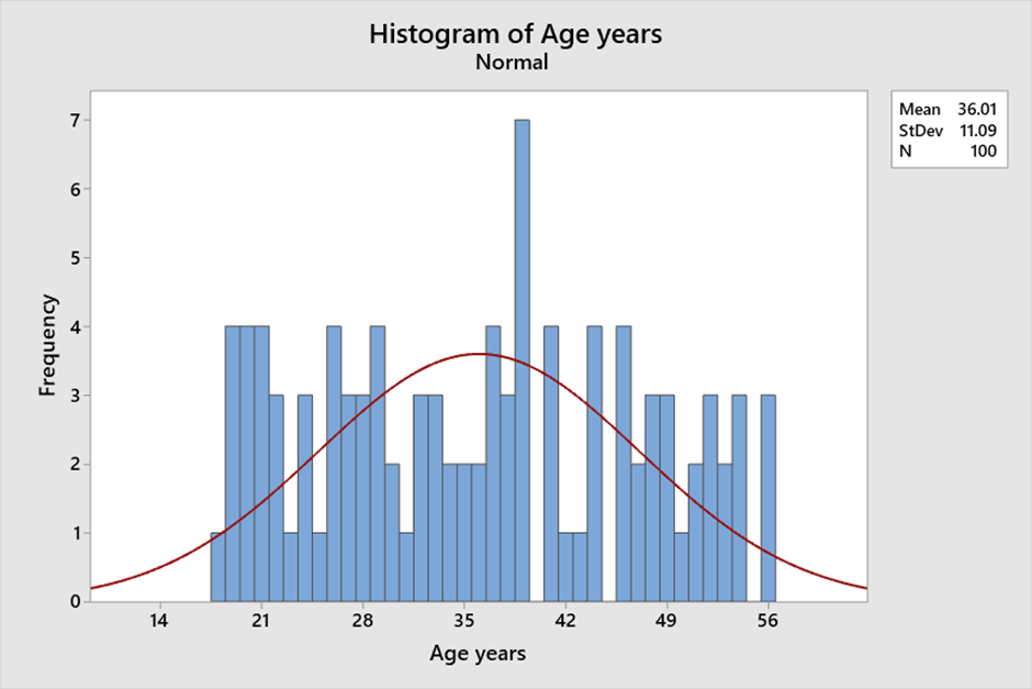
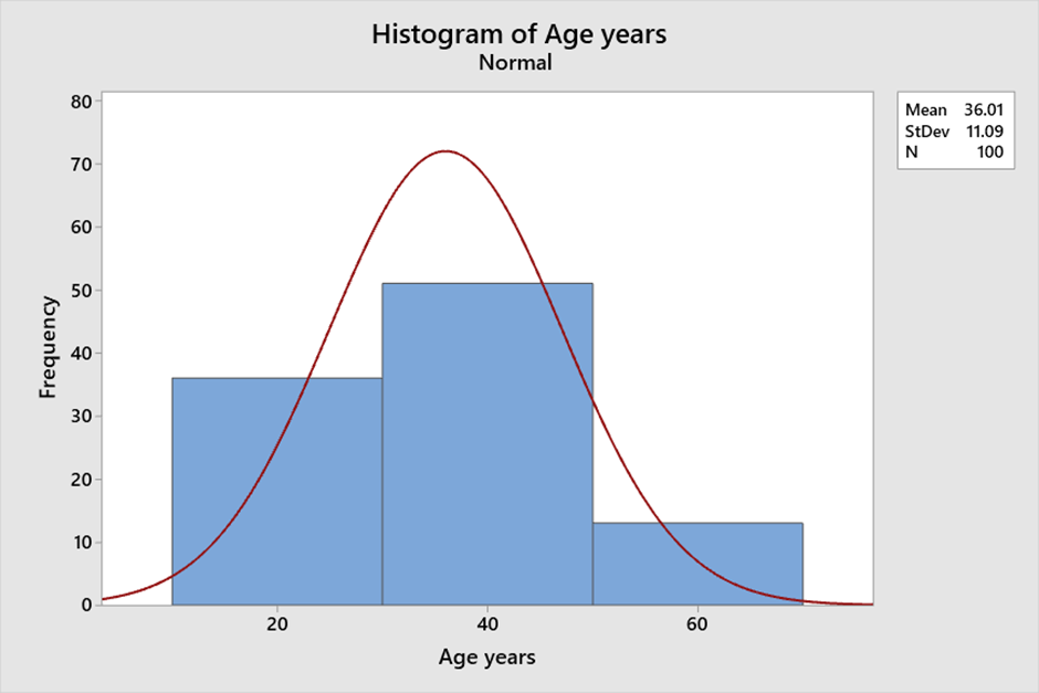
A histogram is a graphical representation of numerical data that provides insight into the distribution of the data. It is created by grouping the data into bins and then plotting the frequency of each bin as a bar. This visual representation of the data allows for easy interpretation of the central tendency, variability, and shape of the data. Histograms are a useful tool for visualizing and understanding the data and can help in data analysis and decision-making. Central tendency: The central tendency of a distribution refers to the value around which the data tends to cluster. A histogram can help to identify the central tendency of the data by showing the peak of the distribution. The peak of the distribution corresponds to the most frequently occurring value. For example, consider the following data set of ages (in years) of a group of 100 people: 18 to 56 . We can see that there is a peak around age 40 and that the distribution is roughly symmetric. Variability: The spread of data is called variability. A histogram can help to identify the variability of the data by showing the width of the distribution. A wider distribution indicates greater variability, while a narrower distribution indicates less variability. For example, consider the following data set of Age (in years) of a group of 100 people: 18 - 56. If we create a histogram with bins of width 1, there is not a lot of variability in the heights of the group. Shape: The shape of the distribution refers to the overall pattern of the data. Histograms help identify the shape of the data by displaying its symmetry or skewness. For example, consider the following same data set of Age (in years) of a group of 100 people: 18 – 56. If we create a histogram with bins of width 20, we can see that the distribution is roughly symmetric, indicating ages are evenly distributed around the mean. Bin size: The bin size refers to the width of each bin in the histogram. The bin size can affect the central tendency, variability, and shape of the distribution. If the bin size is too small, the histogram will have too many bars, making it difficult to interpret. If the bin size is too large, the histogram will have too few bars, potentially obscuring important features of the data. Example: Consider the following data set of ages (in years) of a group of 100 people: 18 to 56 with different bin sizes. If we create a histogram with bins of width 1, we can see that the distribution is relatively uniform and that there are no clear peaks or valleys. However, if we increase the bin size to 20, we can see that there is a peak around age 40 and that the distribution is roughly symmetric. With Bin Size 1: With Bin size 20: In summary, histograms can provide insight into the central tendency, variability, and shape of the data. The bin size can affect these features, so it is important to choose an appropriate bin size that accurately reflects the characteristics of the data.
-
Control charts are used to identify any changes or shifts in the process and to determine if the process is in a state of statistical control. By tracking process performance over time, control charts can help identify trends, and other sources of variation that may affect the required quality of the output. An Exponentially Weighted Moving Average (EWMA) control chart is a statistical process control tool/chart that is also used to monitor the quality of a process over time however it is a type of moving average control chart that assigns more weight to recent data points than to older ones. This allows the chart to detect changes in the process more quickly than traditional moving average charts. EWMA charts and traditional control charts are used to monitor processes and detect changes in the quality of output. However, there are some important differences between EWMA and traditional charts. Example of EWMA charts that they better at detecting small shifts in the process mean: Moving range (Tradition chart ) measurement of 250 samples, where the data seems within control in the below chart. For the same data when EWMA chart is used, it shows test has failed at point 161 which implies that the data is out of control limit. Test Failed at points: 161 Example: Suppose a manufacturer wants to monitor the thickness of a optical film produced by a machine. They decide to use an EWMA chart to monitor the process. The advantages and disadvantages of using an EWMA chart for this application are: Advantages: Sensitivity to small shifts: The EWMA chart will be more sensitive to small changes in thickness than a traditional control chart, allowing the manufacturer to detect changes in the process sooner. Flexibility: The weighting factor can be adjusted to give more or less weight to recent data points, depending on the specific process being monitored. Disadvantages: Complexity: The manufacturer will need to perform more complex calculations to determine the appropriate weighting factor and control limits for the EWMA chart. False alarms: If the process is stable, the EWMA chart may generate more false alarms due to its sensitivity to small changes. Limited detection of large shifts: The weighting factor used in the EWMA chart gives more weight to recent data, which may obscure longer-term trends in the process. In summary, EWMA charts are a variation of traditional control charts that are designed to be more sensitive to small shifts in the process mean and respond more quickly to changes. However, one needs to be vigilant of the fact that they require more complex calculations for control limits and can generate more false alarms.


-
In this scenario, the appropriate control chart to use would be the Xbar-R chart. The Xbar-R chart is used to monitor the stability of the process when the sample size is less than or equal to 10 and the subgroup size is constant. In this case, the subgroup size is 3 as there are three shifts in a day, and the sample size is 8 bottles per shift, which is less than 10. To create an Xbar-R chart, the QC team would need to take measurements of the water level in each of the bottles they sample. They would then calculate the average water level (Xbar) and the range of the measurements (R) for each set of 8 bottles sampled during each shift. Once they have collected enough data, they can plot the Xbar and R values on the chart to look for any patterns or trends in the data. The chart will show the average water level and range for each set of 8 bottles sampled during each shift and over time. If the chart shows that the process mean and variation are stable over time and within control limits, then the process is considered to be under control. If the chart shows any patterns or trends that indicate the process mean or variation is changing, then the process may be out of control and require further investigation. Here is an example of an Xbar-R chart for water level measurements in the bottling plant for QC done for consecutive 5 days (Data is taken considering the fact that measurement is same for every day for sake of this example): Xbar-R chart example: Day Shift Bottle 1 Bottle 2 Bottle 3 Bottle 4 Bottle 5 Bottle 6 Bottle 7 Bottle 8 1 1 20.1 20.3 20.0 20.2 20.1 20.3 20.2 20.0 1 2 20.2 20.2 20.0 20.1 20.1 20.0 20.2 20.1 1 3 20.1 20.2 20.2 20.3 20.0 20.1 20.1 20.3 2 1 20.1 20.3 20.0 20.2 20.1 20.3 20.2 20.0 2 2 20.2 20.2 20.0 20.1 20.1 20.0 20.2 20.1 2 3 20.1 20.2 20.2 20.3 20.0 20.1 20.1 20.3 3 1 20.1 20.3 20.0 20.2 20.1 20.3 20.2 20.0 3 2 20.2 20.2 20.0 20.1 20.1 20.0 20.2 20.1 3 3 20.1 20.2 20.2 20.3 20.0 20.1 20.1 20.3 4 1 20.1 20.3 20.0 20.2 20.1 20.3 20.2 20.0 4 2 20.2 20.2 20.0 20.1 20.1 20.0 20.2 20.1 4 3 20.1 20.2 20.2 20.3 20.0 20.1 20.1 20.3 5 1 20.1 20.3 20.0 20.2 20.1 20.3 20.2 20.0 5 2 20.2 20.2 20.0 20.1 20.1 20.0 20.2 20.1 5 3 20.1 20.2 20.2 20.3 20.0 20.1 20.1 20.3 In this example, the Xbar values are plotted in the top chart and the R values are plotted in the bottom chart. The horizontal axis shows the time period over which the data was collected, and the vertical axis shows the average water level and range, respectively. The chart shows that the process mean for the water level is relatively stable over time, as the Xbar values are mostly within the control limits (the dashed lines on the chart). The chart also shows that the process variation, as measured by the R values, is also stable over time. Therefore, based on this chart, the QC team can conclude that the water bottling process is under control and producing consistent water levels in each bottle.

-
JBS stands for Job Breakdown Sheet, which is a tool used for job analysis and process improvement. It started during World War II when young men were fighting the war and manufacturing plants had to train unskilled workers. JBS showed the safest and most efficient way to do the job. After the war JBS reached Japan and Toyota took this program and perfected it creating the Toyota Production System. JBS is used as a process improvement tool because it helps identify waste and inefficiencies in a process by breaking down the steps involved in a job or task. Advantages of using a JBS as a process improvement tool include: · Standardization: JBS documents standardizes the process for a particular task, making it easier to train new employees, reduce errors, and ensure consistent quality. · Process optimization: By breaking down a task into its individual steps, a JBS can identify inefficiencies in the process, allowing for optimization and improved efficiency. · Training: JBS documents can be used to train new employees on the steps required to complete a task, reducing the learning curve and improving performance. · Quality improvement: By standardizing and optimizing the process, JBS documents can help reduce errors and improve overall quality. Disadvantages of Using a JBS: · Time-Consuming: Creating a JBS can be time-consuming, and it may take some time to see the benefits of using one. · Limited Flexibility: JBS can be restrictive and may not allow for deviations from the prescribed steps. · Resistance to Change: Some workers may resist using a JBS, viewing it as an unnecessary additional step in their work. JBS, or Job Breakdown Sheet, can be integrated into the broader Lean Six Sigma DMAIC framework as a tool for standardizing work processes and reducing variation in service industry operations. Specifically, it can be used in the Define, Measure, Analyze, Improve, and Control phases of DMAIC. Define phase: JBS can be used to identify the specific steps involved in a service process and establish a baseline for measuring performance. For example, a hotel may use JBS to document the steps involved in checking in a guest, including verifying identification, obtaining payment information, and assigning a room. Measure phase: JBS can be used to collect data on the time, cost, and quality of each step in the process. This data can be used to identify areas of waste, variability, or inefficiency. For example, a restaurant may use JBS to track the time it takes to prepare each dish on the menu, and identify which dishes take the longest to prepare or have the highest error rates. Analyse phase: JBS can be used to identify the root causes of problems or inefficiencies in the process. For example, if a hotel is experiencing long check-in times, JBS data may reveal that the step involving payment processing is taking too long due to a cumbersome system or inadequate training. Improve phase: JBS can be used to develop and implement solutions to address the identified root causes. For example, the hotel may streamline its payment processing system or provide additional training to front desk staff. Control phase: JBS can be used to monitor and sustain the improvements made to the process. For example, the hotel may continue to use JBS to track the time it takes to complete each step in the check-in process to ensure that improvements are sustained over time. Overall, JBS can be a useful tool for standardizing work processes, reducing variability, and improving service quality in the service industry.
-
Out of Control Action Plan (OCAP) An Out of Control Action Plan (OCAP) is a structured process used to address situations in which a process is considered "out of control." In statistical process control, an out-of-control situation occurs when a process is no longer stable or predictable, and its output exceeds its normal variability limits. An OCAP is a documented plan that outlines the steps to be taken when an out-of-control situation is identified. Its purpose is to ensure that corrective action is taken promptly to bring the process back into control. Steps for OCAP implementation: Step 1: Identify the problem and collect data In this step, the process is monitored to identify when it goes out of control. This can be done using statistical process control tools such as control charts. Once the problem is identified, data is collected to understand the extent and impact of the problem. For example, if a manufacturing process is producing defective parts, data can be collected on the number and type of defects. Step 2: Containment The next step is to contain the problem to prevent it from causing further damage. For example, if the defective parts are being produced, the process may need to be stopped to prevent further production of defective parts. Step 3: Root Cause Analysis In this step, the cause of the problem is identified. This may involve a detailed analysis of the process and the data collected in step 1. Tools such as Ishikawa diagrams or the 5 Whys can be used to identify the root cause. Step 4: Develop and implement corrective actions Once the root cause is identified, corrective actions are developed and implemented to address the problem. For example, if the root cause of the defective parts is found to be a faulty machine, the machine may need to be repaired or replaced. Step 5: Verify effectiveness of corrective actions The effectiveness of the corrective actions is verified by monitoring the process and collecting data. If the corrective actions are successful, the process should be back in control and producing products within the specified limits. Step 6: Prevent recurrence To prevent the problem from recurring, preventive actions are developed and implemented. For example, regular maintenance of machines can prevent future breakdowns. Step 7: Close the OCAP Finally, the OCAP is closed, and documentation of the problem, root cause, corrective and preventive actions are recorded. The team responsible for implementing the OCAP can then conduct a review to identify lessons learned and to improve the process further. In conclusion, the OCAP implementation process is a structured approach to problem-solving that can help organizations address process variation and control issues. By following the steps outlined above, organizations can quickly identify problems, contain the issue, and implement corrective and preventive actions to bring the process back under control. Examples of OCAP as a method to promote continuous improvement: A restaurant receives multiple complaints from customers about food poisoning. An OCAP can be implemented to investigate the root cause of the issue, such as the source of the contaminated food or incorrect food handling practices. Corrective actions can then be taken, such as updating food safety protocols and staff training. A hotel receives complaints from guests about rude behavior from the front desk staff. An OCAP can be implemented to identify the root cause, such as inadequate training or hiring practices. Corrective actions can then be taken, such as implementing a customer service training program for all staff or improving the recruitment process to hire employees with better interpersonal skills. So as we can see above, OCAP can be used for continuous improvement in an organization by providing a structured approach to identify and address issues, improving processes and preventing future issues from occurring. By implementing corrective actions and continuously monitoring and measuring the effectiveness of these actions, an organization can improve its overall quality and customer satisfaction. OCAP can also help organizations meet regulatory requirements and improve safety and environmental performance.


