Godwin Thomas
Members
-
Joined
-
Last visited
-
There are three levels of contradiction in TRIZ. They are a) Administrative contradiction b) Technical contradiction c) Physical contradiction a) Administrative contradiction: We realize there is a need for a change, but the know-how on how to do it is unknown. Such contradictions are administrative contradiction. An example is, I want to reduce the fuel consumption, but don’t know how to do it. This constraint defines the problem at a very superficial level and does not give any meaningful direction towards a solution. As such, unless this constraint is converted to a technical or physical constraint, it does not yield any value. b) Technical contradiction: A technical contradiction is governed by if-then rule. If I do this, then something good happens, but something bad happens too. If I increase the processing power of my computer, then the speed of response improves, but the system becomes bulky. c) Physical contradiction: In this contradiction, the physical requirements are opposing each other. For example, to accommodate more things, the table should be large and to accommodate less space, the table should be small. Here the two physical requirements, (ie)., large and small that are opposing each other, are spelt as requirement for the same entity (ie)., table.
-
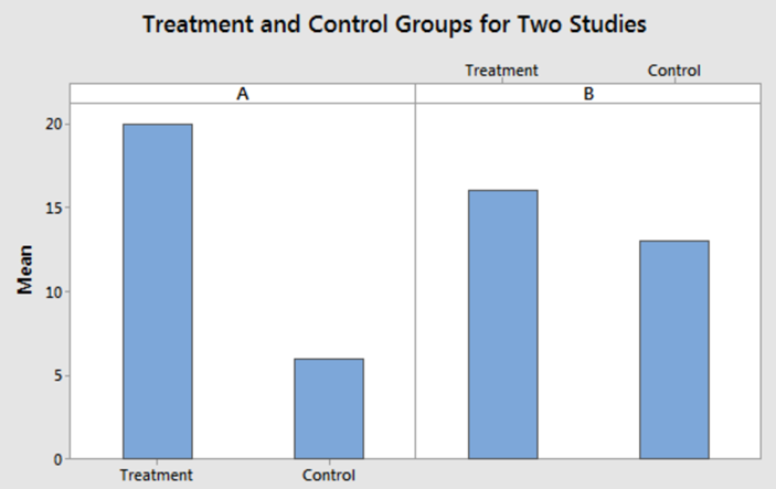
Effect size helps to understand the magnitude of differences found, whereas statistical significance examines whether the findings are likely to be due to chance. While a P value tells if an effect exists, the P value does not reveal the size of the effect. Hence, in reporting and interpreting studies, both the effect size and statistical significance (P value) are essential results to be reported. When hypothesis test indicates statistically significant results, we can conclude that there is sufficient evidence that an effect exists in the population. This helps to rule out random sampling error as the culprit for an apparent effect in sample. But this doesn’t necessarily mean the effect size is meaningful in the real world. To understand if a statistically significant result is practically important or not, the effect size which provides the magnitude of the effect comes in handy to answer crucial questions such as how much a particular treatment worked or how strong a relationship between a dependent and an independent variable is. Consider the above example where the medication A is compared with medication B to understand which is more effective treating a disease. Assuming a p-value < 0.05 for both samples, provides an inference that there is a statistically significant difference in means between the treated and control groups in both cases. Now to understand which sample is better than the other, an effect size can be used. The effect size, calculated by subtracting the means indicate that the effect size for A is (20-5 = 15) is bigger than the effect size of B (16-14 = 2). To derive further insights and accuracy, it is also worthwhile to look into the confidence intervals of the effect size. In the above example, lets say, the CI for effect size A is [-4 to 25] and effect size B is [1 to 3]. Now, B looks more precise and statistically significant whereas A is imprecise and considering also includes 0 in its CI, can also result in a no treatment effect.
-
Six sigma proficiency provides an accreditation to an individual on their level of expertise in practically deploying the six sigma governing framework and the effective use of underlying tools/techniques to solve critical business problems. Typically, there are 6 levels and each is described as below. Some companies have separate teams with six sigma BB/MBB experts who are responsible to train GB/BB, mentor projects, establish six sigma governance frameworks such as targets for certified employees, exams to test knowledge proficiency. Usually each proficiency is acquired through a variety of self help online courses, instructor led class room trainings, simulations in the form of games/exercise followed with an exam and a project to test the practical application of the concepts learnt. White belt: Entry level proficiency. White belt help individuals to have an understanding of six sigma, quality and its history to help them explain in layman terms, provides an overview of the different roles in six sigma implementation, understand what it means to achieve 6 sigma level of quality, an overview of the DMAIC model, basic training on various quality tools such as 5why, pareto, histogram, process maps, SIPOC, and high level understanding of value vs non value added activities as part of lean. Yellow belt: In addition to the knowledge from white belt, yellow belt professionals can identify use cases where six sigma can be applied thus play a role in supporting project teams with a problem solving approach. The number of quality related tools that is taught as part of the curriculum is more compared to white belt as the DMAIC process is dealt a bit more in detail, introduction to minitab usage and understanding of graphical technique for data analysis, root cause analysis techniques Green belt: At this level, the understanding is advanced and GB professionals typically have the capability to work/assist in real world practical business problems under the guidance of black belts. Usually from this level an exam and a project that clearly demonstrates usage of DMAIC concepts are mandated to pass this certification. Professionals are taught in depth concepts on DMAIC and curriculum usually follows the Body of Knowledge. Black Belt: Plans and executes projects using Six Sigma principles. Black belts are experts and agents of change. They provide training in addition to leading projects. The Certified Lean Six Sigma Black Belt is a professional who can explain Six Sigma philosophies and principles, including supporting systems and tools. A Black Belt showcases team leadership, understand team dynamics, and assign team member roles and responsibilities. Black Belts have a thorough understanding of all aspects of the DMAIC model in accordance with Six Sigma principles. They have basic knowledge of lean enterprise concepts, are able to identify non value-added elements and activities, and are able to use advanced analytical tools. The BB training is extensive usually spread across 2 weeks of dedicated trainings, lot of practical simulations and concludes with an exam. Master Black Belt: Lean Six Sigma Master Black Belts (MBBs) lead and educate all levels of an organization in Lean Six Sigma tools and methodologies. They provide guidance to senior leaders, aligning Lean Six Sigma projects with an organization’s business plan to further drive continuous improvement and are responsible to provide strategic decisions on areas to invest as far as application of six sigma professionals are concerned to derive the maximum return of investment. Master Black Belts are inspirational leaders and innovators, always seeking new ways to align business practices with Lean Six Sigma and promote a continuous improvement culture across all processes and departments. The MBBs are trained in business impact analysis, agile leadership, business simulations, new age technologies such as AI/RPA awareness. MBB usually report to senior management and are part of crucial decision making processes in an org. Champions: The top level senior executives who are responsible to drive lean six sigma culture throughout the org.
-
Impediments are things the slows down an agile team from accomplishing the end results thus affecting the velocity or prevents them from achieving the desired results. How to solve impediments: Create visibility – Call out all the blockers so that everyone is aware Find the root cause – Identify what is the main cause of the blockers using 5 why analysis Escalate when needed – Surface to senior leadership for support Examples of impediments: IT infrastructure readiness Head count constraints Lack of Subject matter expertise Dependance on multiple teams awaiting approval
-
What is a heatmap? Heatmap is a graphical representation of data using color codes to represent different values. The intensity of the color is governed by the magnitude of the underlying data, thus enabling the users to quickly analyze areas of interest and how it varies in the space under analysis. Heatmap are widely used in various fields of engineering as illustrated below. Applications of heatmap in various fields: A spatial heatmap is used in weather forecasting to figure out the spread of environmental temperature across the planet earth as in below image. The red colors indicate the regions with higher temperature, followed by yellow, green, blue and white. Another category of heatmap is a clustered heatmap as in below image. In this image, each cell in one line indicates the average temperature of a region in one particular week. By looking at the heat map, it is easy to understand how temperature changes weekly for a particular region and also understand how it correlates to similar places/other regions at the vicinity. Such information is a crucial input in weather forecasting, engineering planning, etc. Another popular usage is in webpage design. Depending on where the users click on a webpage, the design can continuously be improved to increase user retention and also gain valuable insights on which is the area that the users are paying attention. The below image clearly illustrates to an ecommerce website, which is the area / phone that most customers are interested using the number of clicks made and accordingly sort the offerings based on popularity. The heat map can also help to identify issues such as dead links on the webpage that might lead to no-where but is represented as a link that can lead to user frustration. Below image is a heatmap generated using scrolls of a webpage to understand how long customers like to scroll. This helps companies to understand where to place the products of most interest, how many products or search results can be displayed in one page. In finance, heatmaps are used in wide applications such as understanding the movement of real estate prices, credit card spend, etc. The below heatmap is the stock position of some top companies. The red color indicates that the stock lost its value and green indicates a gain. The intensity of the color indicates the magnitude of loss / gain and the size of the tile represents the market capitalization of the company. How to create heatmaps? Heatmaps can be created using excel. First select the data that needs to be analyzed for heatmap, then Home -> Conditional formatting -> Color scales will produce the heat map. The colors are customizable and for doing that, go to, Home -> Conditional formatting -> Manage rules.


-
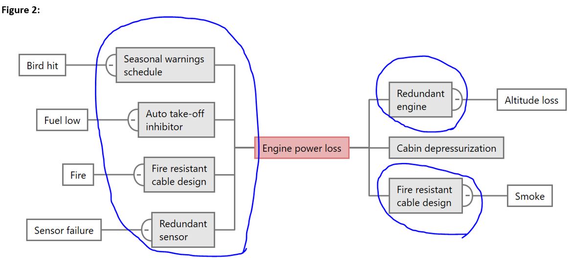
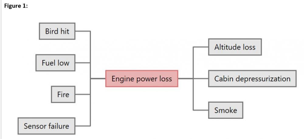
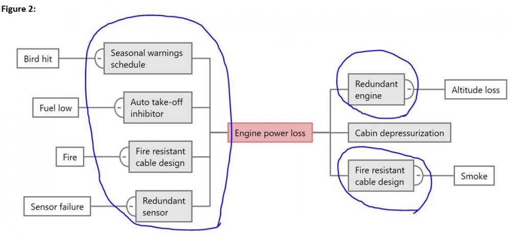
What is a bowtie? It’s a risk assessment methodology that uses a pictorial representation of the pathways of the causes of an event to its consequences. The left side of the diagram are the causes that would trigger the event, the middle/knot of the bowtie is where the causes converge to trigger the event and the right side are the possible consequences of the event. The diagram provides a simple scheme to easily visualize all possible proactive and reactive risk management to avert an event. How to construct bowtie? MS applications such as word/PowerPoint can be used in case of simple bowtie. In the below example, I used the idea map available in Minitab workspace to recreate. It doesn’t look like a bowtie, but it conveys the intent The first step in bow-tie analysis is to figure out the hazard. Anything in an organization that has the potential to cause damage if control over it is lost is considered a hazard. Typical hazards seen in industries include a process / product that does not comply with local government rules / regulations leading to product withdrawal from market or a total ban on the company to sell, improper design of a valve that could lead to an explosion resulting in loss of material and life, poor quality resulting in market erosion, etc. A hazard identification brainstorming event with subject matter experts from various disciplines is formulated by companies to identify all possible hazards and the ones that could cause maximum impact are typically selected for further detailed qualitative analysis using bowtie. Top event: Once the hazard is finalized, then the next step is to find the top event. It is defined as the moment when the control is lost. Hazard Flying an aircraft Top event Engine power loss Now, list the causes that could lead to the event on the left and the consequence of the event to the right. Historical data can be used to figure out all possible causes/consequences that has occurred and proactive risk management tools/techniques can be used to figure out all possible causes/consequences that could occur. Introduce barriers for each identified cause/consequence as highlighted in blue. As the name suggests, barriers are the controls that needs to be placed in the system so that the threats/causes do not occur or even if they do, they don’t lead to the top event (in this case, engine loss). The barriers on the consequence side should ensure that, in case the top event occurs, it does not further escalate and result in the impact/consequence. Typically, the barriers should be properly mistake proofed to ensure errors due to human behaviors are nullified. Once the bowtie analysis is completed, the subject matter experts along with management can analyze to take decision on the sufficiency of each barrier in lieu of the risk it averts. In cases where the probability of a particular barrier failure is high, escalation factors are used to analyze this failure and take preventive measures. Uses of bowtie: a) Provides a structured systematic method to analyze a hazard/risk b) Provides a quick view of the controls that are available and its sufficiency to effectively control c) The scheme is simple and easy to understand, thus promoting communication to gain better ownership to manage risk, helps management to take decisions on the controls to improve/sustain by deploying additional resources A comparison with FMEA: Per ISO14971, “FMEA is a technique by which the consequences of an individual fault mode are systematically identified and evaluated. It is an inductive technique using the question “What happens if..?” Components are analyzed one at a time, thus generally looking at a single-fault condition. This is done in a “bottom-up” mode, ie., following the procedure to the next higher functional system level. Failure Mode Effect Analysis (FMEA) is another risk analysis tool where the impact of every potential defect on the whole system is evaluated using a risk score. The risk score or the risk prioritization number is obtained using the formula: RPN = Probability x Severity x Detection wherein probability is the probability of the defect to occur, severity is the severity that that defect could cause when it occurs and detection is the probability of detecting the defect or the failure each determined using the current as-is state of the process. Once all potential failure modes are analyzed and a RPN number is calculated, usually either the top 10 is taken for improvement or a threshold value of RPN is set, above which all identified risks are to be improved. Effective control/preventive strategies are then designed to counter the three parameters (ie)., probability, severity and detection that would effect a change on the RPN. Although at the outset, FMEA and bowtie are used for analyzing risk and their consequences, they are different in the way they are constructed, evaluated, presented, but the end objective remaining the same. In fact, based on the complexity, resource/expert availability, depth of analysis required, each tools shall be evaluated based on its features and the output of one can become the input to another one. For example, the FMEA report with all the potential failure modes can be the input to the bowtie to construct the cause and consequence for the top failures for further analysis.
-
When a logical relationship exists between two activities needed as part of a project, then a Precedence Diagram Method (PDM) is used to represent the relationship between the two activities. This technique is widely adopted for scheduling activities in project management. In PDM, there are four different types of logical relationships that are possible between two activities. They are a) Finish to Start b) Finish to Finish c) Start to Start d) Start to Finish. To understand the four logical relationships better, we need to first understand what a predecessor or a successor activity means. In a schedule, predecessor activity is an activity that comes before a dependent activity and successor activity is a dependent activity that comes after another activity. a) Finish to Start: In this relationship, the successor activity cannot start unless the predecessor activity is finished. This is the most widely used relationship visible commonly across many workflows / processes. For example, you cannot proceed with payment for your ecart unless you have added all the items to your cart when using an ecommerce platform. In this example, payment initiation, which is the successor activity cannot start unless the predecessor activity, which is, adding items to cart is completed. Similarly, you cannot upload the ITR form (successor) unless you have filled-in all the mandatory pre-requisite fields (predecessor). b) Finish to Finish: In this relationship, a successor activity cannot finish unless the predecessor activity has finished. For example, the security guard cannot finish his activity of closing the shop (successor) unless all the customers have finished shopping and left the shop (predecessor). If a document has to be peer reviewed by an approver before it can be published, then the activity of document closure by publishing (successor) cannot finish unless the approver has finished his/her review and approvals (predecessor) c) Start to Start: In this relationship, the successor activity cannot start unless the predecessor activity has started. In other words, the start of successor activity is dependent on the start of the predecessor activity. For example, you cannot start the activity to load the cake into an oven (successor) unless the oven preheat activity has started (predecessor). For a reliability test of a spring, you cannot start the activity to measure the spring stress (successor) unless the spring loading activity (predecessor) has started. d) Start to Finish: In this relationship, the successor cannot finish unless the predecessor has started. For example, in case of product delivery, a project/program management team cannot finish or cease to support (successor) unless the operations teams starts the takeover (predecessor).
-
When your data is arranged vertically and represented using bars with the largest bar stacked at the top and the smallest bar at the bottom, the output shape resembles a tornado and you have just generated your tornado chart. Tornado chart is used to perform quantitative risk analysis using the sensitivity data the chart offers as output as part of the project risk planning process in project management. The tornado diagram shows the variables that govern an output in the order of their impact (ie)., so the variable that is stacked at the top of the chart, becomes the one that is most sensitive to influence the output. A classic example in project management is to find the risk that could have the maximum impact on project schedule. In the example shown in the image, lets assume that a company has used subject matter experts and available data to arrive at the following risks such as head count, free cash, shop floor, suppliers, etc that could impact the end delivery of a product to a customer. As a PM, if I have to find the top three risks that could have a huge impact to the delivery or the top risk that has maximum sensitivity towards a change in the output, this can easily be inferred using the above tornado diagram. From the figure, Head count has the highest sensitivity, implying that any issues in having the right head count and ensuring its availability can have a drastic impact on the delivery of the project. This serves as an useful mechanism to identify risks proactively and also provides clarity on the area that need attention rather than boiling the entire ocean with the limited available resources. In the above example, considering that license, material, etc are stacked at the bottom, implies that they have the least impact on project delivery and hence, can safely be removed from further analysis. A simulation tool when used with tornado charts, can come handy to dynamically vary the decision variables to understand how the output is impacted to make better informed decisions.

-
Trial and error is the simplest experimental approach. Currently, across many industries, this approach is often coupled with fail fast, fail often concept to promote aggressive experimentation to learn and explore new ways of designing products/processes. Gordon Moore, founder of Intel, noted: “With engineering, I view this year's failure as next year's opportunity to try it again. Failures are not something to be avoided. You want to have them happen as quickly as you can so you can make progress rapidly.” In the trial and error method, a 4 step approach is typically followed, wherein the experts start by first observing a problem, then make assumptions on what could or could not possibly work, devise & deploy a solution based on the assumptions, learn valuable lessons from the outcome of the deployed solution. This approach is repeated again and again, each time with adjustments made to the design based on previous learnings, until a convincing solution is arrived at (or a decision is made to simply stop the experiment based on several other factors). Trial and error has many advantages compared with the other experimental setups: a) it is easy and quick to setup b) it does not need special expertise and can easily be implemented by the specific subject matter experts c) it promotes a culture of learning by doing and observing Trial and error should be the last resort if other approaches cannot be used due to the following disadvantages: a) Not rule based and hence, does not provide a structured thinking on all the factors that could affect the experiment b) Its best suited only for simple problems, whereas typical real world problems have a wide variety of variables as inputs c) It cannot be used to predict an outcome as it does not provide enough clues on why a solution works d) It cannot be used to find the best possible solution or all possible solutions Examples to understand trial and error: Our day Is filled with instances where we continuously experiment with new things. Trial and error seen in nature: A monkey figuring out to open a soda bottle with a bottle opener; Trial and error seen in our everyday life: A person trying to figure out the best transportation to commute to work, a baby trying to stand up and walk; Trial and error seen in industry: Supervised machine learning. One factor at a time: As the name implies, an experimental approach in which the factors are tested one at a time. This approach is also known by various other acronyms such as OVAT, OVaaT (one variable at a time). Suppose we have a process with inputs X1, X2 that are processed to provide an output Y. In OFAT, we keep X2 constant and vary X1 to find the optimum result. Once the optimum output is achieved, X1 is fixed at that point and we then vary X2 to find its optimum value. In this way, one factor or variable (ie)., X1 or X2, is varied at a time till all the input factors are exhausted. The main advantage of OFAT is that it serves as a good alternative to multi factor analysis when collecting data for multi factor is cumbersome or not economically viable. OFAT has the following disadvantages: a) Cannot figure out interaction effects between the variables under analysis. This means, OFAT cannot be used if the input variables to a process interact with each other and the interaction also has an impact on the output. b) In certain cases, depending on the number of variables, can lead to large number of experimental runs with a negative impact on cost and time. If you want to understand adding 2 strawberries or 4 strawberries (factor / variables) to 1 glass of milk, with 2 spoons of sugar, mixed for 3 mins in the same mixer (fixed entities) gives the best strawberry smoothie, we can use OFAT. Multiple Factors at a time: When multiple factors are manipulated to study their effect on the response/output, its called multi factor at a time experimental approach. This solves the major disadvantage with OFAT pertaining to interaction effect as the response pertaining to changes on multiple factors at the same time are observed to find the optimum response. In case of random selection of input variables as followed in trial and error, there is no structure which gives clear understanding if all possible combinations of inputs have been analyzed in an orderly way. Hence, with trial and error, its not possible to quantify if the solution finalized is the best optimum. With multi factor analysis, as the experiment can be designed to include all the interactions that is of interest, probability of achieving the best optimum solution with an orderly experimentation is high. Further, the multi factor analysis also provides key insights on the key factors to be considered, the optimal settings for each input variable to be set that would result in the least variation in the process output. Despite the advantages, the subject matter experts in coordination with the management should determine the right use cases for doing a multi factor analysis by taking the complexity, cost of experimentation, multiple runs, practical feasibility for simulation and time needed. An OEM that manufactures Turbines for power generation can use a multi factor analysis experimental approach to find which operational conditions such as ambient temperature, fuel used, fuel gas temperature, etc will result in the maximum power efficiency.
-
RPA IPA RPA stands for Robotic Process Automation IPA stands for Intelligent Process Automation RPA provides mechanisms to build and manage software robots that can imitate human actions based on pre-defined rules with speed, accuracy and availability thus helping to automate repetitive, less cognitive mundane tasks. IPA is the combination of RPA and AI or in other terms, an upgraded RPA. IPA provides capability to develop bots that can continuously improve by learning from humans. Rule based, the bots cannot think and take decisive actions. Structured/unstructured Data based with continuous learning capability provides decision making ability to the bots and keep improving. Example: In an invoice approval workflow, RPA can be designed to have predefined sequence with Person A approving the invoice and then it needs to move to Person B and so on. Example: With IPA a variety of use cases and complexity can be addressed to fit for scenarios such as understanding if all approving authority are available and if not, take decisions to move the workflow to the next available suitable authority, route the workflow to different stake holders with additional steps depending on certain variables in the invoice Based on certain keywords, RPA can categorize files/emails/folders IPA can classify or categorize using advanced sorting criteria such as an email pertaining to a particular subject coming from a particular person within a certain timeline needs to be moved to a certain label.