

Rakesh Chandra
Members
-
Joined
-
Last visited
-
Rakesh Chandra changed their profile photo
-
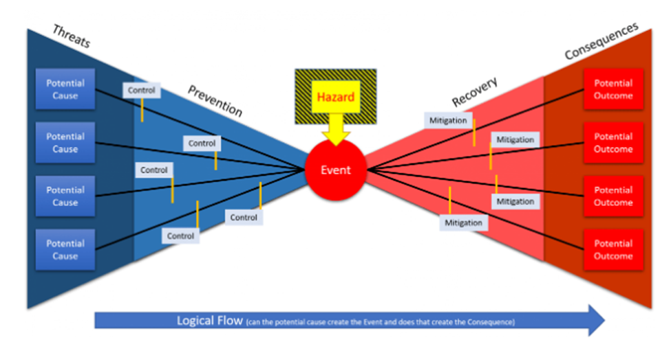
Bowtie Analysis A bowtie is a graphical representation of the pathways from the causes of any event or risk to its consequences. The diagram is shaped like a bowtie, creating a clear differentiation between reactive risk management and proactive. Benefits of bowtie analysis The benefits of the Bowtie analysis include but not limited to: It provides a structure to analyze a hazard systematically. It helps make a decision to check the current level of control is sufficient or for those who are familiar with the concept, whether risks are As Low as Reasonably Practicable. It helps to identify where and how investing resources would have the greatest impact. Also increases risk communication and awareness. We have eight basic steps in building of a bowtie diagram: Identify hazard: This is the first step and the first step in managing risks is to identify what their sources are there. Identify top event: When we know that what is/are potentially hazardous then we need to know how we could lose control over it/them. Identify threats: The next we need to consider the scenarios or events which could directly cause the occurrence of the top event. Evaluate consequences: Then after the top event occurs, the subsequent scenarios or events are now possible and these consequences may have lead to losses and damage. Identify preventive barriers: The next step is to identify the barriers which should prevent the threats from reaching or causing the top event(s). These are the preventative barriers. Identify recovery barriers: Barrier(s) on the right side try to recover from the occurrence(s) of the top event(s) and this/these barrier(s) should prevent or alleviate the consequences and/or the resulting losses and destruction. Identify escalation factors: The next step is now to identify the specific situations or conditions under which the barriers are less or not effective. Identify escalation factor barriers: The next and last step is to look at what barriers you have to prevent or manage these escalation factors. Comparison between Bowtie analysis and FMEA Bowtie Analysis FMEA It is considered as an approach that has both proactive and reactive elements and that systematically works through the hazard its management. It is a model used to prioritize potential defects based on their severity, expected frequency and likelihood of detection FMEA is a step by step approach to identify the possible failures in design, manufacturing or assembly process or product or service. FMEA is two types of 1. DFMEA 2. PFMEA It is a systematic tool for identifying the effects or consequences of failure mode and is used to eliminate or reduce the chance of failure.


-
Tornado Diagram Tornado diagrams are a special type of bar chart where the data categories are listed vertically instead of the standard horizontal presentation and the categories are ordered so that the largest bar appears at the top of the chart, the second largest appears second from the top, the third largest appears third from the top and so on. They are so named because the final chart visually resembles either one half of or a complete tornado. It is also called tornado plots, tornado charts or butterfly charts. Purpose of Tornado diagram The purpose of the tornado diagram is to determine the sensitivity analysis; comparing the relative importance of variables. For each variable or uncertainty considered, one needs estimate for what the low, base and high outcome would be. The sensitive variable is modeled as having an uncertain value while all the other variables are at the baseline values which allows testing the sensitivity or risk associated with one uncertainty. For example- If a decision maker needs to visually compare 100 budgeted items and wishes to identify the 10 items one should focus on then it would be nearly impossible to do using a standard bar graph but in a tornado diagram of the budgeted item, the top 10 bars would represent the items that contribute the most to the variability of the outcome and then what the decision maker should focus on. Use of Tornado diagram in Sensitivity Analysis and Risk Analysis One of the easiest ways to increase the effectiveness of the optimization is to remove decision variables that require a lot of effort to evaluate and analyze but that do not affect the objective very much. If we are unsure how much each of our decision variables affects the objective, we can use the Tornado Chart tool in Crystal Ball. The Tornado chart/diagram tool shows how sensitive the objective is there for each decision variable as they change over their allowed ranges. The chart or diagram shows all the decision variables in order of their impact on the objective. Crystal ball Tornado diagram/chart shows a Crystal Ball tornado chart. When we view a tornado chart or diagram, the most important variables are always at the top. This arrangement makes it easier to see the relative importance of all the decision variables. The variables listed at the bottom are always the least important in that they affect the objective the least. If their effect is significantly smaller than those are at the top, we can probably eliminate them as variables and just let them assume a constant value. Crystal Ball Tornado Diagram/Chart Before running the Tornado Chart tool, we run an initial optimization so that the base case values of the decision variables are close to the optimal solution for the model. We can use the Tornado Chart tool to measure the impact of our decision variables.


-
Inventory Turnover Ratio The number of times a company has sold and replenished its inventory over a specific amount of time. Inventory Turnover Ratio = Cost of goods sold / Average inventory The inventory turnover ratio is derived from a mathematical calculation where the cost of goods sold is divided by the average inventory for the same period. A higher ratio is more desirable than a low one because a high ratio tends to point to strong sales. Cost of goods sold- It is the direct costs of producing goods including raw materials to be sold by the company. Average inventory- It smooths out the amount of inventory on hand over two or more specified time periods. The formula can also be used for calculating the number of days it will take to sell the inventory on hand. It is used in inventory management to assess operational and supply chain efficiency. The concept of an inventory turnover provides a number that symbolizes a measure of units sold compared to units on hand or can say that how well a company is managing inventory and generating sales from that inventory. Its an important component of the effective supply chain management. It is especially important measurement for retailers and companies that sell physical goods. Reducing the inventory holdings can lead to reduced overhead costs and improved enterprise profitability also. Examples of Inventory Turnover Ratio 1. ABC Woods Furniture is a specialized supplier of high-end, handmade dining sets made from specialty woods. Over Q3, its busiest period the retailer posted Rs. 47,000 in COGS and Rs. 16,000 in average inventory. To find the inventory turnover ratio, we divide Rs. 47,000 by Rs. 16,000 and the inventory turnover is 3. 2. We’ll use the same company and the same scenario as above but this time compute the average inventory period; meaning how long it will take to sell the inventory currently on hand. We already know that the inventory turnover ratio is 3. For calculating how many days it will take to sell the inventory on hand at the current rate, divide 365 days in the year by 3, which equals 121.67 days. Inventory Turnover Ratio helps in business growth as: 1. Making smarter decision in varieties of areas of business i.e. pricing, manufacturing, marketing, purchasing and warehousing management. 2. Helps in increasing sales volume and stores profitability. 3. In reselling excess inventory. 4. In better forecasting.
-
Waterfall chart A Waterfall chart is a data visualization technique that shows that how an initial value can be affected by the cumulative effect of sequential positive and negative values. This chart can be used to show either sequential or categorical data. It uses a series of bars that show gains and losses, clearly showing how an opening figure was changed by events and led to the closing figure. Waterfall charts were popularized by the strategic consulting firm “McKinsey & Company” in its presentations to the clients or customers. The use of waterfall chart became popular after the book “The McKinsey Way” was published. Construction of waterfall chart in Power Point 1. In the power point ribbon, click on the ‘insert’ then on ‘chart’ 2. In the chart list, select ‘waterfall’ then click ‘OK’. Waterfall chart with a linked excel sheet will be inserted into the presentation. Can also click on the diagram placeholder of a slide. It will open the diagram list and waterfall chart will be displayed at the excel location of the placeholder. 3. Then right click on the chart, also can select ‘edit data’ to open the excel sheet that contains the waterfall data. Below that we can see how to add or remove sums or connecting lines. We can use our data also from an external excel file and link them together. Construction of waterfall chart in Excel 1. Select the desired data table in excel and ‘click’ the ‘insert’ tab on the ribbon. 2. In the center of the charts group, we see a waterfall icon. ‘click’ on it and select "Waterfall" from the list at the top. The values will be displayed as a waterfall chart in Excel. There is not to be surprised if totals are not displayed correctly, we can easily edit this afterward then see the headline, display totals in waterfall chart. 3. Then ‘click’ on the diagram to copy it. 4. Open the power point presentation and insert the waterfall chart at the desired position. Now the waterfall chart is displayed with the Excel values. Uses of Waterfall chart in business excellence Examples: 1- In HR to show attrition and growth in hiring. 2- In financial industry to show credits and debits, gains and losses over the course of a single period of time 3- To visualize positive and negative growth or values. 4- Category wise gains and losses.


-
Trial and Error: Trial and error is a problem solving method in which multiple attempts are made to reach a solution and learning from the mistakes. It is basic method of learning of new behaviors. This method is repeated until success or a solution is reached. Example- climbing of a spider on wall is one of the best examples as spider use to climbs up and falls down and keeps trying till to reach the top or destination. One Factor at a Time: OFAT is a method in which the impact of change in one factor is studied on the output when all the other factors are kept constant. In OFAT, only one factor can be changed and can be used for screening of critical factors only. OFAT tells the main effect of the of the factor on the output. In OFAT, the project lead can decide the number of experiments that want to do It is statistical technique and it requires experiments to be conducted. Solution identified from OFAT need to be checked for practical or business sense. Example- Assume the mileage of a car as the output and there are multiple inputs for this like: Car condition, road condition, fuel type way you drive and resistance between tyres and road. If I have only one car which is 10 yrs old, car condition is good, road condition is good, it is petrol car, use to take the same route to go to office every day, I have fixed the driving style and the tyres are in good condition. The given things mean that except of fuel type other factors are almost constant, for this I can use OFAT. Multiple Factors at a Time: MFAT is a method in which the impact of change in two, more or all the factors are studied on the output. It is also a statistical technique and it requires experiments to be conducted. Solution identified from MFAT need to be checked for practical or business sense. Example- Taking the same example as above of car mileage issue and assume the same as the mileage of a car as the output and there are multiple inputs for this like: Car condition, road condition, fuel type way you drive and resistance between tyres and road. If I have only one car which is 10 yrs old, car condition is good, road condition is not good, it is petrol car, I use to take different routes to go to office, I have fixed the driving style and the tyres are not in good condition. The given things mean that multiple factors or variables are responsible here for the mileage issue, for this I can use MFAT. *Trial and error can be preferred over OFAT and MFAT in new product development where all the raw-material are available as per the requirement but the person/chemist/engineer is not making it as per the benchmark that why min three trial batches use to be prepared before sending to the market so trial and error can make perfection here, practice/trial can make the perfection after learning from the errors. Trial and error can be preferred over OFAT and MFAT in learning the driving also. So the trials and errors can be preferred for new learning.
-
MAGIC criteria for making a persuasive statistical argument The MAGIC criteria are the set of guidelines proposed by Robert Abelson in his book Statistics as Principled Argument. He presented MAGIC criteria for that the goals of Statistical analysis should be to make compelling claims about the world. It is an easy read with few formulas but with lots of wisdom. MAGIC criteria Magnitude- How big is the effect? We can tell that how big an effect is through the various measures of effect size. We will get into some of these in the later diaries but some of the common ones are correlation coefficients. The difference between two means the big effects are impressive while the small effects are not. How big is big depends on the context and on what already known. If we find, for example that a new diet plan lets people lose (on average) 10 pounds in a month, that’s pretty big. 10 ounces in a month is pretty small but if it was a diet tested on rats, 10 ounces might be a lot. Articulation- How precisely stated is it? The Articulation is measured in what Abelson calls Ticks and Buts. A ‘tick’ is a statement and a ‘but’ is an exception in articulation. The more ticks the better, the fewer buts the better here in articulation. There are also the blobs which are masses of undifferentiated results. Blobs are as it might have guessed, bad. Generality- How widely does it apply? Generality refers to how general an effect is. Does it apply to all humans everywhere? That would be very general or does it apply only to people who have posted more diaries daily? That would be pretty specific. Usually, more general effects are of greater value than the more specific ones but should be sure that the study states how general it is. Interestingness- How interesting is it? Interestingness is very hard to measure precisely but one way is to say that how different the reported effect size is from what we thought it would be. For example, I once read a study that showed that black people on average earn less that white people. Upsetting but not interesting. Knew that already and the size of the difference was large (which is thought it would be) but not huge (which also knew because after all, even the average white person doesn’t earn all that much) but then it went on to say that while black men earned a lot less than white men (more than it was thought that the difference would be), black women and white women earned almost the same (that’s really interesting! it would have thought that black women earned much less than whites!) Credibility- How believable is it? The harder a result is to believe; the more stringent have to be about the evidence supporting it.
-
Difference between RPA and IPA with examples Robotic Process Automation (RPA) · Robotic process automation uses technology to emulate human tasks to complete a business process. Types of human actions that Robotic process automation (RPA) bots mimic are repetitive computer-based tasks that are rule-based and have defined inputs and outputs are repeatable and also occur frequently. · Robotic process automation utilizes structured data to complete the tasks e.g. data entry, data processing & mapping, client onboarding and new accounts opening. · Robotic process automation (RPA) is often confused with artificial intelligence (AI) while some argues that RPA qualifies as a form of AI technology and RPA is often combined with AI, the two technologies are distinct. Unlike the AI, RPA bots generally do not have the ability to learn. With RPA, if something changes there in an automated task, the bot will not be able to adjust and figure it out on its own. RPA is basically designed to mimic the human actions while AI is intended to simulate the ways that humans think. Intelligent Process Automation (IPA) · IPA is based on Artificial intelligence technologies · IPA can mimic human actions as well as can learn to do them better over time. · IPA builds upon and encompasses RPA with AI. · IPA consists of four core technologies: 1. Machine learning (ML) 2. Natural language processing (NLP) 3. Intelligent workflows 4. RPA Machine Learning- It is an application of artificial intelligence. ML gives systems the ability to access data and learn from it without being programmed. Machine learning (ML) uses algorithms that are either supervised or unsupervised to identify patterns in structured data, supervised algorithms create inputs and outputs prior to making predictions of their own while unsupervised algorithms observe structured data and develop insights from pattern recognition. When combined with RPA, bots can evaluate their efficiency and make adjustments to improve the processes. Through deep learning (DL), systems can utilize data gathering in one context to improve upon others. Natural language processing- It (NLP) is a software tool that analyses human language to give machines the ability to read, understand, and derive meaning. This technology works through a combination of techniques like statistical and machine learning (ML) to algorithms. NLP is commonly used to create chatbots. Chatbots use RPA to communicate with human users and to complete the tasks. Among other things, Natural language processing (NLP) helps chatbots to determine the meaning of interactions and to provide users with relevant responses. Intelligent workflows- Introducing of bots into workflows may lead to confusion and inefficiencies. Human stakeholders need to understand their own roles and responsibilities. For the instance, when does a robot handoff a task to a human etc., Process management software helps stakeholders to understand and track processes to avoid bottlenecks etc. IPA plays an important role in improving employee satisfaction and customer experiences both. For employees, they better understand their roles and appreciate the opportunity to work on tasks that are less repetitive and offer more values to their organizations. Value is passed onto customers since more resources can be devoted to providing excellent customer services. Customers are also benefitted from user-friendly IPA technology. For example- new customer onboarding has traditionally been a drawn-out process, especially in industries like banking where organizations must collect large amounts of information and documentation etc. With IPA, however, organizations can easily capture and extract the data from onboarding documents, reducing waiting times and significantly improving customer experiences. Robotic Process automation- RPA (Robotic process automation) uses the technology to emulate human tasks to complete a business process. The types of human actions that RPA bots mimic are repetitive computer-based tasks that are rule-based also, have defined inputs and outputs, are repeatable and also occur frequently. Robotic process automation (RPA) utilizes structured data to complete the tasks. Examples of the tasks where RPA technology works well are data entry, data processing & mapping, client onboarding and new account openings etc. RPA is often confused with artificial intelligence while some argues that RPA qualifies as a form of Artificial intelligence (AI) technology and RPA is often combined with AI, the two technologies are distinct. Unlike AI, RPA bots generally do not have the ability to learn. With RPA, if something changes in an automated task, the bot will not be able to adjust and figure it out on its own. RPA is designed to mimic human actions while Artificial Intelligence is intended to simulate the ways that humans think.
-
Analysis of Means (ANOM) Analysis of Means (ANOM) is a systematic statistical procedure used in depicting significant differences among the groups of information in a visual form. It is active mostly in quality control. Analysis of Means (ANOM) methodology compares the average of each group to the mean of the overall process to discover statistical differences of significance. How is Analysis of Means (ANOM) Used? ANOM (Analysis of Means) is a graphical variation of ANOVA (Analysis of Variance), it allows data to be graphically visualized. This technique was developed by R. Ellis in 1967, who observed that statisticians were not challenged with comprehension of the Analysis of Variance ANOVA). Edward G. Schilling extended the concept further in 1973 by allowing Analysis of Means (ANOM) to be used with a large number of statistical tests based on the assumption of the normality and the connected data in a way that the mean and the variances of the number of successes in repeated trials of a binomial experiment when only two outcomes are possible does not apply. As Analysis of Means (ANOM) is a graphical likeness of analysis of variance which is a statistical procedure for deciding the amount of similarity or difference between two groups of the data used to evaluate the balance of population averages. The graph shows the decision limits, total mean and the mean for each determinant. If a point in the chart falls outside of the decision limit for any given factor, it shows there is an important difference between the factor's mean and the population mean, which is the average of all elements which meet the criteria of selection for a group. Mean analysis is the same as the ANOVA but can be used for both normal distribution, which is a bell-shaped symmetrical curve represents the number of times a given sum of objects or events occur in a data set(s) and binomial distribution which is the number of times one of two possible outcomes occurs in a set of data. Analysis of Mean (ANOM) is equal to the null hypothesis of the Analysis of Variance (ANOVA) which states that all the factors are the same in averages. When it comes to the alternative hypothesis of the ANOM, it indicates that the mean value of an element is not the same as the population mean. However the alternative hypothesis of Analysis of Variance (ANOVA) states not all factor means are equal. Because of this difference, the ANOM and the ANOVA can end up with different conclusions. For example, if the average of one factor group is higher than the population mean and the other group is lower, then the F test which is a statistical test that determines if two populations with normal distribution have identical variances or standard deviation, for the ANOVA will show that there are the differences but the F test for the ANOM will show none. In another example, if a one-factor level has a mean different than the other means then the ANOVA F test may not show a difference but for the ANOM, it could explain a variation of the group from population mean. Differences between ANOM and ANOVA ANOM ANOVA · ANOM compares the group mean to the overall mean. · ANOM can tell which group mean is significantly different. · ANOVA compares the group mean to the other group means. · ANOVA can tell if there is a significant difference. ANOM will be preferred over the ANOVA because the ANOM can identify immediately that which subgroup is different from the group but the ANOVA is not able to do this. ANOM will prefer where the difference in group and subgroup need to find.
-
Larger the sample size better it is- · Larger sample size is more closely approximate the population as the primary goal of inferential statistics is to generalize from a sample to a population; it is less of an inference if the sample size is larger. · Small sample size is bad and if we pick a small sample means we are running a greater risk and it will be completely random and will be very unrepresentative of the whole population so the variability will be greater if the sample size is small. · The value of the standard error is directly dependent on the sample size and to calculate the standard error, we divide the standard deviation by the sample size. · If the sample size is large enough, a sampling distribution will be normally distributed and if the sampling distribution is normally distributed, we can make better inferences about the population from the sample. · Large sample size gives more power and we will have the smaller standard error. Lindley’s paradox makes note the conflict between Bayesian and Frequentist evidences in hypothesis testing. If the sample size is large, we become more confident about our estimate and our intervals become smaller and the size of our confidence interval decreases. Whenever the sample size is too large, the chances of the error are small in null hypothesis and highly statistically significant result. The ways to avoid the paradox is to not conflict both the Bayesian and Frequentist evidence in hypothesis testing and to use the analysis on the base of large sample size.
-
Bayesian approach for hypothesis testing Frequentist approach for hypothesis testing Bayesian approach How unusual is the observed result under the given hypothesis is Bayesian approach. p-value for a Bayesian: The p-value is the probability is an expression of a degree of belief of an event, based on prior knowledge (previous experiments) or personal belief. P-value is the probability of the hypothesis given the data, P(Hypothesis|Data). Frequentist approach What is the probability that the hypothesis is true given the observed result is Frequentist approach. p-value for a Frequentist: The p-value is the probability of the observed data, or more extreme data under the assumption that the null hypothesis is true, P(Data|Hypothesis). Bayesian way of thinking · Bayesian statistics relates with subjective belief. · Bayesian statistics uses the idea of updating beliefs with new information when testing a hypothesis. · Prior belief x Bay’s factor = Posterior belief (= updated, new belief). · Bayesian talks about the observed data been fixed and the varying the model around. · Given the observed data, there is 95% probability that the true value of the parameter lies within the credible region. Frequentist way of thinking · Frequentist statistics is about the absolute truth and care about the true answer. · Frequentist statistics is not involving the opinion. · Frequentist talks about models been fixed and the data varying around them. · If the experiment is repeated multiple times, in 95% of the cases the computed confidence interval will contain the true value of the parameter.
-
AHP Pugh Matrix AHP enables decision makers to represent simultaneous interaction of many factors in complex unstructured situations. Pugh matrix is a decision matrix for the comparison of alternatives.. It is multi-criteria decision making tool with wide range of applications. It compares alternative solutions against the Datum (the current situation) as per the defined criteria. It is used to rank multi-dimensional options of an option set. The basic steps of the AHP Concept Selection Process are: The basic steps of the Pugh matrix Concept Selection Process are: 1. Brainstorm criteria that is important to the customer. List them down rows of sheet along with their weightages. 1. Brainstorm criteria that is important to the customer. List them down rows of sheet along with their weightages. 2. List the alternatives across columns of sheet Identify the Datum or status quo choice. 2. List the alternatives across columns of sheet Identify the Datum or status quo choice. 3. Begin filling in 1 or 0 or ‘or 1 or ratings in the main area of sheet, based on whether that alternative is better, equivalent, or worse than the datum for that criteria. 3. Begin filling in 1 or 0 or ‘or 1 or ratings in the main area of sheet, based on whether that alternative is better, equivalent, or worse than the datum for that criteria. 4. Prepare the prioritization matrix for each attribute. 4. Look at what the spreadsheet tells is the best choice. We need to do our and the group feel good about that decision? If ok means done and if not then need to look again to verify that something has missed from the set of criteria. 5. Calculate and check the CR, if the CR is equal to or less than it is 10% is ok, CR closer to the zero means better the result. 6. Create the summary table and choose the best alternative. Pugh matrix may not a long term strategic decision making like AHP as it selects baseline from the alternatives. AHP is a long term strategic decision making and gives the best result as per the consistency Ratio. AHP works on the basis of quantitative and qualitative data (Nominal, Ordinal, Interval and Ratio) and Ratio data is the best for AHP. Pugh matrix gives alternatives only because it uses discrete data not continuous data so unable to give the logical output as compare to AHP AHP develops a hierarchy of decision criteria and define the alternative courses of actions. AHP gives the logical output because it uses continuous data, It also uses discrete data. As we must use continuous data for critical matrix and continuous data is always preferred for best decision making. AHP algorithm is basically having two steps: 1. Determine the relative weights of the decision criteria. 2. Determine the relative rankings (priorities) of alternatives. AHP is used in complex decision making and group decision making also. We can check the best alternative by using a single chart (RADAR chart) *Finally AHP is the better than Pugh matrix for comparison and choosing the best alternatives. Pugh matrix can be preferred over AHP in small projects where there is no use of continuous data and discrete data is enough for choosing the alternatives.
-
Project artifacts is a documentation for any project in an organization for the project management containing the details of project charter, business case, communication plan, logs and registers, reports, hierarchy charts, dashboard, visual data, information, agreement and contracts etc.
