Ambikesh
Members
-
Joined
-
Last visited
Everything posted by Ambikesh
-
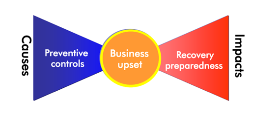
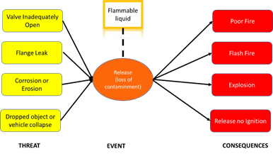
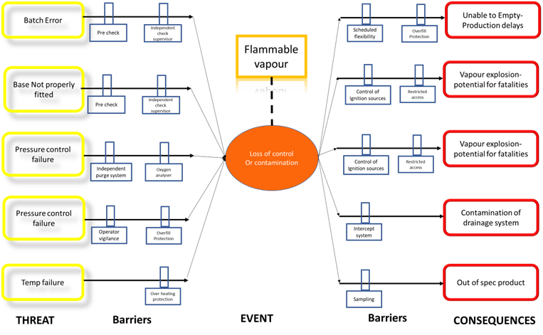
Bowtie is a methodology and used as a risk assessment, A major accident is often the results of multiple barrier failures. It can often be difficult to understand which combination of barrier failures could lead to incident this is where bowtie diagram come in a well constructed bow tie dram helps everyone to visualized the risk by focusing on the barriers that prevent incidents from occurring or those that prevent one from getting worse. It is a visual assessment that can be understood. By peoples at all levels in an organization and can be far easier to communicate that risk assessment in tabular form. At the center of the diagram is the hazard which is something that has the potential to cause harm. Below the hazard sits the top event which describes the point at which control of the hazard is lost and left-hand side we list the threads which are all the potential reasons that we could lose control of the hazard, on right-hand side are the consequences which is harm or damage, Which that could result from top event. Any threat may trigger the top event which may trigger result in any of consequences. Example : flammable liquid We can insert barriers. These are the measures we take prevent of mitigate unwanted threats and consequences. Barriers to the left of tope event are preventive barriers, they prevent the top event from occurring. The barriers to the right are mitigative barriers. They mitigates, or reduce, the consequences of the top event. Barriers should be described such as independent of one another, which means that each barrier alone can block the top event. Barriers are not 100% reliable they can fail. History show they do fail. Bowtie can be used to analyze barrier failure by examine degradation factors. These don’t cause an event to happen directly but they can lead failure of barrier. By helping to communicate key process safety information a more process safety information, a more positive safety culture promoted. Bowtie diagrams are also fantastic training tool, contributing to an increase an process safety competence. Below drawn Bowtie filter Dryer Here all barriers are not reliable enough, In Bowtie analysis we can use the color coding for prioritize action based on the impact. Bowtie approach is proactive and reactive and work though the hazard and its management. FMEA is a systematic method for identifying effect or impact of failure mode. Bowtie focus entirely on safety and hazard whereas FMEA focus on performance, quality and readability. FMEA talk about occurrence but Bowtie wont talk about occurrence factor. Compare Bowtie and FMEA . Bowtie approach is proactive and reactive and work though the hazard and its management. FMEA is a systematic method for identifying effect or impact of failure mode. Bowtie focus entirely on safety and hazard whereas FMEA focus on performance, quality and reliability. Bowtie analysis most used for the risks that have high level of risk, particularly those with high level consequences. FMEA talk about occurrence but Bowtie wont talk about occurrence factor . Bowtie highlight risk between controls and management, Bowtie analysis enhance the existing technique like FMEA by helping those involved in original identification or analysis studies to confirm their discussion and those not involved in the studies (but still responsible to manage the risk) to understand address the relevant issue. “Bowtie analysis offers a simple but effective method to visualize risk and show that hazards are under control”
-
Tornado Diagram Tornado diagram was used to understand the sensitivity factor which contributes to the target value and compare the relative importance of variables. The category is ordered as the large bar appears at top of the chart and the second largest appears second from the top, and so on. In the tornado chart, the big bar needs attention, based on the bar size we estimate how this factor is critical for the set target value, In other words, It shows the effect on the output or set target of varying each factor variable at a time, keeping all. Generally, you have to choose a “low” and a “high” value for each factors. The result is then displayed as a unique type of bar graph, with bars for each factor variable displaying the variation from the nominal value. It is normal practice to plot the bars horizontally, arranged so that the widest bar is placed at the top. When drawn in this way, the diagram takes on the appearance of a tornado, hence its name. The below figure shows a typical tornado diagram In the chart, variables are positioned are indicated in such a way, considering baseline factors when behaving relatively low or high. Example: studying Material -3 Reliability Here in the diagram coil diameter is the most sensitive factor for the reliability of material3 and 2nd most factor is coil diameter. In the above graph, the bar coloured by parameter range blue represent higher range and orange represent lower range. Based on the above graph our target reliability is 1.16, but we can improve further reliability if increasing the coil diameter by keeping other factors at base level. But in Case of Wire diameter, when increasing the wire diameter reliability decreases. Tornado diagram also give an overview how output of the process correlated with input variable.


-
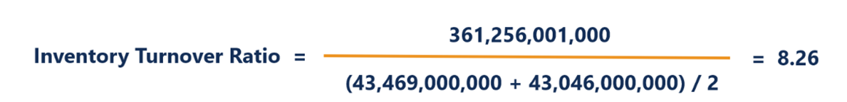
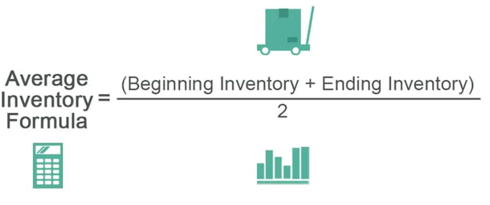
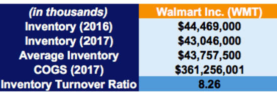
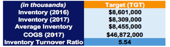
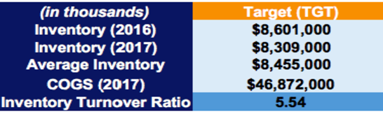
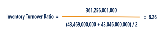
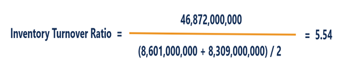
Inventory Turnover The inventory turnover ratio is a financial matrix that tells you how many times throughout a period of time the company converted its inventories in cash for the business. In fact, that can be calculated either by dividing the sales by average inventory or by dividing the cost of inventory. Average Inventory Example :- Inventory Turnover Ratio Ratio of wallmart is calculated below By comparing the inventory turnover ratios of Walmart and Target, both companies operate mainly in the retail industry, here we can see that Walmart sells its inventory 8.26x over a period of one year compared to Target’s 5.54x. It shows that Walmart can more efficiently sell the inventory it buys. In addition, it may show that Walmart is not spending excess on inventory purchases and is not incurring high storage and holding costs compared to Target. Interpretation of Inventory Turnover Ratio Inventory turn ratio is an efficacy ratio that’s measures how effectively company can control or manage inventory . It’s good to achieve a high ratio. Higher turn reduce the storage and other holding cost. The fundamental is compare the ratios between companies operating in same industry and not for companies operating in different industries. The benchmark value depending on the type business or industry. Low turnover reflects company sales are poor , company use to keep to much inventory or implies poor inventory management. Unsold inventory may lead significant risk in term of blockage of money, dead stock or obsolescence , market fluctuation. Inventory can help to determine the liquidity , In current scenario retail industries not keeping in any inventory eg Amazon . They always think no place for anything wherever find the place keep the material.


-
Trial and Error – Randomly changing inputs to observe changes to output without any specific plan One-Factor-At-A-Time (OFAT) – Varying each factor one at a time to understand the impact of that variable on the output. Full Factorial Design – Running all possible combinations of factors in order to develop a complete model of the system. Fractional Factorial Design – Running only a subset of the tests and still being able to derive useful information from the tests. The Trail Error Experiment is also known as S-R bond Theory and Learning Theory This method was introduced by Edward Lee Thorndike. He first stated the element of this theory of learning in 1913 that connections are formed in the nervous system between stimuli and response illustrated by the symbols S-R another word used to describe these connections is the word “ bond” and hence this theory is sometimes called a bond theory of Learning. Trial and error is a problem-solving tool and learning tool where multiple attempts are performed to get the right response / Solution. Learning takes place by trial-and-error theory. The learner makes random activities and finally reaches the goal accidentally. The scientific method can be thought of as an elemental trial and error in the formulation and testing of hypotheses. Also compare genetic algorithms, simulated annealing , and reinforcement learning – all varieties for search which apply the basic idea of trial and error. Trial and error mostly use for learning, traditionally been used for new medicines and clinical trials, for example, Corvid vaccine, Corvid Drugs, etc. Chemist simply selects chemicals randomly and try to find desired effects. Trail and error experiment methods are mostly used in developing antibiotic drugs the saving human life.
-
RPA ( Robotic Process Automation ) RPA Robotic Process Automation is used to perform the atomized process by eliminating human interference. RPA is as software that mimics human behaviour, with little or no human assistance. RPA was developed based on the rule and logical repetitive standardized process. RPA is the technology that automates high volume, clerical repetitive, monotonous tasks and performs at higher speed. It works to compile data, data segregation, data reorganizing, and perform tasks. RPA is mostly used when simple and easy to automate, High volume, low accuracy, short turnaround time, speed sensitive, required round clock staffing, has lots of steps etc. RPA – Examples from Real World · Call Centre Operation ( check account balance, transition history) · Banking forget password · Insurance sector claim · Help desk ( Auto repair commands ) · Pulling the data from multiples sites to find the best deal · Sending message Example customer service Problem statement:- The customer representative must understand and solve the customer queries carry out the necessary actions by switching between the various software and applications and inform the customer this must wait while the representative is busy dealing with data sometime asking for information that has already been requested this tends to decrease customer satisfaction extends call duration. The solution requires identifying frequently asked customer questions assessing customer representative actions in response to those questions and developing RPA solutions to facilitate those questions. When several sets of information need to be coordinated across systems the customer service representative can launch a bot the bot completes all actions in seconds with the press of a button for frequently asked questions a dashboard can be created. IPA (Intelligent Process Automation) IPA is the high level or can say next level of RPA, in this Machine learning and Artificial Intelligence that enable Businesses to automate processes by removing monotonous, repetitive, and scheduled tasks from the equation. IPA is a higher version of RPA that combines fundamental process redesign with RPA and machine learning. by joining RPA and AI technology. Intelligent RPA is more reliable and performs routing tasks more quickly, efficiently and error-free. A most important quality of IPA is making decisions and delivering results at most efficiently. RPA are automated rule-based task repetitive tasks but if embed that rpa with AI that is artificial and machine learning and some other technologies for analysis then we result in to intelligent process automation so this enables us to automate not only rule-based task but also automate the cognitive process where the judgments everything apart from the rule is required. Why IPA need ? There are some limitations to rpa that’s why the industries are shifts towards intelligent process automation if we have Processes where we need to have a human judgement or we need to make decisions that are not rule-based then we need to have the IPA. Whenever we have complex processes which are not rule-based, as explained whichever needs a decision to be taken on during run time then we need AI models to be embedded with the RPA. Resulting the Intelligent process automation. Examples :- Health Care Domain Imagine a bot that can detect diseases on the provided data and the detail of patients in some legacy application. So we can use intelligent process automation in health care. Customer service Many companies provide the best services to the customer and try to resolve the issue of the customer so imagine a bot embedded with natural language processing that classifies those emails and auto-resolve the complaints RPA IPA RPA stands for Robotic Process Automation IPA stand for Intelligent Process Automation RPA is the software base robot (or bot) that is capable of automating human action or behavior in the workplace IPA is the combination of RPA and AI technology to handle more complex processes rather than automating the routing process Automate high-volume processes for which people were formerly responsible RPA brings a measure of decision-making to the process to meet the challenging demand RPA involved three primary technology technologies: Screening Scrapping , work flow automation and Artificial intelligence IPA Brings Innovative new technologies to RPA, Such as Natural Language Process NLP, Machine Learning , Data Extraction AI

-
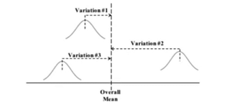
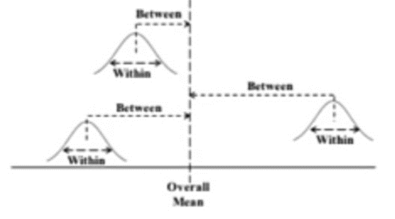
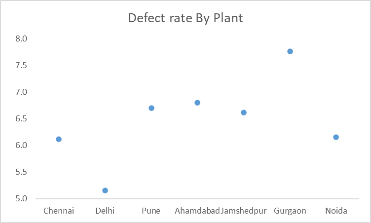
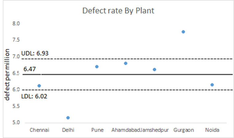
ANOM 1. Analysis of mean (ANOM) tell us which mean of samples from several population or process are statically different from overall mean. 2. ANOM has some similarity to and some differences from ANOVA 3. The Graph ANOM output display a confidence interval. Analysis of mean (ANOM) tell us which mean of samples from several population or process are statically different from over all mean 2· This is something ANOVA can’t do, ANOVA can tell us weather one of the mean is different but it can’t tell us which one(s), · 3. The individual population or process are identified by name e.g manufacturing plants located at Chennai, Delhi,Pune etc · 4. The “Y “variable being compared is numeric. ( e.g. Mean number of defect per thousand item produced each plant ) · ANOM can tell us which, if any, of the plant have defect rate that are different from over all mean to a statistically significant degree. ANOM has Similarities as well as Some Differences from ANOVA ANOM ANOVA Assumptions Approximately Normal Data Analysis Variation of several Means YES YES 1-Way, 2 Way YES YES Variation Around The Overall Mean Among each Other Identification which means are different Yes No ANOM calculates the overall mean and then measures the variation of each mean from that. ANOM ANOM calculates the overall mean also known as the grand mean. It then measures the distance from that overall mean to each sample mean is this conceptual diagram each sample is depicted by a normal curve the distance between every sample mean and the overall mean is detected as a variation. ANOM retains the identify the identity of the source of each of these variations. Number one , number 2, and number 3 and display graphically in the ANOM chart. In ANOVA the variation between each sample mean and the overall mean is calculated as sum of the square between. SSBs there is one SSB for each sample then mean of these SSBs is calculated this is the mean sum of squares between or MSB this value of MSB is then used in next step of the calculation the information in the individual contribution from each sample the SSB is lost when we calculate the mean of SSB in this example the information is three SSB’s is distilled down into one MSB so in the next step of the ANOVA calculation which use only MSB is impossible to identify how much of the variation is due to each sample that is why ANOVA cannot identify which sample or samples significantly different from the overall mean. In ANOVA, the identity of each sample is lost 3 SSBs 1 MSB (Next step in the ANOVA calculation) Example how ANOM does it with example lets say we own seven manufacturing plants in seven cities we want to see if there is a statically significant difference in any of the plant either good or bad for each of five days we collect data number of per thousand items produced then for each plant we calculate means we can see from each point has smallest defect rate in Gurgaon has largest but either of these differences statically significant Chennai Delhi Pune Ahmedabad Jamshedpur Gurgaon Noida 6 5.2 6.8 7.1 6.8 7.4 6.2 6.5 4.3 7 6.7 6 7.9 6.9 6.1 5.1 6.7 6.5 6.4 8.2 5.9 6.2 5.3 6.4 6.9 7.3 7.7 5.7 5.8 5.9 6.6 6.8 6.6 7.6 6.1 means: 6.1 5.2 6.7 6.8 6.6 7.8 6.2 The Graphical ANOM output displays a confidence Interval We run the data through ANOM and it produces this chart the center line is the overall mean the UDL is the upper decision line and LDL is the lower decision line. These two lines define a confidence interval in this example its alfa is 95% for the confidence interval


-
Pugh Matrix Pugh is a kind of prioritization or decision matrix that allows us to choose between a list of alternatives based on certain criteria. The ultimate aim is to narrow down the option to one choice, normally employed after we have captured the voice of the customer. Pugh matrix developed by “ Stuart Pugh” Pugh matrix basically helps to determine which items or potential solutions are more important or better than other options. Several concepts are evaluated against Datum. Datum is the best current concept that the team has to date. Example Step involved for constructing Pugh Matrix Step#1 : List important criteria Step #2 Select datum /Base line Step# 3 list of alternative Step# 4 Rank ( +Ve , -Ve , S ) +Ve = Better then datum -Ve = Bad then datum S = equal to datum Analytic Hierarchy Process (AHP) AHP is a technique is multiple criteria decision-making base on mathematics and psychology. It’s developed by Dr. Thomas L saaty developed this process in the 1970 Applications:- - Decision regarding the selection of the best alternative ( eg selecting the best suitable vendor based on certain criteria - Prioritize factors that may influence some phenomena ( e.g factor influencing on ROI due to high taxation) - Comparison while taking strategic decisions. Advantages of using the Analytic Hierarchy Process (AHP) over the Pugh Matrix? - Pugh matrix we are dealing with discrete data but in the case of AHP we are dealing with continuous data. Continuous data gives better and more accurate results compared to discrete data. - Chances of a decision may be biased while using Pugh matrix depend on the criteria selection and judgment but in the case of AHP we can find the best solution among the alternatives. - While using Pugh matrix we have a high chance to get two optimal solutions that have the same score, in that case, difficult to get one of the best solutions. While using AHP we will get the best solution. As well as we will get each criterion which is the best option available. - APH is having importance - Pugh matrix scaling Points are 5 but APH matrix total scaling points are 17. if scaling points are more It magnifies the result. - Criteria & Importance in AHP different company to company. Are there situations where Pugh Matrix is preferred over AHP? A company’s production PPE requirement has been increased due to the number of operators increased. The company was not sure whether its current vendor is the best in the marketplace. They have identified the criteria and their weightage to compare three vendors with the current one. Higher weightage was given to the most important criteria and lower weightage was given to the least important. Using the Pugh matrix, decision-makers can decide what most satisfied their criteria. In this case Reason for use of Pugh matrix over the AHP is I have an existing vendor who is providing PPE to the company due to demand increase I am looking for some alternate option that can provide me better solution in terms of selected criteria
-
Project Artifacts : Project Artifacts are any written documents that an organization produces documents to outline and support a project’s workflow. They can include documents plan design code and even meeting notes. One of the most important things about project artifacts is that they can be used to track the progress of the project this is especially useful if there are multiple people working on a project by having a centralized location for all the project artifacts. It is easy to what has been done and what skill needs to be done another advantage using a project they can help in problem-solving. If something goes wrong with the project the artifacts can be used to help identify the source of the problem. This can then be used to fix the problem and hopefully prevent it from happening again in the future. They also support stakeholder requirements, establish expectations and align the project with organizational goals. Since the majority of artifacts are live project documents most of them need to be constantly updated. The project artifacts outline the activities necessary to produce a deliverable. Different Types of Artifacts as per Project Management Book Knowledge 1) Strategy Artifacts:- Strategy artifacts Include the business case and feasibility study, the Vision statement and project chatters, and the cost-benefit analysis. The strategy artifacts were created before the work began. This artifacts do not change as the work progresses. 2) Register and Log In this category, we find artifacts such as the stakeholder register the backlog the issue log and risk register. A project manager can use these artifacts to evaluate how far along a project is and decide which task need to be completed on given workday with their assistance, during the project life cycle these logs will undergoes numerous modifications. 3) Release Requirement Testing Prototype development unit and finished product are made easier for project team tasks to the release to requirements. Release requirement include vision statements assessment standards develop budget agreement etc. 4) Management Plan Plans are essential artifacts of the project that manager produce to carry out the work , monitor the progress and successfully complete the project. This document may include one or more artifacts that combine textual and visual components. The project plan includes risk management plan, communication management plan, resource management , Scope management plan, procurement management plan etc. 5) Hierarchical Diagram The Link between various projects components such as a the risk breakdown, structural organization and work breakdown structure is described using hierarchy chart 6) Baseline The project cannot move forward without baseline which are version of the plan that have already been approved. The milestones. Plan cost base line scheduled baseline & scope base line as well as another performance assessment base line are all included with project base lines. 7) Communication Plans A communication strategy is developed by a project team while they are working on a project determine the most effective ways to delivers information as an illustration they can revise Strategy for effective communication regards conferences issues, documental views access to deliverable at current standing of project. 8) Visual Information The category includes any charts and documents that contains graphs this include various visualization such as flow chart, dash board requirement traceability, matrices and velocity chart. When use appropriately visual data source can make process of communicative information much simpler following the data analysis a project manager may produce visual information use method to update data automatically. 9) Reports :- Project management evolved dealing with a lots of reports. Reports include status risk quality reports and formal records for stakeholders 10) Contracts & Agreements A project can have multiple procurement contracts and agreements for instance purchase order for the acquisition of consumable procurement contracts for the acquisition of services or the sub-contracting of work etc. You might be required to sign a contract when hiring staff or experts. Examples of contracts & agreements include a most reimbursable and fixed-price contract with a time and materials agreements a contract with a legally binding clause and many others. Other artifacts that fall under this category are user stores team chatter bid paper etc project Phases Project Artifacts Initiation Phase: - Important artifacts in initiation phase are the project chatter and shareholder register. Planning Phase Artifacts: Includes various project management plan and other project management documents throughout the project life cycle these documents serve as a road map for the project team to follow as they carry out the work monitor and control it and so on. Execution phase: Actual work is carried out in this phase, spend most of the funds and time in this phase Monitoring Control Phase: - track is crucial to monitoring a project, it help take corrective and preventive actions if required. Closing Phase:- In this phase deliverable is delivered the project is closed lesion learned organizational processes are updated and the project team is released, You can improve the efficiency of your project management by using artifacts of the project the line documents can be utilized for various purpose. Which of these are relevant for DMAIC Project? DMAIC projects are data-driven projects, DMAIC projects are mostly related to company project failure or Company Pain. Project Artifacts contain data that help to understand project failure and the heavy costs involved. DAMIC provides an optimal solution by data analysis. Strategic Artifacts help to understand and set the project Goal, Register log help to understand what defect has been produced and passed from the manage plant final checker. Which phases of DMAIC are they likely to be created? Since DMAIC is the problem-solving methodology or tool we can use any point in time when stuck up with a bigger problem. Preferred to use at the time of goal seating initiation phase.
-
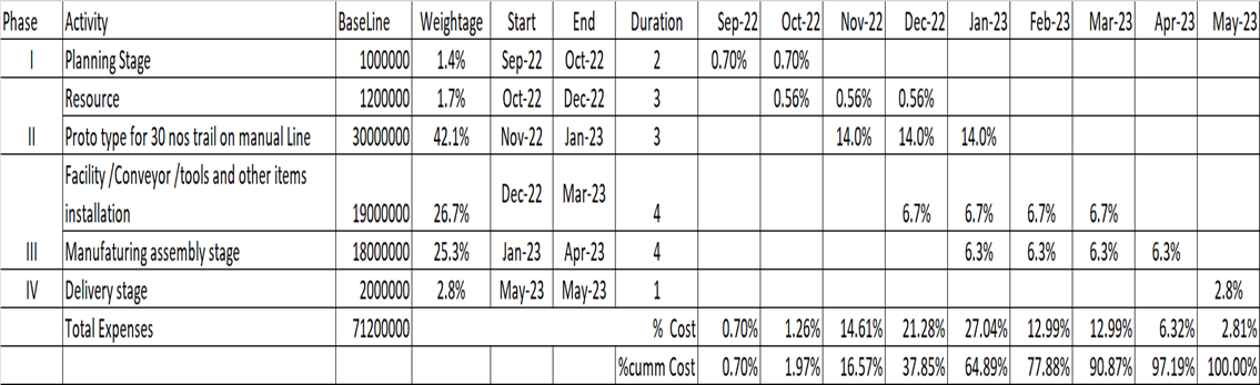
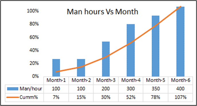
What is an S Curve:- Project management S curve is a graph display of cumulative cost, man per hour, progress, or other quantities plotted against time. S curve is one of the best communication tools for the project manager to communicate project status/ performance to all stakeholders. S curve is used to measure the progress performance of any project. Why do we call S curve? The graph is termed an “S” curve because graph’s S shape, Initially, every project has a slower pace than ramp-up project execution at end of the project gin slower Note:- Graph shape also depends upon the type of project, for example when initial expenses are high compared to the mid of the project the shape of the graph would be change. The basic type of “S ”Curve, 1. S curve workload mid of the project 2. Front-load S curve ( workload more at beginning of the project ) 3. Back loaded S curve ( Workload more while completing of the project ) S curve workload Mid of the project Below mention S Graph indicated man hours requirement quite in compare to start and end of the project Front loaded S curve (workload more at beginning of the project) In the below-mentioned graph initially, the project requirement, manpower hours requirement is high Comair to mid and end of the project Back loaded S curve (Workload High while completing of Project) In the below-mentioned Graph, man hours requirement is high at end of the project. Where S curve Graph to be use? Common use of the S Curve Ø Progress and performance evaluation Ø Monitoring Project Progress Ø Cash flow forecasts Ø Quantity Output comparison Ø S curve with Early and Late date Example Type of S curve · Target S curve · Cost Vs time s curve · Value and performance s curve · Base line S curve · Man hour versus time s curve · Actual s curve Note: Types depend on the measurable matrix vs time frame. Example How to draw S curve Note Final Conclusion :- S curve use for compare Project metric with respect of time frame, Time frame deciding based on daily , weekly , monthly. its totally depend on when reviewing the project .


-
MLR uses happenstance data gathered, in this case, there is no guarantee historical data contains all the factors in which we are interested. We might miss some factors. It is also possible we want to check to look at three variable interactions but data have only two-level interactions. Happenstance data may contain some noise factors. if happenstance data contain a noise factor it can mislead the interaction factor, we cannot get better information about the interaction effect. DOE – If we are creating experimental data we can control the variable and check the interaction between variable factors by controlling all noise factors. This will give us a correct and authentic interaction effect. By choosing DOE will give a clear-cut interaction effect. With DOE you can do blocking & noise treatments to ensure signals comes from the factors. With DOE we would have more control & accurate measurement system compared to MLR.