Kaviraj
Members
-
Joined
-
Last visited
Everything posted by Kaviraj
-
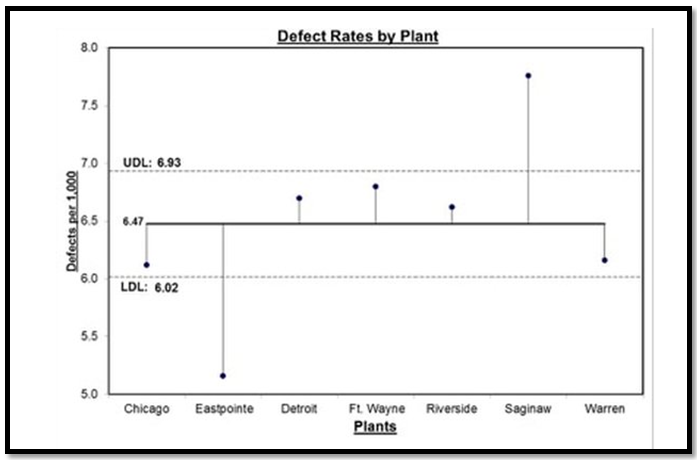
The significant difference between ANOVA and ANOM is explained below: An ANOVA analysis often includes multiple comparisons and multiple comparisons look at the differences between means of groups to determine which means are statistically different and by how much. However, ANOM (Analysis of mean) calculates the overall mean of all the data from samples provided, then it measures the variation of each group’s mean from the overall mean. Referring to the diagram each sample is depicted by a normal curve and the distance between each sample’s mean and the overall mean will be considered as a variation. Advantage - ANOM holds the identity of the source for all three variations (#1, #2, and #3), and it displays this graphically in a chart called “ANOM chart” shown below. In this ANOM chart, we are comparing the defect rates of a process between seven manufacturing plants of an organization located in different countries. Hence there are seven variations that are being compared. The horizontal dotted lines are the Upper Decision Line (UDL) and the Lower Decision Line (LDL) and the α = 0.05. In this analysis, our conclusion is that the Eastpointe (on the low side) and Saginaw (on the high side) exhibit a statistically significant difference with respect to their mean defect rates. Hence ANOM tells us not only whether any plants are significantly different, but it also tells us which plants are different we prefer to use ANOM when we want to know which data contributes to the variation.

-
Let’s understand what an ARTIFACT is. In project management, artifacts relate to documents, templates, outputs, or a specific deliverable. Which will be created by the project’s manager/members. Also, artifacts are related to the work of managing the project, not the output of the project. There are 9 types of artifacts as per PMBOK, which are: 1. Strategy artifacts (Relates to strategy and project initiation) Documents that are developed at the start of the project, normally don’t change in between. A few examples are, · Business case · Project vision statement · Project charter · Roadmap 2. Logs and registers It relates to the various project management logs (records) and registers, we normally use as a part of the daily management of the project process. This category represents a set of endlessly evolving documents. They will be updated regularly and throughout the project. Eg, · Assumption log · Risk register · Backlog (see, agile project artifacts are relevant too) · Stakeholder register 3. Plans (Relates to the different types of plans formed) These plans are developed to help us to run the project. All these can either be in one document or separate documents. (Which includes written documents, visual drawings, and flow charts) · Communication management plan · Project release plan (Phase by Phase) · Work scope management plan · Iteration plan · Testing or validation plan · Quality plan and process · Logistics plan 4. Hierarchy charts (Describes the relationships between various parts of the project) such as, · (WBS) Work breakdown structure · Product breakdown structure · Organizational breakdown structure · Risk breakdown structure Etc,. 5. Baselines (Created and monitored throughout the project, which represent approved versions of the plan) Eg, · Budget · Milestone schedule · Scope baseline · Performance measurement baseline 6. Visual data and information (Types of visual data we might have on the projects are,) The point of having visual data sources is that they make it easier to understand the information. Normally these visuals will be created after we complete a data analysis which helps us absorb the information. · Cycle time chart · Project dashboard · Flow charts · Gantt charts · Requirement’s traceability matrix · Velocity chart · S-curve 7. Reports (Some of the typical reports produced on a project are,) · Quality report · Risk report · Status report and update · Formal records for stakeholders (highlight report for a sponsor or an update to the PMO) 8. Agreements and contracts Agreements and contracts on the project are known as internal and external. (Agreement related to the procurement of material or service is known as external. The agreement made within the departments is known as internal.) Eg, · MOU (Memorandum of Understanding) · Fixed price contract · Cost-reimbursable contract · Time and materials contract for delivery · Indefinite delivery indefinite quantity contract · Any other type of legally binding agreement 9. Other (Artifacts that don’t easily fit into the above category such as, ) Requirements Team charter Bidding documents, etc., Project management artifacts by phases, Though the documents created are used and updated throughout the project life cycle, the idea of project management artifacts by phase may not be really accurate. However, we can create and align them under the most relevant project phase, where the artifacts are heavily used. In my view most of the artifacts are relevant to the DMAIC project, the below-mentioned table shows the alignment of artifacts with respect to the appropriate project phase and its alignment. In general project Typical artifacts In DMAIC project Initiation Business case Define Project vision statement Project charter Roadmap Team charter Planning Assumption log Define, Measure & Analyse Risk register Issue register Change log Stakeholder register Comms management plan Release plan Scope management plan Test plan Quality plan Logistics plan Work breakdown structure Product breakdown structure Organizational breakdown structure Risk breakdown structure Budget baseline Milestone schedule baseline Scope baseline Performance measurement baseline Gantt chart Requirements and requirements traceability matrix Execution Dashboard Improve Flow charts or process maps as needed MOU, contracts, and agreements Monitoring Quality report Control Risk report Status report Ad hoc stakeholder reports Closure Project closure document Sharing Handover documents
-
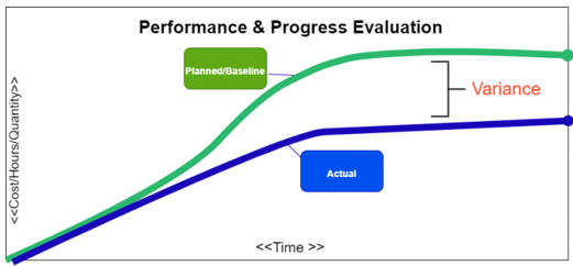
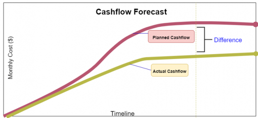
What is an S Curve in project management? Elaborate on its various uses along with an example. In project management, an s-curve is a mathematical graph that portrays relevant cumulative data for a project plotted against time to visualize the progress of a project over time. Visually it is not a proper S-shape but a loose shape that develops slowly at the start of the project (Like a straight line), whereas it grows rapidly when the project progresses. Several internal and external factors throughout the project’s life cycle will impact the shape of an S- curve graph. Types of S-curves: Though a wide variety of s-curves, can be used in project management, some commonly known types are, · Target S-curve · Costs versus Time S-curve · Value and Percentage S-curves · Baseline S-curve · Man-Hours versus Time S-curve · Actual S-curve Common uses of the s-curve in project management: In the project lifespan, s-curves are used for numerous different purposes some of the most important uses of the s-curves are discussed below: 1. Performance and Progress Evaluation First and foremost, S-curves are used to evaluate the project’s progress and performance with respect to the plan/schedule. This is achieved using the concept called Earned Value Management. S-Curve graphs are traditionally generated as a part of the EVMS process and are the basic platform for the evaluation of the project’s progress and performance. There are so many factors that need to be evaluated to find out the current status of the project and future forecasts about the project. They are: PMB - Performance Measurement Baseline, also known as Planned Value. Earned Value. Actual Cost. All the above-mentioned factors need to be compared with the planned S-curve to generate results. This comparison will be very much useful and compelling because when we want to know whether the project is exceeding the budget? or any tasks are behind the schedule? we can glance at the graph, and it will immediately answer our query. 2. Cash Flow Forecasts Another benefit of the s-curves is the development of Cash flow and the prediction of the changes that the cash flow would bring. In detail, Cash Flow is the timing and movement of the cash with respect to the tasks and events that occur during the project execution. This cash flow curve is useful for the stakeholders/sponsors/investors. The most significant advantage of drawing a cash flow curve is that we can evaluate the need for cash and the timing when the payment is due with respect to the obligations agreed by the company. 3. Quantity Output Comparison Another significant use of the s-curves is to estimate and quantify the output that the project will yield. This quantity output comparison is used more prominently in the field of construction and manufacturing industries. 4. Schedule Range of Possibilities, (Banana Curves) T his type of s-curve is also known as the Banana curve which consist of two "S" types of curves. First, the upper limb is made according to the earliest time of the project plan. Second, the lower limb is made according to the latest time of the project plan. These 2 types of s-curves usually overlap at the beginning and at the end of the project. The shape they form looks like a banana. This is probably one the most significant use of the s-curves and the project schedulers can easily sum up the s-curves using the parameters like, Quality Man-hours Cost The banana shape curve tells us the range of possibilities & when we can expect the project to be completed. Conclusion Project management is a very complicated business nowadays since many factors must be monitored if one wants their business to be successful. These factors need appropriate tools and parameters, and the s-curve is just that.


-
The statistical tool used in the analysis of variance is known as ANOVA, this tool is used to compare two or more variables simultaneously. It reports the results and values which can be checked to find out whether any relationship is there between different variables or not. This test is commonly used to determine the influence that independent variables have on the dependent variable in a regression study. ANOVA is also called as the Fisher analysis of variance and t is the extension of the t- and z-tests. -------------------------------------------------------------------------------------------------------------------------------------------- One-Way ANOVA: Is used to determine how one factor impacts a response variable. · Let’s take an example, of randomly splitting up a class containing 90 students into 3 groups of 30. · Each group of 30 students uses a dissimilar studying technique for a period of one month to prepare for an upcoming exam. · At the end of the month, all the students take the same exam. · Now we want to know whether the studying technique has an impact on exam scores or not. · Hence, we must conduct a one-way ANOVA to determine if there is a statistically significant difference between the mean scores of the three groups. Two-Way ANOVA: Is used to determine how two factors impact the response variable, and also to determine whether there is an interaction between the two factors on the response variable or not. · Let’s understand with an example, that we want to determine whether the level of exercise and gender has an impact on weight loss or not. o Level of exercise - No exercise / Light and intense exercise. o Gender – Male / Female. · Two factors we are studying are exercise and gender and our response variable is weight loss in KG’s. · Hence, we can conduct a two-way ANOVA to determine if exercise and gender impact weight loss or not. Also, to determine whether there is an interaction between exercise and gender on weight loss. ---------------------------------------------------------------------------------------------------------------------------------------------- ANCOVA is known as “Analysis of Covariance” and it is used to determine whether there is any statistically significant difference between the means of three or more independent groups or not. Unlike an ANOVA, an ANCOVA includes one or more covariates, which will help the analyser to understand the relationship of how an influence impacts a response variable. · Let’s take the same example, of randomly splitting up a class containing 90 students into 3 groups of 30. · Each group of 30 students uses a dissimilar studying technique for a period of one month to prepare for an upcoming exam. · At the end of the month, all the students take the same exam. · Now we want to know whether the studying technique has an impact on exam scores or not at the same time we want to account for the grades that the students already achieved · Hence, we use their latest grade as a covariate and run an ANCOVA to determine if there is a statistically significant difference between the mean scores of the three groups. Benefit ANCOVA method allows us to test whether studying technique has an impact on exam scores or not? after removing the covariate. Thus, if we find that there is a statistically significant difference in exam scores between the three studying techniques, we can conclude that the studying technique has a strong significance on exam score. ---------------------------------------------------------------------------------------------------------------------------------------------- MANOVA is known as “Multivariate Analysis of Variance” is like an ANOVA, but the difference is it uses two or more response variables. Like the ANOVA, it can also be one-way or two-way. An example of one-way MANOVA, is when we analyse how the level of education (i.e. high school, degree, master’s degree, etc.) impacts both annual income and amount of student loan debt, we have one factor (level of education) and two response variables (annual income and student loan debt), hence we need to conduct a one-way MANOVA in the case. An example of two-way MANOVA, is when we analyse how the level of education and gender impacts both annual income and amount of student loan debt. In this case, we have two factors (level of education and gender) and two response variables (annual income and student loan debt), hence we need to conduct a two-way MANOVA. MANCOVA is known as “Multivariate Analysis of Covariance” is identical to a MANOVA, and differs by including one or more covariates. Like a MANOVA, a MANCOVA can also be one-way or two-way. An example of one-Way MANCOVA is when we want to know how a student’s level of education impacts both their annual income and amount of student loan debt. However, we want to account for the annual income of the student’s parents as well. In this analysis, we have one factor (level of education), one covariate (annual income of the student’s parents), and two response variables (annual income of student and student loan debt), so we need to conduct a one-way MANCOVA. An example of Two-Way MANCOVA is when we want to know how a student’s level of education and gender impacts both their annual income and amount of student loan debt. However, we want to account for the annual income of the student’s parents as well. In this case, we have two factors (level of education and gender), one covariate (annual income of the student’s parents), and two response variables (annual income of student and student loan debt), hence we need to conduct a two-way MANCOVA. Conclusion – The analyst has options to choose the appropriate type, with respect to the factors, covariates, and variables of the required analysis.


- 10 replies
-
- anova variants
- anova
- ancova
- manova
-
Tagged with:
-
The control chart, which is used to study the data of rarely occurring incidents/events is known as the “RARE EVENT CONTROL CHART”. Rare event charts provide insight into the processes that occur infrequently enough to track them using traditional control charts. Rare event charts offer two types they are, G Charts and T Charts. They differ from each other in the way it measures rare events, the G Chart measures the count of events between incidents and the T Chart measures the time intervals between incidents. G Charts, It measures the number of events between errors or nonconformities which occurs rarely, each point on the chart represents the number of units between relative occurrences, E.g. In a production line materials are produced daily, and an unexpected line shutdown may happen we can use a G Chart to track the number of units produced between line shutdowns. T Charts, It measures the time elapsed (Interval) since the last event, each point on the chart represents several time intervals that have passed since a prior occurrence, E.g. In a production line materials are produced daily, and an unexpected line shutdown may happen we can use a T Chart to track the number days between line shutdowns. A “T chart” can be used for numeric, nonnegative data, date/time data, and time-between data. Understanding the rare control chart, the points that appear above the UCL indicates that the number of events between errors has increased. Which is a positive event. Hence, a point flagged as out of control above the limits is usually considered as the desired effect when we read G & T charts. ADVANTAGES OF THE G CHART Advantages of the Rare control chart, in addition to its easiness, this chart offers better statistical sensitivity for monitoring rare events than its traditional charts (P or U charts). Since rare events occur at very low frequencies, traditional control charts are naturally not effective in detecting the changes immediately. In addition to the difficult task of collecting more data, this creates the circumstance of having to wait longer to detect a shift in the process. On the other hand, G / T charts do not require large quantities of data to effectively detect a shift in a rare events process. Another advantage of using the G / T chart to monitor rare events is that it does not require the collection and recording of data on the total number of opportunities. Therefore, G or T Charts are more effective and quick in detecting the shift in rare events monitoring than the traditional P or U charts.


-
Berkson’s Paradox – Generally visualized as a statistical Illusion. This paradox is also known as Berkson’s bias, this is a condition where two metrics can statistically be negatively correlated or even uncorrelated in the general population though they appear to be positively correlated in the specific population. The situation may arise due to the selection BIAS of the analyser/observer during the collection of data. On the other hand, Berkson’s Paradox is the counter-intuitive connection between two traits in the statistical data. Basically, this false observation will be based on the inappropriate assumption that “cause” is related to “effect” and bias in data collection. Let’s take the high school dropouts as an example. Example: We were often impressed with the coverage of school dropouts who became multi-billionaires and people would start saying “universities are useless!” or “Academics are useless!” as their response. Their argument is graduates are struggling to find jobs while high school or university dropouts are building successful businesses around the world. Let us take this case to understand the paradox. Figure.1, General population. In this graph, the X axis is higher education level, and the Y axis is a higher success. We biased ourselves as that less-educated people will find great success in life. Hence, we have ignored a fair proportion of the population (Shaded in Fig.2) in our collected data before analysis, and proceed with the analysis with succeeded/educated people (Fig. 2). Figure.2, Ignored un-succeeded / less educated population. Because of the bias in our data collection period, We ended up seeing 100% of less-educated people finding success (Figure 3 – green shade), But only a fraction of highly-educated people finding success (Figure 4 – green shade). Therefore, forced to conclude that, education seems to make people less successful in life. Figure.3, People with a low education level. Figure.4, People with a high education level Think of a scenario, where the few data from the population were ignored due to selection bias, the takeaway will be Highly successful people are less educated. On the other hand, if we consider the entire population without selection bias (as shown in Fig.1) then the results will show that success in life is not even correlated with the level of education. This indicates how a narrow mindset/selection bias would lead to strange conclusions in analysis. Hence before using statistics to support our claim or fact, everyone should think and double confirm whether we collected enough data and opened our views wide enough to avoid Berkson’s paradox/bias.


-
Dimensions: Which answers the who, what, where, and when of our data The data that contains qualitative information are categorized as dimensions. These are expressive attributes, like a category of product, address of the customer, or country of origin. We can say, Dimensions can contain numeric characters (like an alphanumeric customer ID) but are not numeric values (It wouldn’t make sense to add up all the ID numbers in a column, for example). Let us think in this way: if we can’t (or wouldn’t) compute a field, it’s a dimension. Eg. Title of the product, category of products, vendor list, etc. Measures: Which are the numerical fields that we can compute The data that can be quantified are categorized as measures. Fields like subtotal of the order, the number of items purchased, or duration spent on a specific page. “Hence measures are computable”. Say we have a measure, quantity of items purchased: we can do things like calculating the average quantity ordered, sorting by descending quantities, sum all quantities, and so on. Eg. Price of a product, Customer rating for the product, etc., Note: Date fields are dimensions too. Eg, The Year of production will be a dimension because calculating min/max/sum here will not help. Instead, we may group this date according to the year of manufacturing. Dimensions Measures It is an independent variable. It is a dependent variable. It is not dependent on the measure. It is dependent on the dimension. Adding to the filter will give us insight into the data, it is beneficial to add this in the filters. Adding to the filter will not give us many insights of the data. We can’t aggregate it. We can aggregate it. Min, max, and sum won’t work. Min, max, and the sum will work. It is used to compare the data. It is a metric that we use to compare the dimension. It may contain duplication of data. It does not contain duplication of data. Headers are generated when added to the rows or columns. Axes are generated when added to the rows and columns. It contains qualitative and categorical information. It contains quantitative data. It describes data records. It cannot describe data records. It cannot be continuous and discrete. It can be continuous and discrete. It is not possible to get several records because aggregation does not apply to it. Due to the aggregation feature, we can get the number of records present in the database no matter how huge the dataset is
-
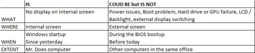
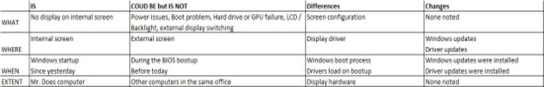
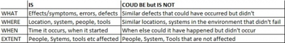
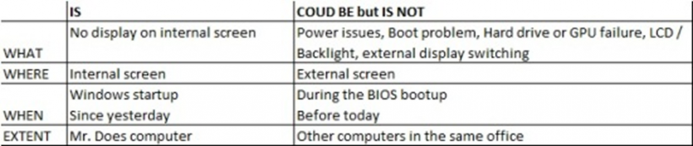
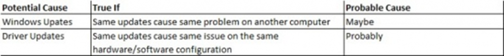
K-T method or the Kepner – Tregoe method is a systematic method to analyse the problems and understand their root causes, without making any assumptions or jumping to the conclusions. Usually, 5 steps are there in Kepner-Tregoe Problem Analysis, (1) Define the Problem, (2) Describe the Problem, (3) Establish possible causes, (4) Test the most probable cause, (5) Verify the true root cause 1. Define the Problem, This is the first step in this process and the most crucial one too, many people tend to skip this step thinking they know the problem already, such conclusions may lead to a wrong diagnosis and waste of time. For example, if an employee reports “My computer screen is blank” to an IT person. K-T method guides us to ask a few basic questions that can expose far more information about the nature of the problem and helps us to define the possible causes effectively. Let’s expand this further with a few basic questions, Let’s assume these answers to expand the problem definition from “My computer screen is blank” 1. Who - Mr. Moorthy 2. Why - Needs to see his screen so he can perform his duties, 3. What – The computer screen went blank when booting up and nothing appears on the screen and the start-up sound was heard. 4. When - Morning when he came for work, it was working fine till the previous evening. 5. Where - Mr. Moorthy’s computer. Let’s restate the problem definition. “Mr. Moorthy is unable to perform his duties because his screen goes blank during boot it worked well till he shut it down yesterday” The above statement is a much better problem description, which allows us to understand exactly what the problem is and allows us to narrow down the questions that will help us to understand the impact as well. A brief simulation before the problem statement will also help, Example. why would the screen be blank? The reasons could be, a) The graphics card could have failed? · Ans, no the computer wouldn’t boot, it would give 3 loud beeps then stops. b) The screen could be faulty? · Ans, no the manufacturer’s logo appears at first then the screen goes blank. c) Hard Drive could be faulty and the computer doesn’t boot? · Ans, no we hear the windows start-up music. d) The backlight might have failed and the screen is dark? · Ans, no the logo appears perfectly visible. e) The display could be switching over to an external screen? · Ans, no we can see everything on external display but when we switch to internal it’s still blank. Let’s restate the problem definition now, “Mr. Moorthy is unable to perform his duties because his internal screen goes blank when Windows is starting since he shut it down yesterday” 2. Describe the Problem, Let’s describe 4 aspects of any problem, 1. What the problem is, 2. Where the problem occurs, 3. When it occurred, and 4. The extent to which it occurred. We, already have the answers for these questions when we fine-tuning our Problem Definition, but the IS and IS NOT method is allowing us to explore these even further. For the above-mentioned aspects, let’s describe what the problem IS, and also what the problem COULD BE but IS NOT. Let’s fill out the table for the problem we have taken, 1. Identify possible causes The arrived comparison of “what the problem IS and IS NOT” will help us to sensibly inspect what changes could have affected the items in the 1st column but not the items in the 2nd. Our own experience will tell us the majority of the problems are because of the recent change, let’s add 2 more columns to the worksheet, the ‘Differences’ column will list the differences between the IS and IS NOT, and the ‘Changes’ column will list the changes to where the problem IS that could account for the differences. Another important aspect is that the effects don’t always follow the action immediately, most recent changes could have uncovered the fundamental problems that were always there, so when considering the list of changes we should not limit ourselves only to recent ones. 1. Test most probable causes The list of changes identified in the previous step will become a list of possible causes and a Subject Matter Expert ranks the possible causes by asking “If THIS is the root cause of this problem, does it explain everything the problem IS and what the problem COULD BE but IS NOT?” In our example, 1. Verify true cause In this step we need to compare the probable causes against the Problem Description and check does it satisfy all the conditions of the problem or not? When we find a cause that explains all these conditions, we must test it to confirm whether it is correct with the procedure in the ‘True if’ column starting with the most probable cause. When we are confident that all the identified root causes of the problem, then we need to develop a solution and check if we are satisfied this would prevent any reoccurrence of the problem. If we agree that we are satisfied then implement the solution, and test the problem again under the same conditions, does the issue still occur? In our example, we have determined the problem with the display is due to a recent driver update which was installed but did not take effect until Mr. Moorthy had restarted his computer. As a corrective action we may attach an external screen and uninstall the driver update and restart the computer, issue is resolved, but has the root cause been addressed? It is not appropriate to ask all the employees not to update the drivers, hence as an immediate action we can ensure Mr. Moorthy does not install this driver again. and as a preventive step we may notify all the employees who has similar type of computer that they should not install this driver until further notice. Conclusion, The purpose of this method is to bring situational awareness to the solution/opportunity. This method advocates a balanced and systematic approach to analyse the problem without jumping to conclusions or making assumptions based on experience. Compared to other methods one of the biggest advantages is the IS and COULD BE but IS NOT procedure which provides an intuitive approach to identify the possible causes of a problem. This process may be faster than the other methods on the other hand it may be harder if not impossible to detect delicate variations in a process, hence this method needs to be implied sensibly.

-
What is Thematic Analysis, Thematic analysis is a study of patterns, a methodology used to analyse qualitative data (i.e. non-numerical data’s like audio or video, or audio) for understanding the opinions, experiences, or concepts. This analysis will be used to gather in-depth insights into a problem or to generate new ideas for research. There are 3 approaches/ways to do this analysis, they are, 1. Inductive approach – This approach derives meaning and creating themes from data without any preconceptions. (Will do the analysis without any idea of what themes will emerge, hence the themes will be determined by the data) 2. Deductive approach – In this approach, we start the analysis with a set of themes that we already expect to find from the data. (Will do this analysis after getting the knowledge from research or existing theory about the data) 3. Semantic approach – In this approach, we ignore the underlying meaning of data, but will identify the themes based on what is openly stated or written. (This approach is taken when investigating opinions and viewpoints, as these tend to be understandable) 4. Latent approach - This approach focuses on underlying meanings and relatively looks at the reasons for semantic content, which involves an element of interpretation, where data is not just engaged because of face value, but meanings are also theorized. Note – I personally prefer the Latent approach though we have the option of choosing any of these four as per the analysis requirement. Application, This analysis is useful during an interview or transcripts or during psychological research to examine the data to identify the patterns of meaning that come up repeatedly. How to do this analysis, There are different approaches to conducting thematic analysis, the most familiar type is the six-step process, Step 1 - Familiarization, In this step the analyser makes himself familiar with the data that needs to be analysed. This may include reading and re-reading the whole data thus having an overview of its context and taking notes of it. Step 2 - Coding, In step 2, the analyser highlights or labels the keywords or group of keywords, or even the entire phrases in the data that indicate some meaning. This meaning will come in handy when the analyser trying to clutch the essence of the data. In this example - The survey questing is “How has social media changed over the years?”, and we are interviewing a person who is 40+ years old and working in a middle school. And receiving the opinion, “I think these social media platforms such as YOUTUBE/FACEBOOK and LINKEDIN are not for the oldies anymore. Because the current trends are rapidly changing and evolving every day. Hence it becomes difficult for people like me to keep up with them. This difficulty makes us feel disconnected.” Further, we need to derive codes for the key phrases like – Quickly changing/ Uninterested/ Discomfort, etc., Step 3 - Generating themes, For the above-mentioned example, we can have a theme called “NOT SATISFIED” for the codes we derived from the interview mentioned. This step will give the analyser a brief idea about how many codes are being used repeatedly and which ones of them will be useful and which need to be discarded. Step 4 - Reviewing themes, In this step, the analyser compares the themes with the original data and looks for any missing points or irrelevant results, and may modify the themes by checking on how they satisfy and/or justify the data intended. Step 5 – Defining and naming themes, Next step, the analyser will do the naming for the themes depending on what they indicate and what we will understand from the data. Step 6 - Writing up, in the last step, using all the results we may conclude that social media has evolved so much that the elder generations find it difficult to understand and interact with which results in their dissatisfaction. This is the method I prefer and practice to regulate a perfect Thematic Analysis. Thanks
-
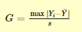
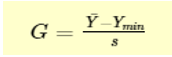
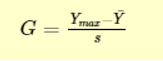
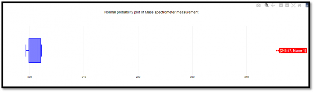
Grubbs test is a statistical method used to find the outlier in the data range. Also, this test is used to find a single outlier in a normally distributed data set. This test is used to find if the maximum or the minimum value is an outlier in the given data range. Definition - Hypothesis of Grubbs test: Ho - There are no outliers in the given data set Ha - There is only one outlier in the given data set Test Statistic for the Grubbs' test - Y¯ represents sample mean and s represents standard deviation, the Grubbs test statistic is the largest absolute deviation from the sample mean in units of the given sample’s standard deviation. This is a 2-sided version of the test, the Grubbs test can also be defined as one of the following one-sided tests, 1. Test whether the minimum value is an outlier, 2. Test whether the maximum value is an outlier, Grubbs Test Example: Range given - 199.31, 199.53, 200.19, 200.82, 201.92, 201.95, 202.18, 245.57 Firstly a normal probability plot was generated, This plot indicates that the normality assumption is reasonable except for the maximum value. We, therefore, compute the Grubbs test for the given case to find whether the maximum value of 245.57, is an outlier or not. Test Results, H0: there are no outliers in the data Ha: the maximum value is an outlier Test statistic: G = 2.4687 Significance level: α = 0.05 Critical value for an upper one-tailed test: 2.032 Critical region: Reject H0 if G > 2.032 Hence we conclude that the maximum value is in fact an outlier at 0.05 significance level. Boxplots are used to graphically display different parameters briefly. Among other things, the median, the interquartile range, and the outliers can be read in a boxplot. The data used must have a metric scale level. Such as a person's age, electricity consumption, or temperature. How to interpret the boxplot? The box indicates the range in which the middle 50% of all values lie. Therefore, the lower end of the box is the 1st quartile, and the upper end is considered the 3rd quartile. Below q1 lies 25% of the data, and above q3 lie 25% of the data. In the boxplot, the solid line represents the median whereas the dashed line represents the mean. The T-shaped whiskers in the boxplot are the last part, which is within 1.5 times the interquartile range. This means, that the T-shaped whisker is the maximum value of your data but at most 1.5 times the interquartile range. Therefore, if there is an outlier, then the whisker goes up to 1.5 times the interquartile range. If there is no outlier present in the data, then the whisker is the maximum value. Hence, the upper whisker is either the maximum value or 1.5 times the interquartile range. Depending on which value is smaller. The same applies to the lower whisker as well, which is either the minimum or 1.5 times the interquartile range. Points that are further away are considered outliers. If no point is further away than 1.5 times the interquartile range, the T-shaped whisker thus gives the maximum or minimum value. Box Plot Example: Range - 199.31, 199.53, 200.19, 200.82, 201.92, 201.95, 202.18, 245.57 From the above example it’s graphically visible that the data value of 245.57 is not falling within 1.5 times the interquartile, hence it’s an outlier. Conclusion – I would prefer a box plot to find the outliers in normally distributed data range, since its less complex and easy to easy to understand because of its graphical representation. Thanks.