

M V Ramana
Members
-
Joined
-
Last visited
Everything posted by M V Ramana
-
The two distinct interrelated dimensions of a process capability are 1. Short-term capability, or simply Z-st and 2. Long-term capability, or just Z-lt. Z-shift = Z-st – Z-lt or Z-st = Z-lt + Z-shift and Z-lt = Z-st – Z-shift. For Z-shift, we consider the underlying mathematics. The Z-st is given as Z-st = |SL – T| / S-st, where SL is the specification limit, T is the nominal specification and S-st is the short-term standard deviation. The short term standard deviation is computed as S-st = sqrt [SS-w / g (n – 1)], where SS-w is the sums-of-squares due to variation occurring within subgroups, g is the no:of subgroups, and n is the no:of observations within a subgroup. Z-st assesses the ability of a process to repeat any given performance condition, at any arbitrary moment of time. Instantaneous reproducibility is measured by Z-st. The sampling strategy must be designed such that Z-st does not capture or otherwise reflect time related sources of error. The metric Z-st must echo only random influences. 1.5 SIGMA SHIFT 1.5 sigma shift is a statistical correction or in simple words a buffer which is created to protect processes and products from variation which is a constant companion of long-term projects. Example: Planning to go to a remote town for two days and this place has limited supplies of all major amenities and need to stay there for two days, assuming will keep extra phone batteries or battery banks, extra set of clothes and whatnot, basically preparing to face any kind of deviation or variation and this is what 1.5 sigma shift is used for.To improve process performance by a data-based methodology to bring down the number of defects to 3.4 defects per million opportunities is the concept of Six sigma and this includes 1.5 sigma shift. 3.4 defects ideally means near to zero defects but statistically is equal to 2 defects per billion opportunities. Six sigma is a measure of variation and if a process is at 6 sigma capacity indicates working at an efficiency that it is 3.4 defects Per million opportunities which has near-zero defects and statistically 6 sigma is equal to 2 defects per billion opportunities, the reason behind this is 1.5 sigma shift. All processes are designed to meet the specification limits but as a law of thermodynamics, it states entropy enters and variation plays its role and when this happens Either Process Standard Deviation goes up OR Mean of the process moves away from the center and this standard deviations will fit in between mean and spec limits which decreases sigma level, so to accommodate this variation, the concept of 1.5 sigma shift was introduced.Although control limits are maintained but “Control limits are not enough or a better word is Sufficient” Reasons are (1) Sampling errors (2) Control charts will not detect each and every movement in process Avg and (3) Variability in data collection Other reasons are, the biggest error in production is OVERSIMPLIFICATION as it estimates sigma based on short-term variation or data. All activities of the value chain which substantially add to variation such as shipping and handling effects are not considering Customer requirements are incompletely understood Environmental factors to which product is exposed to not counting or how the customer will handle /use or misuse the product.ontrol charts cannot keep track of all variation, we need to consider a few things when we work on any process Changing environmental conditions which may result in variation so in planning stages itself we consider a compensation factor to accommodate unavoidable variation and this compensation factor is 1.5 sigma shift. This means that St goal = Lt goal + appropriate compensation factor Which can be better understood as 1. Short term goal is 6 Sigma 2. Long term Goal is 4.5 Sigma 3. Compensation Factor is 1.5 Sigma


-
Genrich Altschuller, a Russian engineer in 1980’s defined this method of analysis for the TRIZ contradictions. During his research and analysis he noticed that similar problems were solved by many patents. Over years of his analysis he came across 2.0 Lac patents and noticed that most solutions could be classified into 40 categories and he noted that all the inventions were made to solve the contradictions. TRIZ - Contradictions TRIZ as being sources of contradiction there are 39 domains which are defined in it. Most of the inventions are about solving contradictions. Please refer to the below example for contradictions occur between two items. Example: To make a car accelerate faster require a bigger capacity of engine, while proceeding for the bigger capacity weight is involved and this weight of the engine will reduces the performance of the car. What is required is power and what is not required is the weight this is where the contradiction between power and weight. Introducing the TRIZ to the organisation following challenges may come


-
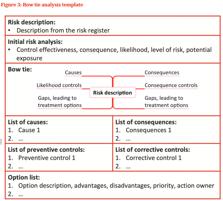
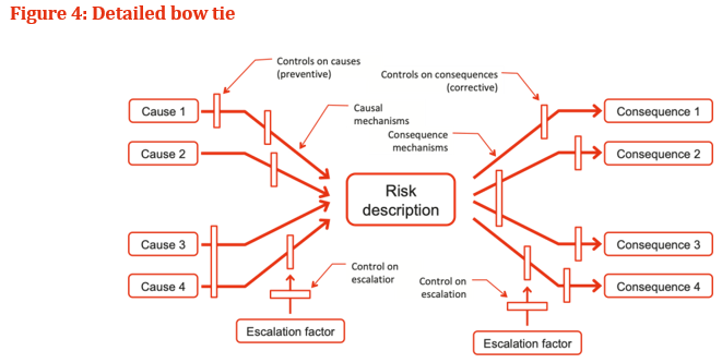
Bow tie analysis To explore and communicate risk the Bow Tie technique is used, in 70’s and 80’s the Bow Tie principle to analyse and document risk has been attributed back to Royal Dutch A bow tie in a simple qualitative cause-consequence diagram is a graphical depiction of pathways from the causes of an event or risk to its consequences. The left hand side of the diagram is a simplified combination of a fault tree that analyses the cause of an event or risk and in the right hand side, an event tree that analyses the consequences. Shown as a bow tie (Figure 1 To identify control gaps, where additional controls may be warranted are the primary usage of bow tie analysis. Figure 1 helps to identify gaps in the current controls and examine causes, consequences and the existing controls that address them.In figure 2, the risk treatment stage of risk management shows Bow tie analysis has an important contributor; the analysis carried out earlier in the risk process treatment is the stage that enables to derive benefit. Without risk treatment, we do know the situation that describe in which we are operating. For a very effective means of illustrating the factors at work in relation to a major risk the bow tie provides a logical flow thus making useful communication with people outside and the immediate group carrying out the analysis. Bow tie analysis can be conducted using straightforward in a simple way which is represented in Figure 3. Complex bow ties: The mechanisms that cause a risk, and the mechanisms that lead to consequences can be drawn by bow tie diagrams showcased in Figure 4. Barriers on the pathways causes to the risk can be shown as controls. Specific controls that support Management functions can also be shown and linked to the associated controls. Wherever necessary Bow ties can be linked, so that consequences from one bow tie become the causes in another. Bow tie analysis usage: To communicate the range of causes and consequences and the associated controls a simple diagram is required Instead of text, a graphical representation is much clearer From causes to the risk, and from the risk to the consequences there are clear pathways Where the overall level of control effectiveness is low A single cause-event-consequence pathway is more complex than the situation. Bow tie analysis is not useful when: In a complex ways there are multiple causes that are linked and where the detailed quantification is needed. Example: In a fault tree depicting the left-hand side of the bow tie there might be AND and OR gates Software for bow tie analysis As indicated in the figure 3 a simple bow tie analysis can be conducted using templates that are straightforward tables in Microsoft Word. Specific software may be useful when more complex bow ties represented in Figure 4 A six steps process involved in control design and implementation.


-
Treemapping: Using nested figures hierarchical data is displayed usually in rectangles is known as treemapping method. Treemap is a special type of chart to visualize a set of nested rectangles of categorical data that is hierarchical. Professor Ben Shneiderman at the University of Maryland were first used the Treemaps in the 1990s. The 3 sections of a treemap chart are: Plot Area: Where the visual representation takes place. The highest-level categories is coloured by a rectangle, and the sub-category rectangles is drawn proportional to the size of numerical value and they each contribute to the aggregate dataset. Chart Title: The title of the chart. Adding chart with a descriptive name will help users to easily understand the visualization. Legend: Highest level categories are represented with an individual color. These legends in the map helps distinguish the data series. In an overall tree structure of the hierarchical data the categories or items share parent-child type relationships. The simplest example of this type of data structure can be seen in a company as an organogram where all verticals with individual designations within teams grouped under one entity A set of nested rectangles displays hierarchical data as a Treemaps. A rectangle is given as a each branch of the tree and are tiled with smaller rectangles representing as a sub-branches Usage of Treemap when there is a clear ‘Part-to-whole’ relationship amongst multiple categories present in the data Treemaps work well Hierarchical Data is required which indicates that the data to be arranged in branches and sub-branches. Visualized using different dimensions of rectangles and with more than one color. All these are calculated values from the proportions of the quantitative variables. The focus is on spotting the key factors/trends or patterns. Benefits of a Treemap In certain situations Treemaps offers interesting advantages over the regular pie charts and bar charts viz., Space constraint: Where large amount of hierarchical data that needs to be visualized in a shorter/smaller space. Easier to read: Treemap is easier to read due to its linear visual appearance in comparison to a circular multi-level pie chart. Quickly spot patterns: Area of rectangle is always proportional to its value, each group is represented by a rectangle and trends and patterns are clearly visible in treemaps. Few Real-world use cases for Treemap Charts The treemap chart can be used in different industries are mentioned below to demonstrate the chart applicability 1. Customer complaints displayed about a product region-wise Example: there are 10 different types of complaints about a product and the company wants to visualize which complaints are relevant to a region assuming these are denoted as C1 to C10 by which it is visualize different regions have specific types of complaints. The Perfect Tool for Displaying Hierarchical Data


-
Projects are a set of activities or tasks and completed in a defined sequence by individuals or groups of individuals, within certain timeframes, and using a specific set of resources. The start and end points of these activities there are a defined set of relationships that can exist Activities have two types of relationships i.e., a workflow relationship or a data relationship. Data relationships are further divided into two types 1. Insert data or reference data and are these are inter dependencies There are four types of activity relation which are explained below 1. Finish-to-Start The Finish-to-Start relationship means that one activity before any following successor activities the predecessor must be fully complete may begin. In project management, Finish-to-Start is the most common activity relationship. Example: finishing configuration of a wireless router gateway by a certified network admin, before starting to connect it to the router. 2. Start-to-Start The next relationship is Start-to-Start. Until and unless another activity starts this activity cannot start. Example: multiple rack-mounted routers slotted them in and then connect them to the internet. The routers slotting in is the predecessor activity and routers connected to the internet is the successor. 3. Finish-to-Finish In this relationship two or more activities exists and can only be considered as the activity completed when both are completed. Example: We need to load and configure the server operating system and also must connect the server to the router. Which are the examples of finish-to-finish activities. 4. Start-to-Finish Start-to-Finish relationship is the last. In real-life projects this relationship is rarely found. In start-to-finish relationships, the successor activity will finish as soon as the predecessor activity starts. Example: like in a cut-over to a new system. The best example would be if migrating to a new system.
-
A common tool used to depict the sensitivity of a result to changes in selected variables by a tornado diagram. keeping all the other input variables at their nominal values It shows the effect on the output of varying each input variable at a time. Its commonly used for the decision making. There are special types of bar charts by which Tornado diagram represents are viz., tornado plots, tornado charts or butterfly charts. Instead of the standard horizontal presentation the data categories are listed vertically, and the largest bar appears at the top of the chart, the second largest appears second and so on. The final chart visually resembles a complete tornado or either one half of it. By comparing the relative importance of variables for determining sensitivity analysis, Tornado diagrams are used. To estimate for the low, base and high outcomes for each uncertainty considered. With one uncertainty this allows to test the sensitivity risk associated with. On the tornado, for a factor to be high it must be high in both uncertainty and leverage. Refer to the below image Resolve Conflict and Confusion with Objectivity and Evidence with Tornado Diagram. While making decisions a lot of time is wasted in chasing things that don’t have any impact. even sometimes we get into shouting matches over what’s most important. While unable to move the ball forward to make matters worse, we can get into analysis paralysis. And when we move forward, we are so hung up on risk that we lose sight of the upside and inadvertently destroy the very opportunities we are trying to create. The Tornado Diagram provides a clear way in identifying the factors whose uncertainty drives the largest impact, so that the focus objective is on what is important. Which helps in saving time, increase efficiency and reduce frustration. The Tornado is a powerful visualization that helps us to move with a strategic decision 1. clarity towards on what really matters out of the analysis 2. with both risk and opportunity from an obsession with risk to a holistic engagement 3. beyond the mathematical sensitivity to a holistic engagement with both 4. being driven by objectivity and evidence from being mired in conflict and confusion.


-
Inventory Turnover: the amount of time that passes from the day an item is purchased by a company until it is sold is referred to as an Inventory turnover. the company sold the stock that it purchased, less any items lost to damage or shrinkage is the one complete turnover of inventory Many successful companies have usually several inventory turnovers per year, and varies industry to industry and product category. Ex: Consumer packaged goods have high turnover, whereas the high-end luxury goods, viz., luxury handbags, typically sold few units per year. The following factors have an impact on the inventory management challenges like., turnover which includes changing customer demand, poor planning of supply chain and overstocking. Alternatively, inventory turnover can also be used at an aggregated level by bundle disparate items. Example: the geographic location of retail outlets. 80/20 rule when it comes to inventory the Pareto, principle applies to a lot of areas in business. it means 80% of company’s sales revenues are likely generated by 20% of the SKU’s. To Optimization Inventory Turnover there are 5 Techniques To optimize inventory management, the primary way is to apply inventory turnover ratios in a practical manner. Following are the 5 techniques Streamline the supply chain: Lowest price suppliers may not be the best choice. In the market demand if the product is seeing a surge, it is guaranteed delivery times for vital components which are of more important. To stream line the supply chain inefficiencies to be eradicate that will benefit sales, profits and overall margins. Adjust your pricing strategy: To realize the larger margins which are in higher demand and to freely capitalised by moving the old inventory by adjusting the price. If the stock is dead stock and can’t be sell are to be considered as zero value and to take the tax deduction by donating the stock to charity and other way is to offload through a second channel. Change ranking in industry: More market share can be grasped and increase the ranking within the industry by managing the inventory strategically by checking the inventory turnovers and inline with rest of the industries and with a better strategic position emerging trends in inventory ratios by positioning on competitive items. Improve forecasting: To make inventory forecast more accurate the sales numbers and inventory reports need deep data. With this data can suggest ways to change the product mix in a creative way in moving the inventory slow with a higher potential margin. Automate purchase orders: By automation we can reduce the cost and increase efficiencies. If these are linked with an order management system which facilitates reordering of inventory which sells good so that the stock is always in by which we net even more. To generate purchase orders automatically using an inventory system for buyers to review by which the results will better and minimum errors. Inventory Management Software’s can Improve Inventory Turnover.

-
Waterfall chart A waterfall chart is a bar chart of specific type that reveals the story behind the net change in between two points of values. A beginning value is shown in one bar and an ending value in a second bar. All of the unique components that contributed to that net change, and visualizes them individually are the dis-aggregates of waterfall chart. The waterfall chart name has been derived from its shape. Usually, in a waterfall chart the first bar starts from a baseline of zero, and represents the initial quantity of the measure. There are series of smaller bars, seemingly floating in space (like a wave in an ocean falling towards the baseline), leading up to one final bar, which represents the end measure. How does a waterfall chart work Bar charts all have a common baseline of zero which is one of the very few golden rules of data visualization. In a waterfall chart, the first bar that shows the initial value, and the last bar that shows the final value. The component bars of the baselines between these totals are all different, and are dependent on whatever the running total. One complicating factor in the waterfall chart is that sometimes the “baseline” of these component bars is at the top of the bar (if a component showcased a negative value), and on the other hand it is at the bottom of the bar (for all the positive values). Some of the people prefer to draw horizontal lines connecting the edges of bars to indicate eyes a line to follow as we move from left to right through the chart, to trace across components making the stair-step pattern easier. Some of the people prefer to make bars showing increases a different color from bars showing decreases. There are couple of ways to make waterfalls clearer. Waterfall charts used Human resources are often use the waterfall chart to show case the attrition and growth hiring. To show credits and debits, gains and losses the waterfall chart is commonly used in the financial industry Unusual variants on the waterfall chart Multiple totals is the main variant in the waterfall chart. The visual effect from a single cascade into multiple arcs can be changed. Waterfall chart would not truly be considered for Stock charts. Component bars floating have more in common with box-and-whisker plots for stocks. Drawbacks of the waterfall chart Waterfall charts compare the lengths of objects that are floating in space and good at comparing the length of lines if those lines share a common baseline but, in a waterfall, chart a very few of the bars do and therefore, it’s hard to compare the specific sizes of growth or contraction between two subcategories. One of the last challenges of the waterfall chart is for its designer and it’s one that is true whenever we need to show large and small values together the temptation to truncate your Y axis. To represent the HUGE numbers It’s not uncommon for the “pillars” of waterfall charts.

-
RPA is a software-based robot (or bot) that is capable of automating human actions or behaviour in the workplace, generally for administrative functions. RPA, refers to a set of automated tools that help enterprises / businesses automate processes by mimicking human actions on computers, with little or no human assistance. RPA is designed to minimize the burden for workers of mundane, repetitive tasks. RPA is regarded as a transformational technology that can bring significant value to the organizations adopting it. To automate any business process RPA allows to configure own software robots. IPA abbreviation is Intelligent Process Automation and refers to the application of Artificial Intelligence and related new technologies, combined with RPA application. The robot learns from doing tasks and becomes smarter after the completion of every task using IPA. IPA grants the robot access to endless possibilities of potential tasks and processes to automate. Adding intelligence to IPA creates transformation across the full spectrum of emerging technologies. The main difference between RPA and IPA Automating repetitive tasks and rules-based processes are focused by RPA, artificial intelligence (AI) technologies like machine learning, natural language processing, structured data interaction, and intelligent document processing are incorporated by intelligent automation. Cost of adoption is one of the differences between RPA and IPA
-
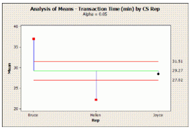
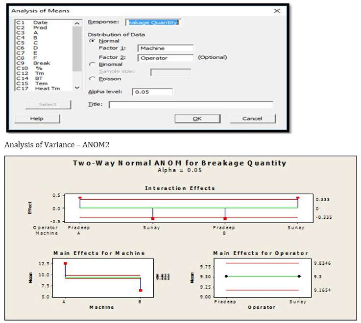
(Analysis of Means) is a graphical representation technique which graphs the Means for each level of a factor compared to the overall mean. The format is similar to a control chart and significance is indicated by a point outside upper and lower “decision limits”. Decision limits are determined using a significance level (α - alpha) specified by the user. Examples The time, in minutes, to complete ticket booking of a client was recorded for three customer service representatives. overall mean service time refer to the green line. The red lines represent the upper and lower decision limits for the mean based on a 95% confidence level (α - alpha = .05).For Six Sigma practitioners, ANOM (Analysis of Means) is very important.ANOM use interactions plot to test the hypothesis. The interactions plot shows the following: Plotted points – the effects for each cell in the two-way design. The strength of the interaction indicates the effects Reference line – plotted at zero. Decision Limits for Lower and upper – used to whether the effect is ZERO by test the hypothesis If one or more effects are beyond the decision limits, then reject the hypothesis and conclude that there is statistical evidence of an interaction. Examining which cells are beyond the decision limits will help to interpret the interaction. Beyond the decision limits if there are no effects, then cannot reject the hypothesis. There is no statistical evidence of an interaction. Analysis of Variance – ANOM3 If we check values plotted in the red line (Decision line) and if the value lies outside the decision line, Alternative Hypothesis (Ha) shall be true else Null Hypothesis (Ho) is true. From the above if we see: Points in the interaction graph is outside the decision line, hence can conclude that Alternative Hypothesis (Ha) is true Main effect for Machine is outside the decision line, hence Alternative Hypothesis (Ha) shall be true. Main effect of the operator is inside the decision line, Null Hypothesis (Ho) is true.

-
Frequentist approach It’s the model of statistics taught in most core-requirement and its approach most often used by A/B testing. Making predictions on the underlying truths of the experiment using data from the current experiment in the Frequentist method Example: Is this variation different from the control in a t-test or the probability of a coin landing heads being 0.2 means that if we were to flip the coin enough times, we would see heads 20% of the time Bayesian Approach Bayesian approach is a more bottom-up approach to data analysis. In this approach past knowledge of similar experiments is encoded into a statistical device known as a prior, and this prior is combined with current experiment data to make a conclusion on the test. Example: if X-company knows that by 5 PM there are 50 reservations, then they can predict that there will be around 250 covers for the night. Major Difference Between the Frequentist and Bayesian Approach are Frequentist statistics never uses or calculates the probability of the hypothesis, while Bayesian uses probabilities of data and probabilities of both the hypothesis. In the frequentist approach, they are fixed variables. Bayesian approach, trying to estimate are treated as random variables. Bayesian view, a probability is assigned to a hypothesis whereas in the frequentist view, without being assigned a probability a hypothesis is tested.
-
Project artifacts can be classified into nine types as specified below 1. Strategy: strategic artifacts are related to planning and strategizing, and feature during project initiation 2. Logs / Register: This category of artifacts covers all the documents involved in charting the day-to-day management of the project 3. Plans: This category of artifacts deals in the various forms of plans produced which help managers to run the project and guide it in its normal course with the effective ways 4. Hierarchy Charts: This category of artifacts plan a relationship role between the different parts and variables of a project and break down a project into smaller, self-contained units and view for effortless monitoring and management 5. Baselines: This category of artifacts is the approved versions of what we plan or forecast. under ideal circumstances these act as the benchmarks and can be created or updated as major changes take place within the project or as it migrates from one phase to another 6. Visual Data and information: This category of artifacts is an umbrella that covers every other artifact that is visually presented, unlike the traditionally “written” document 7. Reports: This category of artifacts generate several reports by manually or by automation to act on the findings of the reports. Most commonly reports are Quality report, Risk assessment report, Status report and Progress report 8. Agreements and contracts: This category of artifacts are involved in activities like purchases, outsourcing tasks and accessing services. drawn up agreements and contracts are Memorandum of Understanding (MoU), Fixed price contract, Time and materials contract, The indefinite-delivery and indefinite-quantity contract 9. Other: This catefory of artifacts is the final category and a miscellaneous bucket. It contains an assortment of project elements and Some of these may not regularly feature in standard project management practices but could be specific to the needs of a project.