

Dimple Tiwari
Lean Six Sigma Black Belt
-
Joined
-
Last visited
Everything posted by Dimple Tiwari
-
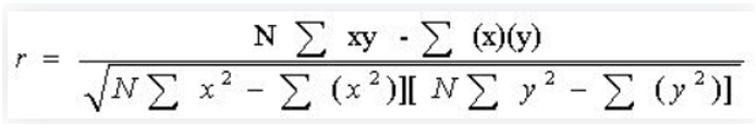
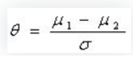
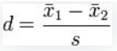
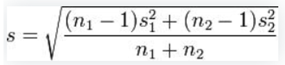
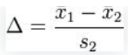
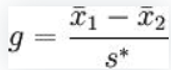
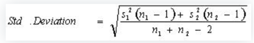
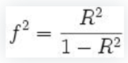
Effect Size Effect size may be a statistical conception that measures the strength of the relationship between two variables on a numeric scale. For case, if we've data on the peak of men and women and we notice that, on the average, men are high than women, the difference between the peak of Male and the height of Female is known as the effect size. The lesser the effect size, the lesser the peak difference between men and women will be. Statistic effect size helps us in determining if the difference is real or if it's thanks to a change of factors. In hypothesis testing, effect size, power, sample size, and important significance position are related to each other. In Meta- analysis, effect size is worried with different studies and also combines all the studies into single analysis. In statistics analysis, the effect size is usually measured in three ways (1) formalized mean difference, (2) odd rate, (3) correlation measure. Effect size tells you ways significant the association between variables or the dissimilarity between clusters is. An outsized effect size means that exploration finding has practical significance, while a little effect size indicates limited practical operations. Sorts of effect size Pearson r correlation Pearson r correlation was developed by Karl Pearson, and it's most extensively utilized in statistics. This factor of effect size is signified by r. the worth of the effect size of Pearson r correlation varies between-1 to 1. Consistent with Cohen (1988, 1992), the effect size is low if the worth of r varies around0.1, medium if r varies around0.3, and enormous if r varies further than0.5. The Pearson correlation is reckoned using the subsequent formula. Where r = measure of correlation N = number of dyads of scores ∑ xy = Add of the products of paired scores ∑ x = Add of x scores ∑ y = Add of y scores ∑ x2 = Add of squared x scores ∑ y2 = sum of squared y scores Formalized means difference When a hunt study is grounded on the population mean and standard divagation, also the posterior system is used to know the effect size The effect size of the population are frequently known by dividing the two population mean differences by their standard deviation. Cohen’s d effect size Cohen’s d is understood as the difference of two population means and it's divided by the standard divagation from the data. Mathematically Cohen’s effect size is represented by Where s can be calculated using this formula: Glass’s Δ system of effect size this system is similar to the Cohen’s system, but during this system standard divagation is used for the alternate group. Mathematically this formula are frequently written as Hedges ’ g system of effect size This system is that the modified system of Cohen’s d system. Hedges ’ g system of effect size are frequently written mathematically as follows Where standard deviation can be calculated using this formula: Cohen’s f2 system of effect size Cohen’s f2 system measures the effect size once we use styles like ANOVA, multiple correlation, etc. The Cohen’s f2 measure effect size for multiple retrogressions is defined because the following Where R2 is that the squared multiple correlation. Cramer’s φ or Cramer’s V system of effect size ki- forecourt is that the stylish statistic to measure the effect size for nominal data. In nominal data, when a variable has two orders, also Cramer’s phi is that the stylish statistic use. When these orders are relatively two, also Cramer’s V statistics will give the simplest result for nominal data. What’s the distinction between statistical and practical significance? While statistical significance shows that an influence occurs in a study, practical significance shows that the impact is large enough to be important within the real world. Statistical impact is denoted by p- values whereas practical impact is represented by effect sizes. Why Is not the P Value Enough? Statistical significance is the probability that the observed difference between two groups is due to chance. However, If the P value is larger than the nascence position chosen(eg. 05), any noted variation is expected to be explained by slice inconsistency. With a sufficiently large sample, a statistical test will nearly always demonstrate a significant difference, unless there's no effect whatsoever, that is, when the effect size is exactly zero; yet veritably small differences, indeed if significant, are frequently pointless. therefore, reporting only the significant P value for an analysis isn't acceptable for compendiums to completely understand the results. For illustration, if a sample size is 10 000, a significant P value is likely to be set up indeed when the difference in issues between groups is negligible and may not justify an precious or time- consuming intervention over another. The position of significance by itself doesn't prognosticate effect size. Distinct significance tests, effect size is individual of sample size. Statistical impact, on the other hand, hangs upon both sample size and effect size. For this cause, P values are believed to be mystified because of their dependency on sample size. sometimes a statistically significant outcome means only that a vast sample size was used. Illustration a coin is flipped 100 times. Call XX the number of heads. • Θ is the true and unknown probability of" heads". • Null thesis the coin is unprejudiced( θ = 0.5 θ = 0.5). • Our test is grounded on the distance from 50 to X d = | X −50| d = | X −50|. It's called the statistical summary. For illustration, if you get X = 33X = 33 heads, d = 17d = 17. p- value is the probability, assuming the coin is unprejudiced, that you see what you see P( d ≥ 17| θ = 0.5) P( d ≥ 17| θ = 0.5). A small p- value means" if the coin was poisoned, what I see would be veritably doubtful". You decide to set an arbitrary limit for the p- value, say α = 0.05 α = 0.05. also your test is completely defined • if p- value> α> α, answer accept unprejudiced • if p- value< α< α, answer reject unprejudiced αα is also the probability of a false positive. The true (and unknown) effect size then's ever| θ−0.5|| θ−0.5|. It's how important the null thesis is false. The better data (better power), the more you can descry the effect(reject null) for a small effect size. Summary Effect size helps compendiums understand the magnitude of differences set up, whereas statistical significance examines whether the findings are likely to be due to chance. Both are essential for compendiums to understand the full impact of your work.

-
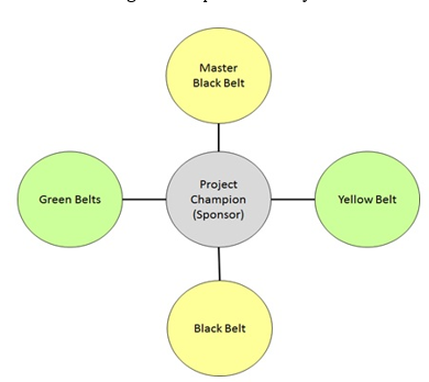
SIX SIGMA proficiency Levels At the design position, there are master black belts, black belts, green belts, yellow belts, and white belts. These people conduct systems and apply advancements. · Master Black Belt Trains and trainers Black Belts and Green Belts. Functions more at the Six Sigma program position by developing crucial criteria and the strategic direction. Acts as an association’s Six Sigma technologist and internal adviser. · Black Belt Leads problem- working systems. Trains and trainers design brigades. · Green Belt assistances with data collection and analysis for Black Belt systems. Leads Green Belt systems or brigades. · Yellow Belt Participates as a design platoon member. Reviews process advancements that support the design. · White Belt Can work on original problem- working brigades that support overall systems but may not be part of a Six Sigma design platoon. Understands introductory Six Sigma generalities from a mindfulness perspective. · Team Member A Team Member is having a special skill and help in designing new process and completion of project. Process Owner Takes over the project after completion and review the project on periodic basis In addition, each design needs organizational support. Six Sigma directors and titleholders set the direction for opting and planting systems. They insure, at a high position, that systems succeed, add value, and fit within the organizational plan. · Champion A Champion is an upper- position director who leads LSS strategy and deployment. Grounded on the objects set by administrative leadership, titleholders ensure that all enterprise to lower waste and remove blights come together in alignment with a company’s requirements for growth. backed by Master Black Belts, these directors tutor the leaders involved in LSS perpetration and track their progress. · Subject Matter Expert (SME) Is an expert in a specific functional area and provide guidance on needed basis. · Project Sponsor Part of senior management responsible for selection / approval of project Roles & Responsibilities Master Black Belt A Six Sigma Master Black Belt is the loftiest position of instrument related to the Six Sigma enhancement process methodology. Master Black Belts are endured in handling complex business practices, enforcing technical programs in micro and macro associations, and moving easily and snappily between colorful aspects within associations. Master Black Belts are the individualities within the association who are responsible for tutoring Black, Green, and Yellow Belts the Six Sigma methodologies. They're also responsible for organizing Six Sigma systems within the association. Master Black Belts are also instructors, as they've knowledge that other professionals within the association may need. They will be needed to partake their knowledge and answer questions that are material to their job liabilities. With these liabilities, it's important for Master Black Belts to retain strong leadership, interpersonal and statistical chops. With the different set of chops that are present in utmost Master Black Belts, associations employ their services to apply directly and efficiently large- scale enhancement systems that will potentially ameliorate the processes within the association and save up to millions of bones annually. Master Black Belts also help ameliorate the processes within an association by conveying their knowledge and tutoring other individualities proper process enhancement chops. As they educate other individualities the Six Sigma methodologies, those individualities are incorporating their fresh Six Sigma knowledge into their current job liabilities and their assigned Six Sigma systems, which leads to fresh process enhancement and savings. Master Black Belts admit in- depth training on Six Sigma statistical tools and the process enhancement methodologies. As they gain this knowledge, they're generally anticipated to partake that knowledge by tutoring other individualities how to perform the functions of a Six Sigma design. Depending on the position of training given by the Master Black Belts, the trained individualities can earn their Black, Green, or unheroic Belts. Master Black Belts also trainer these new Six Sigma professionals during their first many systems and also remain available to give them with guidance when demanded. When Master Black Belts aren't tutoring, they're organizing and overseeing the company’s Six Sigma systems. Organization of Six Sigma systems is generally executed by · establishing and following design schedules · estimating, validating, and measuring organizational design savings · gathering, monitoring, and assaying design platoon conditioning · resolving conflicts within the brigades and with design guests, merchandisers, and stakeholders · communicating on a regular base with the Project Champion and the association’s leadership and administrative platoon · promoting and celebrating the success of the design brigades Benefits of being a Master Black Belt for Organization and for tone- career · MBB helps to set the culture of Six Sigma right from the lawn- root position in the association. · Black Belts are served due to the mentoring and statistical chops of MBB. · MBB can grow up the graduation and come the Chief Quality Officer as he gains experience and moxie in the field of Six Sigma. Black Belts Six Sigma black belts are most effective in full- time process enhancement positions. The term black belt is espoused from the martial trades, where the black belt is the expert who coaches and trains others as well as demonstrates a mastery of the art. In a analogous way, six sigma black belts are individualities who have studied and demonstrated skill in the perpetration of the principles, practices, and ways of six sigma for maximum cost reduction and profit enhancement. Black belts generally demonstrate their chops through significant fiscal enhancement and client benefits on multiple systems. Black belts may be employed as team leaders responsible for measuring, assaying, perfecting, and controlling crucial processes that impact customer satisfaction and/ or productivity growth. Black belts may also operate as internal advisers, working with a number of brigades at formerly. They may also be employed as preceptors for problem working and statistics classes. Black belts are encouraged to tutor green belt and black belt campaigners. Implicit black belts frequently take over four weeks of instruction over a three or four- month period. Specific rudiments will differ, but all stress an understanding of variation reduction, training, and design operation. Black belts frequently admit guiding from a master black belt to guide them through systems. Black belts have the ensuing duties in their company o Mentor: Have a network of six sigma individualities in the company o Teacher Train original labor force o Coach give support to labor force on original systems o Identifier Discover openings for enhancement o influencer Be an advocate of six sigma tools and strategy Benefits of being a Black Belt for Organization and for tone- career · BB’s are responsible for taking the process advancements to the coming position in the association. · BB’s are largely trained on perfecting results for the association using statistical analysis and Six Sigma tools. Hence, they've a veritably economic career path ranging from Business Judges to Reuse enhancement experts. Green Belts Six Sigma Green Belts aren't generally in a full- time process enhancement positions. The term green belt is also espoused from the martial trades, pertaining to an existent who has learned the introductory chops but has lower experience than black belts. Green belts must demonstrate proficiency with statistical tools by using them for positive fiscal impact and client benefits. individualities may remain green belts or, with experience, they may come black belts. Green belts operate under the supervision and guidance of a black belt or master black belt. Benefits of being a Green Belt for Organization and for tone- career · GB’s have authority in their separate processes and can get the work done effectively. This is a veritably critical aspect for the association as it builds its process enhancement structure within each process. · For tone- career, GB’s admit exposure to elderly operation directly by virtue of the systems and get the occasion to make a difference in the association. Team Member A Team Member is chosen for a special skill or capability and platoon Members help design the new process. Team Members drive the design to completion. Meets regularly with enhancement platoon. Has spare Six Sigma mindfulness. Participates in applying process enhancement tools Process Owners Crucial processes should have a process proprietor. A process proprietor coordinates process enhancement conditioning and observers progress on a regular base. Process possessors work with black belts to ameliorate the processes for which they're responsible. Process possessors should have introductory training in the core statistical tools but will generally only gain proficiency with those ways used to ameliorate their individual processes. In some associations, process possessors may be six sigma titleholders. Yellow Belt Give support to Black Belts and Green Belts as demanded and supporting systems with process knowledge and data collection Deliverables of a Yellow Belt · A Yellow Belt has introductory knowledge of Six Sigma · They don't lead systems on their own, as does a Green Belt or Black Belt. · YB participates as a core platoon member or subject matter expert(SME) on DMAIC design or systems. Supports Green Belt or Black Belt in developing process charts, helping with data prisoner, easing simulation, and advancements. · YBs may frequently be responsible for driving lower process enhancement systems using spare tools or stylish practice sharing in their processes. Benefits of being a Yellow Belt for Organization and for tone- career · For any design, unheroic Belts are those individualities who are the Subject Matter Experts (SME’s) of their separate processes and also have the introductory know- style of Six Sigma. They're the spokes of a wheel and can help drive any Six Sigma process to check by using their process moxie. Organizations can greatly profit by choosing the right YB’s for the right systems. · For tone- career, YB’s progeny exposure of channeling their Subject knowledge to reuse enhancement openings yielding tremendous benefits for tone understanding. Sponsors Administrative backing is a crucial element in an effective black belt program administrative leadership sets the direction and precedence’s for the association. The administrative platoon is comprised of the leaders that will communicate, lead, and direct the company’s overall objects towards successful and profitable six sigma deployment. directors generally admit training that includes a six-sigma program overview, exemplifications of successful deployment and strategies, and tools and styles for description, dimension, analysis, enhancement, and control. Champions Six Sigma Champions are generally upper- position directors that control and allocate coffers to promote process advancements and black belt development. titleholders are trained in the core generalities of six sigma and deployment strategies used by their association. Six Sigma titleholders lead the perpetration of the six-sigma program. titleholders also work with black belts to ensure that elderly operation is apprehensive of the status of six sigma deployment. titleholders ensure that coffers are available for training and design completion. Some further details and associated deliverables on the part of Six Sigma Champion · Training guarantors must share in available Six Sigma trainings. · Support give visible support for Six Sigma MBB, BB and GB’s and give access to coffers demanded to conduct the design. · compass Set veritably clear compass for all Six Sigma systems. insure that the design is easily defined, has a compass which can be managed within 4- 6 months, and which has high liability of success. Watch the design as it progresses to insure that the compass stays rigorously within the bounds firstly set. · Prospects Set high prospects on the value of the results. insure the pretensions aren'tsub-optimized. The Six Sigma process has proven in numerous cases to deliver value far beyond original estimates. Less- than-aggressive pretensions will yield less- than-aggressive results. · Data Challenge Experts on their Knowledge of data and the base of their conclusions. · Involvement guarantors are anticipated to interact with design brigades on a regular base to share in problem working, make opinions, and allocate coffers. Plan to spend at least 2 hours every other week with the design platoon. · Hand- over guarantors will be responsible for icing that the business takes power of the perpetration and delivers the value indicated in the Control phase. This requires a specific existent who'll enjoy the delivery of the design criteria . · Results Guarantors, as well as 6sigma instructors and business regulators, are responsible for icing that design results hit the nethermost line of the association. Benefits of being a Six Sigma Champion for Organization · Champion set the direction of process advancements in the association. They link the benefits of the design to organizational precedence’s. · Champion can produce a portfolio of systems which could range from systems in client Satisfaction, Service, Cost and Quality. It provides the titleholders the visibility in the process and also showcases his capacities to top- operation to manage varied portfolio of systems. Six Sigma Interacting places Subject Matter Expert (SME) Is an expert in a specific functional area and may be invited to specific platoon meetings but not inescapably all of them, provides guidance demanded to project brigades on an as demanded base


-
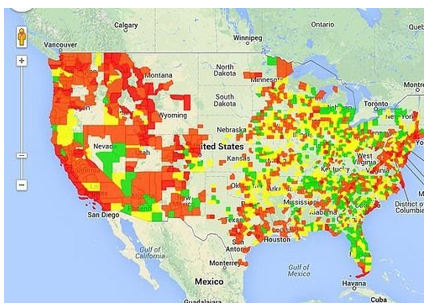
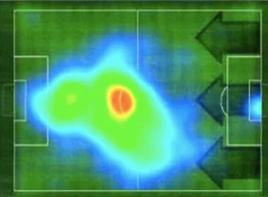
What is the purpose of a Heatmap? A heat chart (or heatmap) is a data visualization fashion that shows magnitude of a miracle as color in two confines. The variation in color may be by tinge or intensity, giving egregious visual cues to the anthology about how the miracle is clustered or varies over space. There are two unnaturally different orders of heat maps the cluster heat chart and the spatial heat chart. In a cluster heat chart, bulks are laid out into a matrix of fixed cell size whose rows and columns are separate marvels and orders, and the sorting of rows and columns is purposeful and kindly arbitrary, with the thing of suggesting clusters or portraying them as discovered via statistical analysis. The size of the cell is arbitrary but large enough to be easily visible. By discrepancy, the position of a magnitude in a spatial heat chart is forced by the position of the magnitude in that space, and there's no notion of cells; the miracle is considered to vary continuously. There are two main type of heat maps spatial, and grid. A spatial heat chart displays the magnitude of a spatial marvels as color, generally cast over a chart. In the image labeled “Spatial Heat Chart illustration,” temperature is displayed by color range across a chart of the world. Color ranges from blue (cold) to red (hot). A grid heat chart displays magnitude as color in a two- dimensional matrix, with each dimension representing a order of particularity and the color representing the magnitude of some dimension on the combined traits from each of the two orders. For illustration, one dimension might represent time, and the other dimension might represent month, and the value measured might be temperature. This heat chart would show how temperature changed over the times in each month. Grid heat Maps are farther distributed into two different types of matrices clustered, and correlogram. · Clustered heat Chart The illustration of the yearly temperature by time is a clustered heat chart. · Correlogram A correlogram is a clustered heat chart that has the same particularity for each axis to display how the traits in the set of traits interact with each other. The correlogram is a triangle rather of a square because the combination of A-B is the same as the combination of B- A and so doesn't need to be expressed doubly. Uses Heat Maps have a wide range of possibilities amongst operations due to their capability to simplify data and make for visually appealing to read data analysis. Numerous operations using different types of heat Maps are listed below. Business Analysis Heat Maps are used in business analytics to give a visual representation about a company’s current functioning, performance, and the need for advancements. Heat Maps are a way to dissect a company’s being data and modernize it to reflect growth and other specific sweats. Heat maps visually appeal to platoon members and guests of the business or company. Websites There are numerous different ways toast Maps are used within websites to determine a visiting druggie’s conduct. Generally, there are multiple heat Maps used together to determine sapience to a website on what are the stylish and worst performing rudiments on the runner. Some specific heat Maps used for website analysis are listed below. · Mouse Tracking Mouse tracking heat Maps or hang Maps, are used to fantasize where the stoner of the point hovers their cursor. · Eye tracking Eye tracking heat Maps measure the eye position of the website's druggies and gathers measures similar as eye obsession volume, eye obsession duration, and areas of interest. · Click Tracking Click tracking heat Maps or touch Maps, are analogous to mouse shadowing heat Maps, but rather of hang conduct, these types of heat maps help fantasize the druggies click conduct. Click tracking heat Maps not only allow for visual cues on clickable factors on a webpage, similar as buttons or dropdown menus, but these heat maps also allow for tracking on non-clickable objects anywhere on the runner. · AI- Generation Attention AI- generated attention heat maps help fantasize where the visiting stoner’s attention will go on a certain section of a webpage. These types of heat Maps are enforced using a created software algorithm to determine and prognosticate the attention conduct of the stoner. · Scroll Tracking Scroll tracking heat Maps are used to represent the scrolling behavior of the website’s druggies. This helps produce visual cues to what section on the website the stoner spends the utmost time at. Netflix is maybe one of the stylish exemplifications of a digital business that uses heatmaps to gain perceptivity on user behavior and improve user experiences. The folks at Netflix took it upon themselves to identify their target followership’s streaming interests, the kind of shows and pictures they watched, the colorful stripes they identify with, and so on, and also used the gathered data to deliver substantiated gests to each bystander. elow are two of the foremost website heatmaps colluded by Netflix during UX exploration conducted to optimize their television experience Exploratory Data Analysis Working with small and large data sets, data scientists and data judges look at and determine essential connections and characteristics amongst different points in a data set as well as features of those data points. Data scientists and judges work with a platoon of others in different professions. The use of heat Maps make for a visually easy way to epitomize findings and main factors. There are other ways to represent data, still toast Maps can fantasize these data points and their connections in a high dimensional space without getting too compact and visually unpleasing. Heat maps in data analysis, allow for specific variables of rows and/ or columns on the axes and indeed on the slant. Biology In the natural field, heat Maps are used to visually represent large and small sets of data. The focus is towards patterns and parallels in DNA, RNA, gene expression, etc. Working with these sets of data, data scientists in bioinformatics, concentrate on different generalities, some of which being community discovery, association and correlation, and the conception of centrality, where heat Maps are a compelling way to visually epitomize results and to partake amongst other professions not in the field of biology or bioinformatics. The two heat maps to the right, labeled “Data Analysis Heat Map Example,” show different ways in which one may present genomic data over a specific region( Hist1 region) to someone outside the field of biology so they've a better understanding of the general conception a biologist or data scientist are trying to present. Fiscal Analysis The values of different product and means change both fleetly and/ or gradationally over time. The need to log changes to the diurnal requests is imperative. It allows for the capability to draw prognostications from patterns while being suitable to readdress once numerical data. Heat Maps are suitable to remove the tedious process and enable the stoner to fantasize data points and compare amongst the different players. Geographical Visualization Heat Maps are used to fantasize and display a geographic distribution of data. Heat maps represent different consistence of data points on a geographical chart to help druggies see the intensities of certain marvels and to show particulars of utmost or least significance. Generally, heat Maps used in geographical visualization are incorrect for Choropleth maps, but the difference comes with how certain data is presented which separate the two. Sports Heat maps can be used in numerous sports and can impact directors and/ or trainers opinions grounded on high and low consistence of data displayed. Druggies can identify patterns within the game, the strategies of opponents and one’s own platoon, make further informed opinions serving the player, platoon, and business, and can enhance performance in different areas by relating improvement is demanded. Heat Maps also fantasize comparisons and connections amongst different brigades in the same sport or between different sports each together. This heatmap depicts the on- field movement pattern of a player in terms of where he spent the most quantum of time. Similar data visualization can help brigades make game- changing strategies that are data- backed and further effective. Heatmaps in the stock request A stock indicator heatmap helps identify prevailing trends in the request at a regard. It uses a cold- to-hot color scheme to indicate which stock options are bullish and which are bearish. The former is represented using the color green, whilst the ultimate is stressed in red. Benefits of heatmaps Analytics tools like Google Analytics or Site Catalyst are great at furnishing criteria to show which runners druggies visit, but they can warrant detail when it comes to understanding how druggies engage with those runners. Heatmaps can give a further comprehensive overview of how druggies are really carrying. Heatmaps are also a lot further visual than standard analytics reports, which can make them easier to dissect at a regard. This makes them more accessible, particularly to people who aren't oriented to assaying large quantities of data. Good heatmapping tools enable judges to member and filter the data. This means that it can be easy to see how different types of druggies are engaging with a particular runner. Conclusion Statisticians and judges employ a plethora of tools and styles to sort the collected data and present them in a further stoner-friendly manner. To this end, heatmaps help professionals from every assiduity. To add up, the reason why heatmaps have gained the motivation they've in the once many decades as a statistical and logical tool is that 1. It's a visual and accessible system of data representation 2. It's readily and fluently consumable as it simplifies numeric data and depicts it using a color scale 3. One can fluently compare colorful data points colluded on different heatmaps 4. It's protean and adaptable as it can record and present both absolute and deduced values 5. It removes multiple way from the traditional data analysis and interpretation process by laying down all the values in one single heatmap 6. These are only some of the exemplifications of where heatmaps have helped businesses across diligence fantasize data more and make data- backed opinions. The possibilities are endless


-
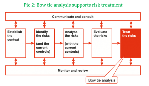
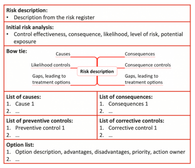
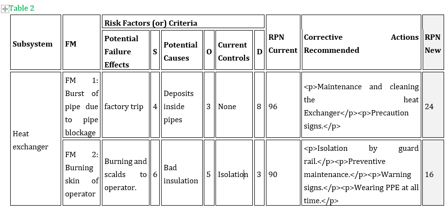
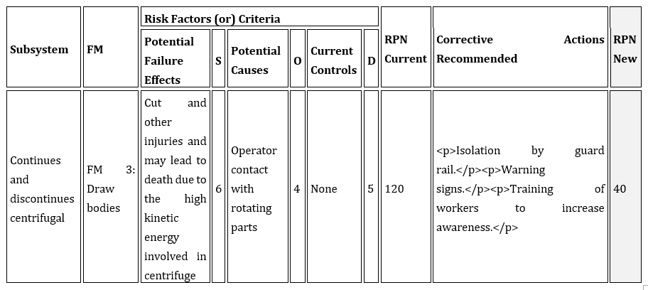
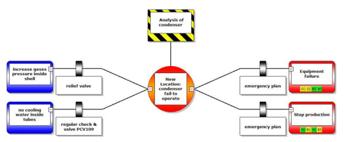
Bow tie analysis Preface Bow tie analysis is a simple process for relating where new or enhanced controls may be worthwhile. It's a core part of threat treatment planning, particularly where there's a high position of threat or where control effectiveness is assessed as low. Background A bow tie is a graphical definition of pathways from the causes of an event or threat to its consequences in a simple qualitative cause- consequence illustration. It's a simplified combination of a fault tree that analyses the cause of an event or threat, the left- hand side of the illustration, and an event tree that analyses the consequences, the right- hand side. It's represented as a bow tie (Pic 1), where the knot of the bow tie is of the point where the fault tree paths meet, and the event tree spans out. While bow tie plates can be constructed from fault and event trees, they're more frequently drawn directly from a brainstorming session, furnishing a fruitful base for a group disquisition of controls. The focus of bow tie analysis is on the walls or controls depicted to the left- hand side of the knot that can change the liability of the event or circumstance, or on those on the right- hand side that can change its consequences. It's used when assessing the absoluteness of controls, to check that each pathway from cause to event and event to consequence has effective controls, and that factors that could beget controls to fail (including operation systems failures) are honored. A primary use of bow tie analysis is to identify control gaps, where fresh controls may be warranted. Examining causes, consequences and the being controls that address them helps to identify gaps in the current controls (as shown in Pic 1). · The most effective controls generally address causes, generally to stop them arising or leading to the threat (preventative controls). They should match the causes, in extent and nature. This requires that the causes and their counteraccusations for business objects be easily understood, frequently in some detail. For illustration, conservation systems are preventative controls for pitfalls associated with asset integrity. · On the right of the bow tie, controls should give applicable responses to consequences being felt or produce walls to the consequences developing. They might either impact the consequences on business objects directly (corrective or reactive controls), or descry changes snappily and give triggers for contingency plans(operative controls). For illustration, a bund around a storehouse vessel may not help a release of product, but it limits the spread of the release and hence the adverse consequences; a bank alarm is a operative control that allows fast response to a fire. Bow tie analysis is an important contributor to the threat treatment stage of threat operation (Pic 2); threat treatment is the stage that enables us to decide benefit from the analysis carried out before in the process. Without threat treatment, we do no further than describe the situation in which we're operating. A bow tie can also be used for recording information about a threat that doesn't fit the simple direct representation of a threat register. It can be used proactively to consider implicit events and scripts (pitfalls) and retrospectively to model events that have formerly passed. The logical inflow of a bow tie illustration also provides a veritably effective means of illustrating the factors at work in relation to a major threat. This makes it useful for communicating with people outside the immediate group carrying out the analysis. Simple Bowtie analysis Simple Bowtie analysis can be conducted using straightforward templates like the one in Pic 3. 1. Identify the threat to be examined in the bow tie analysis. Bow tie analysis is of utmost use for pitfalls that have high situations of threat, and particularly those with high consequences. 2. Describe the threat, in the form (commodity happens) and leads to (a consequence for our objects) and note the main threat analysis issues from the threat register. 3. List the causes of the threat on the left and the consequences of the threat on the right, drawing on material from the threat register and expanding where possible. 4. List the being controls on the causes (preventative controls) below the causes on the left wing, and the controls on the consequences (corrective controls) below the consequences on the right. However, also show it doubly, on each side of the template, if a control acts on both causes and consequences. 5. Assess the effectiveness of each control, by asking ‘ Is it designed well( could it work)? ’ and ‘ Is it enforced well( does it work)? 6. Identify options for enhancing being controls, to ameliorate their effectiveness or to fill gaps. This may include enhanced monitoring and further frequent review, for illustration using control tone- assessment. 7. Look for gaps, where there are causes and consequences for which there are no matching controls. 8. Identify options for creating new controls to fill the gaps. 9. estimate the advantages and disadvantages of each option, agree options to be pursued, and develop perpetration plans. Pic 3 Bow tie analysis template In utmost circumstances, conduct to produce new or revised controls will be enforced only if they induce a net benefit for the organization, where the advantages and benefits overweigh the disadvantages and costs when considered as a whole. still, controls should conform to applicable norms or nonsupervisory conditions, similar as those assessed by plant health and safety policy or legislation. In circumstances like this the net benefit criterion may not apply, and perpetration must do, irrespective of net benefit, to satisfy compliance scores. Benefits and costs should be interpreted more astronomically than simple fiscal measures. Bow tie analysis is of utmost use in the following situations • A simple illustration is needed to communicate the range of causes and consequences and the associated controls • further detail about the causes and consequences of a threat is demanded than is contained in a threat register • Where a graphical representation may be important clearer than textbook • There are clear pathways from causes to the threat, and from the threat to the consequences • The overall position of control effectiveness is believed to be low • The focus is on relating controls, control effectiveness and control gaps and icing that each pathway has a control (a hedge) • The situation is more complex than a single cause- event- consequence pathway, but not so complex that a full fault tree analysis and event tree analysis is warranted. Bow tie analysis can be used for desirable influences as well as those we seek to avoid. In this case the controls aren't walls, but rather factors that support or enhance the pathways. Bow tie analysis isn't useful when • There are multiple causes that are linked in complex ways, for illustration when there might be AND and OR gates in a fault tree depicting the left- hand side of the bow tie • Where detailed quantification is demanded. Bowtie plates have several advantages • the full range of initiating events (AKA pitfalls) are shown • the intermediating safeguards (AKA walls) are easily shown • the factual way in which these combine and escalate is easily shown • the consequences side shows walls in an original manner • the numerous possible consequence issues are defined • the relation of the walls to the safety operation system can be made unequivocal Bowtie illustration limitations disadvantages • can bear in depth knowledge from subject matter experts for thickness on delineations and development methodology • may take significant time to develop a meaningful bowtie illustration • walls linked aren't independent of each other leading to a false sense of security • confusing pitfalls with escalations factors • limited norms on the development and use of bowtie plates • can come relatively large and complicated • does not give a quantitative assessment of threat How does it compare against FMEA? Provide relevant examples. FMEA is a systematic tool for identifying the effects or consequences of FM and is used to eliminate or reduce the chance of failure. Bowtie is considered as an approach that has both proactive and reactive elements and that systematically works through the hazard and its management. Case Study The FMEA and bow- tie methodology are applied to a particular type of accident in the anhydrous Sodium Sulphate plant, The critical outfit in plant consists of (Melter, boiler, crystallizer, thickener, evaporators, packing machines, centrifugal pump, plate heat exchanger and screw pumps). This outfit was named grounded on analysis of literal data of the plant and interviews with crucial labor force involved in the safety, conservation and operation. RESULTS AND DISCUSSIONS Risk Analysis Through the FMEA There are nine subsystems linked, at which implicit failure mode ( FM) can do, as shown in Table 2. In this table, FMEA punctuation form is presented. It shows the form of FMEA for S, O and D. The advised RPN values and criticality for the failure modes are presented. There are several FM with high values of RPN. It can be observed that the values of RPN for quilting and sewing machines are 500, 490 independently. Packing machines are the loftiest criticality values of failure modes. Risk Analysis through the Bow-Tie Diagram The main pitfalls on the left hand- side and demonstrates in a “Bow- tie illustration” shape how walls help the escalation of the original pitfalls to one of several final issues are introduced. As can be seen from these numbers, safety critical walls are linked and each of these is as- inked to artificial process with an individual responsible. Some shell spots use a point called matrix of permitted operations which defines in matrix format what conditioning may or may not be done if the applicable hedge isn't functional. This is a form of threat grounded operations, but it focuses on interdicted operations and it's understood the approach has not set up favor in ope- standing spots as it's too restrictive on operations.

-
Treemaps: Data Visualization of Complex Hierarchies Summary: A treemaps is a complex, area- grounded data visualization for hierarchical data that can be hard to interpret precisely. In numerous cases, simpler visualizations similar as bar maps are preferable. Treemaps are a data- visualization fashion for large, hierarchical data sets. They capture two types of information in the data (1) the value of individual data points;( 2) the structure of the scale. Description Treemaps are visualizations for hierarchical data. They're made of a series of nested blocks of sizes commensurable to the corresponding data value. A large cube represents a branch of a data tree, and it's subdivided into lower blocks that represent the size of each knot within that branch. A hierarchical tree diagram, showing the structure of the S&P 500. This structure is the basis of the treemaps shown below. Key Uses of Treemaps Treemaps are frequently used for deals data, as they capture relative sizes of data orders, allowing for quick perception of the particulars that are large contributors to each order. Color can identify particulars that are underperforming (or overperforming) compared to their siblings from the same order. Therefore, FinViz’s Chart of the request is an enduring illustration of treemaps it allows druggies to identify companies that are doing better than their assiduity peers, indeed though their overall stock value may be relatively small. Treemaps work well when your hierarchical data has 2 main confines that you want to visualize: A positive quantitative value, which will be expressed as the area of the cube (Because area cannot be negative, you cannot use treemaps for imaging variables like gain/ loss, which can have both positive and negative values.) A categorical or alternate quantitative value, which will be expressed as the color of the individual rectangles. However, it’s explosively encouraged to use only one color ( if all the figures are positive) or two colors( one for negative and one for positive), and vary the intensity of the color to express precise value, If color is used to express a quantitative value. As humans don’t perceive colors to have an essential order, we explosively recommend that you don't use multiple colors to represent a range of figures. Here are a few guidelines for creating usable treemaps: Visually distinct borders around advanced- position orders help druggies identify the top- position groupings. High- discrepancy textbook ensures that people can read the markers inside the treemap blocks. A visually distinctive named state, reached when druggies hang ( or valve) a cube, helps druggies confirm that they're looking at the right data point. Additional detail about a named cube (appearing in an overlay), similar as the name, value of the variables allows druggies to drill into the data. Illustration Below is a treemap where the blocks represent metropolises and are sized and colored by the column Deals. In this case, the aggregation system Sum was named for the Deals column. This treemap only contains data on one position. The sizes and positions of the blocks, as well as the coloring, indicate that Casablanca and Cannes have the loftiest total sum of deals, while Hong Kong and Bangalore have the smallest. To compare sum of deals for entire countries or mainlands, you can add other situations to the treemap scale without losing the information about the individual metropolises. In the treemap below, the columns Country and Continent were added to the treemap scale. The blocks are now nested. Each cube that represents a mainland consists of blocks representing countries within that mainland. Each cube that represents a country consists of blocks representing metropolises in that country. It's still possible to see which existent metropolises has the loftiest sum of deals, but it's now also easy to see that Africa is the mainland with the loftiest total sum of deals, and that Asia is the mainland with the smallest total sum of deals. Since the blocks are now nested, the blocks aren't in the same positions presently. still, each position of the scale is still organized according to the qualified algorithm. For illustration, the size of the cube representing India is decided by the sum of the areas of the two blocks representing Calcutta and Bangalore. The size of the cube representing Asia is in turn decided by the sum of the areas of the blocks representing China and India. To take a near look at a certain part of the treemap, you can navigate from a advanced scale position to a lower one. Click on the scale title of the position you want to navigate to. In the illustration below, the treemap is shown as it appears when you navigate down to the country position India The upmost scale title now displays the scale situations from the top position to the position you're presently viewing. To navigate overhead in the scale, click on the position you want to navigate to. You can hide both the scale heads and the markers in the treemap at any time from the right- click menu of the visualization. All visualizations can be set up to show data limited by one or further markings in other visualizations only( details visualizations). Treemaps can also be limited by one or further filtering’s. Another volition is to set up a treemap without any filtering at all. See Limiting What's Shown in Visualizations for further information. Treemap in Excel Treemaps are a good option to show hierarchical data in a compact graph. Microsoft Excel enables the stoner to produce, style, and customize a treemap in a many twinkle. Treemaps are generally used for displaying scripts similar as stylish- dealing particulars, the population of a specific position, parochial deals, and analogous parent- child structured data series. This tutorial will discover about Treemap Chart, the step- by- step system to produce this map, its advantages and disadvantages, how to customize and format the Treemap map. "A Treemap chart in Excel provides a hierarchical view of the dataset and designs simple spot patterns, for example, which products are the best seller for a company. In this chart type, rectangular boxes depict the tree branches, and each sub-branch is represented as a smaller rectangle." In other words, Treemaps are employed to work with hierarchical data, and this data contains one- to- numerous connections. Treemaps are useful for depicting particulars similar as stylish- dealing products, the population of any position, parochial deals, and analogous data containing parent- child structuring. For illustration, if in the below map you'll notice look at the deals of a product grounded on, also the quarter is the parent with three children (the months in the quarter), and each order has either four or five children, corresponding to the products. A representation of Treemap is given below: As shown over, a Treemap map incorporates nested, coloured blocks that can be considered branches. Every item specified in your dataset is represented by a blockish box wherein the value of the data determines the sizes of each box. These characteristics of Treemap make it easier to see the groups and sizes. Because the colour and size of blocks are generally identified with the tree structure, this map is named Treemap. Treemap maps are generally used when the stoner wants to punctuate the donation of each item to the whole dataset within the scale. The advantages of using a treemap include an easy system to spot patterns, parallels, and irregularities and a structured way of displaying corridor of a whole. Basics of Treemap A treemap chart primarily consists of 3 sections which are given below: Plot Area This is the part where the entire visual representation of the graph transpires. As you can see each cube of the treemap is shadowed by the loftiest- position orders, and the sub-category(sub-branch) blocks for each item is colored commensurable to the size of numerical numbers they each contribute to the dataset. Chart Title This section represents the title of the map. It helps you give your map a descriptive name, thereby helping your observers fluently understand the visual representation. Legend The legend is the part of the chart that differentiates the colorful data series where each color is represented by one of the loftiest- position orders (branches). Applicable use cases for treemaps Treemaps are the stylish choice if your dataset falls into one of the below- given scripts • If you want to fantasize a part- to-whole relationship amongst numerous orders. • If the exact comparisons between the orders aren't important. • If the data series is hierarchical. Limitations of Treemap Charts Like every map type, there are limitations and times when other map types should be used · A treemap map doesn't accommodate data sets that vary in magnitude. · All values of the quantitative variable that represents the size of the cube have to be positive values. Negative values aren't respectable. · Since the data points are depicted in the form of blocks with no other sorting options, it follows that they take up space. In addition to the spatial constraint, readability can be a little more delicate as it's easier to read long and direct data plots than wide and large bones. This also makes it delicate to publish the treemap. · Some treemaps take a lot of trouble to induce, indeed with technical programs. · occasionally treemaps don't display hierarchical situations as sprucely as other maps used to fantasize hierarchical data, similar as a sunburst illustration or a tree illustration. · Despite all of these limitations, treemaps are one of the most visually suggestive tools to represent data and give information on aspects that are hard to capture using other map forms, making them an necessary tool in data analysis. How to produce a Treemap? Creating Treemap in your Excel worksheet is veritably easy and simple. For illustration, in the table below, you can see we've taken a simple three- column dataset. In the first column, we've specified the order of our best- dealing products. The products within each order are specified in the alternate column. And at last, the units vended are mentioned in the third column. Follow the below given steps to quickly create a Treemap: Select the dataset. Go to the Excel ribbon, click on the Insert tab, -> Hierarchy chart option. As a result, you will notice that the Treemap chart will be immediately displayed in your worksheet. The four rectangles are grouped with their categories, wherein the size of the rectangular boxes is determined by the values provided to them. In the above screenshot, the Treemap has used nested, colored rectangles which you can think of as the branches. Every item in the dataset is represented by a rectangle and the sizes of each correlate to the number data. Note: You can also use the Chart Design and Format tabs to customize your Treemap chart's appearance and look and feel. Sometimes both these tabs are not activated. Click anywhere in the Treemap chart to activate those tabs. Excel automatically uses a different color for each of the top level or parent categories. However, you can also use the layout of the data labels to different between the different categories of data.Right-click one of the rectangles on the chart > Format Data Series. Advantages of Treemap Charts The biggest advantages of treemap maps include · The capability to identify patterns and discern connections between two orders or two rudiments in a hierarchical data structure. also, sub-structures or sub-elements are represented. · Application of space when rendering knockouts of thousands of data points, with the capability to drill down as demanded. · Directly displaying multiple rudiments at formerly, including “ part to whole ” rates. This makes visualization of data easy. · Uses size and color keys to fantasize colorful attributes. orders and subcategories can be color- enciphered to match the parent orders. For case, electronics deals in different branches would be tones of blue, while cabinetwork deals could be tones of unheroic. Summary While treemaps can be useful for imaging certain types of complexes, hierarchical data sets, they are frequently hard to interpret. However, visually separate the different high- position orders, avoid using multiple colors to express numeric values, If using a treemap. Last and foremost, understand what your druggies need to do with your data and consider whether other visualizations (similar as a bar map or a smatter plot) could replace or compound the treemap.


-
4 Types of logical Relationships or Dependencies in a Project Schedule In simple words – After identification of conditioning, we dissect them if any connections live between those. However, it's better to show them to maintain the design schedule more, If connections live. The relationship exists between the two conditioning. Let’s take two conditioning for understanding the conception and name the exertion A and B. Then, exertion A is a predecessor, and exertion B is the successor activity. However, it impacts the successor conditioning, If commodity happens to the predecessor exertion. In this way, successor exertion B is a dependent exertion on the predecessor exertion A. So, you can see then – A is an independent exertion. exertion A logically comes ahead exertion B in the schedule. The connections between A and B exertion are either of four types • Finish- to- Start (FS) • Finish- to- Finish ( FF) • Start- to- Start ( SS) • Start- to- Finish ( SF) We define these four relations by two exemptions (XX) using F or S. We link the predecessor (exertion A) with the first character. It defines the state of processor exertion. And, in the same way, we link successor ( exertion with the alternate character. The character defines the rule which we've to apply on the successor exertion. Let’s discuss these four relationships one by one: Finish-to-start (FS) “A logical connection in which a successor venture cannot start until a predecessor activity has finished.” Still, Finish to launch is the most generally used logical relationship, If you have a question – which is the most generally used logical relationship? Yes. You can see, this relation constraint doesn't impact the independent exertion. It only affects the dependent, so in our case, it's exertion B. Then the coming question is – what does FS mean in design operation? From this FS relationship, F shows the finish state of exertion A, and at this state, exertion B can be started. The alternate character ‘ S ’ is the rule on a successor to make it dependent on the Finish state of the successor exertion. Let’s take an illustration – You can not start development until you finish the design. Then, development is the dependent exertion on the design exertion. Design is the precursor exertion, and its finish state can only start the development exertion. Start-to-start (SS) “A logical relationship in which a successor activity cannot start until a predecessor activity has started” So if exertion B is bound to this relation, this means it can not start till the precursor( independent) exertion A is started. The precursor exertion B launch is dependent on the launch state of successor exertion A. The launch of exertion A drives the launch of exertion. Let’s take an illustration – The exertion of marketing folder medication can not start until stoner attestation has begun. In this way, after the inception of exertion A, both A and B can go in parallel. If you're curious to know in what could be the practical cases to make exertion B dependent on the launch state of exertion A – Finish-to-finish (FF) “A logical connection in which a successor activity cannot finish until a predecessor activity has started.” So if exertion B is bound with this relation it means it can not finish till the precursor( independent) exertion A is finished. So, B needs to finish its deliverable and keep working with A till the time A isn't done. Like, the broadcast of a football match can not finish until the match is finished. So the match isn't depended in broadcast, but the broadcast is. If the match takes longer than the originally estimated time broadcast will also continue till that time. It could be possible that the broadcast is continued indeed after the match is finished. The broadcast could be continued to bandy highlights and other effects. It means it'll end after successor conditioning but inescapably incontinently. Start-to-finish (SF) So if exertion B is bound to this relation in which it can not finish till the independent exertion A starts. It looks confusing because in typical cases, precursor exertion gets performed before the successor exertion. But, in this case, the successor is passing first. But indeed if the successor is passing first, the precursor isn't at each confined by successor exertion. It's independent. But the successors( exertion can not finish till the precursor starts( exertion A starts) A logical connection in which a successor activity cannot finish until a predecessor activity has started. It's pivotal to understand the introductory generalities underpinning these four logical connections or dependences between design conditioning. So, make sure you work on them right from the launch and bandy all the tasks and record them consequently.


-
What is a Tornado Diagram? Tornado diagrams, also called Tornado plots, Tornado charts or butterfly charts, are a special type of Bar charts, where the data orders are listed vertically rather of the horizontally, and the categories are ordered so that the largest bar appears at the top of the map, the second largest appears second from the top, and so on. They're so named because the final map visually resembles either one half of or a complete Tornado. A Tornado diagrams is a useful tool for Project Managers to assess risks associated with a project A Tornado diagrams is a bar map that visually displays the magnitude of each threat in a descending order. This gives it the shape of a funnel that looks like a Tornado. These are useful design operation tools when making opinions and assessing risks at different stages of the project The biggest threat is shown at the top of the map, and it'll have the biggest spread. This is the threat that deserves the utmost attention. Purpose Tornado diagrams are useful for deterministic sensitivity analysis – comparing the relative significance of variables. For each variable/ query considered, one needs estimates for what the low, base, and high outcomes would be. The sensitive variable is modeled as having an uncertain value while all other variables are held at birth values. This allows testing the sensitivity / threat associated with one query/ variable. For illustration, if a decision maker needs to visually compare 100 popular particulars and wishes to identify the ten particulars one should concentrate on, it would be nearly insolvable to do using a standard bar graph. In a Tornado illustration of the budget particulars, the top ten bars would represent the particulars that contribute the most to the variability of the outgrowth, and thus what the decision maker should concentrate on. Why Tornado Maps are important Projects keep getting larger and more complex. As associations continue to grow and gauge up complexity of systems keep adding. A design director cannot stay on top of all the pitfalls that a design may encounter. Tools like Tornado diagrams make a significant difference by showing you where you should pay attention and what opinions must be taken to benefit the project while taking only manageable situations of threat. Quantitative Risk Analysis using Tornado Diagram Any design that you work with is bound to have several Risks associated with it. It could be hard for you to keep track of all these risks still you find a way to prioritize them. thus, you should rank the risks according to their magnitude and inflexibility of impact. risks have prices as well as losses associated with them. However, you also bear the threat of not meeting the anticipated quality, If you decide to use a new seller for a design hoping to save costs. The cost of the threat and the benefit associated with it needs to be calculated. Putting it on a bar map helps you prioritize the risks grounded on their implicit impact. A representation of the risks in a Tornado Diagram lets you manage risks and take timely opinions in the interest of the design. typically, the bulks of the risks and prices are commensurable. How to Read a Simple Tornado Diagram? Tornado Diagram can be used for threat assessment outside of design operation too. How to Use Tornado Diagram A Tornado Diagrams like the one given above gives the Risks and prices on either side of the map. The threat is represented on the left and the price is shown on the right side. As you can see the Risks and rewards appear to be commensurable to each other. threat 5 has the smallest threat and price. This threat isn't worth taking because it's a bigger threat than the price it promises. Indeed if it succeeds the price doesn't make a significant difference in the bigger picture. You should concentrate further of your time on the top 3 or Top 4 particulars that promise a bigger price and hence are opinions that bear further scrutiny. They also have a significantly advanced position of price when compared to the implicit loss. This isn't to say that Risks at the top must be taken. The map is only one of the numerous tools available for you to assess Risks the opinions to be taken may depend on several other factors, but the map lets you know which opinions are more important to you and how important time should you spend checking each option Sensitivity Analysis Using a Tornado Chart Sensitivity analysis is a conception in risk operation for systems. It quantifies Risks in terms of how opinions are likely to impact a design and to what degree. This isn't always calculated in terms of financial value; it can also be calculated in terms of time. Especially in cases where design completion or design pretensions are time bound or are sensitive to time. Tornado diagrams plays a crucial part in prioritizing these Risks and helping you assess which Risks are worth taking for the design and which are the bones that don't earn important attention. However, but it's more likely that you might overlook certain Risks or spend too important time assaying Risks of insignificant bulks, If you're managing the design without using similar tools you may still make the right opinions, but it is more likely that you might overlook certain risks or spend too much time analyzing risks of insignificant magnitudes. One of the easiest ways to increase the effectiveness of your optimization is to remove decision variables that bear a lot of trouble to estimate and dissect, but that don't affect the ideal veritably much. However, you can use the Tornado Chart tool in Crystal Ball If you're doubtful how important each of your decision variables affects the ideal. The Tornado Chart tool shows how sensitive the ideal is to each decision variable as they change over their allowed ranges. The map shows all the decision variables in order of their impact on the ideal. Below figure Crystal Ball Tornado Chart shows a Demitasse Ball Tornado chart. When you view a Tornado charts, the most important variables are at the top. This arrangement makes it easier to see the relative significance of all the decision variables. The variables listed at the bottom are the least important in that they affect the ideal the least. However, you can presumably exclude them as variables and just let them assume a constant value, If their effect is significantly lower than those at the top.


-
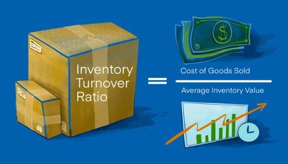
Inventory Turnover Ratio: What is Inventory Turnover? The inventory turnover ratio is that the number of times a business sold and then replaces its stock of raw materials during a certain period. It considers the *cost of Goods sold, relative to its average inventory for a year or in any given period. A high inventory turnover means goods are sold faster, and a coffee turnover rate indicates weak sales and excess inventories, which can be challenging for a business. The inventory turnover ratio can help businesses make better decisions on pricing, manufacturing, marketing, and buying. it's one of the operational efficiency ratios measuring how effectively a company uses its assets. *Cost of Goods Sold (COGS)? Cost of products sold is a reference to the immediate costs of producing the goods sold by a company. This sum includes the value of the materials and labor directly used to create the good. It excludes indirect expenses, like distribution costs and sales staff costs. Cost of products sold is also called to as the ‘cost of sales’ Formula to calculate Inventory Turnover: Average value of inventory is employed to offset seasonality effects. it's calculated by adding the value of inventory at the end of a period to the value of inventory at the end of the prior period and dividing the sum by 2 Example of a Inventory Turnover Calculation ABC For financial year 2022, ABC reported cost of sales of $429 billion and year-end inventory of $56.5 billion, up from $44.9 billion a year earlier. ABC’S inventory turnover ratio for the year was: $429 billion ÷ [($56.5 billion + $44.9 billion)/2], or about 8.5 Its days inventory equaled: (365 ÷ 8.75), or 42 days This showed that Walmart turned over its inventory every 42 days on the average during the year. KEY TAKEAWAYS 1. Inventory turnover measures how efficiently a corporation uses its inventory by dividing the cost of goods sold by the average inventory value during the period. 2. Inventory turnover ratios are only useful for comparing similar businesses, and are particularly important for retailers 3. A relatively low inventory turnover ratio may be a sign of weak sales or excess inventory, while a better ratio signals strong sales but may also indicate inadequate inventory stocking. Accounting policies, rapid changes in costs, and seasonal factors may distort inventory turnover comparisons. Limitations of Inventory Turnover Inventory turnover is merely useful for comparing similar companies because the ratio varies widely by industry. for instance , listed U.S. auto dealers turned over their inventory every 55 days on the average in 2021, compared with 23 days for publicly traded food store chains. A relatively high inventory turnover ratio might indicate insufficient stocking that is costing the company sales, while low inventory turnover could reflect bulk orders helping the corporate cut costs or preparations for a product launch, instead of inefficient inventory management. Because the inventory turnover ratio uses cost of sales or COGS in its numerator, the result depends crucially on the company’s accountancy policies and is sensitive to changes in costs. for instance, a price pool allocation to inventory might be recorded as an expense in future periods, affecting the typical value of inventory used in the inventory turnover ratio’s denominator. Meanwhile, if inventory turnover ratio increases because of discounts or closeouts, profitability and return on investment (ROI) might suffer. For retail businesses, this number is significant, because it provides necessary data that can help make good business decisions that can boost sales. Why It’s Important to live the Inventory Turnover Ratio Not calculating your business inventory turnover ratio may result in you missing valuable data that can help you enact your business plan effectively and achieve your goals. Below are varied reasons why you ought to calculate the inventory turnover ratio. Inventory turnover ratio may be a key performance indicator This is one of the most valuable importance of calculating the inventory turnover ratio in retail businesses. Being a key performance indicator, the inventory turnover ratio can facilitate you manage and grow your business effectively. It can show liquidity Do you intend to get a loan to manage your retail business? If yes, you ought to always calculate the inventory turnover ratio as it will how your business assets liquidity. this may be highly beneficial when making a loan application. It helps in making business decisions Making decisions which will benefit your business can be challenging as a business owner. While there are many indicators that you simply can use, the inventory turnover ratio is especially peculiar to retail businesses. It shows the stock level and turnover rates which makes making business decisions a simple task. With the inventory turnover ratio, you'll answer questions such as: What and the way many items do you have to order What products does one need to put on sale? Consequently, you'll purchase merchandise, and sell products that your customers want. However, had best to combine it with other indicators for maximum business growth. How To Improve Inventory Turnover Ratio If on calculating your inventory turnover ratio you discover it not in the specified range, then you would like to know how to improve it. Below are some ways to enhance the inventory turnover ratio for retail businesses.
-
The waterfall chart is a 2-Dimensional chart that is used to understand the effects of incremental positive and negative changes over time or over multiple steps or a variable. The waterfall charts are also known as Floating /Flying Bricks Charts. The waterfall chart is used in financial analysis to understand the positive and negative effects of multiple factors over a particular asset. Time based charts present the profit or loss over the time. We can use it to explain changes in statistical data, for example changes in headcount – how many new employees were hired, how many resignations or retirements your company had during the year. The Waterfall chart is common in finance, but we can use it for any variable or statistic that goes through changes which can be positive or negative. Objective of Waterfall Chart Using a waterfall chart is to visualize how an initial value is affected by a series of intermediate positive or negative values. For Example Below is the sample data for above Waterfall Chart: Below are the steps to create waterfall chart in Excel. 1. Select the data A2: B4 and go to the menu Insert > Chart. 2. From the Chart window, select the chart type Waterfall Chart 3 Below is the Waterfall chart customization options.


-
Constraint is a restriction of process like policy, people, material which does not allow us to meet customer requirement on the other hand bottleneck comes due to bad management process like a resource/process that can’t keep up with the demand placed on it
