
Topics
-
Jeff Bezos is pushing Prime Video's overhaul to highlight Amazon's AI. The project, known as Lighthouse, aims to showcase AI for millions of users. This initiative seeks to elevate Amazon's standing in the competitive AI landscape. New features will improve content recommendations and respond to spoken requests. Bezos' personal involvement underscores the strategic importance of this AI integration. View the full article
-
Advanced Micro Devices is launching new artificial intelligence hardware on Thursday. This new hardware aims to compete directly with Nvidia's offerings. AMD is targeting the growing data center inference computing market. The company also announced significant deals with AI labs Anthropic and OpenAI. These agreements position AMD for substantial future revenue in the chip sector. View the full article


Leaderboard
-
Venugopal R
Members1Points238Posts

Popular Content
Showing content with the highest reputation on 02/25/2020 in Posts
-
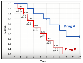
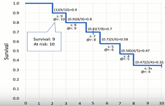
1 pointBenchmark Six Sigma Expert View by Venugopal R The Kaplan Meier chart is used to estimate the probability of survival during a medical research. For instance, let us consider that we are interested to study the effect of a particular drug for treatment of a life-threatening disease. The study based on 10 patients who were subjected to this treatment is plotted as below, which is knows as Kaplan Meier chart. The Y axis represents the probability of survival and the X axis represents time (say no. of years). As seen, at the start the probability of survival is taken as 1 (or 100%). After two years a patient dies, then the probability of survival drops to 0.9 (90 %). At the end of 3 years we have one more mortality, then we calculate the survival rate as the conditional probability of survival at the end of 3 years for patents who survived the first lap i.e. 0.9 * (8 / 9) = 0.8 (or 80%). The calculation for each step of this chart is continued. However, it may sometimes so happen that we might lose track of a patient. They are no longer available for the study and are categorized as ‘censored’ patients. It is represented by a vertical cross line; as seen during the 5th year. The censored patients are removed from the denominator while calculating the survival probability for that year and for subsequent years. In the above figure, the red graph represents the Kaplan Meier chart for another drug B for a similar exercise. If we look the median survival for both the groups, it will be: Median survival for Drug A = 7 years Median survival for Drug B = 4 years One can also compare the estimates of the survival probabilities for a give period. For instance: 3-year survival probability for Drug A = 0.80 3-year survival probability for Drug B = 0.54 In general, a steeper curve represents a worse situation. Though not discussed in detail here, it is also to be noted that there is also a confidence interval associated with each estimate, and the width of the confidence interval depends on the number of samples being studied. I hope that this brief discussion about Kaplan Meier charts provides a broad idea as to how Medical Researches would use this tool for estimating and comparing the effectiveness of treatments.
 1 point
This leaderboard is set to Kolkata/GMT+05:30