

ArvindSwarup
Lean Six Sigma Black Belt
-
Joined
-
Last visited
-
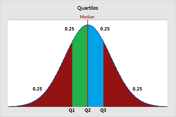
Quartiles are three values that split your dataset into quarters. The three quartiles are the top quartile (Q3), the middle quartile (Q2, also known as the median), and the bottom quartile (Q1). They are used to understand the distribution of data, identify outliers, and summarize the central tendency and spread of a dataset. Quartiles are commonly used in data analysis, visualization, and identifying data points that fall outside the typical range. The bottom quartile, Q1, is the 25th percentile of a dataset. It represents the data point below which 25% of the data falls. Example a dataset of QA scores for 100 agents. If Q1 is 60, it means that 25% of the agents scored below 60 QA score in quality/call monitoring. The middle quartile, Q2, is the 50th percentile of a dataset, also known as the median. It represents the midpoint of the data, where half of the values are above, and half are below. Example in same dataset of QA Scores of 100 agents if Q2 (median) is 75, it means that 50% of the agents scored below 75 QA score, and 50% scored above 75 QA score. The top quartile, Q3, is the 75th percentile of a dataset. It represents the data point below which 75% of the data falls. Example In the QA score dataset, if Q3 is 90, it means that 75% of the agents scored below 90 in call monitoring. Also, in typical call center scenario audit sampling targets are determined based on qualities. For example, the agents falling in bottom quartile for their QA scores will have higher audit samples (3-4 audits per agent/ per week) as compared to the mid & bottom performers (1-2 audits per agent/ per week)
-
The Standard Deviation (overall) would take all data points of the entire month and calculate one number as an output. It is calculated by considering all data points in the dataset, without regard to any specific subgroups or categories. The Standard Deviation (within) will calculate the standard deviation of each subgroup (the samples collected on the same day) and compare them with each other. Also, "Within" standard deviation is the standard deviation calculated without including 'special cause' variation in the calculation. This provides a significantly lower value in this case. Now, let's consider whether there could be a scenario where within standard deviation is greater than the overall standard deviation. Yes, this is possible, and it typically occurs when there is significant variation between the subgroups or categories in the data. Example: Let's say you are monitoring the daily production of a manufacturing plant over a month, and you collect data on the number of defective products produced each day. You have two production lines (Line A and Line in your plant. • Overall Standard Deviation: If you calculate the overall standard deviation for the entire month's data (combining data from both lines), it will give you a measure of the total variability in the production process. • Within Standard Deviation: However, if you calculate the within standard deviation separately for Line A and Line B, you might find that Line B has a much higher within standard deviation than Line A. This means that Line B has more variability or inconsistency in its daily production compared to Line A. In this scenario, the within standard deviation for Line B is greater than the overall standard deviation for the entire plant because Line B's production process is less stable and exhibits more variation within its daily output.
-
Control Chart is a graph used to study how a process changes over time with data plotted in time order. Both C & U charts are used to showcase attribute data to check the stability of a single unit, which might have one or more defects. The main distinguishing factor between the two is that the C chart is used when the sample size is fixed, and the U chart is used if the sample size is not fixed. They also work as a health checkup for the process and enables us to take necessary preventive action for causes that make a process unstable or out of control. The Laney U' chart is like a traditional U chart however it is more accurate in identifying the variation between common & special cause. Example in manufacturing number if defects per batch is monitored but the sample size varies because some batches are bigger than others. Using U chart with constant control limit will not reflect the process performance accurately, as the sample sizes affect the variability. In this case, the Laney U' chart would be appropriate. It would adjust the control limits based on the varying sample sizes, providing a more accurate indication of process stability and allowing for effective monitoring and control
-
ArvindSwarup changed their profile photo
-
Problem tree is somehow similar to creating mind maps to identify the root cause as well as the downstream effect of a problem in a more structured way. There are a few key rules we should consider to make a decision tree to drill down from CTQ to project big Y. First step is to define the Goal and the to add potential decisions and outcomes. Similar to how you create a Ishikawa diagram using 5 why approach. Once you have the CTQ well defined then you can prioritize the causes/outcomes to act upon. For a black belt to decide when to stop and finalize the Project Y depends on several factors, including the project scope, resources available, and the desired level of improvement. Basically his role is to check & ensure that project Y is aligned to defined goals and we are utilizing all possible resources as per the agreed/defines timelines. Also to track & evaluate the effectiveness of improvement efforts though metrics/kpi’s. If there is any deviation observed by the black belt in any of the above listed factors the project can be stopped or finalized.
-
IMR chart is better because it displays observations and moving ranges for continuous data over a period while Z-MR will be used to monitor the process variation for individual units assuming that measurement scale is consistent and does not consider the disparity. Therefore, the I-MR control chart is more suitable in this case as it allows for the monitoring of individual delivery times, accommodating the variability between different orders.
