
Sriya Chatterjee
Members
-
Joined
-
Last visited
Everything posted by Sriya Chatterjee
-
Sriya Chatterjee replied to Vishwadeep Khatri's topic in We ask and you answer! The best answer wins!Process Entitlement is the best possible performance that a process can attain given its current design and structure, without any major adjustment. It shows the maximum that a process can actually deliver with its current capabilities. Calculation Methods For Process Entitlement 1. Historical Best Performance We can refer the historical data and select the best performance the process has delivered by calculating the mean or median of the periodic parameter. 2. Engineering And Scientific Methods : We can use theoretical engineering and scientific principles to arrive at a theoretical best performance . As this is an ideal circumstance we are considering , considering variations that may actually happen is crucial before we arrive at the theoretical best performance. 3. Equipment Capacity Refer the best performance specified by the manufacturer of the equipment or machine being used while considering the real world limitations like operator skill , maintenance and other factors that have been observed before. 4. Benchmarking We may refer to similar processes in other organizations or industries to arrive at the Process Entitlement. 5. Statistical Analysis We may use suitable statistical methods to arrive at the Process Entitlement. How Does It Help In Process Improvement 1. Deciding Achievable Target It helps us to set practical goals in six sigma green or black belt projects so that the chances of achieving the goal is very high. 2. Highlighting Areas Of Improvement It highlights the gap between the current performance level of a process and the target performance level, resultantly highlighting the processes that need improvement the most urgently. 3. Deciding the importance of improvement initiatives Process Entitlement helps us to decide which are the lowest hanging fruits , which improvements will impact the bigger picture the most. 4. Measuring Progress As soon as we start implementing measures for process improvement, Process Entitlement helps us to keep an eye on the delta between the current and target performance levels. Hence, we can keep track of the progress being made. 5. Keeping Wasteful Investments At Bay It helps us invest resources proportionate to a process' current performance level. This way we can currently strategize how much , using which methods and when a resource must be invested in a process to effectively achieve improvement in the bigger picture.
-
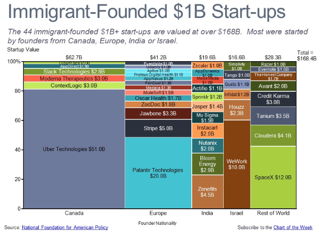
Sriya Chatterjee replied to Vishwadeep Khatri's topic in We ask and you answer! The best answer wins!A Marimekko chart, also known as a mosaic plot or Mekko chart, is a visual representation of categorical data with two or more dimensions. It uses stacked bars of varying widths and heights to depict both proportions within categories and total category contributions. Imagine a Venn diagram where each segment expands and shrinks based on its share. Advantages: Multidimensional insights: Shows relationships between two or more variables simultaneously, revealing nuances hidden in simpler visuals. Flexibility: Handles diverse data types, from percentages to counts, and accommodates various color palettes for effective communication. Comparative power: Identifies outliers and pinpoints dominant categories effectively, highlighting variations within and across dimensions. Engaging presentation: Visually appealing due to its unique layout and color variations, captivating the audience's attention. Disadvantages: 1. Can turn crowded easily and hence, become difficult to interpret. 2. It's usually good for two-dimensional comparisons. 3. Small variations in percentages might get interpreted into visually important changes in bar sizes, potentially misguiding us. 4. Creating this chart usually needs specialized software, making them less accessible. Examples where it can be used in a Six Sigma projects : 1. For visualizing defect types and their distribution across product lines, production stages, or shift times. 2. For showing the contribution of various process steps to the overall variance. 3. Analyze client satisfaction or purchase behavior across demographics, product categories, or regions. 4. For comparing the result or impact and feasibility of different improvement projects based on cost, lead time, and potential benefit.

-
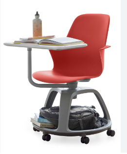
Sriya Chatterjee replied to Vishwadeep Khatri's topic in We ask and you answer! The best answer wins!Provotyping , in Design Thinking, can be split into two terms , that is, Provocation and Prototyping. The traditional Prototyping approach to Testing any new product includes just using it in a very limited variety of environments with very limited scope for user interaction and resultant feedback. Provotyping, on the other hand, includes testing a new idea ( under development) in different permutation and combinations of environments such that it has ample scope of interaction with users in all these environments. This approach of testing a new idea results into an extremely smooth flow of user feedback from the entities the product ( or idea ) interacted with. These feedbacks and the resultant continual improvements done on the idea or product lead to the creation of extremely innovative products that are capable of providing the solution to extremely complicated problems. Let's try to understand this process using the example of the Node Ideo Chair. Traditional chairs and desks used in educational institutes and corporates are designed with zero flexibility. The seats or chairs we are specially focusing on are the single seaters that have a desk attached to one of the arm rests for either writing or keeping a laptop. Prototype approach : 1. The designer or innovator modifies the traditional chair in order to provide solution to seating requirements of a very small population. Following are the requirements received from this population : a. The chair should have a desk like plank to write on. b. The chair should have a place for a back back or bag c. The chair should swivel d. The chair should support ergonomic seating posture. 2. The designers produce 2 products : a. One chair supports ergonomic seating and can swivel b. Another chair has a desk attached at an extremely uncomfortable angle and has a place for a bag. 2. He tests the sample in the same or similar population sample (extremely limited). 3. After achieving success at these tests the product is mass manufactured and sold across the global market. Provotyping Approach : 1. The designing team collects the seating requirements of a huge population sample including school and private coaching class students, college students and employees from multiple industries. Following are the requirements received : a. The chair should have a desk like plank to write on. The desk like structure must be adjustable at various ergonomic angles. Its height must also be adjustable. b. The chair should have a secure place for a back back or bag such that it does not disturb anyone seated in the chairs around. It should also have a place for a bottle or a cup. c. The chair must swivel and must have wheels to change its position dynamically. d. The chair should support ergonomic seating posture. 2. The designers produce incomplete versions using card boards and thermocol sheets and test it at many organizations , schools and universities. 3. With every set of feedback from this large and extremely diverse population sample the designer team continually improves the design of this product. 3. The final product is the Node Ideo Chair which has the following features : a. It had 4 wheels for dynamically changing its position with the changing requirement of the users. b. It has a cage like secure space for bags and back packs between the 4 wheels and the actual seat . This arrangement makes sure that the bag neither disturbs anyone nor is disturbed by a passer by. c. The seat swivels. d. One adjustable ( both height and angle ) desk is attached to an arm rest. e. Underneath this desk is a place for a bottle or a cup. f. The Node Chair is made up of such material that is affordable. Hence, using Provotyping approach the complicated seating requirements of such a large number of people could be provided in one single product .
-
Sriya Chatterjee replied to Vishwadeep Khatri's topic in We ask and you answer! The best answer wins!For a credible project manager one of the most significant pre-requisite skills is the capability to proactively assess all the possible reasons for the projects' failure and their possible mitigation plans. This is what Project Pre-mortem is all about. Procedure For Performing a Project Pre-mortem 1. All the members of the project team, on the basis of their experience and subject knowledge, visualize and document all the possible scenarios where wastage of time or money or resources may occur. 2. The team will next document all the possible contributors to such problems. 3. The team will now document in details all the possible execution modes to either avoid these problems or to contain the damage. Benefits Of Project Pre-mortem 1. It promotes team work . 2. The chances of success of the projects increase manifold. 3. The entire team is well prepared to take corrective course of action in case any of the documented failure scenarios appear. 4. This mode of team work leads to a very productive and motivating manner of knowledge sharing. Disadvantages Of Project Pre-mortem 1. The team members may tend to concentrate on failure scenarios that they are familiar with, unknowingly giving less to no importance to rather unfamiliar scenarios. This may reduce the project's chances of success. Solution : People from diverse professional backgrounds must be included in this exercise and a smooth and positive exchange of knowledge and experience must be extensively encouraged amongst all the participants. 2. Excessive premortem can result into overthinking and hence, delays in project timeline. Solution : Focusing this brainstorming exercise more on the solutions than the problems can help avoid such a paralysis by analysis. Additionally, the target and timeline of this exercise must be perfectly clear and effectively communicated to the participants beforehand. 3. The participants of this exercise may not take it seriously enough, exposing the project to risks anyway. Solution : The initiator of this exercise must effectively communicate proactively all its benefits and that it is an exceptional learning opportunity for them. Approaching a Project Premortem in the above explained way can increase the chances of a project's success drastically.
-
Sriya Chatterjee replied to Vishwadeep Khatri's topic in We ask and you answer! The best answer wins!The journey of design thinking starts with empathy. It means that a design thinker must first be capable of effortlessly understanding the perspective of the end user completely in order to realize what are his/her needs that are truly not being met with. The concept of design thinking is such that as a design thinker , trying to come up with the solution to a problem, does not necessarily need to have any or much experience in the field of profession the problem belongs to. The thinker has to simply follow 5 steps , that is, AEIOU. A stands for Activities and helps the design thinker explore the range of behaviour that is being exhibited by the stakeholder. E stands for Environment, that is, the intricate details of the ecosystem with which the user is interacting with respect to the problem under observation. I stands for Interaction and helps the design thinker to focus on how the stakeholder is actually reacting to all the events occurring in the given environment. O stands for Objects and helps the design thinker narrow down on the items that the stakeholder is actually associating itself with. U stands for Users and helps the design thinker to conclude who the actual stakeholders in this ecosystem are. AEIOU supports design thinkers magnificently by enabling them to consistently concentrate on the needs of the user that are not being provided by anyone else. It is especially quintessential when a design thinker is trying to provide solution to an exceptionally complicated problem through the collection and analysis of data in a systematic manner. It supports the design thinker to absorb each element in the problem environment entirely. And finally , it acts as a strong catalyst to creative , out of the box and innovative solutions to problem. An example : Raymond Damadian invented magnetic resonance imaging (MRI) in 1977. Immediately after it was implemented in hospitals on a large scale he made a trip to one of the biggest hospitals to collect Customer Feedback about the machine. A silent spectator to the full body scan of a 13 year old girl, he observed, from the MRI machine specialist room , how nervous and terrified the child was as soon as she arrived at the MRI room. Her parents persistently tried their best to calm her down and prepare her for the scan. She finally volunteered for the scan but half way through the scan had to be stopped as the child could not take it anymore. The MRI specialist had to give her anesthesia in order to complete the procedure. On further research Raymond Damadian learnt that most kids are given anesthesia either in the beginning of or half way through the scan in order to complete the procedure. This was a huge problem for Raymond as a brilliant and potentially life saving machine was giving patients nightmares. So he performed AEIOU as explained below: Activity is the full body scan that patients direly need for the diagnosis of the significant health conditions they have. Environment is the MRI machine into which patients must enter and stay in a static position for an hour for the scan to be successful. Interaction is the fear and paranoia that claustrophobic and / or young patients experience during the scan due to the internal ambience of the machine. Objects are the loud thundering sounds that the machine produces and the frequent violent jerks that are felt by the patient during the scanning procedure. Users are patients who direly need to go through a full body scan but want avoid it at any cost. The result of this exercise was a MRI machine that had a larger internal diameter and looked like a pirate ship , into which young patients must enter and go on an adventure for an hour. From the moment a patient would arrive at the MRI room an audio would begin playing, welcoming the patient and addressing it as a dangerous pirate that is going to begin its journey in the violent sea. As the patient would lie down and gradually enter into the machine, the audio would play sounds of lightening and thunder, covering the loud sounds and jerks of the machine. At the end of the scan patients would come out of the machine extremely happy and excited about the experience they just had and looking forward to the next scan. This brilliantly creative and out of the box solution to the users problem was a result of Design Thinking, resulting into extremely happy patients who would no more feel terrified or need anesthesia to complete a full body scan.
-
Sriya Chatterjee replied to Vishwadeep Khatri's topic in We ask and you answer! The best answer wins!The factor that contributes to the professional credibility of any project lead the most is being able to complete the project on time. Critical Path Method (CTM) is the technique that assists project leads to calculate the timeline and completion date of projects with a high degree of accuracy. Achieving 100% accuracy in this calculation is usually very challenging since various factors , out of the project leads' control, may appear in the project ecosystem. Examples of factors that are usually out of the project leads' control are : (1) important project execution leads may quit their jobs in the middle of the timeline, (2) delay in talent acquisition , especially, when the skills required for the role are very niche (3) unforeseen budget constraints in the same or other departments may adversely impact the ongoing projects, (4) unforeseen cases of major process breach in the same or other departments may impact the project timeline adversely. These factors may induce delays in the project timeline to various degrees but if , while deciding the project schedule, the project leads include an appropriate degree of flexibility in the timeline then there is high chance of the projects completing on time. This is where 'Float' comes into picture. There are 2 kinds of floats : (1) Free Float (FF) : The maximum amount of time an activity can be delayed without impacting the early start time of any of its dependent activities. (2) Total Float (TF): The maximum amount of time an activity can be delayed without impacting the project's completion date. In order to conclude the float, project leads must first decide the early start (ES) and late start (LS) times for every activity. ES is the earliest possible time an activity may begin, while LS is the latest time an activity may begin without delaying the project. Free Float (FF) for any task , FF = LS - ES - Duration of the task Total Float (TF) for any task , TF = LFT - EFT - Duration of the task Following are the ways in which project leads may use float in project timeline optimization : (1) Find out non-critical tasks : if the float of a tasks turns out to be fairly high then it is not critical. In other words, for such tasks the project lead may include enough flexibility in deciding the timeline so that the focus is more on critical tasks. (2)Assigning resources to high priority tasks : project leads may assign high priority resources to more critical tasks that have less flexibility while lower priority resources to less critical tasks that have high degree of float. (3) Handling delays that are unpredictable : delays that are unpredictable can be diverted to tasks that have higher flexibility or float . This way the more critical tasks can be executed on time. This helps the project leads to make sure that the project can be delivered on time. (4) Adjust scope changes : float can help project leads to handle small scope adjustments well. The small delays caused by these scope adjustments can be absorbed by the less critical high flexibility activities. Thus, the small delays do not permeate into the final closure of the project , helping project leads to finish projects on time. (5) Negotiating delays with external stakeholders : Float assists project leads to position themselves better when negotiating delays in tasks to be performed by external entities like suppliers or service providers. This helps the leads to make sure that the closure of critical tasks with little to no flexibility are unaffected and so is the completion of the project. Let's look at an example to understand all these factors in a practical scenario : Project ABC has 5 activities : A (2 days ) , B (5 days) , C (6 days) , D (3 days) , E (2 days). Task A is dependent on task B Task B is dependent on task C Task C is dependent on task D Task D is dependent on task E. We calculate the float and find out that tasks A , B & C have no float while tasks D & E have it. This means that the project lead must make sure that tasks A, B & C must be completed with strict adherence to the decided timeline while any delay caused by any factor can be absorbed by tasks D & E for the project to be completed on time.
-
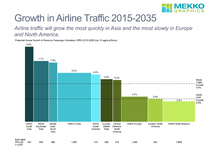
Sriya Chatterjee replied to Vishwadeep Khatri's topic in We ask and you answer! The best answer wins!Let us please get acquainted with the Pareto Chart first. Lean Six Sigma practitioners use this bar chart often to concentrate on the most important parameters that contribute to a problem. It assists us to arrange all the improvement projects we may be currently considering to execute in the decreasing order of their importance and as we execute these projects, it assists us to consistently monitor the progress we make. Let us now understand a little bit about the presentation of the chart. The bars in this chart are always arranged in decreasing order of magnitude such that the tallest bar highlights the parameters that have the highest priority. The total percentage of the effect is plotted as a line as well , enabling us to gain knowledge about the percentage of contribution of each effect to the total effect. Commonly, practitioners call the practical demonstration of this chart as Pareto Principle or Rule. It is called a principle or rule since it has been so widely observed in all spheres of life that is almost seen as a phenomenon. The phenomenon we are talking about is that approximately 80% of effects in a scenario are resultant from 20% of the causes. Hence, Pareto Principle is commonly also called the 80/20 Principle or Rule.
-
Sriya Chatterjee replied to Vishwadeep Khatri's topic in We ask and you answer! The best answer wins!Quartile measures the location of data in Descriptive Statistics and a modified form of Percentile. To calculate it we must first arrange data in increasing order. We must first understand Median if we want to comprehend Quartile better. Median can be perceived as the middle value of a data set or a number that segregates the ordered data into 2 equal halves. This means that half the values are the same or smaller than the median and the other half are either equal or larger. Let us look at the following set of observations: 1 ; 11.5 ; 6 ; 7.2 ; 4 ; 8 ; 9 ; 10 ; 6.8 ; 8.3 ; 2 ; 2 ; 10 ; 1 Let us 1st arrange it in ascending order: 1 ; 1 ; 2 ; 2 ; 4 ; 6 ; 6.8 ; 7.2 ; 8 ; 8.3 ; 9 ; 10 ; 10 ; 11.5 Since the data has 14 observations, the median will be between the 7th and the 8th values, that is, between 6.8 and 7.2 . The formula for median calculation = (6.8+7.2)/2 = 7. This means that half of the observations are equal to or larger than 7 while the other half equal or smaller. Quartiles segregate the data into quarters. The 1st Quartile, Q1, is the middle observation of the lower half of the data and the 3rd Quartile is the middle observation of the upper half of the data. Let’s consider the same data set to explain the same : 1 ; 1 ; 2 ; 2 ; 4 ; 6 ; 6.8 ; 7.2 ; 8 ; 8.3 ; 9 ; 10 ; 10 ; 11.5 As the median or the 2nd Quartile is 7, the lower half of the data are : 1 ; 1 ; 2 ; 2 ; 4 ; 6 ; 6.8 The middle value of the lower half of 2 and hence, it is the 1st Quartile which means that 1/4th of the entire set of observations is either equal to or less than 2 and that 3/4th of the set of observations is larger than 2. The Quartile score of the value 2 is also 25% which means that 25% of the entire set of observations is equal to less than 2. In other words, Quartile score is a percentile rank and it is used to compare the performance of a data point to the rest of the data set. The upper half of the set of operations is : 7.2 ; 8 ; 8.3 ; 9 ; 10 ; 10 ; 11.5 The 3rd Quartile, Q3, is 9. This means that the Quartile Score of 9 is 75%. In other words, 75% of the entire set of observations is less than 9.
-
Sriya Chatterjee replied to Vishwadeep Khatri's topic in We ask and you answer! The best answer wins!Overall Equipment Effectiveness is an industry best practice metric which calculates the percentage of planned production time that is actually productive. An OEE score of 100% indicates Perfect Production, that is, producing only OK units, as quickly as possible, with zero downtime. OEE = Availability * Performance * Quality Where Availability considers all the reasons that disrupt planned production for a considerable period of time ( at least for a few minutes ) such that it needs to be tracked. Performance considers every reason as a result of which a process has less than maximum Throughput. Quality takes into considerations any reason as a result of which the product does not meets its expected Quality Standards including Rework. OEE’s paradigm resembles First Time Yield such that it defines a Good Part as one that successfully passes through the production the 1st time without any rework. Quality is calculated as Quality = Good Count / Total Count OEE is measured using actual data from the ground operations and is capable of helping middle and top management take business decisions provided the data is correct and hence, calculations reflect the true picture. Individuals using OEE must always remember that there are several possible pitfalls that can lead to miscalculated OEE value and following are the ways in which Quality can contribute to mis-calculated OEE : 1. Manual ways of data gathering may lead to insufficient data and poor quality results. Employees who are responsible to gather data may miss some readings, overlook important events during manufacturing or even go to the extent of deliberately manipulating data for various reasons. Such reasons can lead to the Quality score to look great whereas they are not so good in reality. 2. If the quality of parts is checked visually by an employee then there is a very good chance of the following: a. He/ she may have impaired vision and hence misses to notice that some parts are Bad. b. He/she may be not be experienced or trained sufficiently to recognize all the Quality Failures that must be considered for calculating OEE. c. He/ she may manipulate the data to hide his/her or a senior’s mistakes. d. He/she may not have been educated about the motive behind the data gathering and hence, may take the activity of data gathering way too lightly. 3. If the quality of parts are checked using a standard measuring tool, for example, a Vernier Calliper, then the following reasons may cause wrong data and hence mis-calculation of OEE: a. The employee fails to notice that the tool is not correctly adjusted b. The employee is not trained to use the tool correctly 4. If the middle or top management of the organization are not coached sufficiently about the goal and benefits of gathering data for OEE calculation then there is a high probability that the he/she may decide to relax the First Time Right rule so that more parts are OK and the manager’s personal KPI look good. It is the leadership’s responsibility to make sure that every step is taken to align the entire team with the purpose of tracking OEE such that the data is always correct and reflects the ground reality along with highlighting the opportunities for improvement.
-
Sriya Chatterjee replied to Vishwadeep Khatri's topic in We ask and you answer! The best answer wins!Overall Equipment Effectiveness is an industry best practice metric which calculates the percentage of planned production time that is actually productive. An OEE score of 100% indicates Perfect Production, that is, producing only OK units , as quickly as possible, with zero downtime. OEE = ((Good Count * Ideal Cycle Time) / Planned Production Time where (a) Good Count = units that are produced without defect (b) Ideal Cycle Time = the ideal minimum possible time required to produce one unit (c ) Planned Production Time = the cumulative time that the production asset is scheduled for production (d) Fully Productive Time = the cumulative time that an assembly line or machine spends producing only good parts, as fast as possible, with zero stop time. OEE explains wastes in a manufacturing process very efficiently by breaking it down into three components : (1) Availability Loss (2) Performance Loss and (3) Quality Loss Availability Loss considers all those events that stop planned production for an appreciable period of time ( usually, spanning from a few minutes or longer ) . It includes Unplanned Stops ( for example, Equipment Failure and Material Shortage ) and planned stops (for example, Changeover Time ). Availability is calculated as the ratio of Run Time to Planned Production Time , where Run Time is simply Planned Production Time minus Stop Time. Availability = Run Time / Planned Production Time Where Run Time = Planned Production Time – Stop Time Machinery age, maintenance practice (planned shutdowns) and holidays impact availability. A production process can be more automated at one facility than another. Organizations must comprehend where the maximum value of a metric is : measuring performance at a unit level or site level. Some companies have rules which stipulate prolonged downtime to be classified as ‘planned ‘, which means that ‘unplanned downtime’ can get masked so that the OEE is not impacted. OEE represents the average performance but does not necessarily tell the whole story. If the OEE goes up by X % in a quarter, then it can be a result of new system implementation or a different method of measuring data. An organization needs to observe what happens in 6 months.