Venkateswaran K
Members
-
Joined
-
Last visited
-
Venkateswaran K replied to Vishwadeep Khatri's topic in We ask and you answer! The best answer wins!1 variance test is used to compare variance of sample to a known population, with the assumption that sample is drawn from a normally distributed population. This analyses the difference between an observed process std deviation and a specified std deviation. It determines whether the population variance differs from hypothesized value specified in the test Example 1: Let us take a Timber company ships its high quality products through sea to high priced markets of European countries. The quality analyst at the receiving country wants to determine whether the variance of the moisture content in the shipment Has increased from that of the specified value. If the variance is greater than maximum acceptable variance , analyst uses the confidence interval to determine how is the difference and whether this difference has practical significance. A test of single variance can be left tailed or Right tailed. Here in this case Let us assume if the moisture content variance specified is 0.1 gm/cc, it means our Null hypothesis is the population variance = specified variance and Alternate hypothesis is that population variance should be less than specified . Here the word “Less” indicates that it is left tailed test. Example 2: If the doctor wants to know the variation of Diastolic (low) Blood pressure levels in patients is more than 60mm /hg. In this case the word “more” indicates that it is right tailed test. The following Data considerations need to be satisfied when applying the chi – square test: 1> The sample must be randomly drawn from the population 2>The data needs to be ensured for normal distribution 3> Each observation should be independent from all other observations. How to derive the Test statistic for 1 variance? is given below:

-
Venkateswaran K replied to Vishwadeep Khatri's topic in We ask and you answer! The best answer wins!Mixed method Design refers to a design which supports interpretation of an independent variable between subjects and within subjects. The factorial design in which one or more predictors has been manipulated using different participants ( or entities) and one or more predictors has been manipulated using same participants. The within factors in a mixed design add statistical power while the between factors help to rule out threats to internal validity In a factorial design , levels are set completely independent of each other. The factors could be speed, Temperature etc., In a mixture design instead of factors we have ingredients. The method that combines or mixes qualitative & quantitative research in single study. Mixture experiments are special type of response experiments ,in which there is a blend of ingredients ,that produces more optimal response. Example 1- if there is a need to optimize tensile strength of stainless steel, the factors of interest might be proportions of iron, copper, Nickel and chromium in the alloy. The key benefit is provides precise information , when the response changes as a function of relative proportions of the components. However all components must be entered in the same units of the measure and each run must sum to same total Advantage is that the independent factor is the ingredient proportion itself and hence reliability of the design is high. Example 2: A researcher on mindfulness activities – to know the influence of how different types of music helps for relaxation. Participants can be divided to a control group( with no listening to music) & 2 experimental groups (one listening to classical music and one listening to Rock music). Example 3: Mobile phone use by a group of participants can be a within-subject factor , by testing the same participants both while using a mobile phone and while not using it. This is required for targeted digital marketing to focus & select which content for which user
-
Venkateswaran K replied to Vishwadeep Khatri's topic in We ask and you answer! The best answer wins!Johnson Transformation is used in Hypothesis testing/ analysis in the following scenario: When you need to run a statistical hypothesis test to determine if the means of the two processes are the same & if the data are not normally distributed , whereas you need a normally distributed data to perform the test. For the calculation of CpK – transforming non- normal data into a normal distribution requires either Box-cox or the Johnson Transformation. This transformation is performed to apply certain statistical tools.so after transformation, for interpreting and making decisions ,interpreting the original data( by back tracking ) and presenting to audience is better than interpreting the transformed data itself. Conditions where Johnson’s Transformation will be preferred are: 1> when data contains any value including negative values and zero.( Boxcox cannot be used here). 2> when Box Cox algorithm does not define appropriateness towards transformation 3> when the transformed data need to preserve many of the features of original skewed distribution such as range & mode. 4>when non - parametric tests comparing median for a non -normal distribution may not be useful for statistical significance, it needs to use parametric tests with mean comparison for which data has to be normal. And to achieve this normality , there is a necessity to transform data using Johnson or Box cox . In a Hypothesis testing , p value that we enter defines significance level of a normality test before & after transformation. usually Anderson – darling test is performed for normality check. A higher value of p makes the criteria for normality more rigorous. A lower value makes criteria for normality less. Limitations of Johnson Transformation: It would be confusing to interpret when we use the transformed data into a control chart. Since the original data is taken to the power of Lamda while doing the transformation , it cannot be on the same scale or units as the original data. So most of the cases Boxcox plot itself would be adequate to perform than a Johnson transformation. Because johnson more powerfully transforms the original data. In some other cases , the usage of non – parametric statistical tools such as median can be more effective than going for transformation. Example Turn around time of trucks bringing parts from suppliers to OEMs for vehicle assembly is non- normal. In this case when you try to transform the data and plot on a control chart to monitor the variability , it has no meaning because already the data is transformed. Hence transforming data shall be used as a last option , if the statistical analysis you want to perform has normality as an underlying assumption .It depends on the statistical significance of the test to perform. One such case of calcium content across various oceans is non- normal distribution which needs Johnson transformation as some of the values can be zero as well. Using Minitab for Johnson Transformation and interpreting the normality before vs after based on p value :

-
Venkateswaran K replied to Vishwadeep Khatri's topic in We ask and you answer! The best answer wins!Accountability diagram shows Functions and their primary roles, whereas , Organization charts can show reporting relationships & hierarchy A traditional org chart cannot provide the level of detail for the accountability , in a large organization. An accountability chart reduces confusion and defines expectation from each member in the department/organization so that decisions can be made quickly and no ambiguity or delay. The key difference you can find vs org chart is that : The interesting difference you would find in an accountability chart is flat hierarchy & on other side an org chart have power & position of the corporate ladder as prominent display. Accountability chart is more useful in case of driving cross functional six sigma and transformation projects, rather than traditional structure. In a org chart ,one can see the names first and then below their names responsibilities would be detailed. But in an Accountability chart , Roles of the function would be detailed and under each role – whoever is accountable for that role , the names would be displayed .The more beneficial is accountability style of work Example as below: To build an accountability chart – 3 questions need to be answered as below: 1> what needs to be get done? 2> who will do it ?and 3> How does accountability flow to ensure things get done? Difference Between Org chart & Accountability chart: How to get through the stages of Team formation in these approaches: As we all know the 4 stages of Team formation : Forming ,storming, norming & performing ,- Let us see how accountability charts help us to get through these stages effectively : Let us take scenario - a traditional org of software development, with Debugger reports to software maintenance HOD. 1>The traditional org chart headed by a person with position & power – every time need to go Top down to get Debugger support . Forming a team for resolving an issue gets delayed. where as Accountability is driven by CFT leader in Acct chart 2> Storming - The decision taken in a cross functional meeting needs approval from maint HOD every time ( Debugger has no power or limited authority to take decisions).But in accountability style member has authority & power to vote on decisions 3>Norming – The prioritization for the Budgets required for the solutions need to be in line with maint dept control. But in an accountability style , CFT leader can authorize using the ROI/NPV method to take forward as per priority to resolve the issue. 4> Performing – The Evaluation of the CFT project metrics such as cost saved can be shown credit to a single dept , due to use of power & position in a traditional org style, where as Accountability style helps in reaching a consensus towards common goal.


-
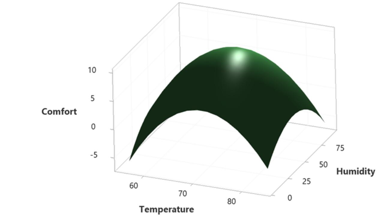
Venkateswaran K replied to Vishwadeep Khatri's topic in We ask and you answer! The best answer wins!Response Surface Methodology, RSM (also known as Response Surface Modeling) is a technique to optimize the response(s) when two or more quantitative factors are involved. Response surface methodology optimizes set points of factorial variables such that responses reaches desired maximum or minimum value . The dependent variables are known as responses, and the independent variables or factors are primarily known as the predictor variables in response surface methodology. Example – if one wants to install an HVAC system in a hill station resort ,he need to estimate efficiency of the room. This is done by recording different temperatures on different season ,and volume of the room. Benefit of applying RSM here is improving the energy consumption & there by reducing the energy cost of the resort. Finding a range of temperature to operate is better , instead of operating at a particular point. Moreover, keeping very cool in summer or very hot in winter would be very wasteful. Response Surface Methodology, RSM, is very useful to optimize variables/factors more practically as compared to just the statistical significance test for a particular point. How can we apply this here in this practical scenario of finding the optimum ambience as “Improve” phase is below case : The below illustration shows, Human comfort is measured on a scale between 0 to 10 in a hill station resort, where 10 is the most comfortable. When does the human feel most comfortable ?.This improvement project should be taken by the resort to see optimal usage of their equipments and save energy in line with " NET ZERO" vision because resort is situated in a environment regulated country & zone.They have to comply to stringent norms. To fulfill The main criteria here is resort wants to be “NET ZERO “ as their vision on carbon consumption by 2027, they have taken a six sigma project and they can deploy their countermeasures in Improve phase using RSM. To take different experimental trials to optimize humidity and temperature for the best comfort, for which the response surface is used as shown. Response surface model used for finding the comfort level improvement of Humans vs Humidity & temperature combinations.

-
Venkateswaran K replied to Vishwadeep Khatri's topic in We ask and you answer! The best answer wins!Robust Design means a product design made to with stand any future variations in usage environment. Robust Design can be categorized as concept design ,parameter design and tolerance design. Taguchi’s Robust design defines a parameter in a band that “noise “ does not cause failure . Example of Robust design are the products not having impact due to variation caused by production environment. ”Green Design” that takes into consideration sustainability of resources for future generations is an excellent example. Sustainable design that used sustainable resources socially, economically & environmentally. Robust Design improves fundamental function offering flexibility in engineering by considering noise factors such as environmental variation due to product’s usage, manufacturing variation and component deterioration. A survey conducted by ITT industries indicates that design influences around 70% of the product’s life cycle cost. The product development effectiveness can be increased by Robust design using value engineering. By addressing variation reduction in a specific stage of a product/process design , one can prevent the downstream failures. 4 steps followed in Robust parameter design are 1>Problem Formulation,2>Data collection , simulation 3>Factor Effects Analysis, 4> prediction confirmation. Below is example of a Robust design strategy during a product manufacturing. Differential amplifier used in coin telephones has the problem of excessive offset voltage due to manufacturing variability. High offset voltage causes poor voice quality , To minimize the field problems Robustness was adopted during mfg., The nominal values of the critical parameters was set such that circuit’s function becomes insensitive to manufacturing variation. Robustness strategy uses following tools – P Diagram, Ideal Function , Quadratic Loss Function , Signal to Noise ration and orthogonal arrays. An Image of the Green Design which utilizes sustainable resources and inputs to give a sustainable output of the product design is nothing but facial creams made of natural and ayurvedic herbs grown in farms. Here instead of using chemicals , By using a farm grown input and natural resources , we are doing a sustainable business without harming environment.
-
Venkateswaran K replied to Vishwadeep Khatri's topic in We ask and you answer! The best answer wins!Top Down is most suitable for Six sigma Implementation & Bottom up is most suitable for LEAN Implementation. However an activity cannot be fully approached by either Top down or Bottom up. In this Agile and dynamic fast paced environment, It requires some mixed approach. In the examples given below as you can refer - green shaded portion shows 70% contribution and yellow shaded portion shows 30 % contribution .

-
Venkateswaran K replied to Vishwadeep Khatri's topic in We ask and you answer! The best answer wins!Plackett –Burrman design is used to find out which factors are important in an experiment /DOE. There by ,we can avoid collecting large amounts of data on unimportant factors. It can only be used for experiments that are multiples of 4,with 8 as starting point(N=8,12,16,20,24,28,32,26). So 4,5,6 or 7 factors would require 8 experimental runs & 8,9,10 or 11 factors ,would require 12 runs. For example, If we 16 factors in a design – just around 20 runs may be sufficient in a Placket Burman. However full factorial would require more than 100 . working with such few data points we can neither predict effects , so it shall be used only as starting point for further experiments. After identifying those important factors , later full factorial can be done. Hence this Plackett- Burman design would save lot of time and resources in R&D applications and in Pharma research formula combinations. This design identifies most important factors early in experimentation phase. Resolution 3, two level designs with main effects heavily confounded with 2 factor . Advantages of Plackett – Burrman Design: 1>More number of factors can be studied with limited number of runs.99 factors can be studied with just 100 runs 2>Main effects have complicated relationships with 2 factor interactions. 3>This allows screening of main factors for more number of Process variables – thus avoiding time and resources. Disadvantages of Plackett – Burrman Design: 1>Each main effect is partially aliased with every 2 – way interaction not involving that main effect. 2>This degrades to accurately estimate true underlying active main effects or 2 way interctions. 3> This design does not allow to analyse and interpret if no replication exists in the design. Example: The decision for combination formula for a fibre reinforced composite to be used in space applications . Screening of the material level for the materials selection(rough combinations), can take place using Plackett- Burrman , while detailed % composition of each material can be decided by a full - factorial design.
-
Venkateswaran K replied to Vishwadeep Khatri's topic in We ask and you answer! The best answer wins!The Laney’s U chart is based on the working principle of a u chart used to monitor number of defects per unit– the difference being that it adjusts for very large sample sizes(usually > 5000), to provide an accurate assessment of control points than in a u chart. Here in this case there may more than 1 defect in the same unit and hence defects per unit is the measure . Laney’s U chart is used in case of over dispersion or under dispersion , to distinguish between common cause and special cause variation . Points on a U chart are shown out of control due to over dispersion. Laney’s sigma Z is a measure of over dispersion. While U chart shows points out of control ,applying same data to plot Laney’s u chart shows points in control. Practical use- case Example: Let us take an example of an automatic toll deduction from vehicles in a toll plaza. Because the number of vehicles crossing the toll will be different at each day , the number of errors that occurs due to non-deduction of toll fees from vehicles also differs. The Toll booth manager is interested in seeing the number of errors at each toll counter of the toll plaza to fix the issue .He can use the Laney u chart since the sample size is large and individual counters would have varying sub group size with error numbers also different. There may be more than 1 defect for the same vehicle passing through the toll Plaza. Here the Error is Toll fee not deducted automatically from vehicle passing , due to number of reasons such as Scanning machine not able to read, scanning machine not consistent , scanning position of vehicle not consistent, different type of vehicle car, trucks etc., Here the control limits vary because the sub group size varies for each counter each day .Thus a Laney u chart can accurately distinguish the defects at each counter accounting to varying sub group size and adjusting the over dispersion. By monitoring those points out of control and u value – Toll plaza can work on the counter which is having more errors than the control limits and using Laney u chart, the Toll Plaza manager can set right the loss of revenue issue in the Toll booth. Steps to do Laney U chart:


-
Venkateswaran K changed their profile photo
-
Venkateswaran K replied to Vishwadeep Khatri's topic in We ask and you answer! The best answer wins!The Laney’s P chart is based on the working principle of a p chart used for attribute data– the difference being that it adjusts for very large sample sizes(usually > 5000), to provide an accurate assessment of control points than in a p chart. It is difficult to assess the statistical control of the proportion due to the over dispersion of results, with a normal p chart. Points on a p chart are shown out of control due to over dispersion. Laney’s sigma Z is a measure of over dispersion. While attribute p chart shows points out of control ,applying same data to plot Laney’s p chart shows points in control. The advantage of the p chart is that it gives us the proportion defective in y axis & np chart gives us the whole number of defective in y axis. while Laney's p chart has the advantage of using varying control limits - it avoids the variation due to over dispersion, in case of higher sample size ( of more than 5000). The disadvantage of p chart is that its predictions may not be accurate if the population has varying sub groups. Hence under such specific conditions of sample size more than 5000 with varying sub groups Laney's P chart is used. Let us take example of our central Govt planning to set up Temporary health care bedded hospitals in Tier 1 towns to tackle the pandemic. And let us say the each Tier 1 city has population varying between 5000 ~ 35000 , out of which % proportion of the people who are attacked by the COVID need hospitalization in let us say 10 such cities is the vital input to the govt to plan the priority. In this case use of p chart would give us over dispersion of results.so the statistical dept shall use Laney's p chart to calculate the proportion using varying control limits and also addressing the variation of the large sample using the Laney's sigma which is not expressed as binomial as in a normal p chart. In this way the govt can really find the tier 1 cities for which the number of persons to be treated exceeds the broader control limits set by Laney's p chart. This is very useful to disregard the variation due to over dispersion or under dispersion .


-
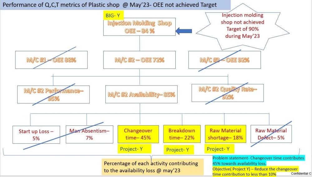
Venkateswaran K replied to Vishwadeep Khatri's topic in We ask and you answer! The best answer wins!Problem Definition Tree: CTQ Drill down or Problem Definition Tree diagram relates high level focal points(Resultant output)to project objective(factors) The measure of those items linked to the CTQ are called Project Y. The following situations mandates the Problem definition Tree to be applied: 1.When Project Indication is vague without knowing which parameter need to be improved. 2.When parameters of Big Ys are defined from customer perspective rather than process control perspective. 3.When dimensions of the Big Ys are aimed at abstract terms and not in tangible terms. In General ,The following rules can be applied while splitting the Big Ys to Project Y : 1st Rule – Boxes in a split should not overlap. Need to respect the parent dictionary and divide it into subgroups 2nd rule – Need to ensure that sub groups selected must encompass the whole dictionary . 3rd Rule – Boxes or sub groups must be able to provide us with details and data needed for running experiments. The Black belt should finalize the last unbreakable activity or component which can contribute to the Big Y and select this item as Project Y. This is the actionable item which need to be acted upon to improve the Project Y and thus the Big Y to solve Let us take example of OEE Overall Equipment efficiency not achieved the Target for may '23( Big Y) and drill down to find the project Y - which contributes the highest , so that action can be initiated immediately . The injection molding machine shop OEE is 84% , which is average of 3 machines OEE #1,#2,#3.However target is 90%. In this Example - the black belt has to stop here and take a call, after he had broken down the Big Y to actionable items or factor KPIs, at the activities contributing to availability loss of M/C #2 - out of the which Top 3 activity can be taken as Project Ys .Thus we have divided our Big Y of OEE Target not achieved problem into many Project Ys and Black Belt can stop here as below to finalize projects for further working by small work groups on each . Here Changeover Time is the 1st actionable item to be worked on followed by Breakdown time reduction & material shortage issue reduction. Once all these Project Ys are addressed , eventually the Big Y ( OEE of molding) would be achieved. Problem definition Tree clearly gives us direction, focus. 1.Change over time - 45% 2.Breakdown Time - 22% 3.Raw material shortage time - 18% The General criteria/steps to be used while splitting boxes. 1.Use Logic to make splits ( using creative & alternate searches) 2.Never move to next level until , all important in the family is identified. 3.Make Broad splits first and detailed splits later - Avoid going into the factor x , until the detailed split of Ys 4.FInally use facts and physical laws of logical correlation to make decision vis cause/effect matrix.
-
Venkateswaran K replied to Vishwadeep Khatri's topic in We ask and you answer! The best answer wins!In a Design of experiment , this principle is used to determine significance of effects using sparsity of effects. It states a system is usually dominated by main effects and low order effects. This is a state where only a few effects would have statistical significance. Main effects & two factor interactions are the most significant responses in a factorial experiment. Three factor interactions are very rare. Analysis of fractional factorial design takes advantage of this principle. such designs study the effect of large number of factors, in less than stipulated set of runs. For example , a researcher uses this sparsity of effects as a worst case scenario. This is very useful in design of cryogenic engines and selection of cryogenic fuels used for space research. Because there are billions of rupees spent on defence & space research - probability of failures have to be ascertained using a worst case scenario of 3 factor interactions - in which the researcher is in a position to prove the sparsity effect. To give an example , a researcher working on fuel selection needs to be careful about the interactions that will happen surrounding the cryogenic engine in a rocket like , fire point , its density, the ambient temperature that would be likely to trigger an accident in the space shuttle. careful analysis and confirmation of the sparsity of the effects of interactions of the above 3 parameters, would give a confirmation and confidence to the researcher to launch the space shuttle. As a matter of fact - one of the US mission on space failed due to such non-confirmation of sparsity of effects confirmation for the ambient temperature reaction of the cryogenic fuel.
-
Venkateswaran K replied to Vishwadeep Khatri's topic in We ask and you answer! The best answer wins!Levene’ s Test is statistical test to compare the variances of two or more samples and test the homogeneity of variance . Specifically To get to know if there are significant differences between sample variances and can be used as a precursor while conducting inferential tests such as ANOVA. Levene’ s Test tells us if samples taken for testing have equal variances. It tests the equality of variance whether they are close enough to be called as “Homogeneity of variances” As generally ,ANOVA assumption , that variances across samples are equal – Levene’s test is used to verify this assumption. Ideally one would want a non- significant result for this test – which means assumption of equal variances shall hold good before proceeding to ANOVA. Let us say 2 groups , 1.Control group & 2. Experimental group. In case of t – test we want that the variances shall be different in the 2 groups.( as of course, because one group has treatment).while independent sample t -tests takes for granted that variances are equal , Levene's test really tests the equality. In case of Levene’s Test, we want variances to be the same. we would like it to be non-significant because we don’t want difference in variances. If Levene’s test is significant ( p < 0.05) – it means there is no equality in variance or sufficient variance available between 2 or more samples. Levene’s test is highly useful to make sure that our assumptions equality of variances are scrutinized /judged. In Hypothesis testing ,while comparing 2 or more samples with each other–Here ‘s an example of comparing 2 or more groups. Example : Let’s say a Human resource specialist doing his doctorate wants to know Job satisfaction index % of 2 groups of genders Male & female. ( another group Transgenders may also be included – if the company of research focusses on Diversity, inclusivity). §Here running one-way ANOVA, based on mean(research studies running Levene’s test can have p<0.01 if sample size is huge) The null hypothesis is that there is homogeneity in variance. Alternate hypothesis is there variances are unequal However for this case we will assume alpha value of 0.05, a significant result here < 0.05 indicates that we are not inline with homogeneity of variance. In the other case a non-significant result would mean that we are inline with our assumption of homogeneity of variance between 2 or more groups..