
Sarala
Members
-
Joined
-
Last visited
Everything posted by Sarala
-
2 Variance test also known as F-test compares variances between two sample groups or data sets which come from the same population assuming data follows normal distribution. The distribution follows F distribution with two different degrees of freedom. Instead of means, it compares variances between two groups. Purpose is to use this test to compare variances between two groups in different fields and domains. Example – Grading % of the exams between two sections – A & B can be compared for a particular class to check if there is any variation in the score. Following are the inferences drawn if the data sets have different variances – Variance between the two data sets are different. One might have a higher or lower variance when compared to the other data set. Data spread are statistically different from one another though the values are independent to each other.
-
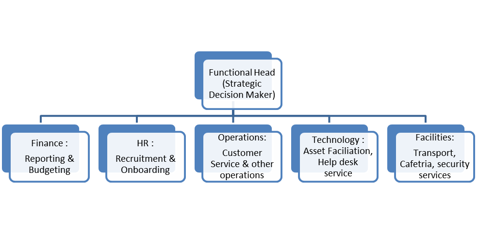
Organizational Chart – These charts explains the reporting structure, the hierarchy model in the organization. Organization charts lists who leads whom internally. The organizational chart lists down the employees by department, location, function and does not provide the detailed view of what these teams actually do. Organizational charts shows the Front line units, Middle management and Top level management and so on in the organization. In order to define the roles and responsibilities of the tasks that needs to be done, the Accountability charts are created. Types of Organizational charts – 1. Hierarchical organizational chart – In this organizational chart, team members typically communicate with the person they report to and anyone who reports directly to them. One person or a group reports to the top of them (reporting manager) and they report to the top of them and so on. 2. Sequential organizational chart – This chart contains the top administrators and the workers and this is also known as horizontal organizational chart. Dotted reporting hierarchy is applied. 3. Matrix organizational chart – This chart represents when the individuals have two line of reporting managers. Example of the Organizational Chart (Hierarchy) - Accountability Diagram/Chart explains the roles and responsibilities of specific functions within an organization for every individual. It provides clarity about the ownership of the work assigned. These charts avoids confusion in the work a particular individual function needs to do in an organization. Every task is assigned accountability for an individual to perform. Types of Accountability charts – 1. Flat Organization Accountability chart – Everyone in the organization reports to one single person the CEO or Director or the organization. 2. Function based Accountability chart – Accountability is grouped basis the tasks and the work the teams do and the complete team works for the same function. 3. Product based accountability chart – This chart is based on the product type and the product leader leads the individuals with various functions within the product groups. 4. Geographic based accountability chart – Basis the location of work operation, the groups are created and defined. Example of the Accountability Chart (Function based) - Accountability chart effectively helps teams move through the stages of team formation quickly as the team works for the same functional goals. Initially, the team members are not aware of each other; however, the accountability diagram helps in collaborating the team to complete the tasks. This chart helps defining individual roles on what they are responsible and accountable to do. The accountability chart keeps the complete team on a same page and work towards specific goal though their roles and responsibilities are different. Using RACI matrix, the roles and responsibilities of the individuals are defined where in the tasks and deliverables are listed. Always ensuring there is someone responsible and accountable for every task to avoid any fail. This accountability chart makes the decision making and communication flow easy. Every individual in the team knows what they role is in an organization and what are the activities/tasks they have to perform.

 Introduction to Robust Design – Robust design is an experimental design run to study the interaction between control and uncontrollable noise factors and alert the control factors to minimize response variation from uncontrollable factors to develop high quality product/process with minimal cost. Basically, a design that has minimum sensitivity to variations in uncontrollable factors (noise factors). Robust design also known as Taguchi method as the design is pioneered by Dr. Genichi Taguchi. Considering the noise factors and the cost of failure in this method helps to enhance customer satisfaction at low cost. Robust design focuses on improving the fundamental function of the product or process, it is the most powerful method available to reduce product cost, improve quality and simultaneously reduce development interval. A robust design aids in variation reduction that leads to productivity improvement and ensures reliability. Robust design thinking is to develop high quality products and process at low cost with increase in customer satisfaction. Tools used for Robustness Strategy - 1. P-Diagram 2. Ideal Function 3. Quality Loss Function 4. Signal to Noise Ratio 5. Orthogonal Arrays 1. P-Diagram – This diagram provides the classification of the variables associated with the product which has inputs like noise, control, signal and output as response factor. P-diagram is used in every project/product development lifecycle. List out all the input and output factors and then consider the factors that are beyond the control of the design which are noise factors and the parameters that are specified by the designer are control factors. 2. Ideal Function – This function is used mathematically or statistically to identify the ideal form of the signal response relationship associated by the design concept for making the higher level system work perfectly. 3. Quality Loss Function – Known as Quadratic loss function which is used to measure the loss incurred by the user/consumer due to deviation from target performance. 4. Signal to Noise Ratio – This is used to predict the quality of field by going through systematic lab experiments. 5. Orthogonal Arrays – This is used for gathering dependable information about control factors (design parameters) with a minimal number of experiments. Following are the main steps for Robust Method – 1. Problem Formulation – In this stage, we identify the main function, develop the p-diagram, select the ideal function and signal to noise ratio and finally plan the experiments to run. We run minimal experiments to alert the noise, control and signal factors for ideal design. 2. Data Gathering – In this stage, the factors data is gathered after alteration which helps to run the experiments that are required for the ideal design implementation. Basically, to run the test experiments at low cost. 3. Factor Effect Analysis – In this stage, we read the outcome of the control factors to identify the most favorable arrangement of the control variables/factors. 4. Prediction/Confirmation – In this stage, the performance of the design is predicted under the most favorable arrangement of the control variables/factors to confirm the best conditions are met. The real time experiments are run to confirm there is no variation in the results for the implemented design. If the results do not match, the process needs to be repeated.Top down approach – this approach mainly focuses on high level planning and decision making where the top management is involved as the results are mostly focused with organizational goals. Leadership team uses comprehensive factors like market analysis, bench marking for decision making. Top down approach seeks to see bigger picture to drive the end goal. Bottom Up approach – this approach focuses on individual processes and teams where in brain storming places a major role with team expertise knowledge. Mainly concentrates on business by business or process by process. Bottom Up approach have a micro level view only to a particular process and not necessarily aligned to organizational goals. Difference between both approaches – Top down approach Bottom up approach Macro level view and widely focused on company goals Micro level view and narrowly aligned to organizational goals as focuses on process to process goals This approach always involves top management Front line units and their individual teams can majorly be involved Less room for creativity and team disengagement Teams are brainstormed and new creative ideas are generated and has more scope for innovation and creativity Time consuming, most of the projects take an year or so and cost driven Projects implemented within a time frame of 3-5 months and lesser period most of the times. Most of the time focused on small improvements Decision and policy oriented with incremental approach Solution and action oriented with radical approach Lean Implementation - For lean Implementation, both Top down and Bottom Up approaches are used. As lean is mostly to do with continuous improvement, the goal is to include every person at the entry level of the organization in the process improvements to include their expertise where in a bottom Up Approach is required. Simultaneously, the top down approach is also applied in which decision making at the highest level is required by senior leadership team and then communicated to rest of the team. This style is applied at company level, project level and process level and adjusted as per needs. Six Sigma Implementation - For Six Sigma Implementation, Top down approach is mostly applied because of the DMAIC and DMADV methodologies. Six Sigma needs a drive and support from top management to implement the solutions at full potential. So, mostly top management commitment is required for success of Six Sigma Projects.Design of Experiments is a method to determine the relationship between impacted input factors (Controllable and uncontrollable) and output of the process. The controllable input factors can be modified for output optimization. DOE delivers an equation that quantifies the relationship between factors and outputs and explains which all factors have big and less impact on the outputs. DOE understands the influence of the experimental parameters on the outcome and to find an optimal solution for the process. Design Type vs features Plackett-Burman Design 2 Level Factorial Design Definition Plackett-Burman Design helps to identify the factors that are important in the experiment. This design can be applied for experiments that are multiples of 4.. A minimum of 4n (n>1) experiments are needed for identifying main effects for 4n-1 factors. 2 level Factorial designs are carried to determine whether certain factors or interactions between two or more factors have an effect on the responses. The number of experiments are based on the number of factors which is 2^n where n is >= 1 Pros Plackett Burman design can provide data with less experimental runs which saves cost and time. Two way interactions is aliased with the main effect factors. Highlighting the relationships between variables, it also allows the effects of manipulating a single variable to be isolated and analyzed singly. No aliasing and confounding as all possible combinations are studied. Cons Cannot verify if the effect of one factor depends on other factor in the experiment due to less data points collected/few experimental runs. Not feasible to run all the 2^n factorial experiments. There is a difficulty of experimenting with more than two factors or many levels. All combinations to be considered irrespective of the factor importance that results in experimental waste. Factors Vs Runs 4 to 7 factors leads to 8 experimental runs 8 to 11 factors leads to 12 experimental runs 12 to 15 factors leads to 16 experimental runs 2 factors leads to 4 experimental runs 4 factors leads to 16 experimental runs 7 factors leads to 128 experimental runs Benefits of Plackett-Burman Design: 1. With few experimental runs large number of factors can be analyzed ,this makes easy to identify the vital factors and eliminate the effects that are insignificant. 2. Time and cost is optimized as fewer experimental runs are considered. 3. Variance of the dependencies is minimized using a limited number of experiments. Limitation of PB Design: 1. Interactions are partially confounding with the main effects of different factors and cannot be evaluated individually. Interpreting the results is risky and difficult due to less experimental runs. 2. Not feasible to run all the 2^n factorial experiments.Control charts are the graphs plotted used to study how the process changes over time. Control chart has an upper line, lower line and the central line. Upper line defines upper control limit (+ 3 sigma away from central line) and lower line defines the lower control limit (-3 sigma away from central line) and the central line is the average. These charts also display the common cause variations and the special cause variations. Common cause is the natural variation that exists within any process. Special cause is the variation occurred due to a special event or change within the process and not natural. Studying the control charts, one can understand if the process is consistent with the variations or is unpredictable. Basis the stability of the process, changes are made to the process to make the process consistent. Preferable conditions where Laney U chart can be used – 1. It can be used when there is a large variation in the sample size. The traditional U chart is not effective when the variation is large. 2. If the data shows non normality then the Laney U chart can be used as it considers mean values instead of median to study in the variations in the sample size. Control Chart Laney U Chart U chart C chart Definition Laney U chart is an attribute chart used to measure the number of defects produced per unit. This chart is used when the sample displays over dispersion and under dispersion and when the sample size is large (> 5000) and assumptions are not met. u-chart is an attribute control chart used to measure "count"-type data where the sample size is greater than one, typically the average number of nonconformities per unit. c chart is an attribute chart used to measure the number of defects (count). It is generally used to monitor the number of defects in constant size units. Pros Laney U chart can distinguish between common-cause variation and special-cause variation when the data shows over dispersion or under dispersion. Used to monitor the process stability over time and monitor the effects of before and after process improvements and when the sample size varies. Identifies if the process is stable and predictable and also monitors the effects of before and after process improvements. c chart is especially used when there are high opportunities for defects in the subgroup, but the actual number of defects is less. Cons Projecting the chart for sampler sample sizes is difficult and has limited applicability. Not effective when the sample size is very large and sensitive when the variation in the means is huge. Not effective when the sample size is large and also when the data is variable. Data type & Sample Size Discrete data and the sample size should be large (>5000) Discrete data and calculate defects when the sample size is variable Discrete data and calculate defects when the sample size is constant Data Assumption Poisson distribution assumption for the data is not valid. Poisson distribution for the data is valid. Poisson distribution for the data is valid.CTQ (critical to quality) tree is one of the six sigma tool to understand the needs of the customer for a product/service and convert them into measurable organizational goals. Big Y is the final goal that is tied to the business strategic goals the project team wants to measure and achieve. Big Y is directly related to customer expectations and requirements and is used to understand and achieve the little Y’s that is tied to the Big Y. CTQ trees are used to identify the critical needs of the customers to provide quality products and service. Important components of the CTQ tree are as follows: 1. Identify Customer Needs 2. List down the Quality Requirement Drivers 3. Prepare Measurable Performance Requirements that each driver should meet to provide quality product Various methods like VOC, VOB, COPQ data, Benchmarking, Focus groups, Financial Analysis of the organization helps identifying the Big Y project. The Big Y project should always be a top down approach so that the team will be able to see a bigger picture that helps to choose which level to stop and finalize the project Y. In DMAIC , Define Phase the Big Y and all the little Ys are identified and defined which are tied to the organization goal. To split the Big Y into little Ys, SMART – Specific | Measurable | Achievable | Relevant & Time bound approach is required. By applying the SMART approach, the Big Y goals can be divided into small Y projects that can help in easy tracking of the project and focus on the timelines to achieve the big Y project. Using the SMART approach, Black belt can choose to stop and finalize the project Y. Various factors are considered like 1. Customer Needs & Requirements – Basis the Voice of Customer and focus groups and other methods, it is always necessary to understand what customer wants and whether it is aligned to the business goals 2. Complexity of the project – as multiple stakeholders within the organization are involved, the project shouldn’t be cumbersome and difficult to complete. 3. Impact of the project – look at the benefit quantification of the project and measure if the objective is aligned to the business goals 4. Data Availability – Make sure data is available, reliable and measurable 5. Time Bound – Project should be achievable within timelines to show its results on the business. Longer time the project takes, less its effects on the business and most of the times the long time projects doesn’t fly and due to some or the other reasons they get scrapped. Necessary to meet the desired milestones of the project. 6. Controls & Risks – Check if there any controls applies to the project and are they within scope and one should evaluate the risks that come with the project and calculate risks to see if they are within acceptable limits. 7. Project Investment – Before a project is defined and started working towards it, it is always necessary to check if there is any cost involved and is the organization willing to invest that cost to achieve the bigger goal of the organization If the above requirements are met and aligns to the organization goals, then it is better to finalize the project Y and start working on the project.Design of Experiments is a statistical framework that allows to identify the impact of multiple different factors using an experimental method for a system/process and helps to understand the interactions between the factors and its dependency to optimize and create efficiency in the process/system avoiding the negligible effects. The Sparsity of effects principle generally states that a system/process is dominated by few factors out of many and suggested to consider the main factors which are actually significant. When considering a system design, the equation is mainly dominated by main effects and its two factor interactions. Higher order interactions like three and four factor interactions effects are seen very rare and most of the times, there is no impact. Due to this principle, when a design of experiment is conducted, most of the times the higher order interactions are ignored by running a fractional factorial design. Basically, this principle is to limit the number of variables when conducting the experiment and focus only on the factors that are likely to have an impact on the outcome/equation. This principle helps researchers in the following ways – 1. Helps in identifying the vital and trivial factors and considering only the factors that are statistically significant to the process. 2. Helps in ignoring the higher order interactions due to negligible effects, when performing fractional factorial design. 3. It saves time and reduces the cost and efforts in performing the higher order experiments which is a cumbersome process.Levene's test and Bartlett's test are used to test the equality/homogeneity of variances for two or more samples before performing ANOVA. If the sample data is normal, it is preferred to choose the Bartlett's test, as Bartlett's test is more sensitive to the violations of normality when compared to Levene's test. Irrespective of data being normal or not normal, Levene test can be conducted to check the homogeneity of the variances. Example – Attritions recorded for a process X in an organization across all locations for 2022. Month Location A Location B Location C Location D Location E January 42 8 32 56 51 February 45 14 33 60 58 March 51 25 41 58 57 April 61 43 52 62 67 May 69 54 62 63 81 June 76 64 72 68 88 July 78 71 77 69 94 August 78 69 75 71 93 September 72 58 68 69 85 October 62 47 58 67 74 November 51 29 47 61 61 December 44 16 35 58 55 Assumptions: Considering data is normal and the values are independent. H0: Variances are equal across all locations. Ha: Variances are not equal across all locations. SUMMARY Locations Count Sum Average Variance A 12 729 60.75 190.3864 B 12 498 41.5 504.6364 C 12 652 54.33333333 279.697 D 12 762 63.5 26.09091 E 12 864 72 248.3636 Source of Variation SS df MS F P-value F crit Between Groups 6223.667 4 1555.916667 6.227781 0.000331 2.539689 Within Groups 13740.92 55 249.8348485 Total 19964.58 59 P value using Levene’s test – 0.000331 P value using Bartlett's test – 0.00104 Inference - As p value < 0.05 (significance level), we cannot accept the null hypothesis of equal variances across locations. Ho rejected and Ha accepted.

