

Chandra Shekhar Chauhan
Members
-
Joined
-
Last visited
Everything posted by Chandra Shekhar Chauhan
-
Chandra Shekhar Chauhan replied to Vishwadeep Khatri's topic in We ask and you answer! The best answer wins!Pugh Matrix: Pugh matrix was developed by British mechanical engineer and Product designer Mr. Stuart Pugh. It is a quantitative decision making tool which normally used within DFSS/ DMADV Six sigma projects. Its objective is to validate multiple concepts and come to an agreement for the final design to robust solution. Pugh analysis is a decision matrix where alternatives or solutions are being listed on one axis and evaluation criteria are being listed on the other axis. The objective of Pugh matrix is to evaluate and prioritize the alternatives. An effective output from Pugh Matrix required a team that is familiar with the concepts and weighting criteria. It is also significant that they remain unbiased towards a particular design to allow this method to do its job. Its results will be considered as good or bad based up on its inputs. Any decision matrix is intended to remove bias and opinions with the intent of making it more objective rather than subjective. the most time consuming part of this whole exercise is create the matrix and scoring criteria. Rest of the steps in this method is quick and simple. We must took time to establish the matrix properly and with the help of qualified assessors review the design concepts along with team and this should lead to the most meaningful outcomes. This is similar to other decision matrix that are quantitative based same as CORRELATION matrix and FMEA where the RPN is calculated by using the severity, occurrence and detection score and which are being used to make improvement decisions. These tools are most commonly used in the DMAIC process to make strategic decisions on existing processes where the Pugh Matrix is being used for a new design. Main strengths of the Pugh Matrix: Pugh Matrix is easy to use and relies up on a data set of pairwise comparisons between design evaluators against a number of criteria. One of its key advantage over the other decision making tools such as Decision matrix is its ability to manage a large number of decision criteria. The advantage of Pugh Matrix is that subjective opinion about one alternative versus another can be made more objective and meaningful. Sensitivity studies also can be performed with the help of this method. Reason to use of Pugh Matrix over other Multi- criteria Decision Making processes; Allow the analyst to organize various criteria of a solution in a structured way for easy comparison Facilitates a team based process for disciplined concept generation and selection Allows the analyst to develop a optimal solution which is a hybrid of other strong solutions Analytic Hierarchy Process: The AHP method is a robust and flexible multi- criteria decision making tool for dealing with complex decision problems. This method divides a complex or complicated system into a hierarchical system of elements which usually includes purposes, evaluation criteria and alternatives. There is a limitation in AHP like AHP permits irregularity and as result of absence of data about criteria and preference and absence of fixation amid pairwise examinations. There is inconsistency in positioning when including or erasing options utilized as a part of the information group. Advantage of AHP over Pugh Matrix: AHP resolved the complex decision problems and being used and recognized worldwide. No special knowledge is needed to apply the technique unlike some other methods of MCDM- Multi- criteria- decision - making. Quantative pairwise comparisons are relatively simple and acceptable to decision makers Dis-advantage of AHP over Pugh Matrix: Need pairwise comparisons for AHP Use of nine point scale which is not easy for all decision makers AHP has a major disadvantage if the decision maker uses the technique to produce the results, but decides to add a new alternative to the model or remove the old alternatives; the preferential order of alternatives can change without changing the values of pair wise comparisons with regards to individual criteria or their choices. Why AHP is the Best Method ? AHP is simple and powerful method for making decisions. It is commonly used for project prioritization and selection. AHP capture all our strategic goals as a set of weighted criteria that we have and then use to score projects. Managers uses the AHP to assign quantitative weights to factors. these factors could be the ones used by our customers while evaluating a product or they could be the ones used by our management to evaluate alternative solutions.
-
Chandra Shekhar Chauhan replied to Vishwadeep Khatri's topic in We ask and you answer! The best answer wins!S - Curve in Project Management In project Management, S curve is being used most commonly. It is a mathematical graph that depicts relevant cumulative data for a project for example - no of design changes in each phase of the project or project cost or man hours plotted against various phases of projects. We called s curve due to the graph typically forms a loose shallow "S" An s-curve in project management is being used to track the progress of a project against budgeted or targeted values to control and monitor the over all performance of the project during entire project cycle - start to end of the project. Common uses of S-curve in project management: Some of the most common uses for s-curve are to measure the progress against target values, evaluate performance against predefined Key performance Indicators and make cash flow forecasts. An s-curve is very helpful in monitoring the success of a project because real time cumulative of various projects parameters like cost; which can be compared with projected data. The degree of alignment between the two graphs reveals the progress or delay of whichever parameter is being evaluated. If corrections need to be made to meet the actual target, the s-curve can help to identify them. Application of S-curve : Cash flow forecasts S-curve is also useful to monitor and evaluate various projects in marketing, new product development, process change management, construction industry, new machine or equipment installation, food and pharma Industry etc.
-
Chandra Shekhar Chauhan replied to Vishwadeep Khatri's topic in We ask and you answer! The best answer wins!Here, I have tried to differentiate about Normal distribution and others distribution types which could be used instead of Normal distribution.

-
Chandra Shekhar Chauhan replied to Vishwadeep Khatri's topic in We ask and you answer! The best answer wins!Multiple Linear Regression (MLR) Multiple linear regression is the most common form of linear regression analysis As a predictive analysis, the multiple linear regression is used to explain the relationship between one continuous dependent variable and two or more independent variables. The independent variables can be continuous or categorical (coded appropriately). The Variable that we want to predict is known as the dependent variable and variables we use to predict the value of the dependent variable are known as independent variables. Multiple linear regression model predictions graph Multiple linear regression can give predictions in 2 forms- Linear regression and non-linear regression. If we refer the above regression equation; MLR give us the information of main effects of independent variables only. Design of Experiment (DOE) Below is the experiments results from 3 factors - 2 level full factorial DOE. Speed, quality and service are the factors and Satisfaction is the outcome/ response. Lets analyze this data with the help of Minitab to know about main and interaction effects. R- Adjusted value 99.03% shows that this model is very much fitted and very accurate for regression analysis. Above data shows that Speed has most significant impact on response, then Quality and then service followed by Quality-service (Interaction effects) on response. Above Regression equation shows all main and interaction effects on response as - satisfaction. Alias structure shows we have single, 2 way and 3 way interaction effects in this case. We can clearly see the main and interaction effects among all the factors or variables. And insignificant interaction effects could be removed from the Regression equation for better understanding of situation or Project study. Regression equation and Pareto chart after model reduction (Elimination of non significant effects from the model) Conclusion: DOE analysis gives us the better information related to interaction effects as compare to Multiple Linear Regression (MLR)


-
Chandra Shekhar Chauhan replied to Vishwadeep Khatri's topic in We ask and you answer! The best answer wins!Lets define the full name of various types of ANOVA's ; ANOVA - Analysis of Variance (It may be further categorized like One way, Two Way, Three Way ANOVA......., which has differentiated based on number of Independent variables- IVs considered in data for study) MANOVA- Multivariate analysis of variance ANCOVA- Analysis of Covariance MANCOVA- Multivariate Analysis of Covariance An ANOVA test is a way to find out either experiment results are significant or not. In other words, this test help us to figure out either we need to reject the Null Hypothesis or accept the Alternate Hypothesis. Generally, we are testing the groups of experimented data to see, if there is a difference between them. there are few examples of ANOVA test for different groups. A group of Cars are trying three different fuel combinations; Normal fuel, Fuel with additives and Super fuel. We want to see if one fuel is better than the others A manufacturer has two different processes to make the Gear; Hobbing, Blanking. we want to know if one process is better than the other A students from different colleague take the same exam. we want to know if one colleague perform better than the other Lets look into application of various types of ANOVA; One Way ANOVA : In one way ANOVA, we study the experiment data with one independent variable which affecting a dependent variable. A one way ANOVA is used to compare two means from two independent groups using the f -distribution. We can define Hypothesis like; Null Hypothesis (No) : Two means are equal Alternate Hypothesis (Na) : Two means are unequal, therefore it is significant result Example: We have a group of individuals and randomly split into smaller groups and completing the tasks. e.g. we can study the effects of tea on weight loss and three groups could be formed like Green tea, Black Tea and No tea. Two Way ANOVA : Two way ANOVA is an extension of the one way ANOVA test. In One way ANOVA, we have one independent variable affecting a depended variable, whenever in Two way ANOVA, there are 2 independents. We use the two way ANOVA when we have one quantitative variable and two nominal variables. In other words, if our experiment have a quantitative variable and two categorical variables, then a two way ANOVA is most suitable test. Example 1: We might want to find out if there is an interaction between Gear Material and Tensile strength at the time of initial design review. Life (working Hours) of the gear will be the outcome or variable in this case. Material grade and Tensile strength are the two categorical variables. these variables are the independent variables which are called factors in a two way ANOVA. The factors may be split into levels. In the above example, Material grade could be split into 2 or 3 levels: A, B, C. Tensile strength could be split into 2 or 3 levels like High, medium and Low. In this example there would be 3X3=9 treatment or experiments. Result of two way ANOVA, provide us the main and interaction effects. Main effects are similar to One Way ANOVA when we consider each factors separately. Whenever in interaction effect, all factors are considered at the same time. We can define Hypothesis like; Null Hypothesis (No) : All the material grades have equal gear life Alternate Hypothesis (Na) : All the tensile strength have equal gear life f-statistic is computed for all hypothesis, we are testing. F-statistic must be used in combination with p-value when we are deciding either results are significant or not? A common Alpha level for test is being considered 0.05. If p-value is less than Alpha level then accept the Null Hypothesis otherwise accept the Alternate hypothesis to find out the significant factors. Example 2: Analysis of Covariances (ANCOVA): The obvious difference between ANOVA and ANCOVA is the covariance. ANCOVA has a single continuous response variable and in this test we compares a response variable by both - a factor and a continuous independent variable. Continuous independent variable called as covariate in ANCOVA. ANCOVA Example: Multivariate Analysis of Variance (MANOVA): MANOVA is an ANOVA with multiples dependent variables. It is very similar to other test and experiments. Purpose of the MANOVA test is to find out the response or dependent variable is being affected by changing the independent variable. This test help us to answer many research question like; if do changes to the independent variables, have significant effects on dependent variables? What are the interaction effects among dependent variables? What are the interaction effects among the independent variables? Example 1: If we want to find out either different grade of material affected gear's life in hot and cold climate. Therefore improvement if Gear's life means there are two dependent variables and MANOVA is most appropriate test. ANOVA give us a single f- value while a MANOVA give us a multivariate f-value. MANOVA test the multiple dependent variables by introducing new dependent variables that maximize the group differences. these new dependent variables are called as linear combinations of the measured dependent variables. Example 2: Multivariate Analysis of Covariance (MANCOVA): Main difference between MANOVA and MANCOVA is covariance. MANOVA and MANCOVA both have two or more response variables, but the nature of the independent variables is the main difference between both. MANOVA can include only factors but when one or more covariates are added to the mix than we use the MANCOVA test. MANCOVA Example: Below assumptions is likely to be the most time consuming task to perform MANCOVA test; Two or more dependent variables should be measured at the interval or ratio level One independent variable should consist of two or more categorical , independent groups One or more covariates, all are continuous variables There is no relationship between the observations in each group of the independent variable or between the groups themselves. There should be a linear relationship between each pair of dependent variables with in each group of the independent variable. There should be homogeneity of regression slopes There should be homogeneity of variances and covariances There should be no significant univariate and multivariate outliers in the groups of your independent variable in terms of each dependent variable There should be multivariate normality


- 10 replies
-
- anova variants
- anova
- ancova
- manova
-
Tagged with:
-
Chandra Shekhar Chauhan replied to Vishwadeep Khatri's topic in We ask and you answer! The best answer wins!Autocorrelation in regression analysis: Autocorrelation mostly refers to the degree of correlation of the same variables or observation points between two successive time intervals. It measures how the lagged version of the value of a variable is related to the original version of it in given time period. Autocorrelation also known as serial correlation. The value of autocorrelation ranges from -1 to +1. A value between -1 to 0 represents negative autocorrelation and a value between 0 to 1 represents positive autocorrelation. Autocorrelation gives information about the trend of a et of historical data so that it can be useful in the technical analysis for the stock market. Causes of Autocorrelation Time to adjust; this is often occurs in Macro and time series data Prolonged influences; this is again a Macro, time series issues dealing with economic changes Data verification and manipulation; using functions to smooth data will bring autocorrelation into the disturbance terms Mis or wrong specification Why is it a problem? When autocorrelation is detected in the residuals from a model, it suggests that the model is misspecified or wrong, A cause is that some key variables are missing from the model. How to deal with autocorrelation? Autocorrelation functions are used for model criticism. It is used to test if there is a structure left in the residuals. An important prerequisite, here is that the data or values are correctly ordered before running the regression models. If there is structure in the residuals of a model, an AR1 model can be included to reduce the effects of this autocorrelation. There are mainly two methods to reduce autocorrelation, of which the first ane is most commonly used; Improve model fit; we must try to capture structure in the data in the model. If no more predictors can be added, include present and AR1 model. by including an AR1 model, the first model takes into account the structure in the residuals and reduces the confidence in the predictors accordingly.


-
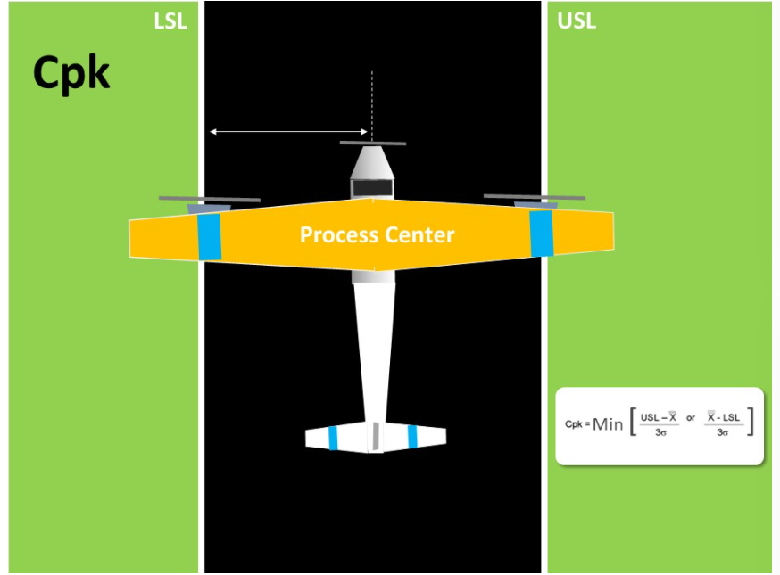
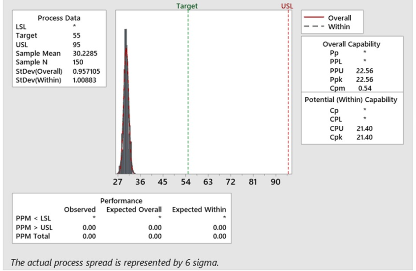
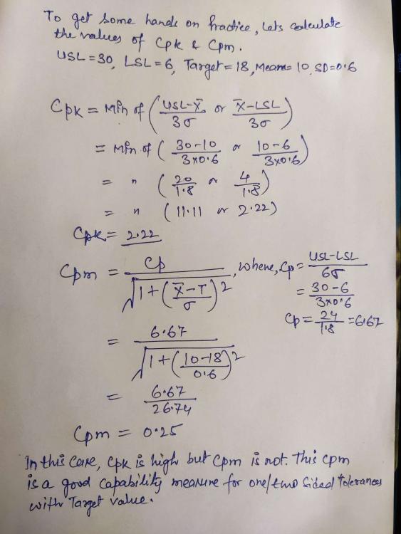
Chandra Shekhar Chauhan replied to Vishwadeep Khatri's topic in We ask and you answer! The best answer wins!Yes, it is true that Capability Matrices (Cp & Cpk) are more relevant for manufacturing Industries where it is common to get 2 sided specification limits. These indices do not adequately address the issue of process centering. Foe addressing this issue, an alternative definition of Cp advocated by Taguchi. Taguchi introduced the name Cpm for the Taguchi Index and examined statistical properties of an inefficient estimator under the assumption that the process mean coincides with the target value. Cpm is now another interesting process capability metric that is not very popular. In fact it is more robust than Cpk. Cpm is an advanced measure and it corrects some deficiencies in Cpk. It is also called as Taguchi Capability Measure. We can easily understood the difference between Cpk and Cpm with this below Illustration and formula; Cpk Cpk is considered as a measure of the process centering for any process. If we closely observe the Cpk formula, it does not require the actual target value. target value is the center value obtained from the customer Given or design specification. However it takes the LSL, USL & Process mean. In this way, we can say that this is an indirect method of assessing if the process centered to the tolerance. In the above picture, in order to know if the plane is landing exactly on the middle of the landing strip, we look at the distance of the plane's nose from either edge of the strip. That is good but it's only an indirect way of assessing the process center. Cpm If we look at the above picture and formula of Cpm, it contains the target value. Thus in addition to obtaining the USL and LSL from the customer or Design, we also obtain the Target Value. This means, Cpm is a true process capability index, because it compares the difference between process mean and target Value. To draw an image for plane landing, we are comparing the plane's nose to the median line of the strip. Lets take an example, where there is only a specification on one side. In most business processes, service levels have only an upper or lower specification. In some cases, Cpk losses its significance. However, in all service scenarios, there is a target value. For example, Customers are told that payment will be updated in 4 hours but the internal target is to get it done in 2 hours. Process is designed for 2 hours. In such scenarios, Cpm will be a relevant centering metric. In this scenario, Cpk is high, but Cpm 0.54 is very less value as comparison to Cpk 21.40. Here Cpm is very sensitive and good capability measure while Cpk is not. To get some hands on experience, lets calculate the value of Cpk and Cpm for another service industry; Below are the few examples of use of Cpm (Taguchi Capability Measure) in Service Industry, where we generally have one sided specification with Target Value; - Resolution time less than X hours - Call time less than X minutes - Payment update in less than X hours - Number of min order places per hours - Number of max. calls in waiting and so on .........

-
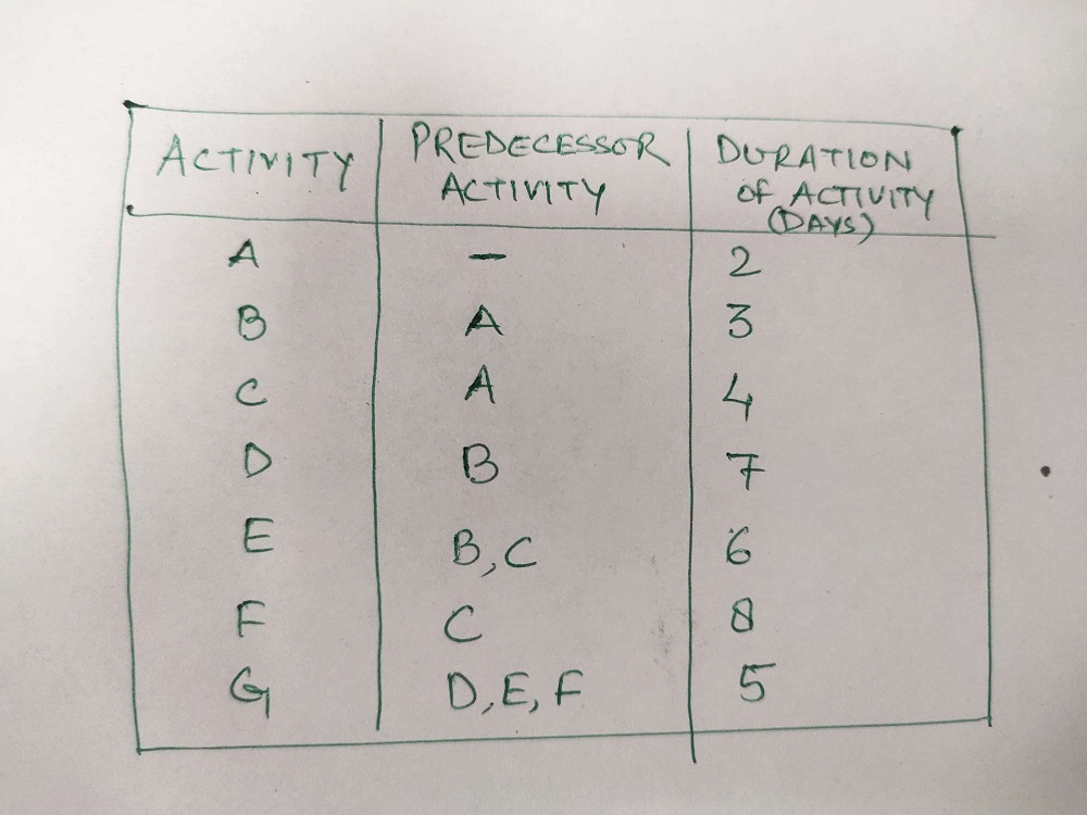
Chandra Shekhar Chauhan replied to Vishwadeep Khatri's topic in We ask and you answer! The best answer wins!Network Diagram : Network Diagrams mainly are 2 types - Activity on arrow (AoA) and activity on node (AoN) are being used to analyze various tasks involved for completing any project, especially when it is being used most to the time that is required to complete each task and the minimum amount of the time that is required to complete the entire project. It is well known method which comes under the Program Evaluation and Review Technique called as PERT. There are 3 stages involved in developing a network diagrams are; - Planning stage - Sequencing stage - Scheduling stage AoA - Activity on Arrow It use arrows to represent activities while nodes stand for events. Each nodes contains 3 numerical values : * Start time * Finish Time * Float or Slack AoA diagrams show the finish to start relationships with a limited offer like Arrow represents the time span from the event at the start of the arrow to the event at the end. Activities that are represented as arrows have to be added to illustrate some of the more complicated relationships and dependencies that are present between the activities. Such diagrams used dummy activity to show the relationship among various dependencies and dummy activity need Zero time to complete it. AoN - Activity on Node Each activity is represented by Arrow with nodes at each end to represent the Start and Finish of the activity. In AoN diagrams, the activity is placed on the node. The interconnection arrows would illustrate the dependencies that are there between the activities. They are more flexible and are capable of illustrating the main relationship types. Since the activity is on node the data usually can be placed on the activity. Such diagram usually start from Start Node and end with the End node. And generally dummy activity is not being used. We can easily understand the difference between AoA and AoN diagram with this example; So what should we use? While there are some fundamental differences between AoA and AoN network diagrams, choosing one over the other is based on individual project requirements and some time matter of the personal choice. Some of the basic differences would be as follows. AoA networks were more popular in the 1960s and 70s. AoN focus on Task while AoA focus on Events. AoN diagrams are generally easier to Create as compared to AoA diagrams. AoA shows only finish to start relationship, while AoN can show any type of relationship like finish to start, finish to finish, start to start, start to finish. AoN is widely used network diagram technique and supported by most of the project management software's.


-
Chandra Shekhar Chauhan replied to Vishwadeep Khatri's topic in We ask and you answer! The best answer wins!What is Q value? Q Value is a p-value that has been adjusted for the false discovery rate (FDR). The false discovery rate is the proportion of false positives we can expect to get from a test. A p-value gives us the probability of a false positive on one sample test. If we are running hundreds or thousands of tests from small samples, we should use q-values. Why are q-values necessary during hypothesis testing ? Generally, we decide ahead of time the level of false positives we are willing to accept - In Hypothesis under 5% is the norm. This means that you run the risk of getting a false significant result 5% of the time. You cant escape this fact when you are running tests as false positives (p-values) are a fact of life and are unavoidable. While 5% might be an acceptable false positive rate for running one test, it becomes completely unacceptable if you run thousands of tests on the same small data set. Assume that we are planning scratch off lottery and we have a 5% chance of getting a winning ticket. One ticket gives us a 5% chance, but if we buy enough tickets, probability tells us that we will eventually get a winner (Buying 1000 lottery tickets should do the trick and will in fact give us, on average, 50 winning tickets). The same is true for Lab test. # The first test on our data, we have a 5% chance of a false positive #The second test on our data, we have another 5% chance of a false positive # The thousandth test on our data, we have had a 5% chance of a false positive a thousand times Therefore, If we run enough tests, we will get a false positive- a false significant result. In fact, at a 5% FDR, we will get 5 false results for every 100 tests we run, or 50 for every thousand. That's pretty high. This is called multiple testing problem. The False Discovery Rate demonstrate the p-values assigns an adjusted p-value for each test. This is the q-value. A p-value of 5% of all tests will result in false positives. A q-value of 5% means that 5% of significant results will result in false positives. Q values usually result in much smaller numbers of false positives, although this is not always the case. The Q value is not the same as the Q we sometimes see in statistics. Q on its own refers to elements is=n a set that don't have a particular attribute. for example, lets say we had 100 students and 55 of them like Math subject. The proportion of students who like Math is p=0.55. therefore, q=0.45; which is just 1-p.

-
Chandra Shekhar Chauhan replied to Vishwadeep Khatri's topic in We ask and you answer! The best answer wins!Grubbs Test is being used to detect outliers in a univariate data set (data of one variable) assumed to come from a normal distribution population. Grubbs test is based on the assumptions of normality. First we should verify that the data can be reasonably follow the normal distribution before applying the Grubbs test. Grubbs test detect one outlier at a time. We need to Calculate the G Calculated value by using below formula; GCalc = I Xi- x Bar I / SD, Xi , X Bar and SD denoting the questionable value, sample mean and standard deviation. The Grubbs test statistic is the largest absolute deviation from the sample mean in units of the sample standard deviation. Based on No of sample in data set, we can get the G Table value. For example n=4 G tab= 1.463 and n=5 G tab= 1.672 at 95% confidence. If G calc > G tab, then outlier should be rejected; if G calc < G table, then outlier should be kept. Example: Data 5, 10, 9.5, 9.8, 9.9 Let say questionable value is 5. X Bar= (5+10+9.5+9.8+9.9) / 5 = 8.84 SD = Root [(5-8.84)2+(10-8.84)2+(9.5-8.84)2+(9.8-8.84)2+(9.9-8.84)2] / 5-1 = 2.155 GCalc = I Xi- x Bar I / SD = I 5- 8.84 I / 2.155 = 1.782 ~ 1.80 G tab for n=5 is 1.672 Here G Calc > G tab; therefore outlier should be rejected. Box Plot Box plot is a method for graphically demonstrating the locality, spread and skewness groups of numerical data through their quartiles. In addition to the box on box plot, there can be lines extending from the box indicating variability outside the upper and lower quartiles. Outliers that differ significantly from the rest of the data set may be plotted as individual points beyond the whiskers on the box plot. Box plots are non-parametric; they display variation in samples of a statistical population without making any assumptions of the underlying statistical distribution. The spacings in each subsection of the box plot indicate the degree of dispersion and skewness of the data, which are usually described using the five number summary- sample minimum, lower quartile, median, upper quartile, sample maximum. In addition, the box-plot allows one to visually estimate various estimators notably the interquartile range, midhinge, range, mid-range and trimean. Box plots can be drawn either horizontally or vertically. Example: Data 60, 82, 82, 84, 88, 90, 90, 92, 93, 97 Sample minimum range - 60 Median= (88+90)/2= 89 Lower Quartile Q1= median of lower values = 82 Upper quartile Q3= median of upper values = 92 IQR = Q3-Q1= 92-82=10 Sample maximum= 97 Upper range = Q3+1.5 IQR = 92+1.5 x10 = 92+15= 107 Lower Range = Q1-1.5 IQR = 82-1.5 x10 = 82-15= 67 (Refer below Box-plot for this example; which has been made free hand) Generally we prefer the Box plot to identify the outliers for any statistical data set whenever Grubbs test could be used for univariable data set with normal distribution population. A box plot is a standardized way of displaying the dataset based on the five number summary like the minimum, the maximum, the sample median and the first and third quartiles.


