

Kiran Kumar Gadhamsetty
Members
-
Joined
-
Last visited
Everything posted by Kiran Kumar Gadhamsetty
-
Kiran Kumar Gadhamsetty replied to Vishwadeep Khatri's topic in We ask and you answer! The best answer wins!Normality test is a statistical hypothesis test used to determine if the sample has been drawn from a normally distributed population. Graphically, normal distribution resembles a bell with a symmetric distribution around the mean value. It is unimodal with mean, median & mode being equal. Commonly used tests for normality are Anderson Darling, Shapiro-Wilk, Kolmogorov-Smirnov & Chi Square. Shapiro-Wilk test is sensitive to sample size. It is generally used for sample sizes less than 50. For larger sample sizes, the result is always statistically significant. Kolmogorov-Smirnov is generally used for sample sizes greater than 50. It doesn't requires to know the underlying distribution of the population before running the test. It requires us to enter location, scale and shape parameters for running the test. It can't be used for discrete distributions. Anderson Darling is a modification to Kolmogorov-Smirnov test with more weight to the tails than Kolmogorov-Smirnov test. It doesn't has a good power as that of Shapiro-Wilk test but offers better power than other tests. Chi Square normality used when the sample has discrete set of data points. It is used when the expected value of number of sample of observations is greater than 5. The data must be randomly extracted and the variable of study is categorical.
-
Kiran Kumar Gadhamsetty replied to Vishwadeep Khatri's topic in We ask and you answer! The best answer wins!S Curve in project management is a mathematical graph that displays cumulative value of a variable against time. The variable can be project cost or resource hours. As it represents cumulative data, there is no negative slope in the curve. It resembles "S" and hence popularly known as S curve. S stands for "Sigmoidal" & it represents the way the curve is defined. S curve was first conceptualized by Charles Handy in mid 90s. It represents 3 important phases in any project. Phase 1 (initial part of S curve) has a gradual increase in the effort/cost due to reduced number of resources in planning. In the project execution phase, there is a significant jump in the effort/cost. This phase is represented by the central region of the S curve. In the project closure phase, there is again a significant reduction in the effort/cost which is represented by the final region of the curve. There can be 2 S curves for a project: Estimated & Actual. Estimated S curve is based on the effort & cost estimates whereas the actual S curve is based on the actual numbers. There are several benefits of comparing estimated vs actual S curves. It helps monitor the project efforts/costs against the estimated numbers. It helps predict the time period for high/low resource involvement. It helps track the expenses against the available budget. It helps gauge overall project progress & evaluate project performance. A typical example involves sales of a potentially profitable new product. It is gradual during the initial period, picks up during the major part of the product sales life cycle (includes numerous product improvements) & stabilizes in the absence of no significant product improvements. There can be an early & late S curves. These are predicted based on early & late start dates. Late curve is the lower curve where every activity uses maximum available float whereas early curve is the upper curve where every activity has an early start and an early finish. These are generally used by Project Managers to monitor if the actual S curve is within the early & limit curves.
-
Kiran Kumar Gadhamsetty replied to Vishwadeep Khatri's topic in We ask and you answer! The best answer wins!Student's T is a continuous probability distribution that has longer tails when compared to a normal distribution. The probability of finding larger values is higher in a T distribution when compared to a normal distribution. Whenever the population standard deviation is unknown or whenever the sample size is less than 30 or in case of both scenarios, usage of Student's T distribution is recommended. Logistic distribution is another continuous probability distribution that has not so longer tails as that of a Student's T distribution but has slightly longer tails than a normal distribution. This distribution is highly used to model growth of a certain species, spread of an epidemic, etc. Binomial distribution is a discrete probability distribution as against normal distribution which is a continuous probability distribution. There are only 2 possible results & binomial distribution gives the probability of success.
-
Kiran Kumar Gadhamsetty replied to Vishwadeep Khatri's topic in We ask and you answer! The best answer wins!ANOVA (Analysis of variance) is a statistical hypothesis test of means for two or more populations. It determines the influence of independent variables, usually called factors, on the means of a dependent variable. Dependent variable must always be continuous & independent variables can be both categorical or continuous. ANOVA variants are differentiated based on number and type of independent variables. But, the dependent variable must always remain continuous. - One way ANOVA: There is only one independent variable and it must be a categorical variable. The factor can take multiple levels. Example: Impact on room temperature (one dependent continuous variable) when subjected to two different refrigerant types (one independent categorical variable with two levels). - Two way ANOVA: There are two independent variables and both are categorical variables. Both factors can take multiple levels. Example: Impact on room temperature (one dependent continuous variable) when subjected to two different branded air conditioners with different refrigerant types (two independent categorical variables with two levels each). - ANCOVA (Analysis of covariance): There are more than one independent variables with a mix of categorical and continuous variables. Categorical factors can take multiple levels. Example: Impact on room temperature (one dependent continuous variables) when subjected to two different branded air conditioners with different refrigerant types and different outside environmental temperatures (two categorical independent variables with two levels each and one continuous independent variable). - MANOVA (Multivariate analysis of variance): There are two or more than two dependent variables with two or more categorical dependent variables. Example: Impact on room temperature and humidity (two dependent continuous variables) when subjected to two different branded air conditioners with different refrigerant types (two independent categorical variables with two levels each). - MANCOVA (Multivariate analysis of covariance): There are two or more than two dependent variables with two or more than two independent variables that are both categorical and continuous. Example: Impact on room temperature and humidity (two dependent continuous variables) when subjected to two different branded air conditioners with different refrigerant types and different outside environmental temperatures (two categorical independent variables with two levels each and one continuous independent variable).
- 10 replies
-
- anova variants
- anova
- ancova
- manova
-
Tagged with:
-
Kiran Kumar Gadhamsetty replied to Vishwadeep Khatri's topic in We ask and you answer! The best answer wins!As the name suggests, the occurrence of event is rare. These events are rare in nature & are also spaced farther in time which makes us to have ineffective traditional attribute control charts with more zeros & with occasional spikes. There are 2 types of rare event control charts: G chart & T chart. T chart is based on the amount of time since the last event occurred. A traditional P chart might show lot of zeros & an occasional spike. This makes us difficult to check if an improvement has helped to control the process. In contrast, a T chart can overcome this & help us in concluding if an improvement has helped or not. On the other hand, a G chart is based on the number of events between rare events. This again prevents lot of zeros.
-
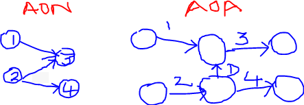
Kiran Kumar Gadhamsetty replied to Vishwadeep Khatri's topic in We ask and you answer! The best answer wins!Activity on node (AON) method represents activity in a node & the arrows give the logical relationship between two nodes (activities) whereas Activity on arrow (AOA) represents an activity over the arrow & the nodes represent the events. AOA can represent only finish to start dependency on the activities whereas AON can be used to represent finish to start, start to start, finish to finish and start to finish dependencies. Also, there is no need for dummy activities in AON as compared to AOA. For example, in the below network diagram, activity 3 must start only after completion of activities 1 & 2. Similarly, activity 4 must start only after completion of activity 2. In AOA, a dummy activity "D" is introduced to complete the network diagram. For this reason, it is easier to construct/understand AON diagrams.
-
Kiran Kumar Gadhamsetty replied to Vishwadeep Khatri's topic in We ask and you answer! The best answer wins!Dark data refers to all the information that is generated by systems & applications but not being used for any value adding purpose. It also includes the data that organizations are unaware of. Storage challenges: Volume of dark data is approximately 50-65% of all data generated. In 2020, 2.5 quintillion bytes of data was generated. We need an extensive storage network to accommodate increasing amount of proportional dark data that's getting generated. Though data storage has become inexpensive, organizations continue to have this expense of storing dark data in the anticipation of future use. Risk of security comes with the volume of data. Though not being used after storage, the data needs to be protected from unauthorized use. Cost factor on storage increases to accommodate data security. Usage challenges: If the purpose is unknown or if the data availability is unknown, there is a greater difficulty in using the dark data. Dark data is highly unstructured. Bespoke applications need to be developed to structure dark data. Need advanced big data applications to understand inferences from high volume of dark data. High data retrieval times can consume big chunk of the dark data analytics budget. Organizations are increasingly using dark data analytics to unlock hidden opportunities. Indiana University Health uses dark data analytics to personalize patient care model. Stitch Fix uses unused social media data to customize clothing styles. (Source: Deloitte Insights).
-
Kiran Kumar Gadhamsetty replied to Vishwadeep Khatri's topic in We ask and you answer! The best answer wins!Berkson's paradox describes a situation where the conclusion on correlation between two variables from a sample study is found to be against our intuition. This happens because of wrong sample selection. For example, regular exercise keeps a person active. However, if the study is performed on hospitalized patients, the result can turn out to be counterintuitive. As another example, regular investments in mutual funds provides a positive return. But, if the the study is performed on poorly performing funds, the result might be negative returns. Sample selection needs to be done from a general population instead of a biased population to prevent occurrence of Berkson's paradox.
-
Kiran Kumar Gadhamsetty replied to Vishwadeep Khatri's topic in We ask and you answer! The best answer wins!Dimension is an independent variable & measure is a dependent variable. Dimension can take any value based on the data type whereas measure is a function of one or more dimensions. In other words, measures are output variables of interest & dimensions are the input variables that need to be controlled to achieve a specific output variable value. Let's take an example of a moving object. It is characterized by speed which can be defined as the distance travelled in a specific period of time. In this case, speed is a dependent variable and can be categorized as a measure. Distance and time are independent variables and can be categorized as dimensions. A 3D contour plot can give us a value of speed for a combination of distance & speed. It helps us to visualize the impact of dimensions on the measure. In addition, main effects & interaction plots in design of experiments are built for measures (response variables) based on different combination of dimensions (control factors).
-
Kiran Kumar Gadhamsetty replied to Vishwadeep Khatri's topic in We ask and you answer! The best answer wins!Fleiss Kappa & Krippendorff's Alpha are used to determine the level of agreement among multiple appraisers. However, Fleiss Kappa determines level of agreement & Krippendorff's Alpha determines the level of disagreement. Fleiss Kappa can be used only for nominal data whereas Krippendorff's Alpha can be used for continuous data too. Secondly, Krippendorff's Alpha can be used in case of missing data.