
Topics
-
Fifty-five women engineering students completed an AI bootcamp focused on rural Karnataka. Participants developed AI-based solutions after visiting villages and conducting field interviews. The She Innovates bootcamp partnered with several organizations to achieve its goals. This initiative aims to boost women's participation in AI and entrepreneurship. It encourages AI applications for rural development and community-focused sectors. View the full article
-
Besi's quarterly orders more than doubled, fueled by AI and hybrid bonding technology. The company saw increased customer adoption of its advanced chip packaging solutions. Demand for AI applications continues to drive growth in data centers. Besi anticipates revenue growth between ten and fifteen percent. This strong performance aligns with other semiconductor sector reports. View the full article


Leaderboard
-
Partho
Members1Points11Posts

Popular Content
Showing content with the highest reputation on 05/12/2023 in Posts
-
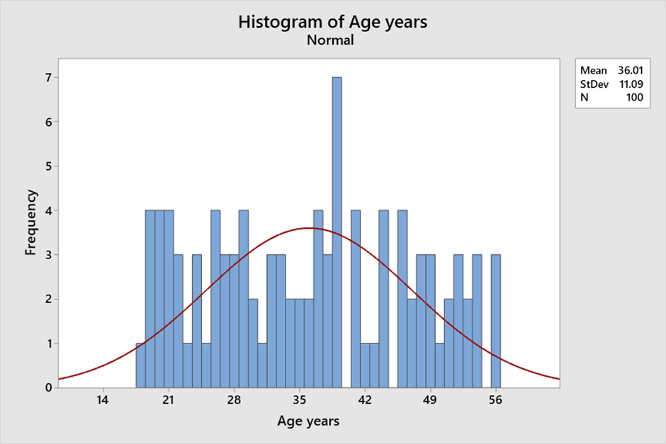
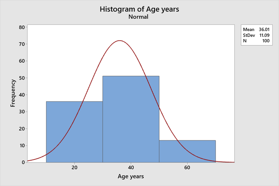
1 pointA histogram is a graphical representation of numerical data that provides insight into the distribution of the data. It is created by grouping the data into bins and then plotting the frequency of each bin as a bar. This visual representation of the data allows for easy interpretation of the central tendency, variability, and shape of the data. Histograms are a useful tool for visualizing and understanding the data and can help in data analysis and decision-making. Central tendency: The central tendency of a distribution refers to the value around which the data tends to cluster. A histogram can help to identify the central tendency of the data by showing the peak of the distribution. The peak of the distribution corresponds to the most frequently occurring value. For example, consider the following data set of ages (in years) of a group of 100 people: 18 to 56 . We can see that there is a peak around age 40 and that the distribution is roughly symmetric. Variability: The spread of data is called variability. A histogram can help to identify the variability of the data by showing the width of the distribution. A wider distribution indicates greater variability, while a narrower distribution indicates less variability. For example, consider the following data set of Age (in years) of a group of 100 people: 18 - 56. If we create a histogram with bins of width 1, there is not a lot of variability in the heights of the group. Shape: The shape of the distribution refers to the overall pattern of the data. Histograms help identify the shape of the data by displaying its symmetry or skewness. For example, consider the following same data set of Age (in years) of a group of 100 people: 18 – 56. If we create a histogram with bins of width 20, we can see that the distribution is roughly symmetric, indicating ages are evenly distributed around the mean. Bin size: The bin size refers to the width of each bin in the histogram. The bin size can affect the central tendency, variability, and shape of the distribution. If the bin size is too small, the histogram will have too many bars, making it difficult to interpret. If the bin size is too large, the histogram will have too few bars, potentially obscuring important features of the data. Example: Consider the following data set of ages (in years) of a group of 100 people: 18 to 56 with different bin sizes. If we create a histogram with bins of width 1, we can see that the distribution is relatively uniform and that there are no clear peaks or valleys. However, if we increase the bin size to 20, we can see that there is a peak around age 40 and that the distribution is roughly symmetric. With Bin Size 1: With Bin size 20: In summary, histograms can provide insight into the central tendency, variability, and shape of the data. The bin size can affect these features, so it is important to choose an appropriate bin size that accurately reflects the characteristics of the data.
 1 point
This leaderboard is set to Kolkata/GMT+05:30