
Topics
-
Fifty-five women engineering students completed an AI bootcamp focused on rural Karnataka. Participants developed AI-based solutions after visiting villages and conducting field interviews. The She Innovates bootcamp partnered with several organizations to achieve its goals. This initiative aims to boost women's participation in AI and entrepreneurship. It encourages AI applications for rural development and community-focused sectors. View the full article
-
Besi's quarterly orders more than doubled, fueled by AI and hybrid bonding technology. The company saw increased customer adoption of its advanced chip packaging solutions. Demand for AI applications continues to drive growth in data centers. Besi anticipates revenue growth between ten and fifteen percent. This strong performance aligns with other semiconductor sector reports. View the full article


Leaderboard
-
Johanan Collins
Members1Points72Posts

Popular Content
Showing content with the highest reputation on 03/22/2022 in Posts
-
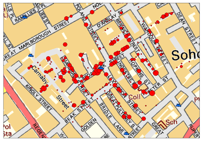
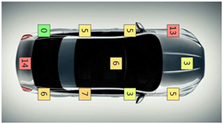
1 pointA Measles chart is also called a defect map or a defect location check sheet. It provides a visual image of the data collected rather than just collecting the count of the number of defects. In addition to the count and rate of defect, it shows the location of the defect. A drawing of the item is used to plot the place where the defect is occurring. The location of clusters of the defect could throw a better light on the nature of the defects, root cause identification, and its solution. Measles charts can throw light on the problem either by highlighting the areas where the maximum clusters of the problem occur as in the case of the 1845 Cholera Epidemic or by highlighting the areas where minimum/nil clusters of the problems occur as in the case of the Bomber Aircraft in World War 2. Examples Cholera Epidemic. The cholera epidemic hit Soho, London in 1854. Dr. John Snow, the father of epidemiology, plotted the location of deaths caused by the epidemic and the location of the pumps. His analysis led to the identification of the source as a contaminated public water pump. The removal of the handle of the pump stopped the epidemic. Survivability Bias World War 2 Survivability Bias draws attention to the survivors while evaluating a problem. Mathematician Albert Wald of the Statistical Research Group, United States did studies on neglected data and came to a conclusion that during World War 2, the retuning combat bombers needed to be strengthened in the areas where the bullet holes were minimum since the places with maximum bullet holes were not causing the aircraft to crash. A Measles chart of the returning aircraft gave an indication of the areas that showed the strongest part of the aircraft (a cluster of holes) and the most vulnerable parts of the aircraft having areas with no holes. The Measles clusters indicated the parts that were strong and needed the least additional protection. Defects in Cars The average number of defects that occur in the body of a car is 67. However, a Measles chart as indicated below show the locations that are more prone to defects. References. https://www.sixsigmadaily.com/measles-charts/ https://worldwarwings.com/the-statistics-that-kept-countless-allied-fighter-planes-in-the-sky/ https://www.r-bloggers.com/2013/03/john-snows-cholera-data-in-more-formats/ https://infodreamgroup.com/blog-defect-map-defect-location-advanced-attribute-spc/

 1 point
This leaderboard is set to Kolkata/GMT+05:30